Graphic Design, Artistic Direction, Research
꧁꧂
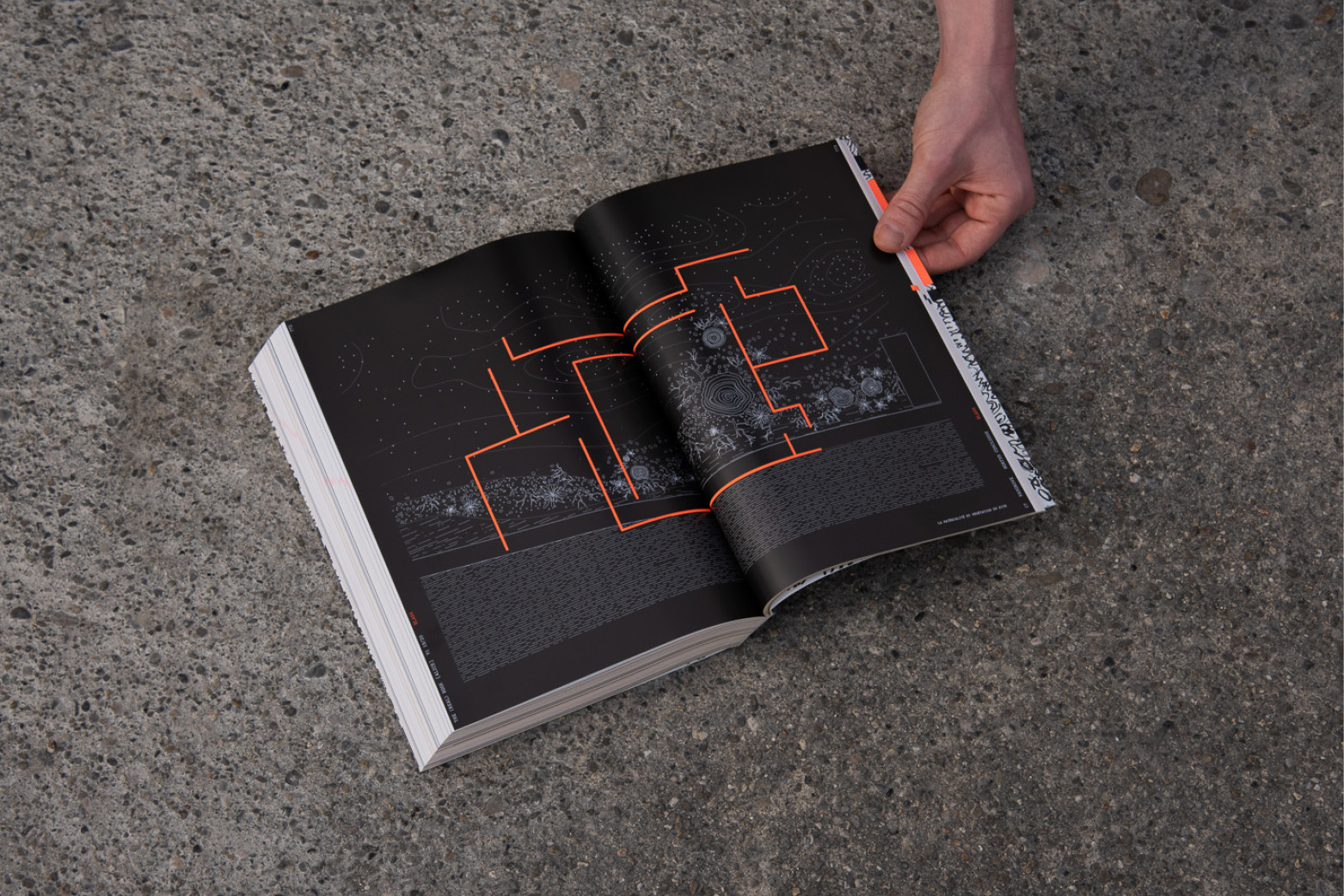
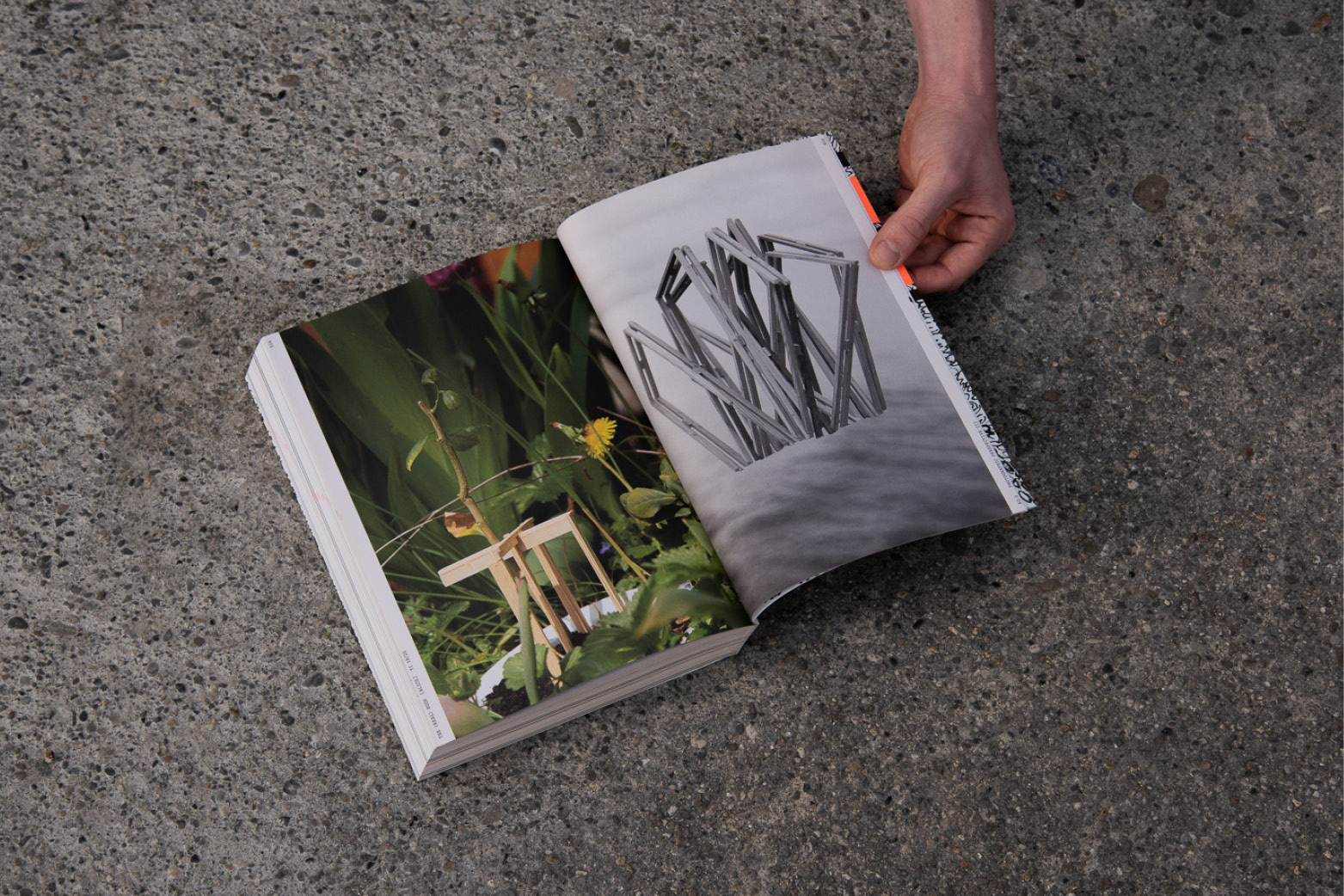
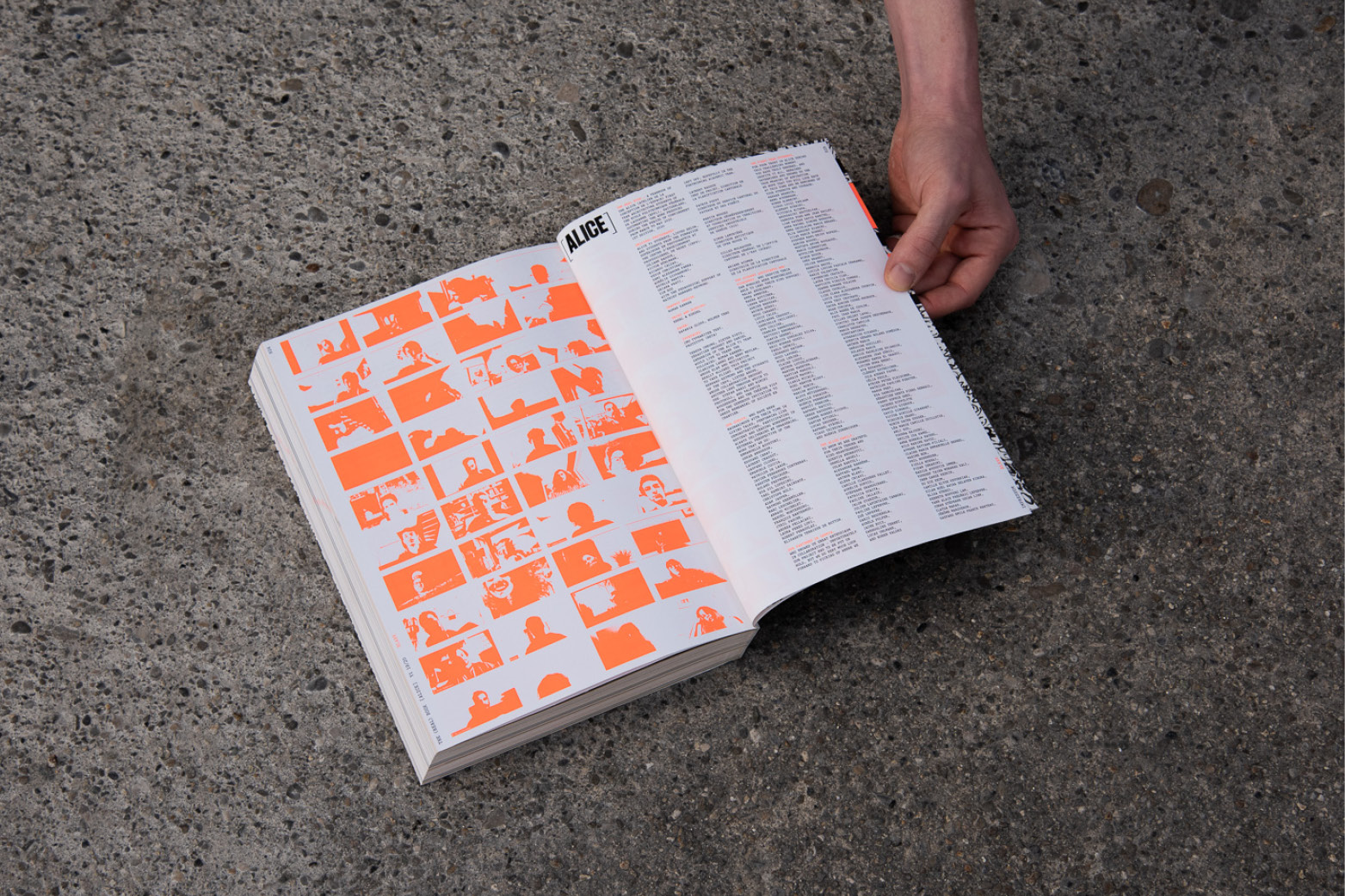
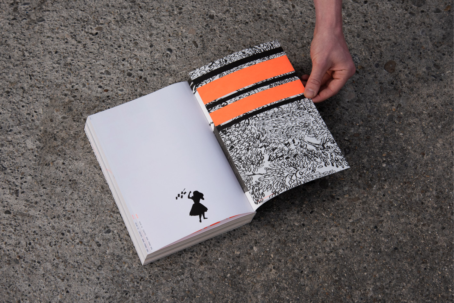
Prix Meret Oppenheim 2025


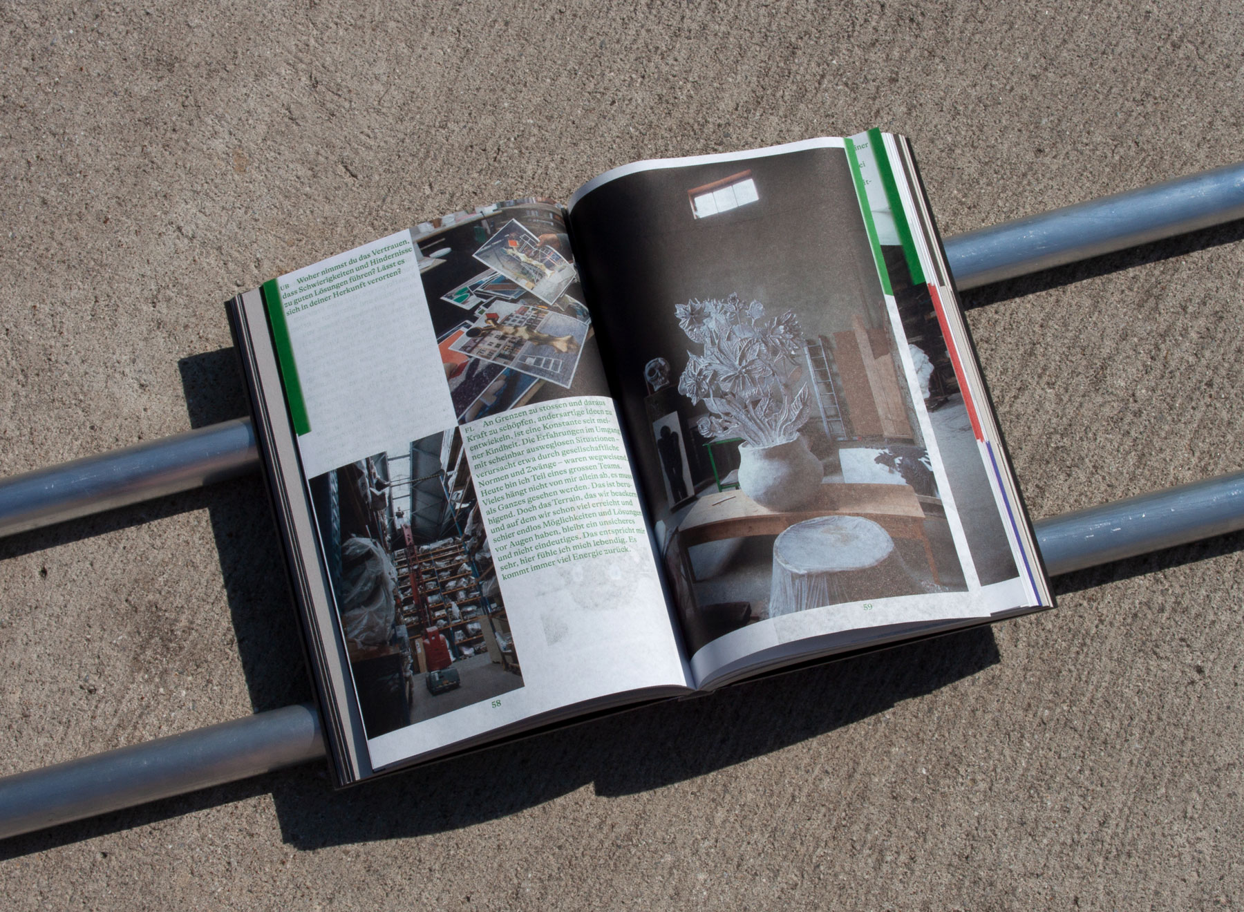
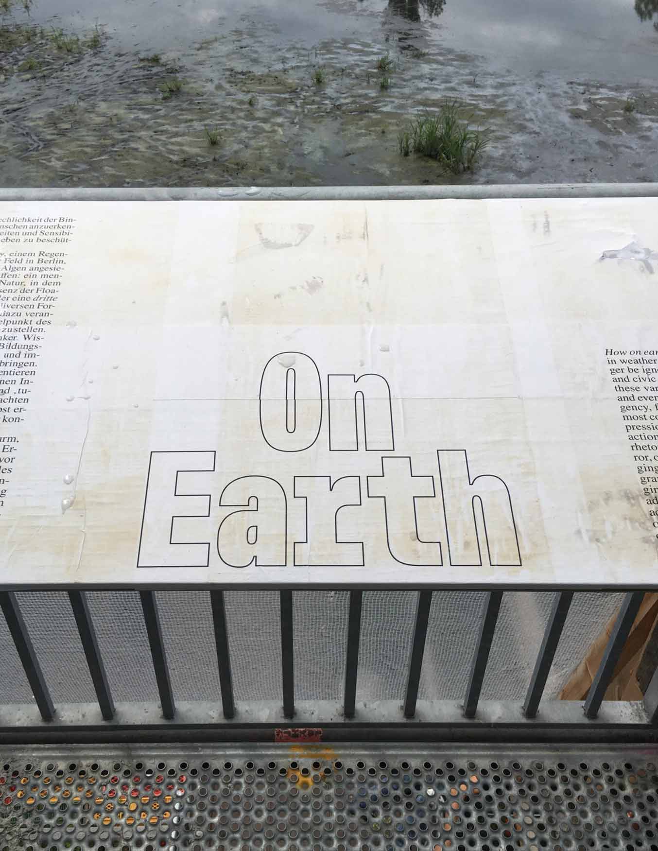
Editorial Design and Art Direction for the Honorary Volume dedicated to the Laureates of the Swiss Grand Award for Art / Prix Meret Oppenheim 2025: Felix Lehner, Pamela Rosenkranz, Miroslav Šik. Set in the four national languages and English, the publication centres on three newly commissioned dialogical texts, each accompanied by a photographic sequence and developed specifically for the volume. Together, they provide both textual and visual insight into the practices and works of the three significant cultural figures. This core is framed by a foreword and the translations.
Many thanks to Léa Fluck and the Federal Office of Culture in Switzerland for the trust, Théa Giglio for the photography and thoughtful collaboration, Gina Bucher for the wonderful cooperation and for keeping the overview, Anglo Miele and La Buona Stampa for their hospitality and craftsmanship and the Federal Office of Culture for their invaluable work. The publication was launched alongside the award ceremony during Art Basel 2025 and is available free of charge on request through the Federal Office of Culture or as a pdf-version through their website.
2025
Laureates: Felix Lehner, Pamela Rosenkranz, Miroslav Šik
Project Lead: Léa Fluck, BAK
Texts: Ursula Badrutt, Bice Curiger, Lukas Imhof
Photography: Théa Giglio
Editing: Gina Bucher
Printing: La Buona Stampa
Typeface: GT Alpina by Reto Moser (Grilli Type)
Format: 15 × 22.5 cm
Pages: 192
Print run: 5,000 copies
ISBN: 978-3-907394-17-5
Printing: 8 colors (CMYK + 3 spot colors + silver)
Paper: Two interior papers, endpapers, and cover stock
Binding: stiff brochure
Finishing: Hot foil stamping on the cover
EPFL Architecture Public Programs


Public Programs posters for EPFL Architecture based on the visual system developed for the Section together with Sandi Gazic in collaboration with the EPFL internal project team: Dieter Dietz, Marie Page and Elena Chiavi. Background Images by Lisa Mazenauer.
2023–2024
Format: 420 × 594 mm, folded to 148 × 210 mm
Typefaces: LL Medium, by Robert Huber (Lineto) and Relative Mono (Colophon)
Printed by PCL, Lausanne.
Publishing Anecdotes


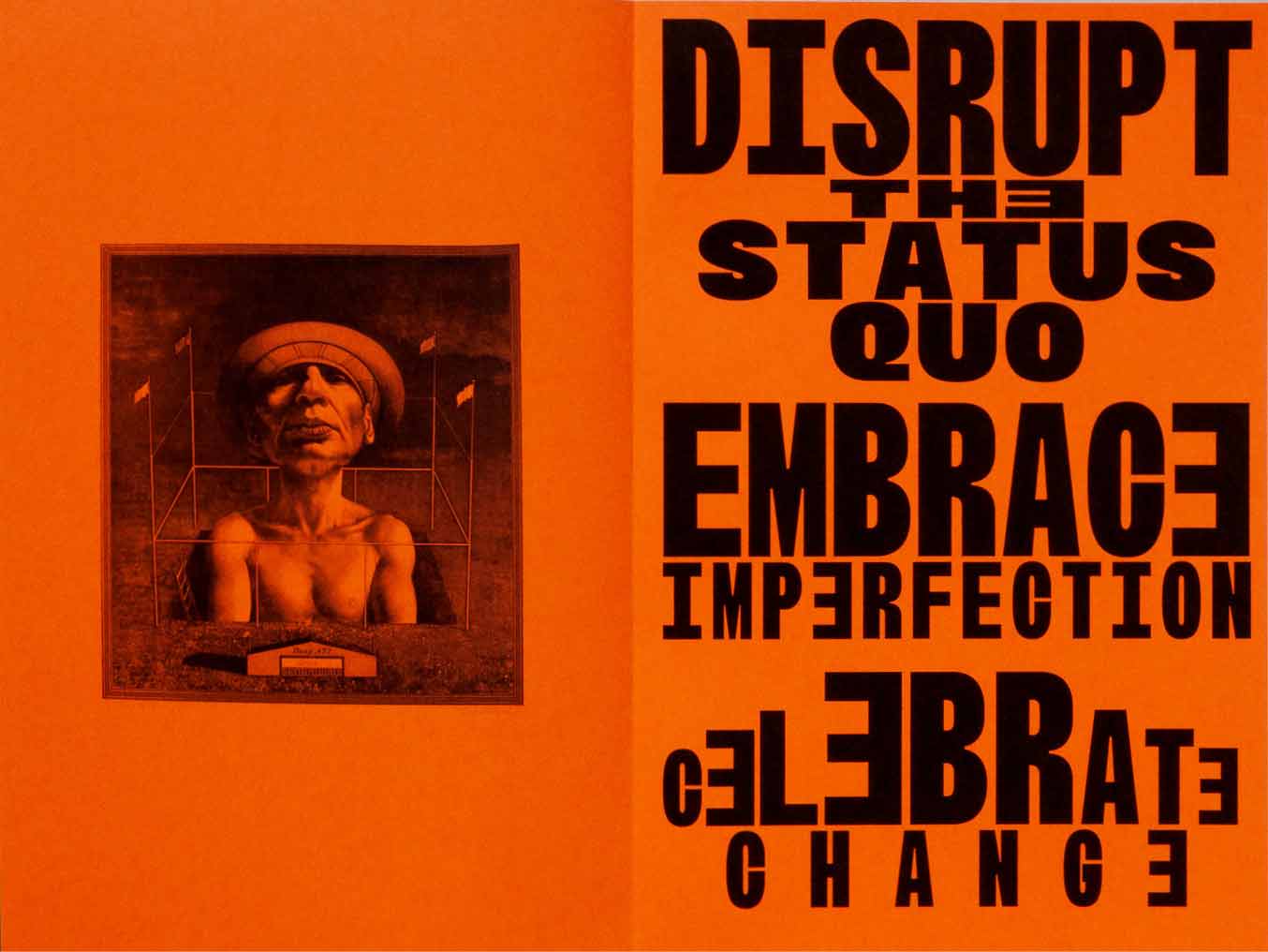
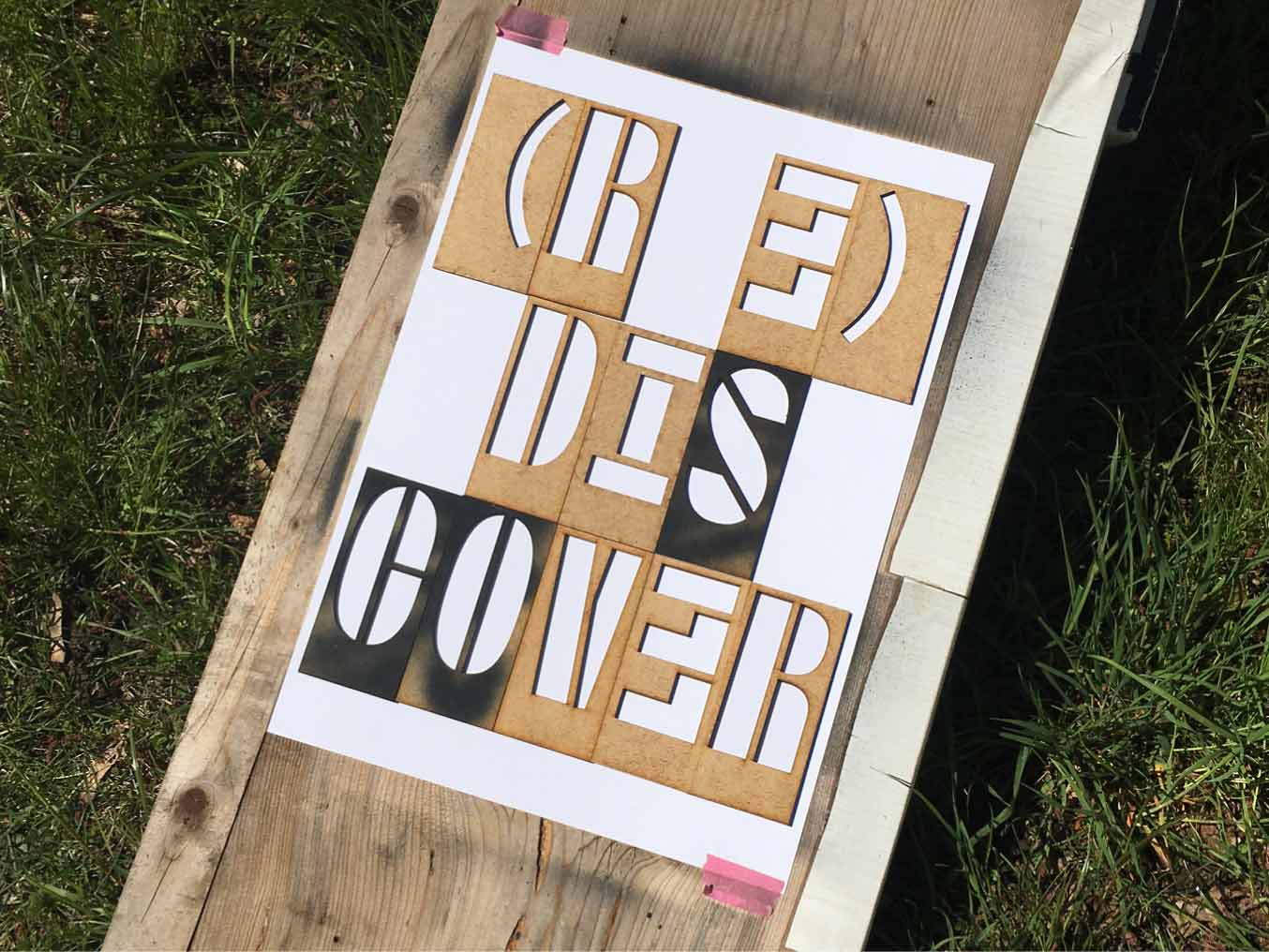
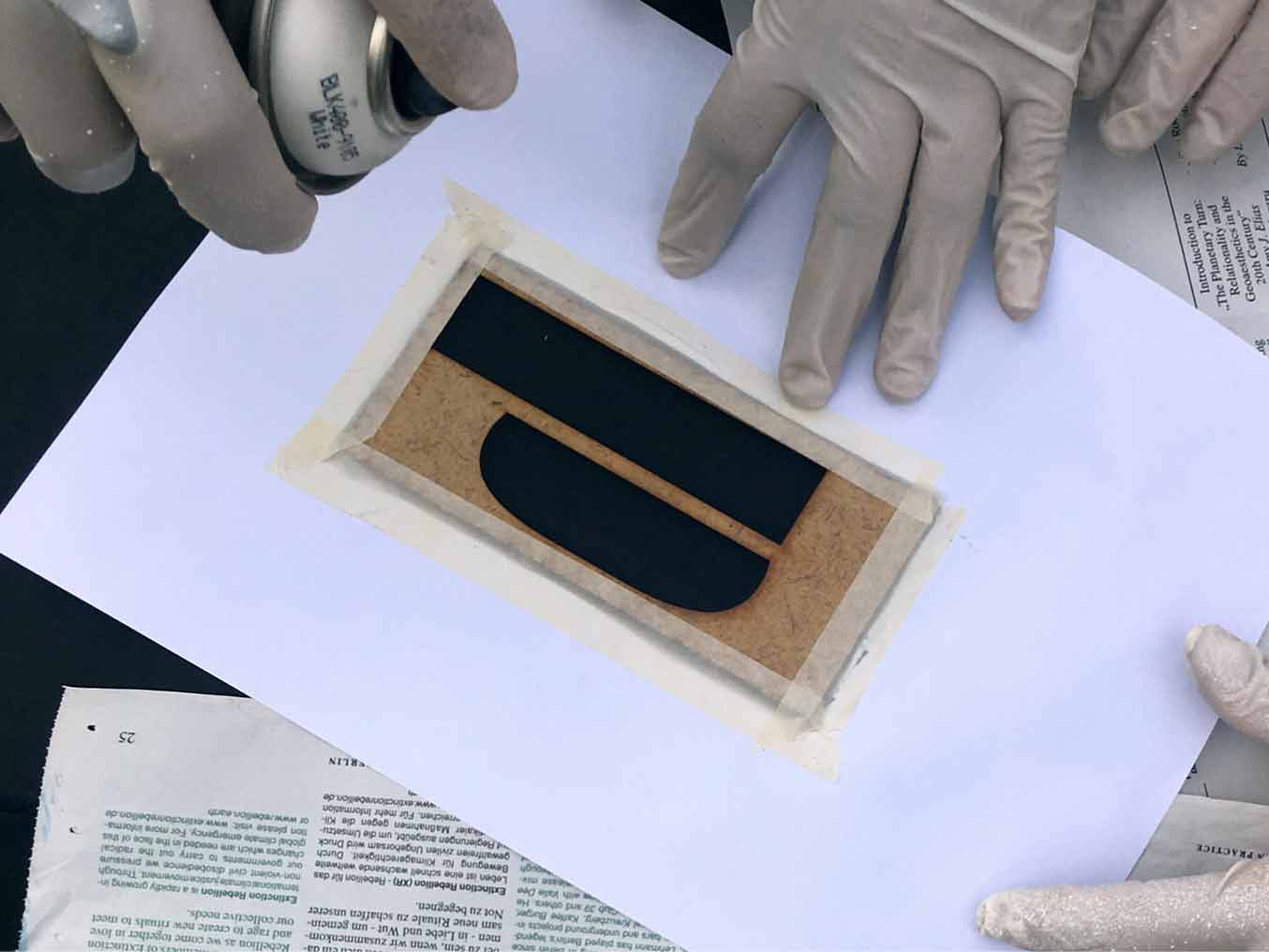
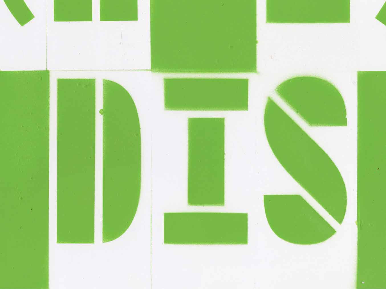
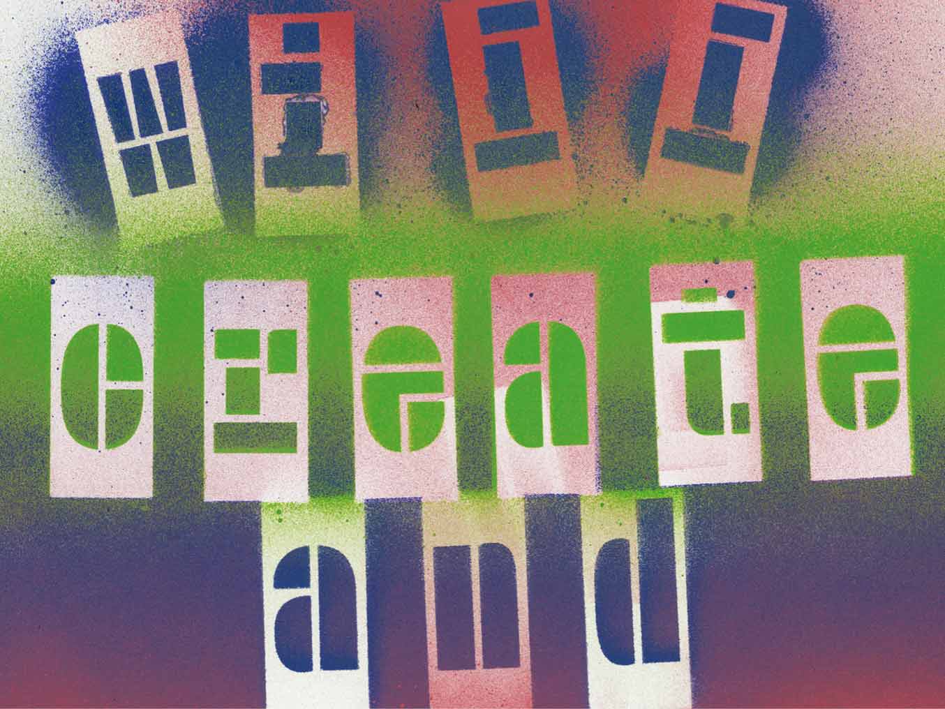
The research zine Publishing Anecdotes brings together insights and reflections from thirteen practitioners – both individuals and collectives – across the diverse field of artistic and critical publishing. Each contributor was invited to share a short anecdote from their practice, be it a thought, an image, a memory, or anything they felt relevant. Contributors include Björn Giesecke, Peter Schmidt (Books People Places), Simon Wahlers (Edition Zweifel), Samuel Bänziger, Rosario Florio, Olivier Hug and Larissa Kasper (Jungle Books), Sabrina Fernández Casas & Patricio Gil Flood (Macaco Press), Paul Soulellis (founder of Queer.Archive.Work), Lauria Joan (Pseudopress), Vida Rucli (Robida), Roland Früh, Eléa Rochat, Léa Gallon, Julien Guazzini, Vincent Chanson, Pablo Arnaud, and Camilla Brenni (Sans Soleil), Freek Lomme (Set Margins’), Jonas von Lenthe (Wirklichkeit Books), and Mio Kojima (Futuress). The publication was initiated, edited, designed, and published by Roman A. Karrer in August 2024 and marked the end of his research residency at ABA Berlin.
Published in: 2024
Format: 138 × 190 mm
Edition: 100 copies
Pages: 48 pages
Printing: Drucken3000, Berlin (Alexander Branczyk & Florian Haberstumpf)
Typefaces: SC Ripley (David Massara) + SC Walla (Baptiste Lecanu)
Paper: Clairefontaine Tropheé Rose 80 g/m2 + Metapaper Rough Warmwhite 90g/m2
Colors: Medium Blue + Silver Metallic (Riso)
Special thanks to: Pro Helvetia, ABA Berlin, Emma Affoua Kouassi
To make your own copy find a black only version here. Print the PDF on A3 (6 pages, double-sided) and follow the instructions on the print sheet for a pocket version print it on A4 (71%). Besides a printer, you will need a stapler and something to cut (scissors, cutter, ideally a cutting machine). Good luck and send me pictures if you try!
Die Gerechte Stadt / Just City


Graphic design and co-conceptualisation of the bilingual zine series Die Gerechte Stadt / Just City a growing publication series on various topics in the field of urban practice initiated by Urbane Praxis e.V., Berlin. The Project was Initiated and curated by: Kristin Lazarova , Nina Peters and Sophia Makrinius, Translations: Miranda Rigby, Editing: Kristin Lazarova, Nina Peters, Sophia Makrinius. Each issue is produced in two colors, which are inverted between the English and German editions. Both versions begin at opposite ends of the publication and meet at the centerfold.
With contributions from: Laura Awad, Yasmina Bellounar, Leila Bensalem, Lorene Blanche Goesele, Sarah Bovelett, Laura Cala Mejía, Maria Faciolince, Marieke Fischer, Emilia Fuchs, Milena Grösch, Léon Gross, Stephanie Haury, Lea Karrasch, Geneviève Kinet, Miriam Kreuzer, Padmapani L. Perez, Nashin Mahtani, Melanie Nazmy, Carissa Pobre, Clément Rames, Anja Röding, Hendrik Sander, Tatjana Schneider, Valeria Schwarz, Licia Soldavini, Friederike Vogel, Maren Zünkler and more.
Featured projects: Mould, Agam Agenda, Alive Architecture, Baynatna Arabische Bibliothek, Berlin Mondiale, Blind in Steglitz, Building Diversity, Cities for Play, Constel.lations Festival, ERbeLEBEN, Embassy of the North Sea, Fem_arc, ollective, Floating e.V., Fluss Bad Berlin, Freiraumlabor, Fé.e.s du Marais, Gecekondu, Haus der Materialisierung, Kiosk of Solidarity, Kunstfelsen, La Rivoluzione delle Seppie, Organismendemokratie, Platz*Da!, Queering the Map, S27 macht Schule, Skinship, Somos Bosque, Spätifunk, Stadtwerk mrzn, Studio Neotropico, SİNEMA TRANSTOPIA, The Hip-Hop Architecture Camp, Växtvärket, We Water, Who Are We?, Yayasan Peta Bencana, aquí, créatrices.ch.
2024 (ongoing)
Self-Published by Urbane Praxis Berlin e.V.
Open–access (pdf) via www.urbanepraxis.berlin
Issues so far:
A – Young Urban Practice
B – Climate-Friendly Urban Practice
C – Queer-Feminist Urban Practice
D – Solidarity-Based Urban Practice
E – Self-Determined Urban Practice
(Coming in 2026)
Format: 200 × 280mm
Approx. 40 pages per publication
Fonts: Helvetica, Instrument Serif
The first edition of 200 copies per zine was printed in Riso (each one in two colours), by Lauria Joan at Colorama, Berlin
searccch


Editorial design for the the first issue of Searccch, CCC’s research journal. Concept: Federica Martini, Editors: Federica Martini, with Alex Gence and Loreleï Regamey, Printing: bahnhofstrasse imprimerie, With contributions by: Mina Achermann with Friends of the Atmosphere, Carla Alis, Çağla Aykaç, Emma Berger-Pierre, Alexandre Boiron, Liryc Dela Cruz, Brenda Dibrani, David Favre, Charlotte Friedli, Alex Gence, Stella Liantonio, Orfeo Aurora Lili, Federica Martini, Lea Melandri, Delcia Orona, Camilla Paolino, Erell Le Pape, Aurélie Pétrel, Catherine Queloz, Gene Ray, Loreleï Regamey, Morgane Roduit, Jazil Santschi, Liliane Schneiter, Danniel Tostes, Anna Tretyakova, Gemma Ushengewe, Jonas Van, Ruyun Xiao.
2024
Typeface: Freight, Neue Haas Unica, Baskervvol.
Print run: 300 copies
Dimensions: 21 × 28 cm
Number of pages: 104
ISBN: 978-2-940510-92-4
Published by CCC – Critical Curatorial Cybermedia Research Master Programme of the Visual Arts Department at HEAD – Haute École d’art et de Design Geneva, February 2024.
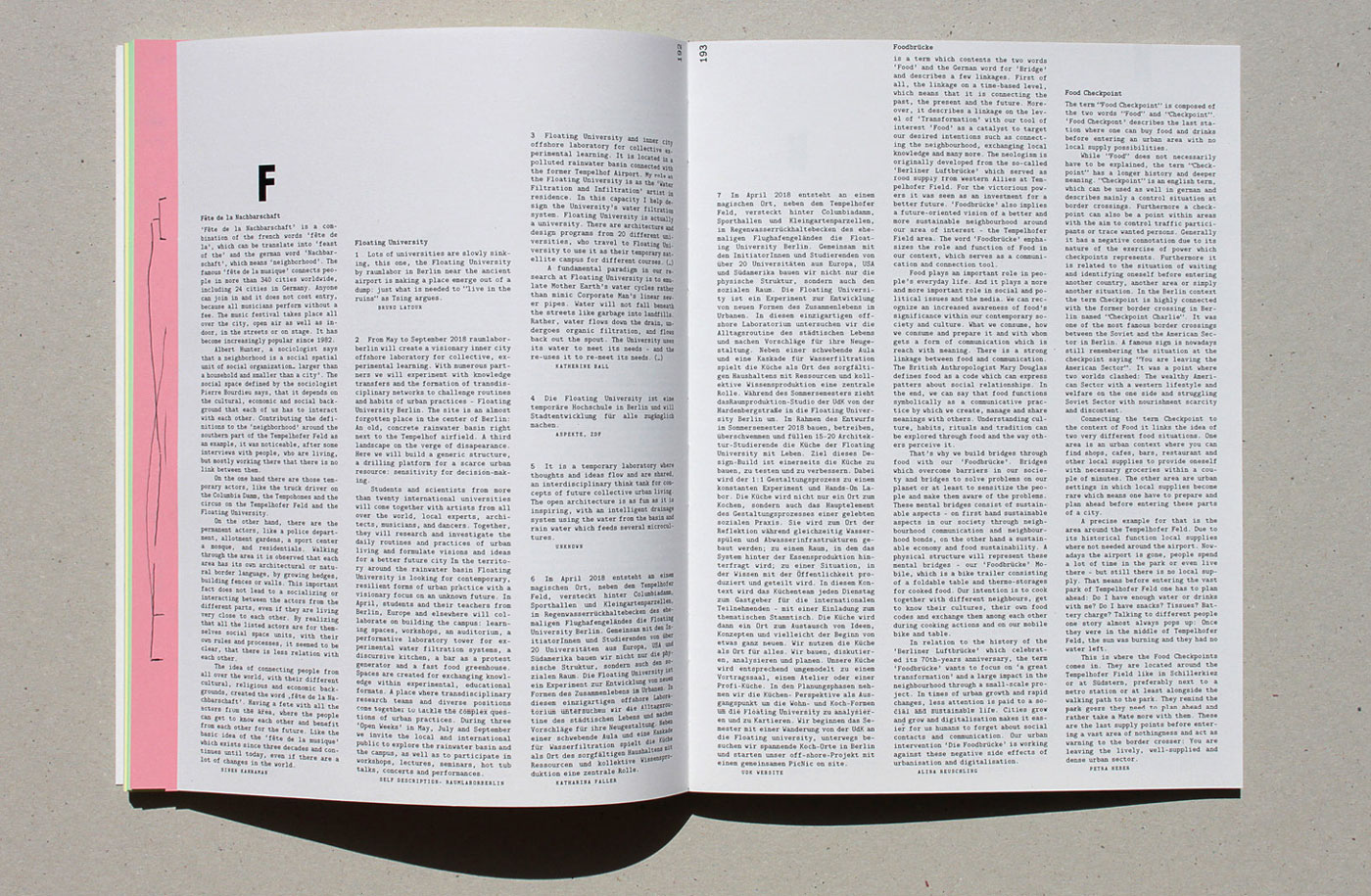
Neighbourhood Networks
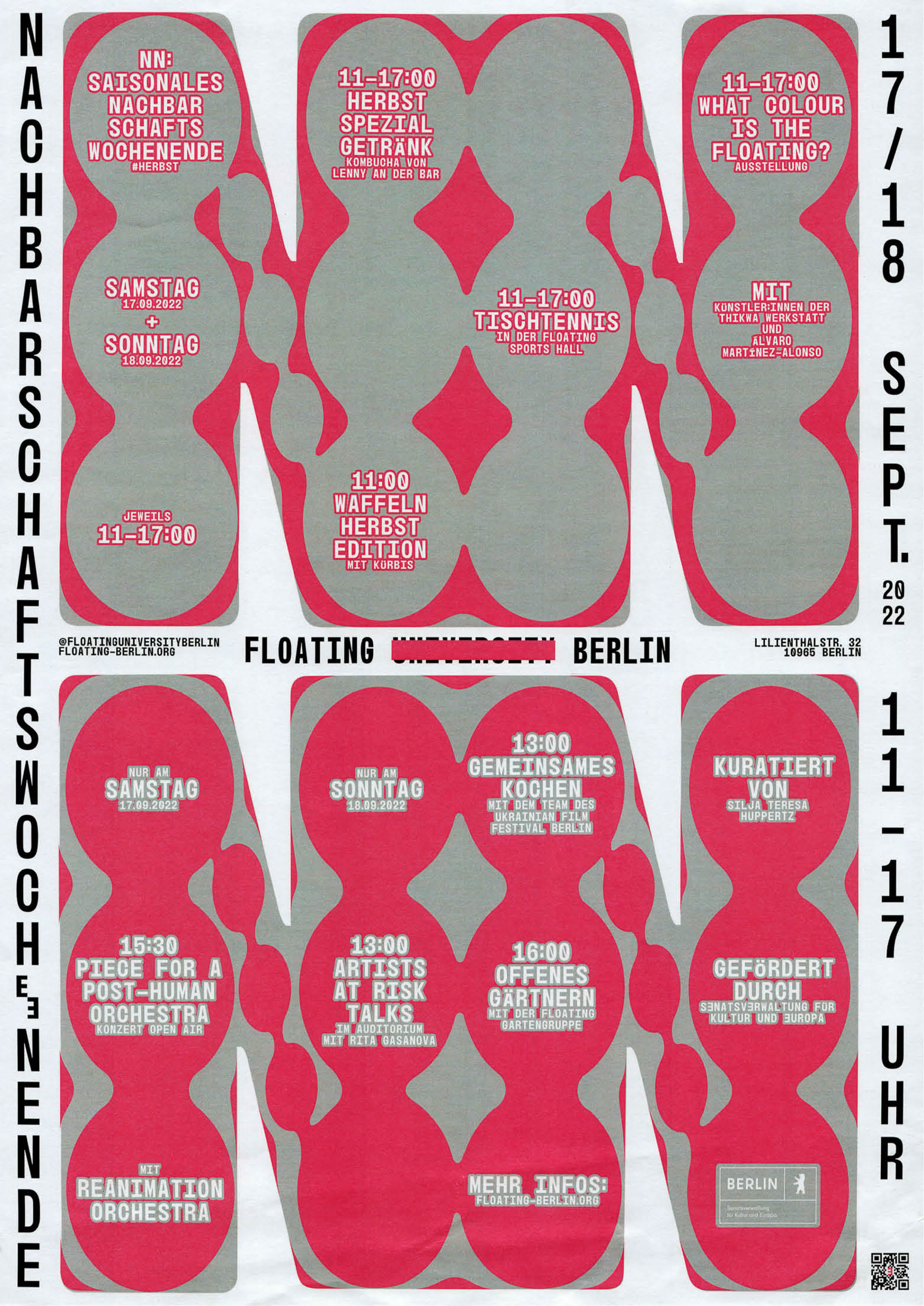
One of many posters made for Floating University’s Neighbourhood Networks (NN) [2022 September Edition]. The program is curated by Silja Teresa Huppertz.
2022, Poster, 297 × 420 mm
close/d
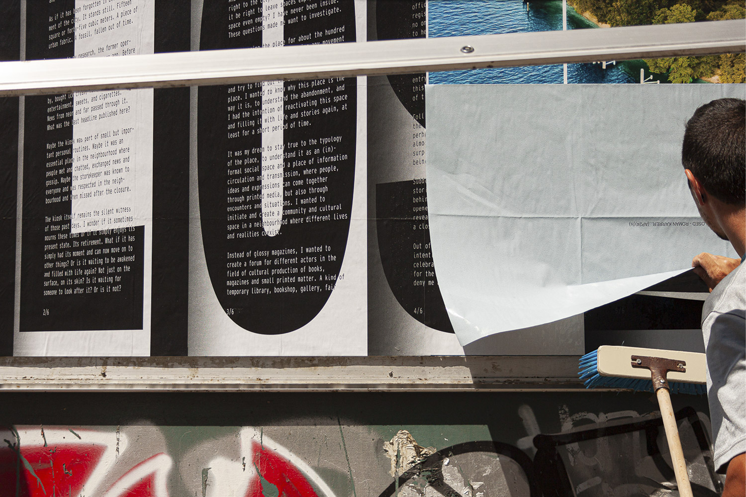
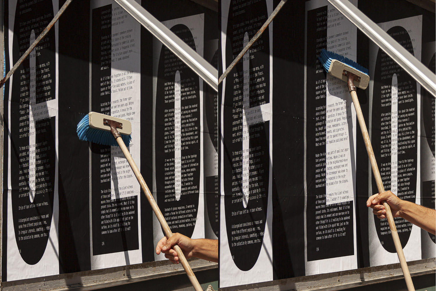
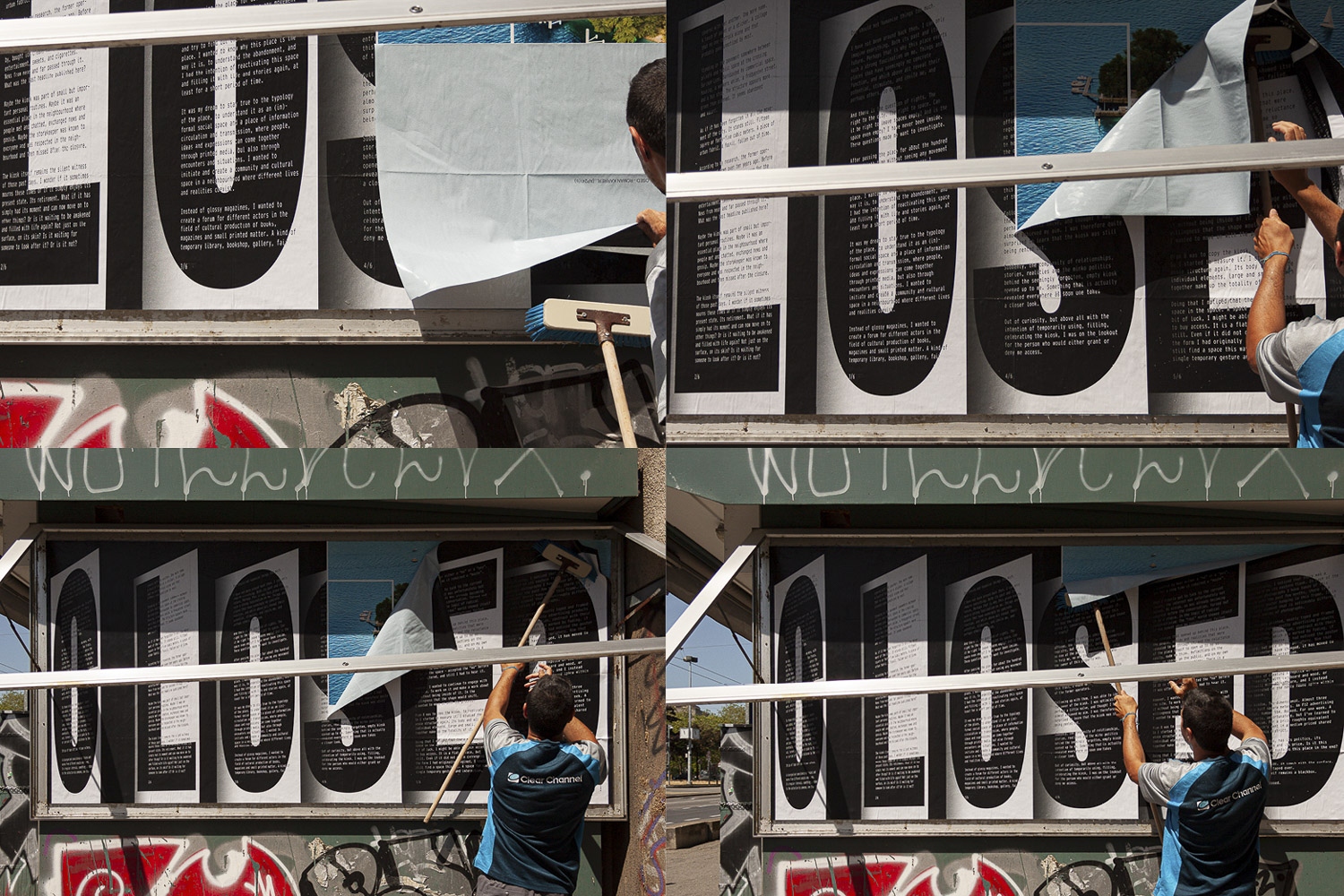
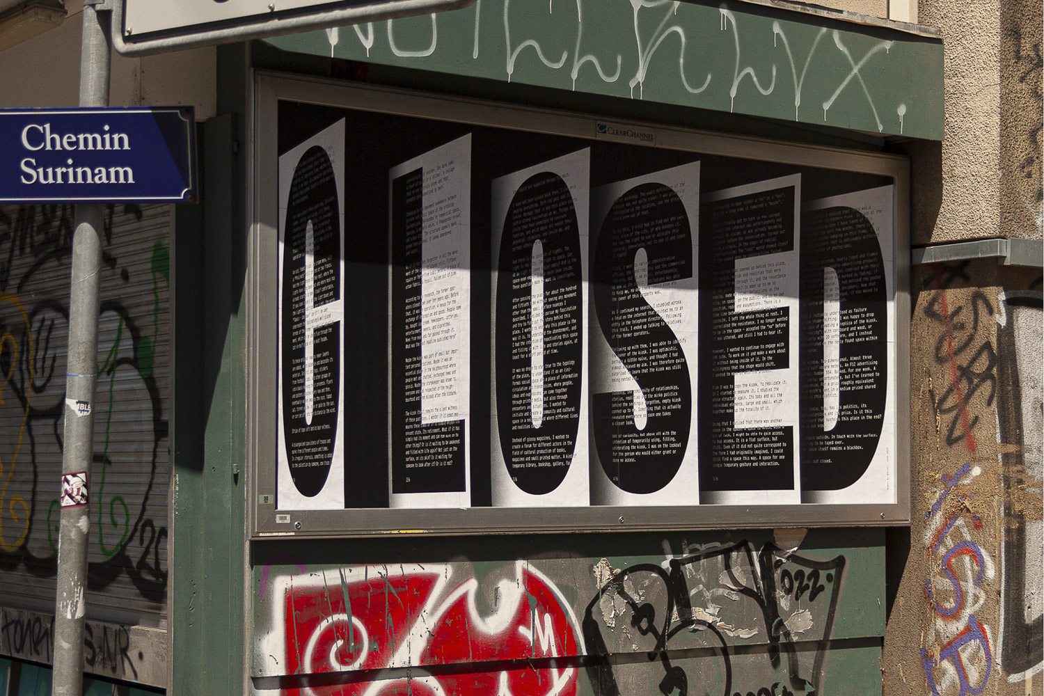
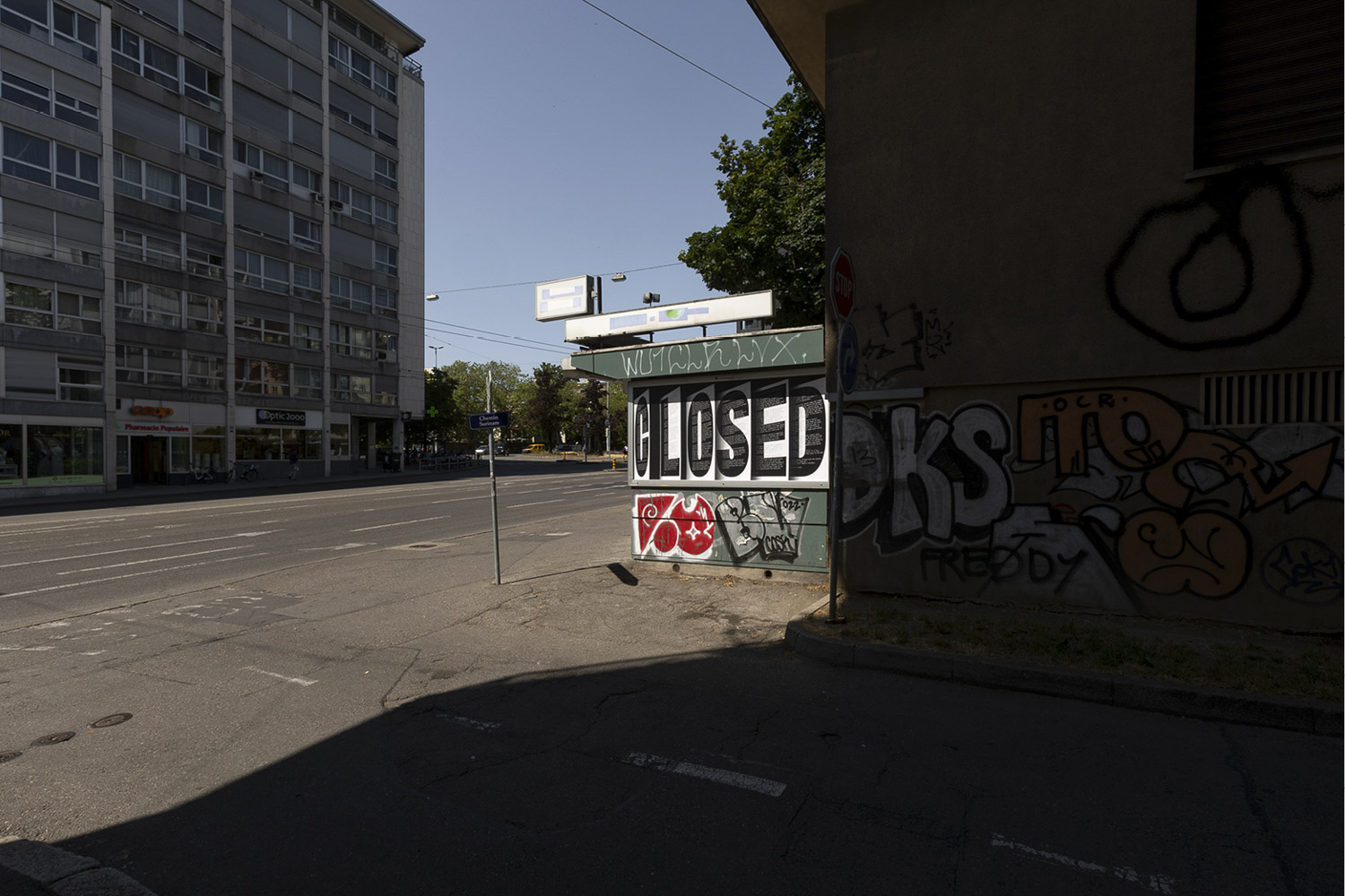
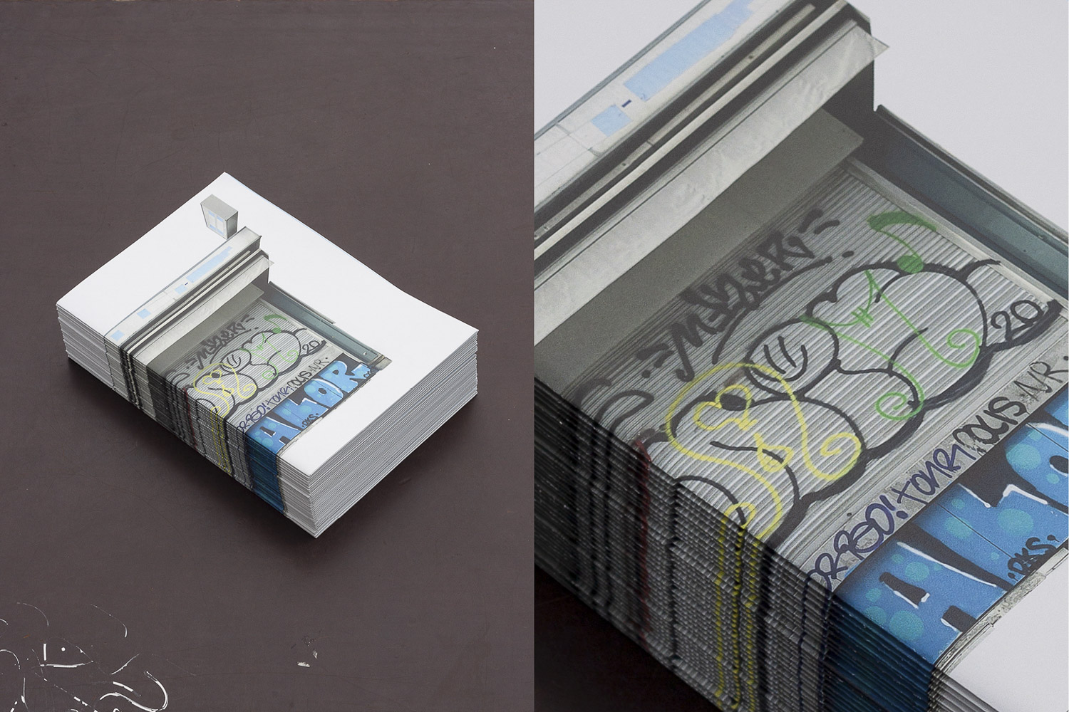
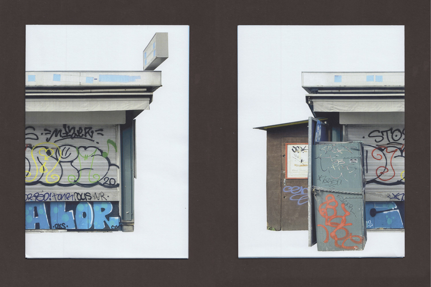
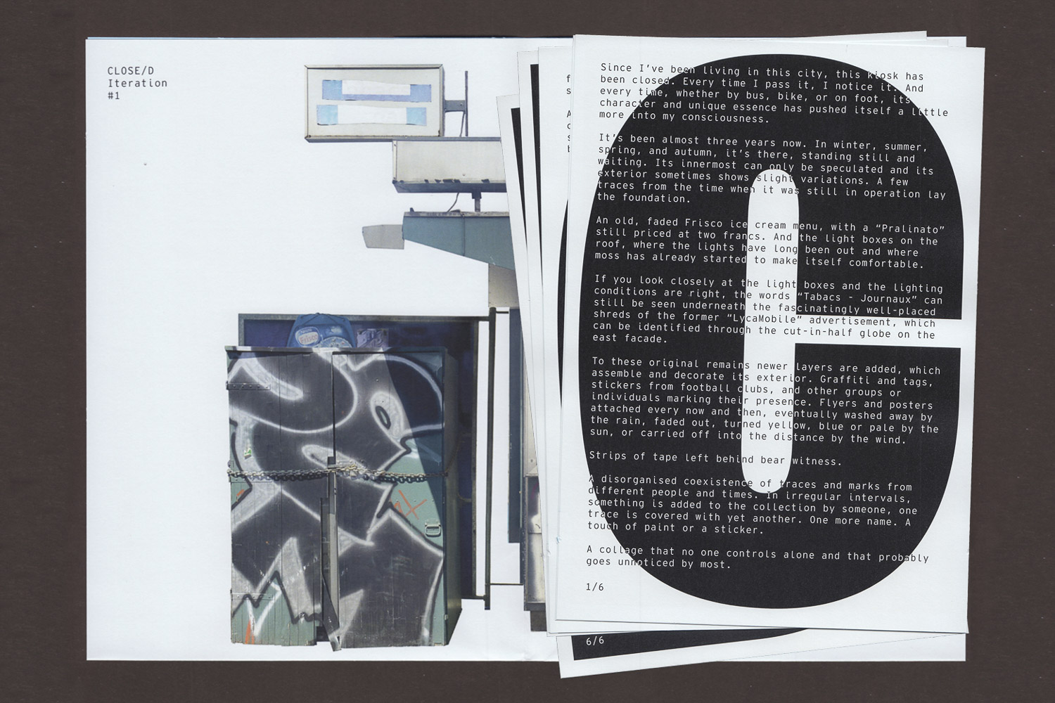
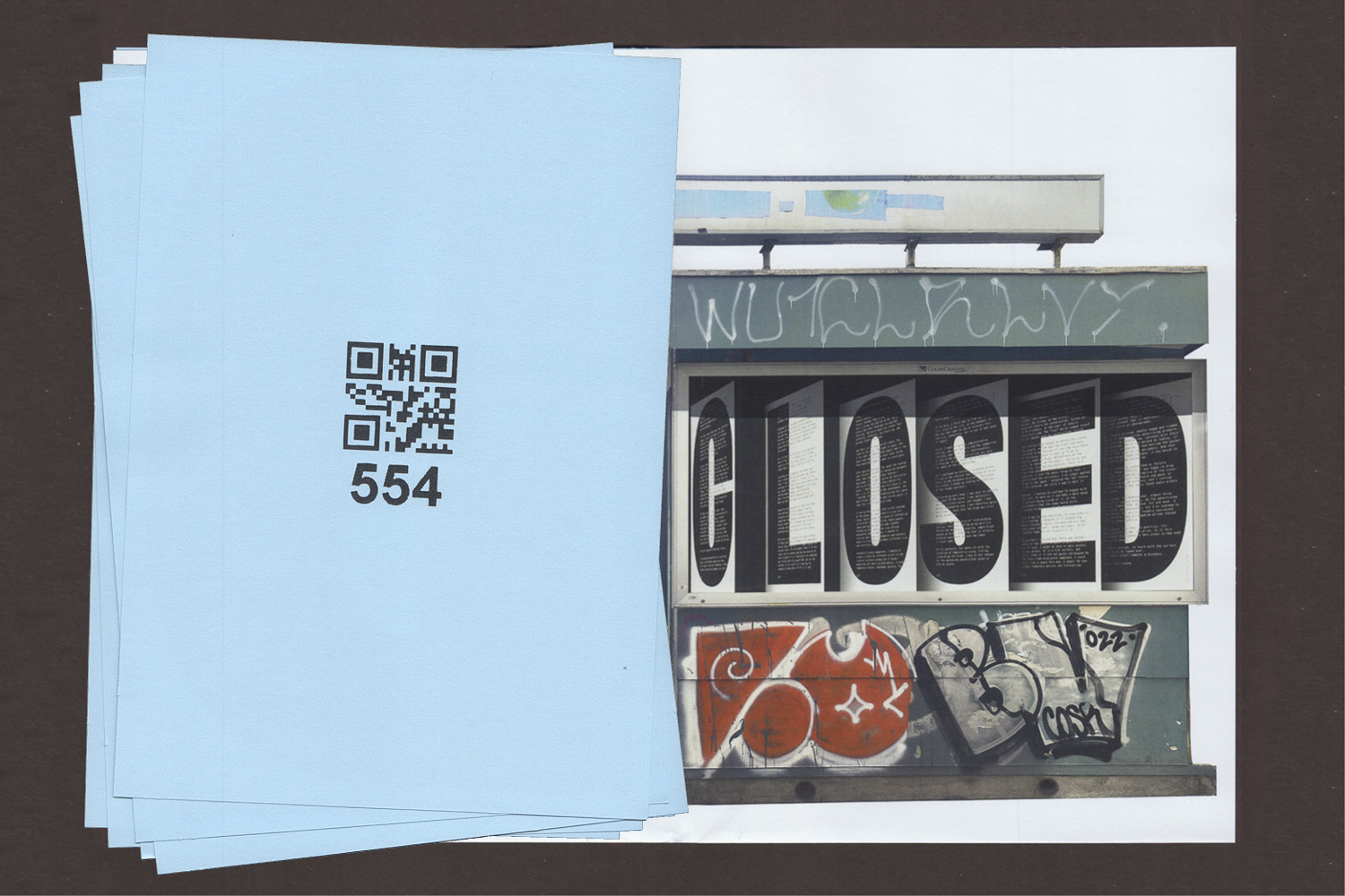
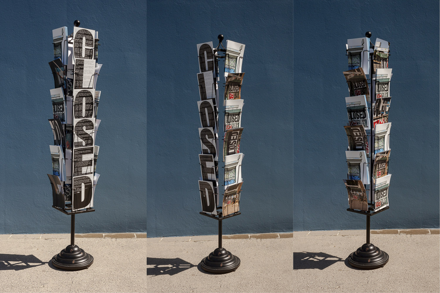
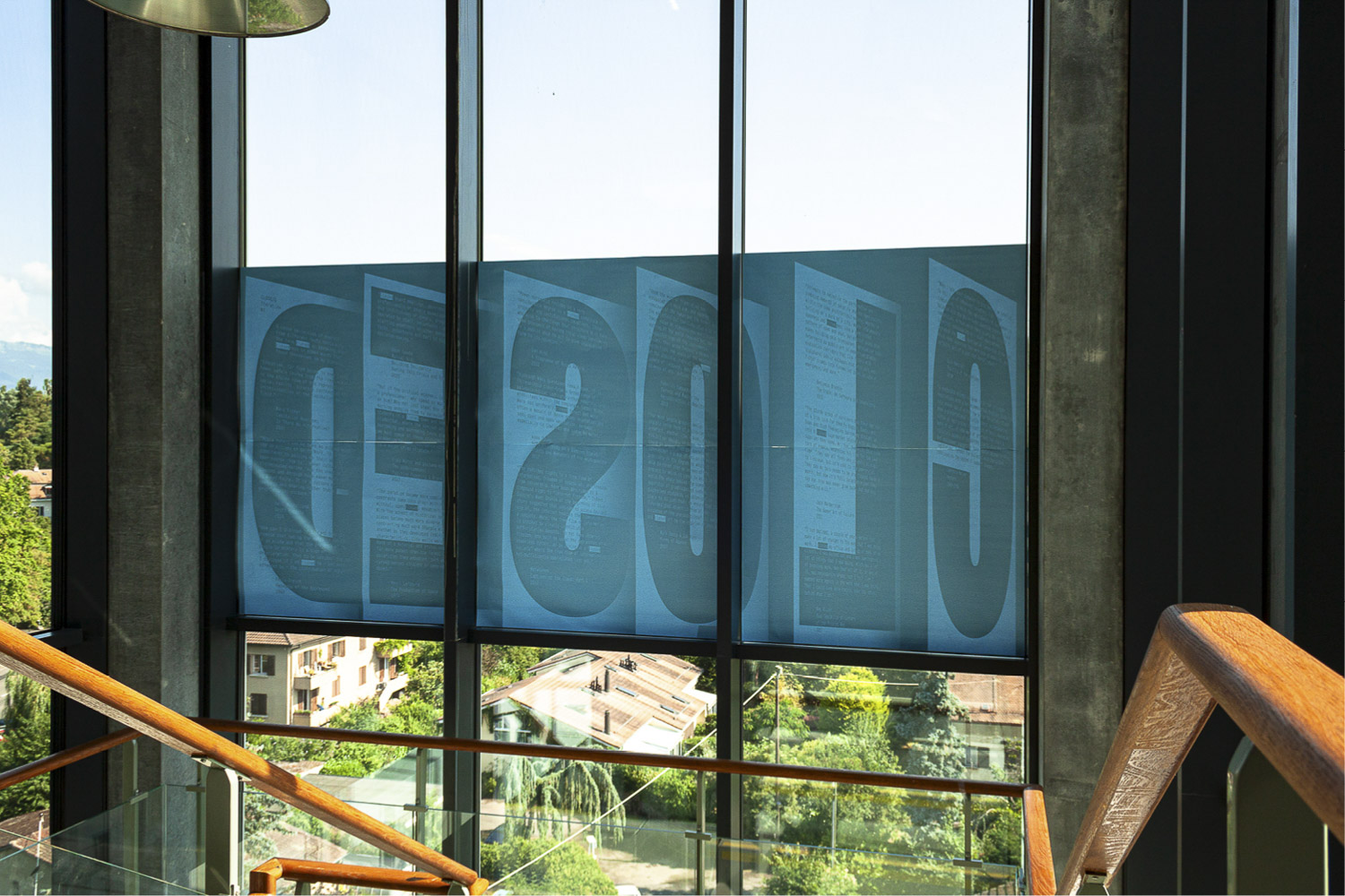
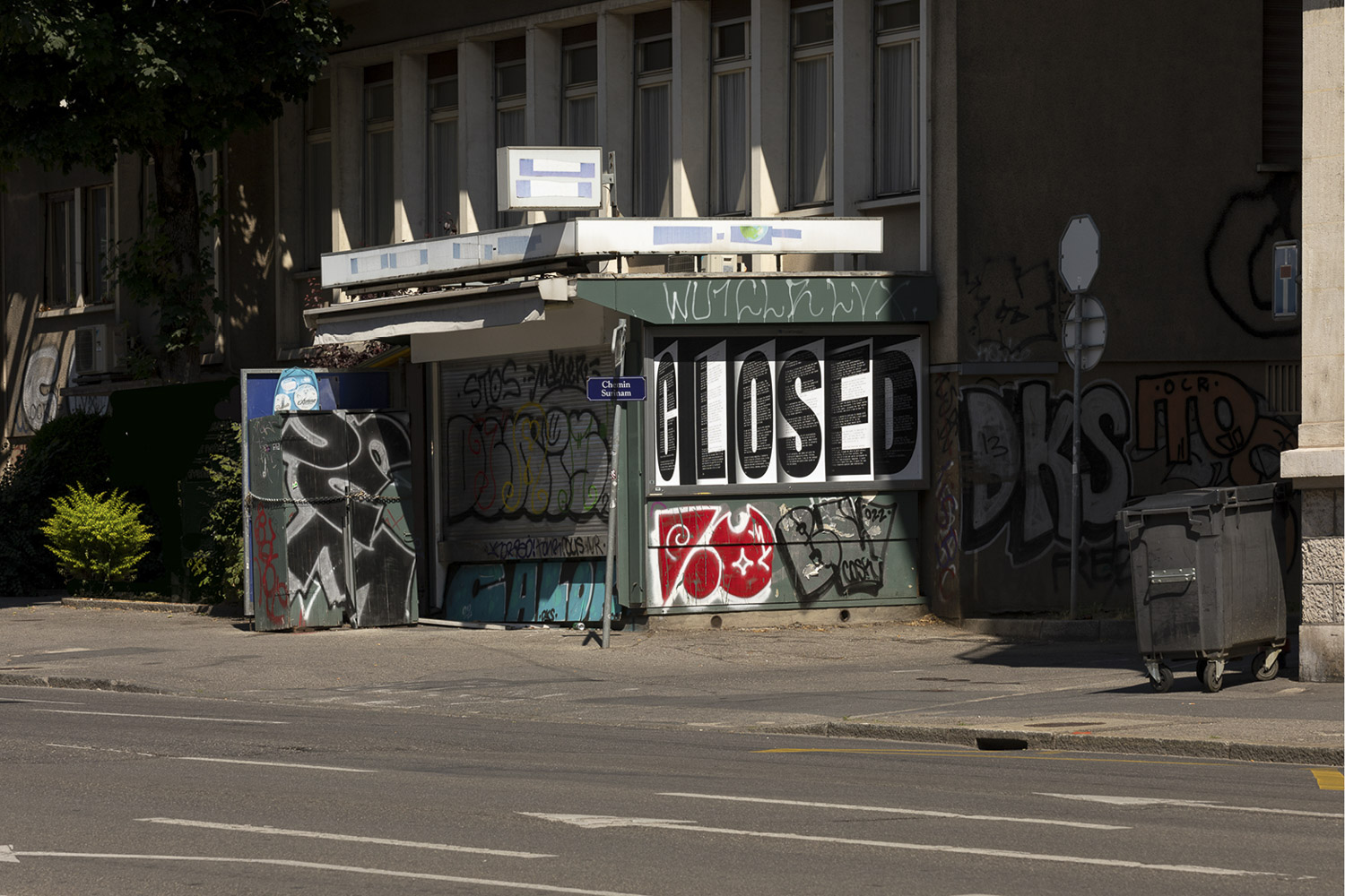
The work CLOSE/D engages with a closed kiosk that has stood still in the city of Geneva for nearly a decade. During my daily commute, I became interested in the kiosk, its history, and its potential. Covered in fading reminders of its past and plastered with graffiti and stickers, the kiosk bears witness to various stories. Positioned between private and public space, it evokes a sense of abandonment while silently holding memories of its heyday. One day, I decided to start a mission to uncover the story of the kiosk, with the aim of revitalising it as a cultural and social space. I traced its history, identified past and current owners, and gained a deeper understanding of the site and its complexity. Ultimately, I reached an impasse with the current tenant and had to accept the situation. Consequently, the project shifted focus to the kiosk’s exterior, particularly a billboard on the eastern side, which became central to the work. Through a temporary installation on this commercial space, I highlighted its potential with a public statement—a letter dedicated to the place.
After the first one-week iteration (12-19 June 2023), the act was repeated and translated for the diploma exhibition in the spaces of the art school that is located in the same neighbourhood, a few hundred meters away from the kiosk. For this purpose, the site-specific poster created for the first iteration was slightly adapted. The second iteration gathers various text excerpts containing the term ‘closed’. The excerpts primarily focus on institutional critique while also addressing other related spheres that resonate with my work and research/practice. The text fragments could be read from inside the school during the day. From the street the word ‘closed’ was readable. The second iteration can be understood as a reflection about the accessibility and the culture of (art and design) schools and acts as a link between my practical and theoretical work. In addition to the two iterations using the medium of the site-specific poster, a publications and postcards were produced to document and temporally extend the project.
2023, Research, Writing, Poster, Publication, Documentation, Site-Specific Intervention
Poster:
Format: F12
Printed on blueback paper
Billboard position number: 554 (clearchannel)
Publication:
Cover: A3 folded
Content: A5 6 pages
Printed on blueback paper
Edition of 200 copies
The work evolved in the context the MA in Critical Curatorial Cybermedia studies (CCC) at Head, Geneva
The Great in the Small
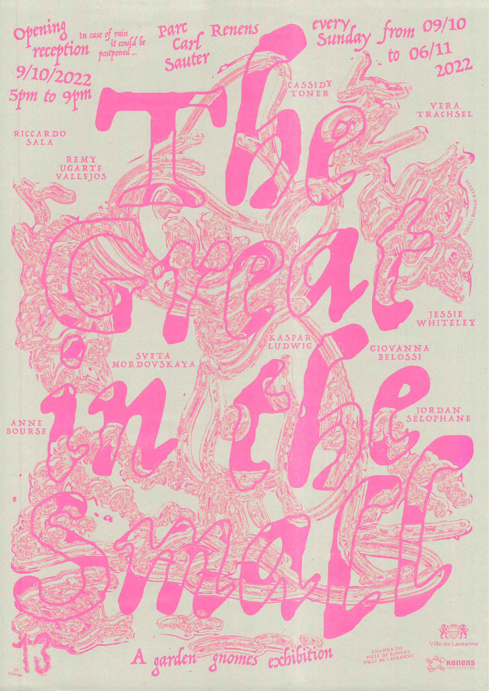
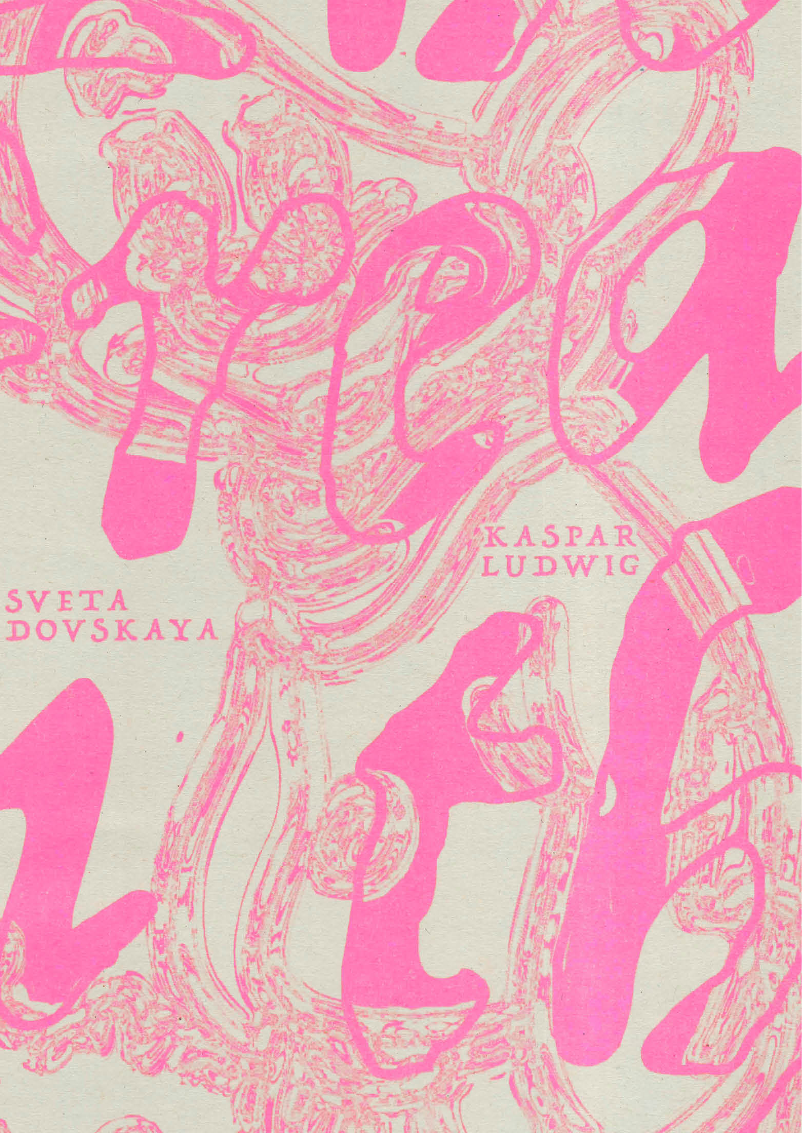

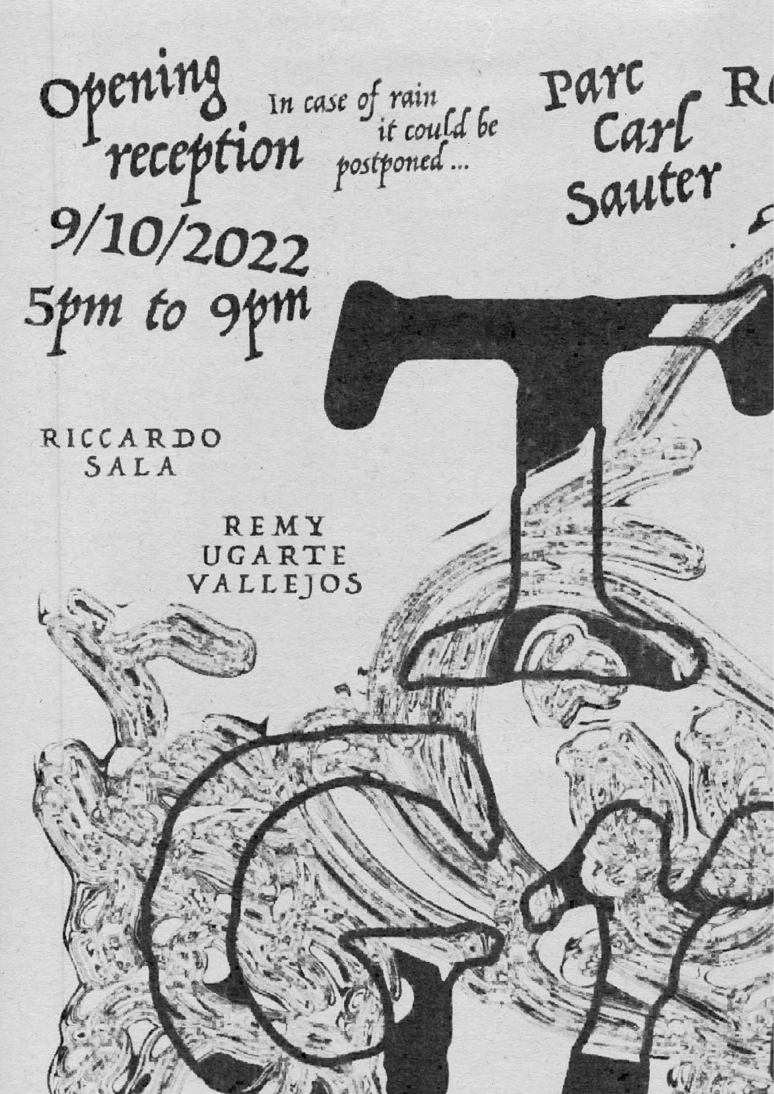
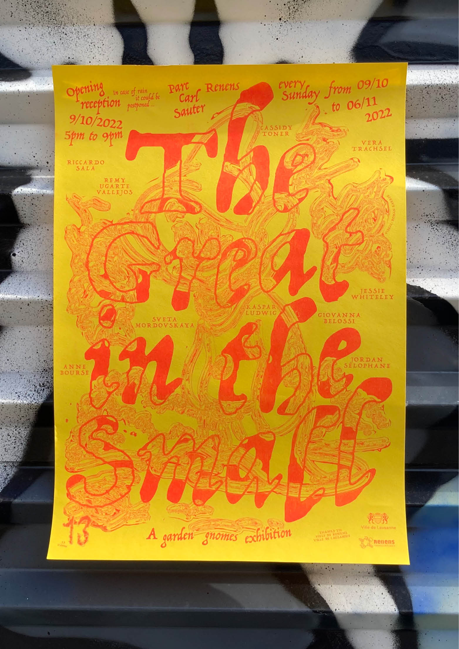
Exhibition poster for a garden gnomes exhibition – The Great in the Small organised by 13 Vitrine, Stefania Carlotti and Margaux Dewarrat in Renens (CH), with contributions by: Giovanna Belossi, Anne Bourse, Kaspar Ludwig, Sveta Mordovskaya, Riccardo Sala, Jordan Selophane, Vera Trachsel, Remy Ugarte Vallejos, Jessie Whiteley, Cassidy Toner.
2022, Poster, 420 × 594 mm, risography on different papers
Reeder Issue 01
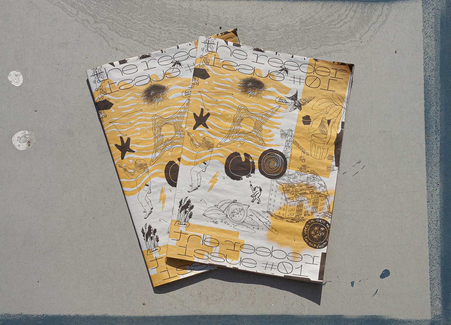
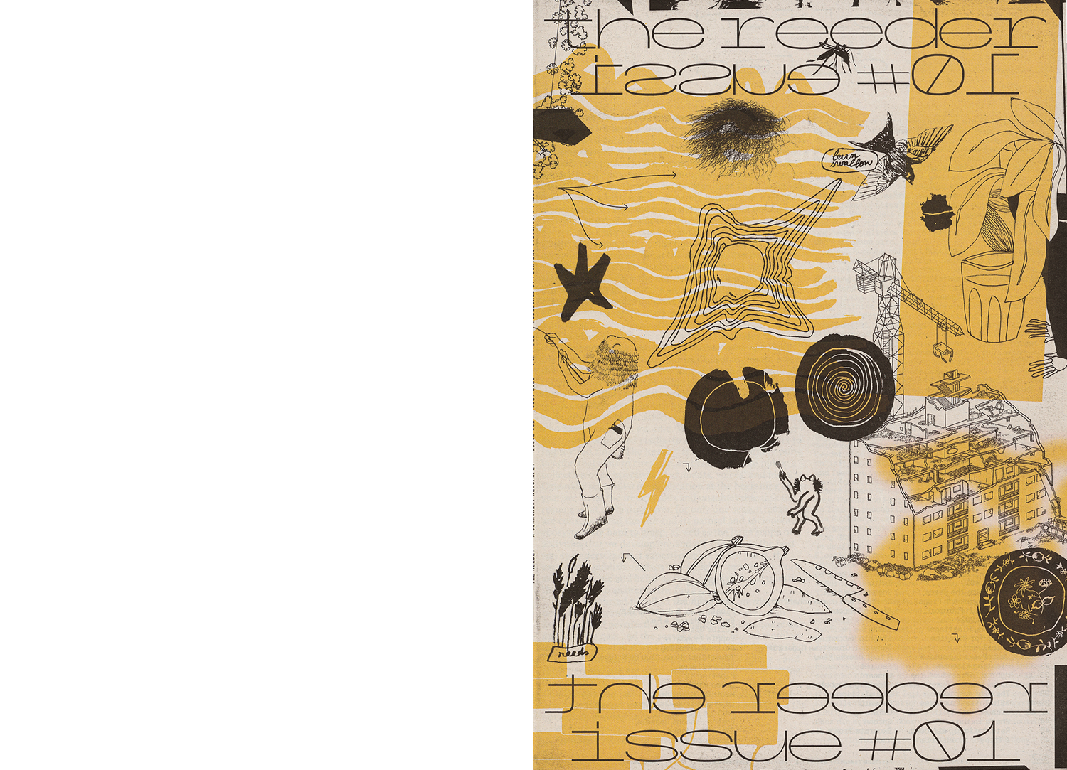
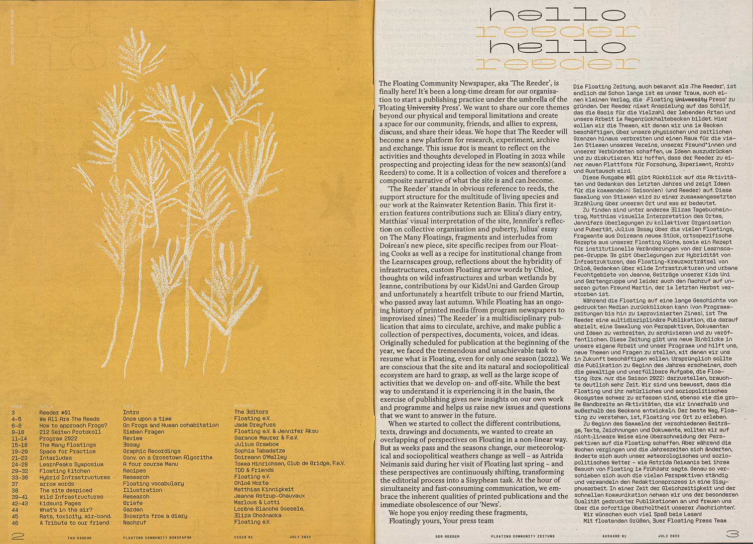
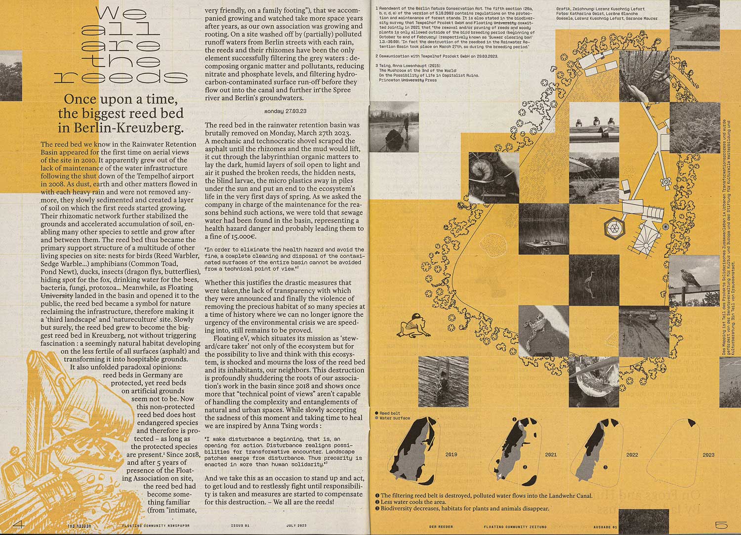
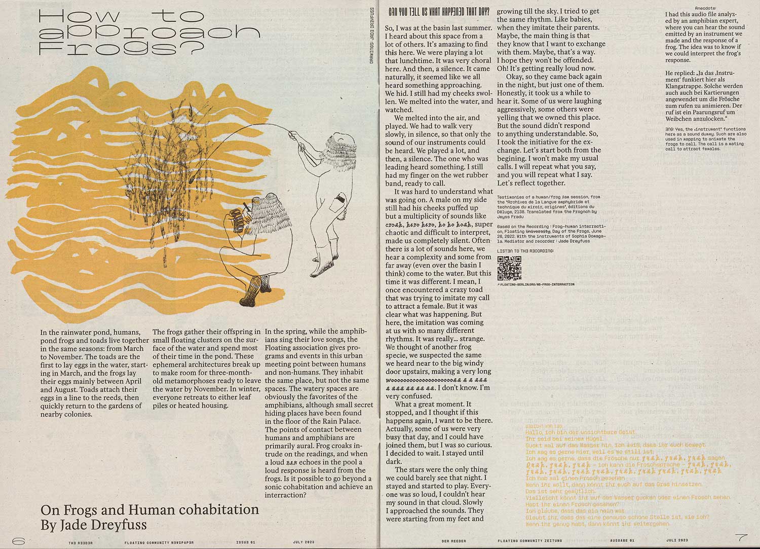
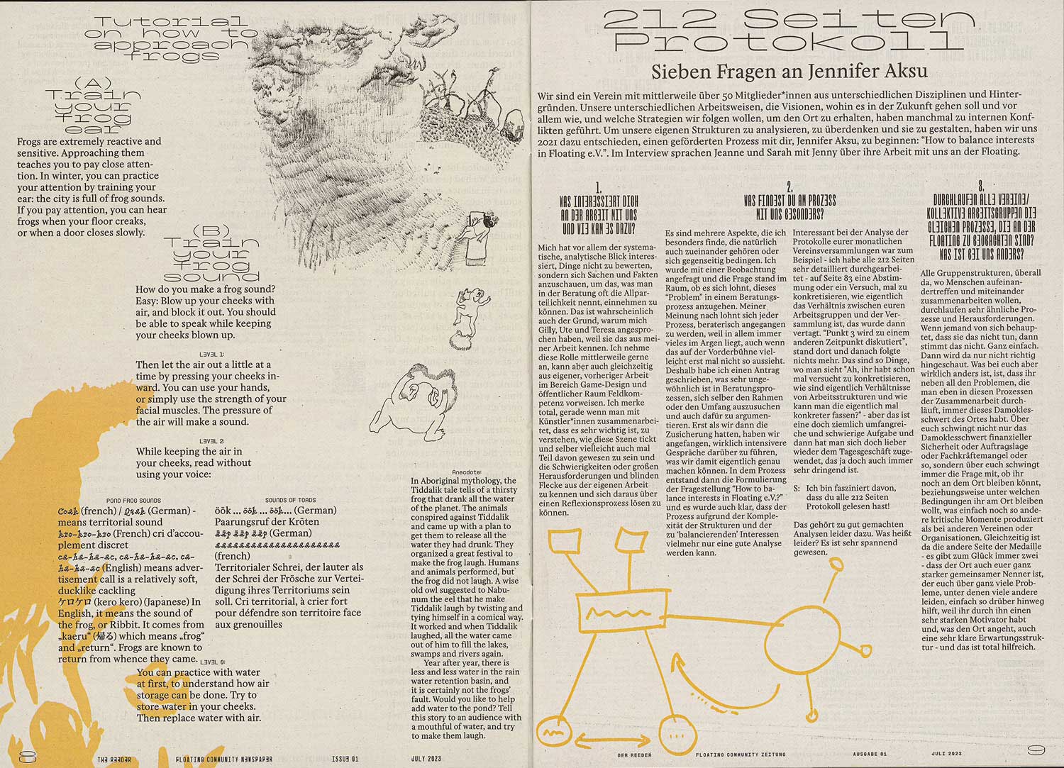
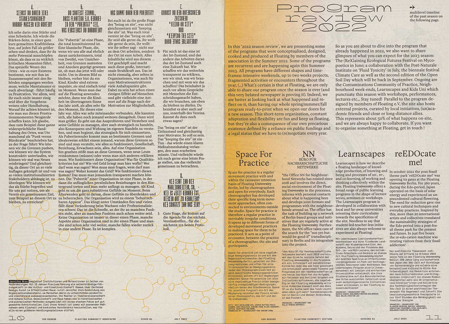
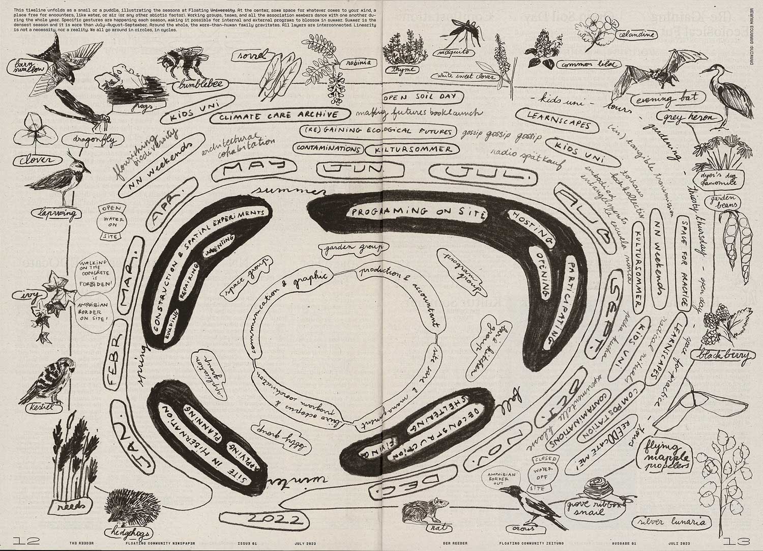
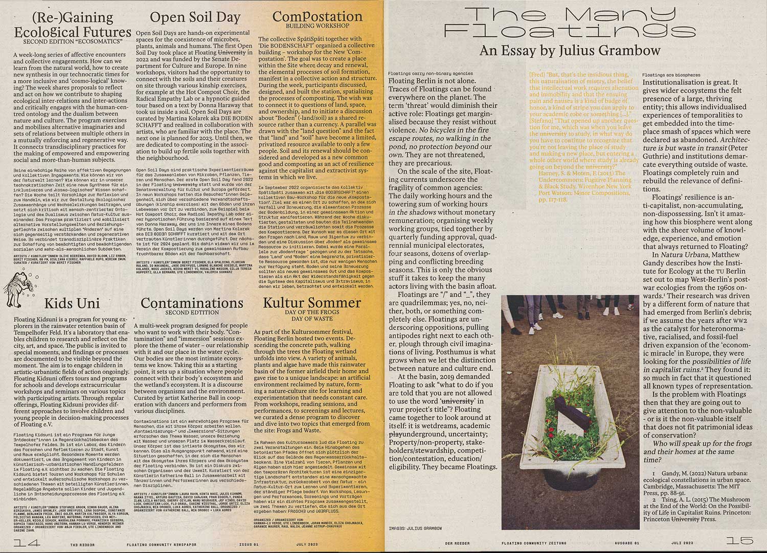
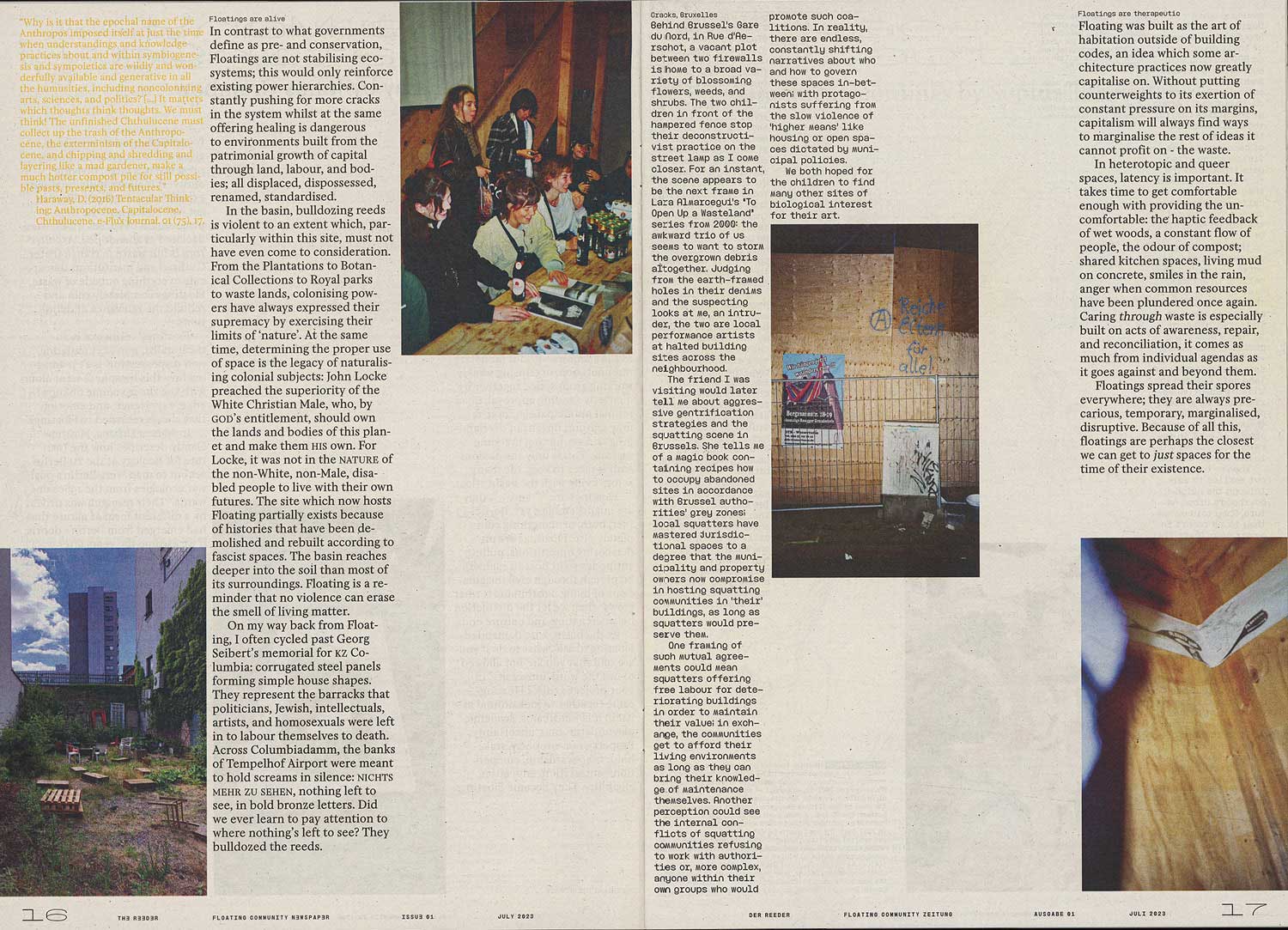
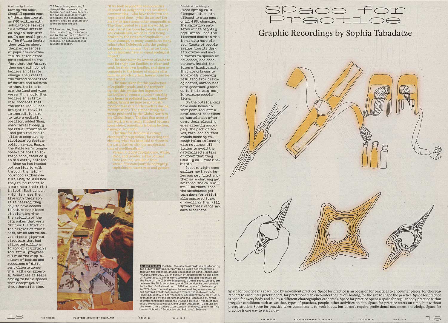
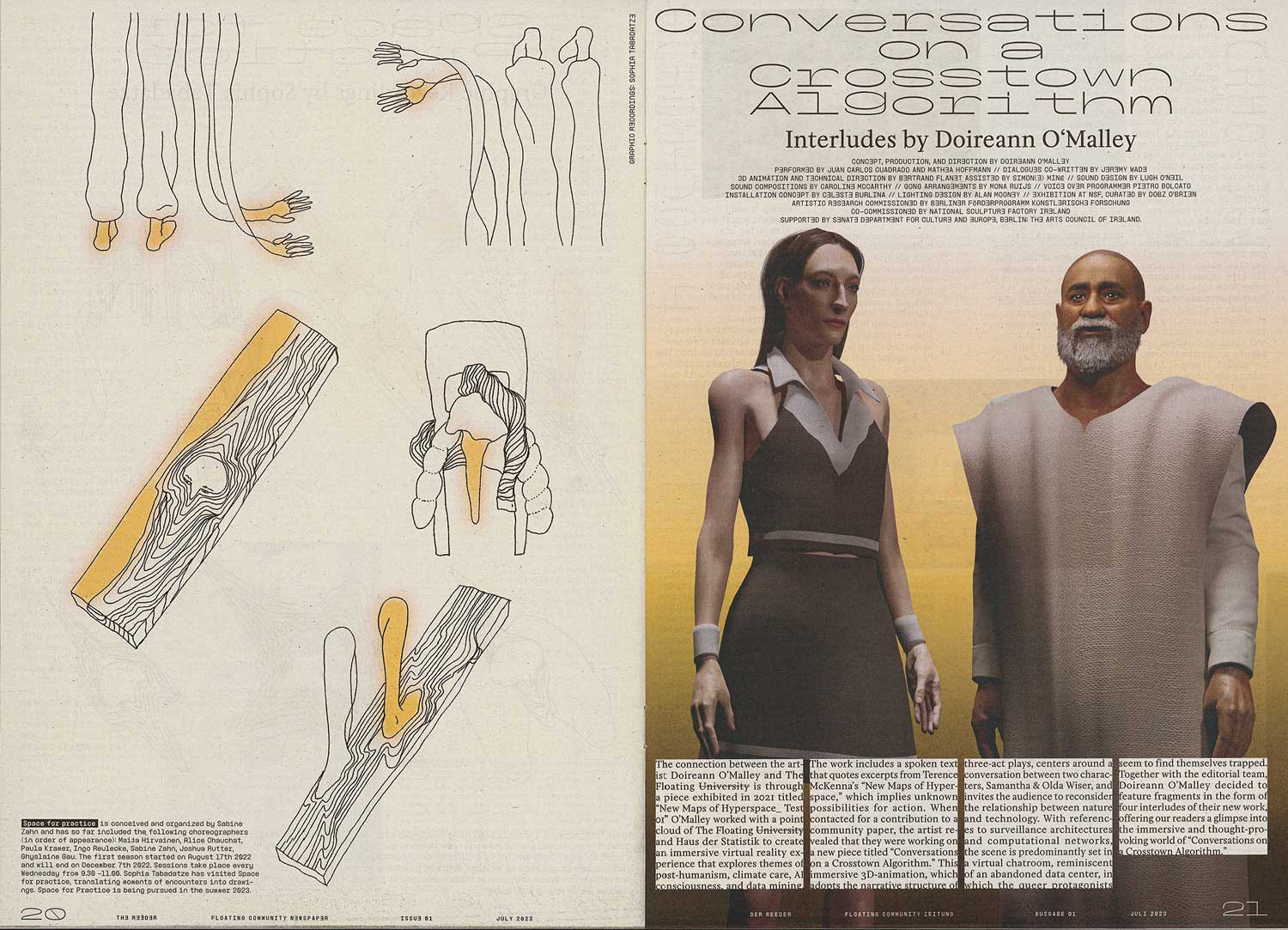

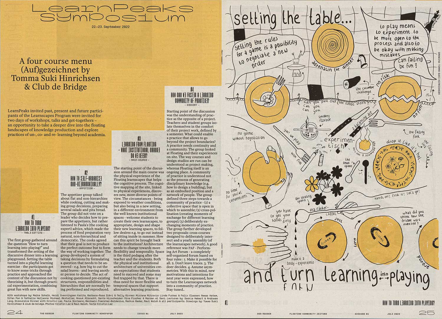
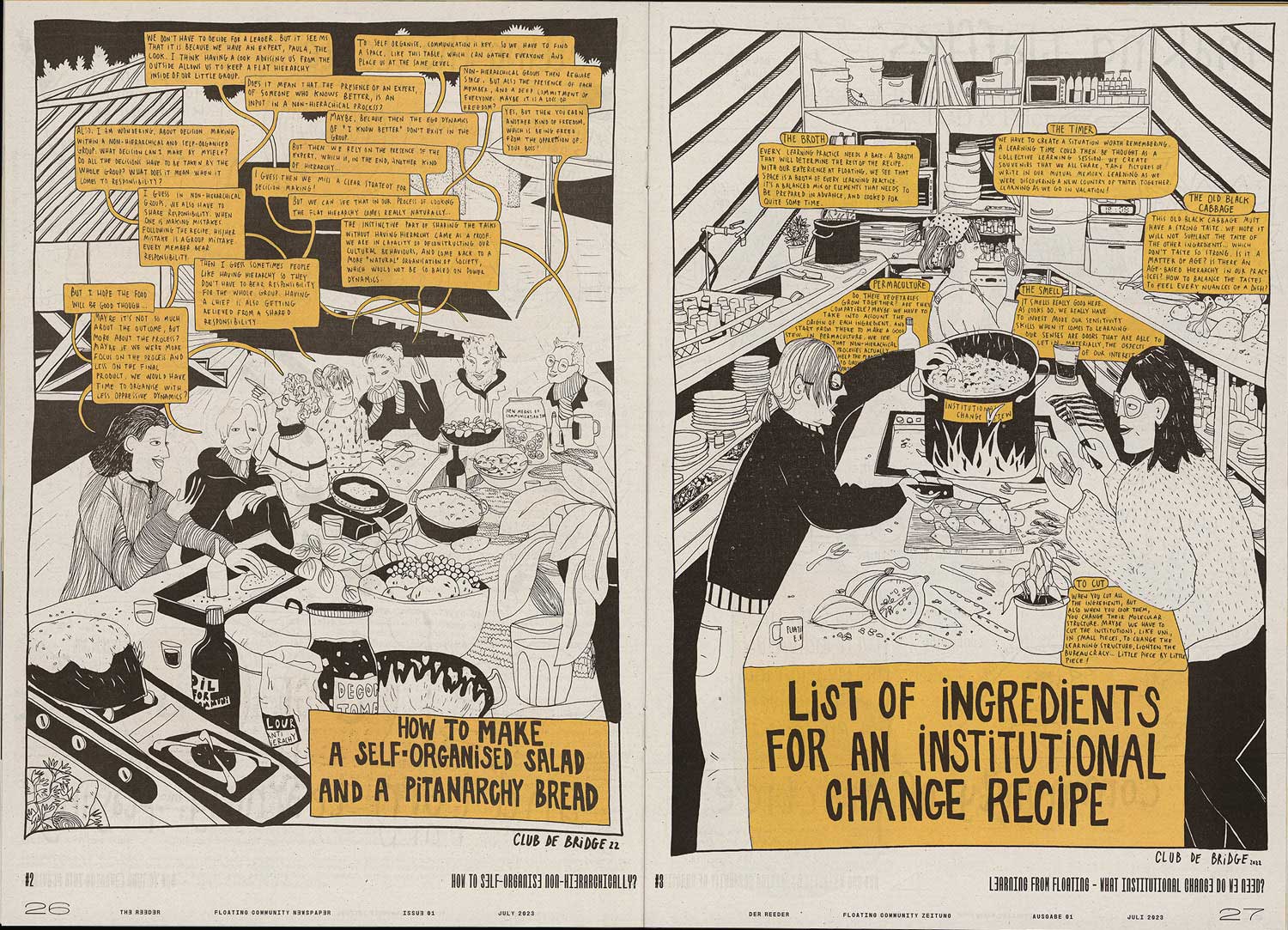
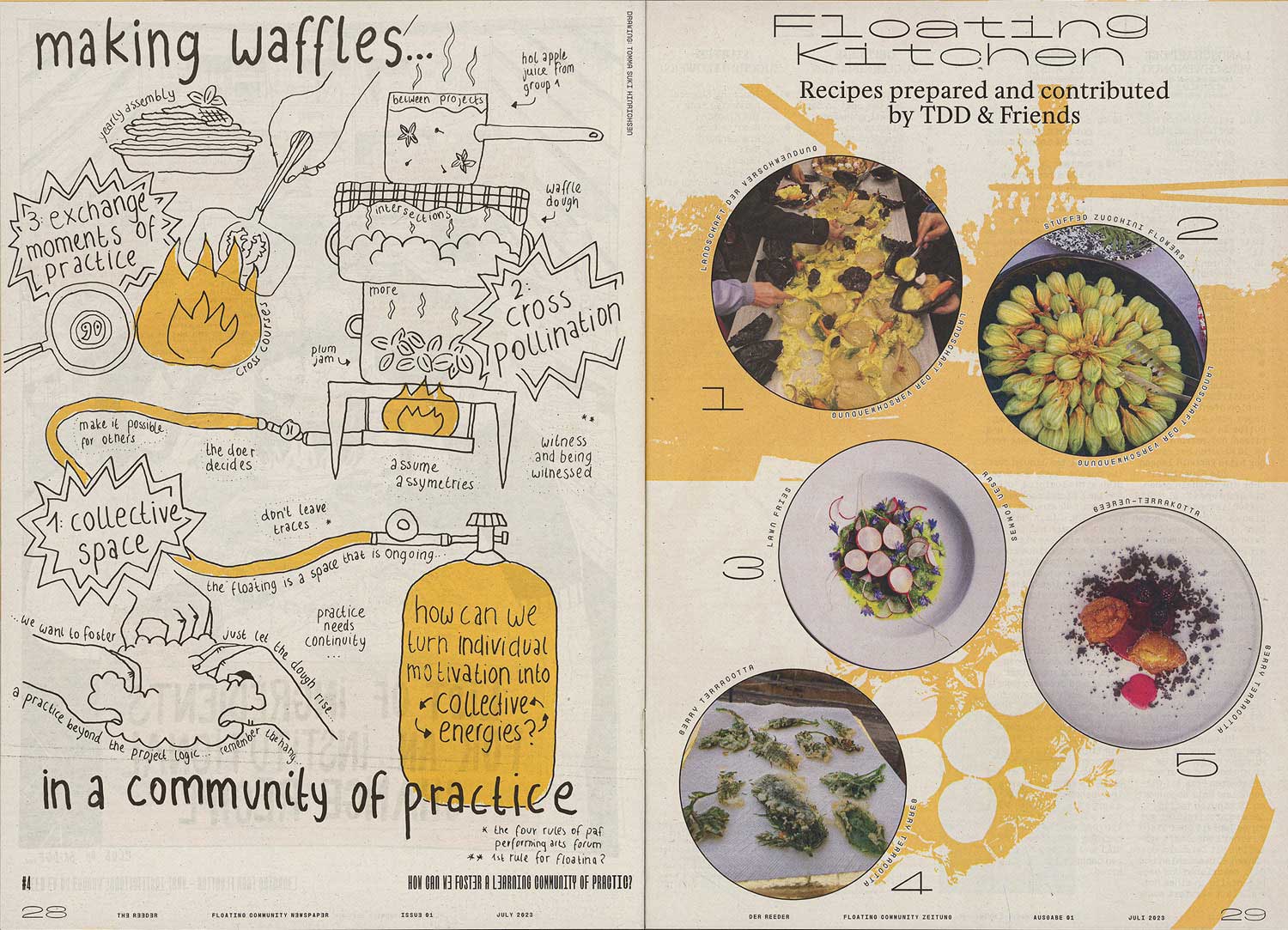
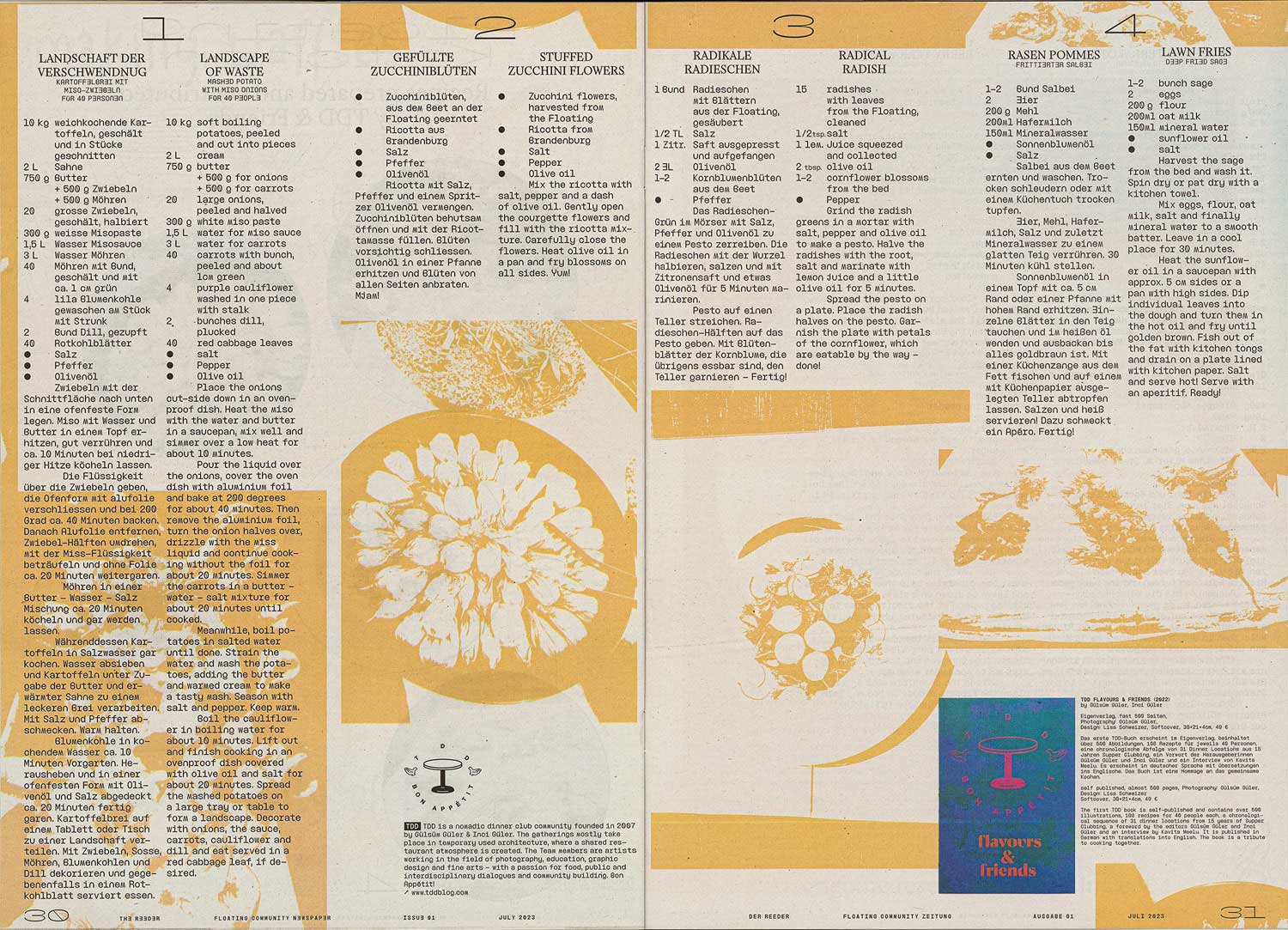
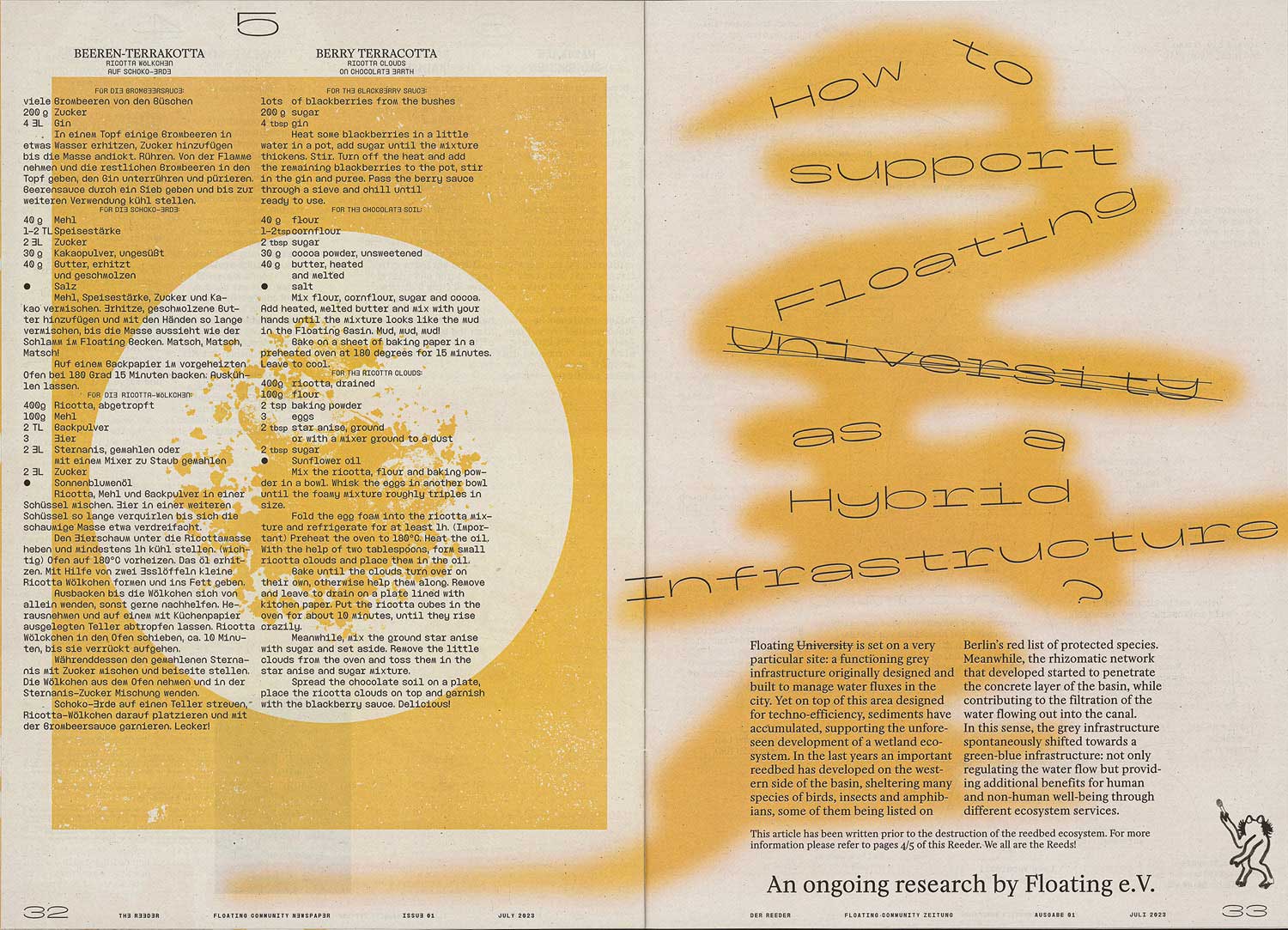
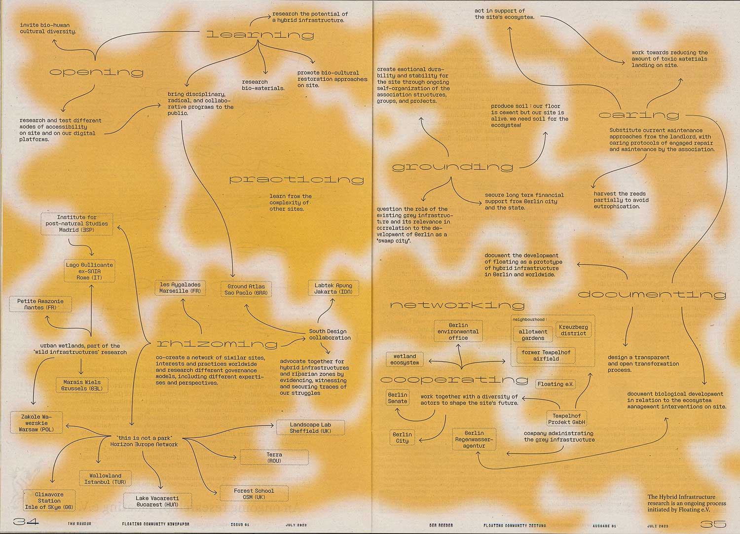
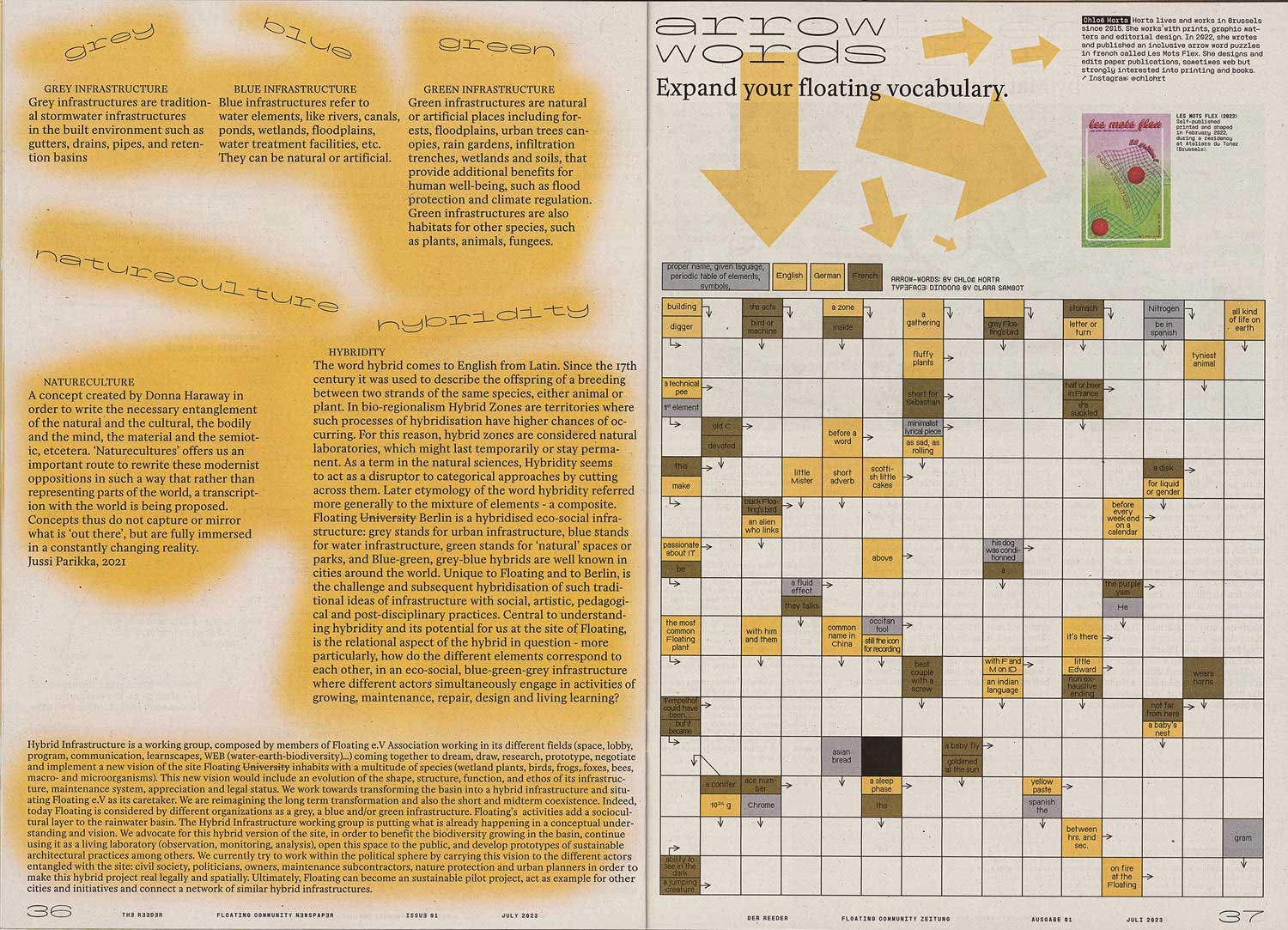
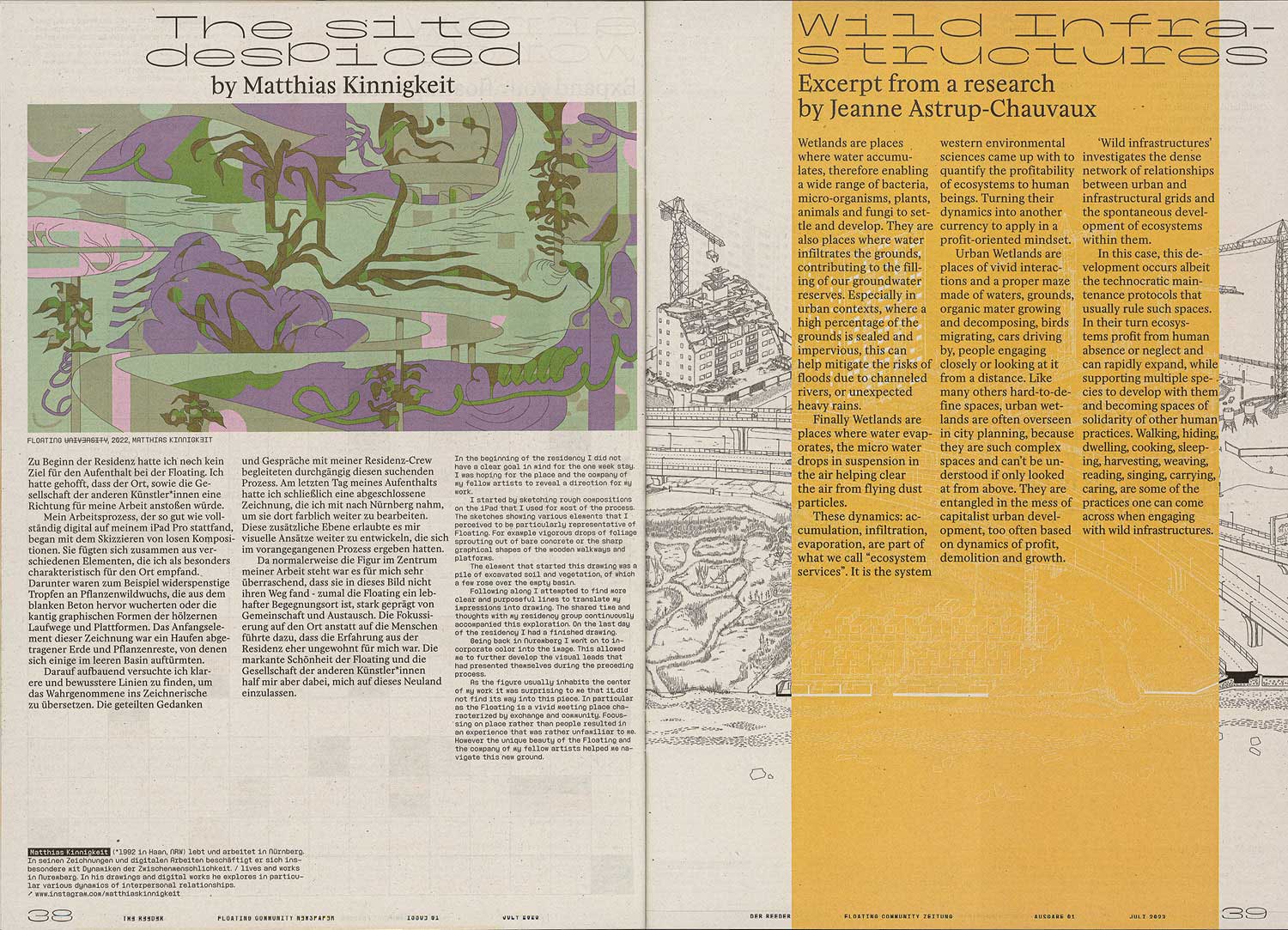
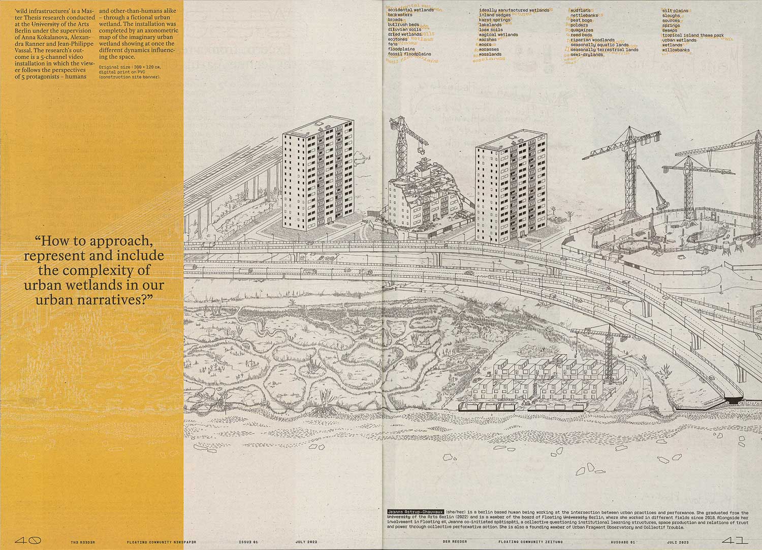
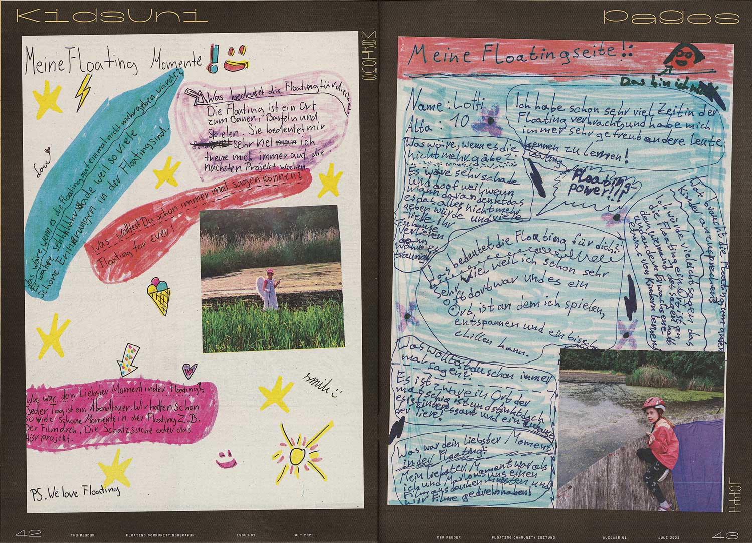
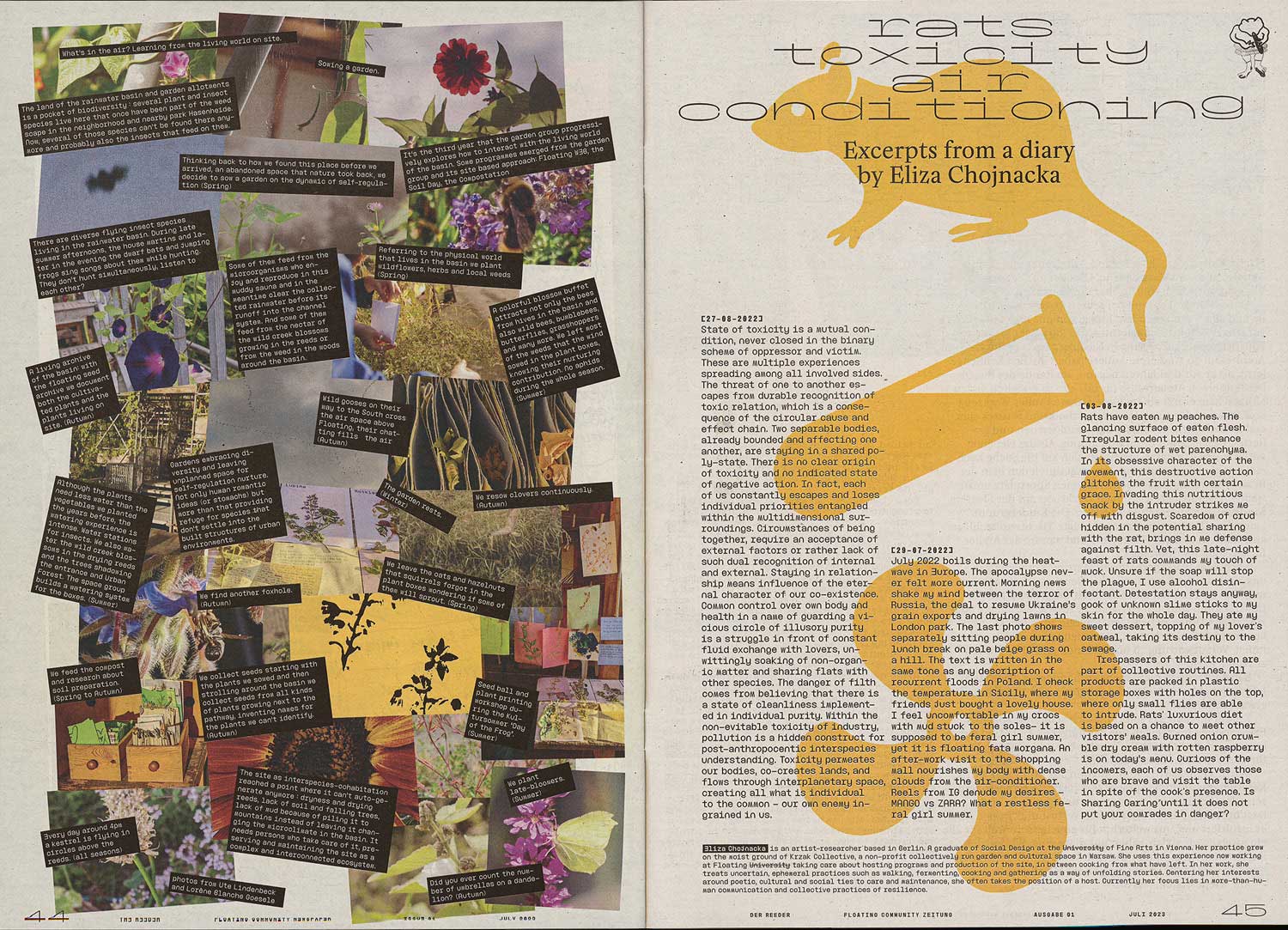
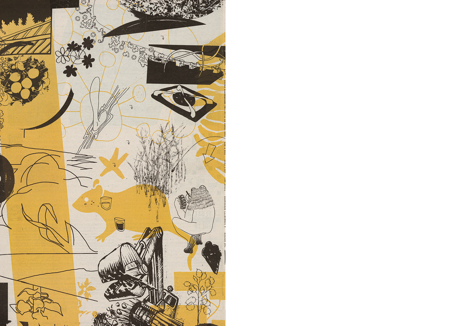
The Reeder is a self-initiated Community Newspaper created for and by the Floating University. The inaugural issue reflects a longstanding aspiration shared by some association members, operating under the ‚Floating University Press‘ umbrella. Beyond the physical site, this platform facilitates exchanges, expressions, and dialogues among our community, allies, and friends. Issue #01 offers reflections on Floating‘s 2022 initiatives while envisioning ideas for the upcoming seasons. With contributions by: Jennifer Aksu, Jeanne Astrup-Chauvaux, Sarah Bovelett, Eliza Chojnacka, Jade Dreyfuss, TDD & Friends, Lorène Blanche Goesele, Julius Grambow, Doireann O‘Malley, Tomma Hinrichsen, Chloé Horta, Teresa Huppertz, Matthias Kinnigkeit, Ute Lindenbeck, Marlous & Lotti, Garance Maurer, Sophia Tabadatze, Sabine Zahn, Club de Bridge. Concept and editing: Sarah Bovelett, Jeanne Astrup-Chauvaux, Roman Karrer, Garance Maurer
2023, Publication, 210 × 297 mm, 48 p., 1000 copies
Typefaces: Minipax, PicNic, Dindong, FloatingMono
Printed by Megadruck
The (Real) Book
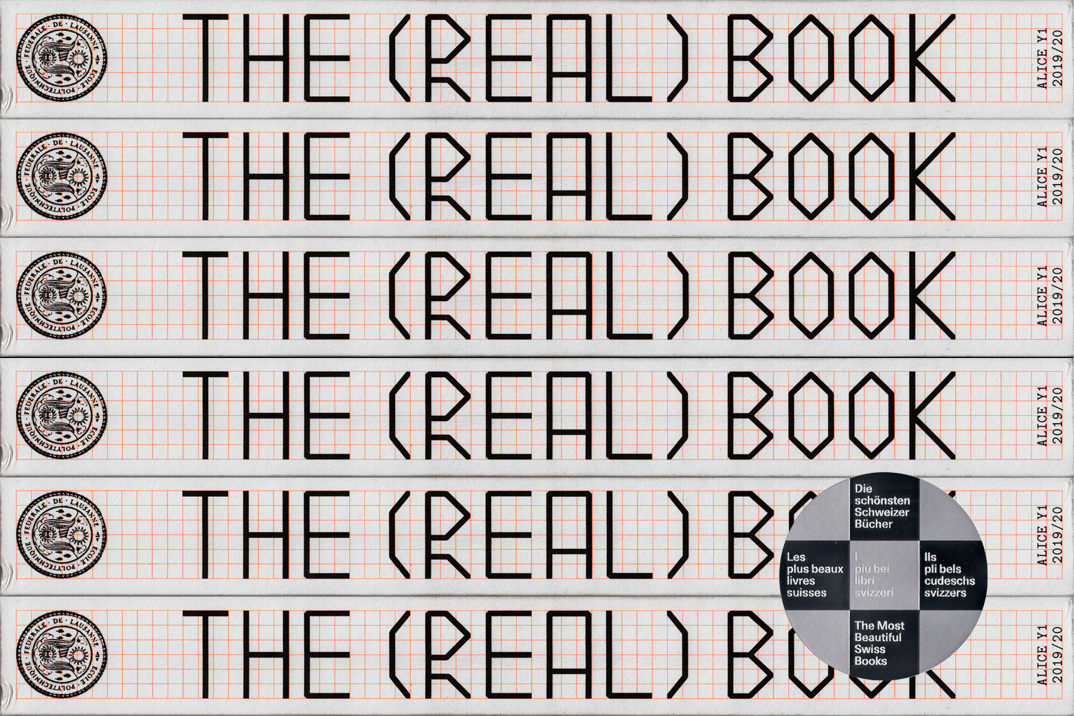
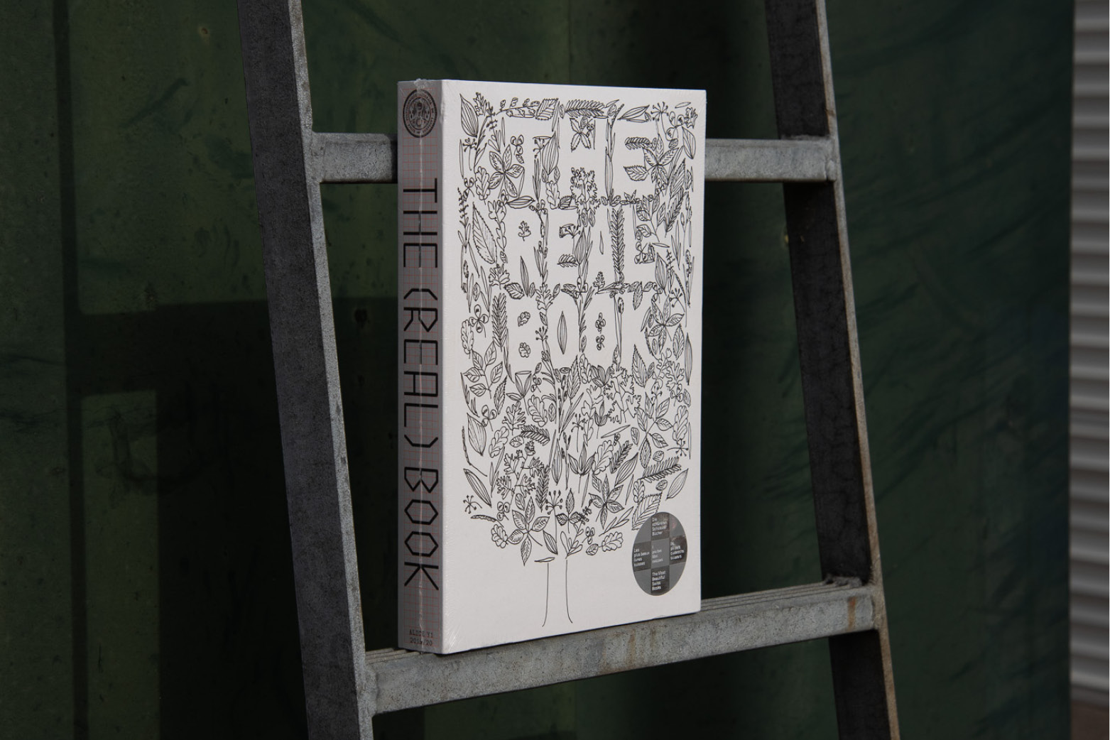
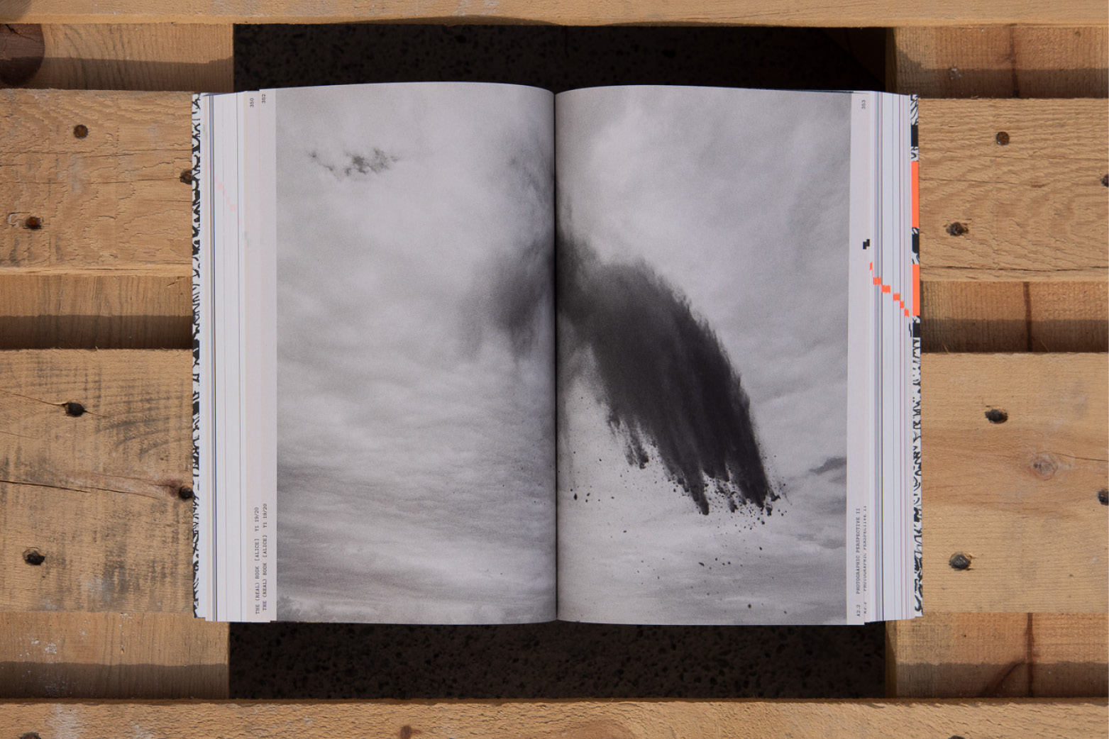
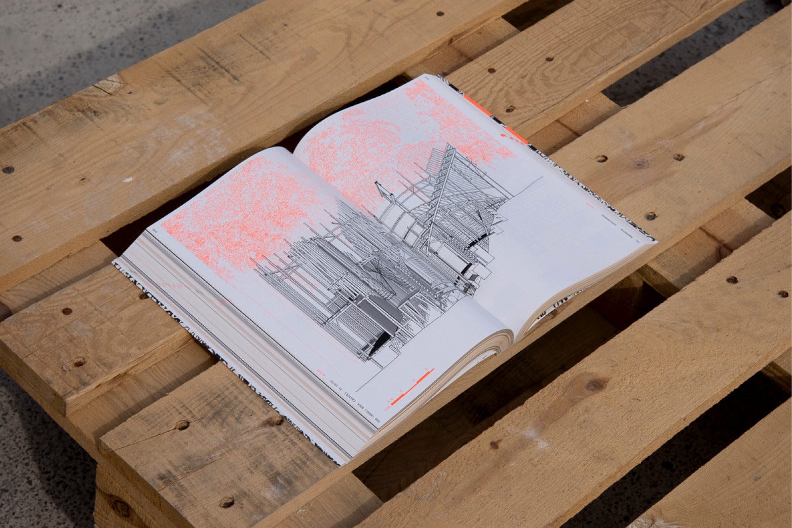
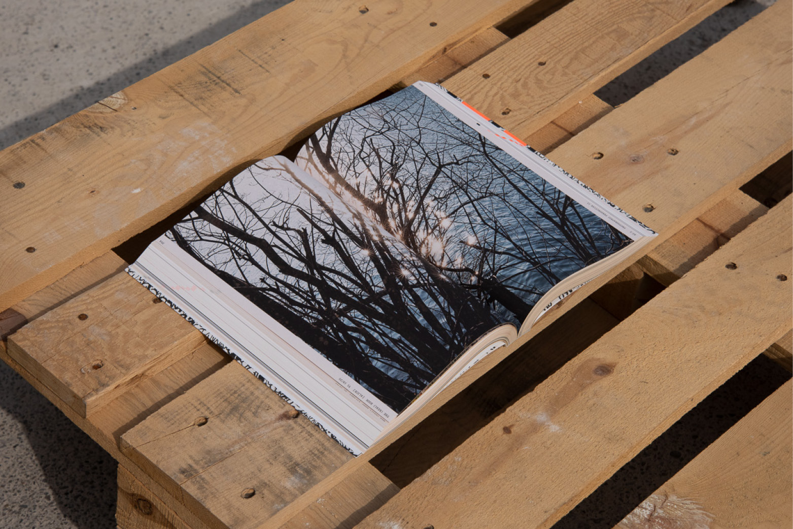
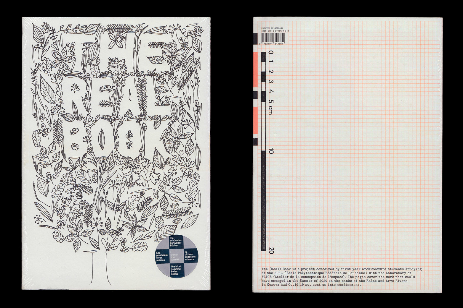
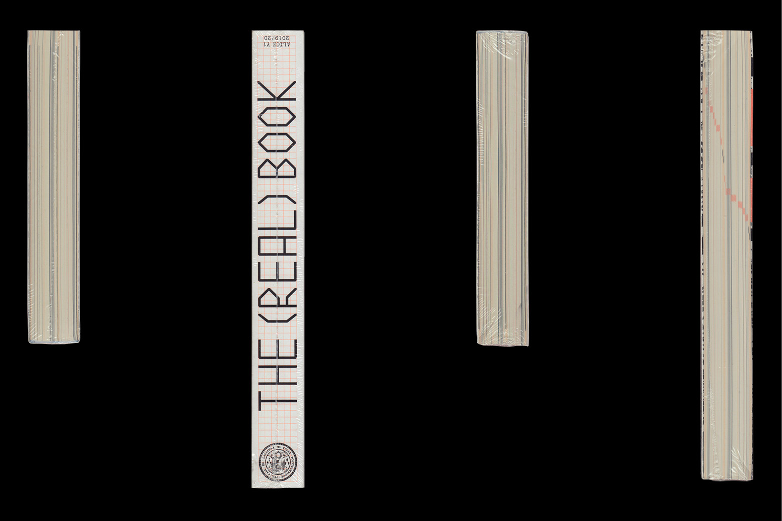
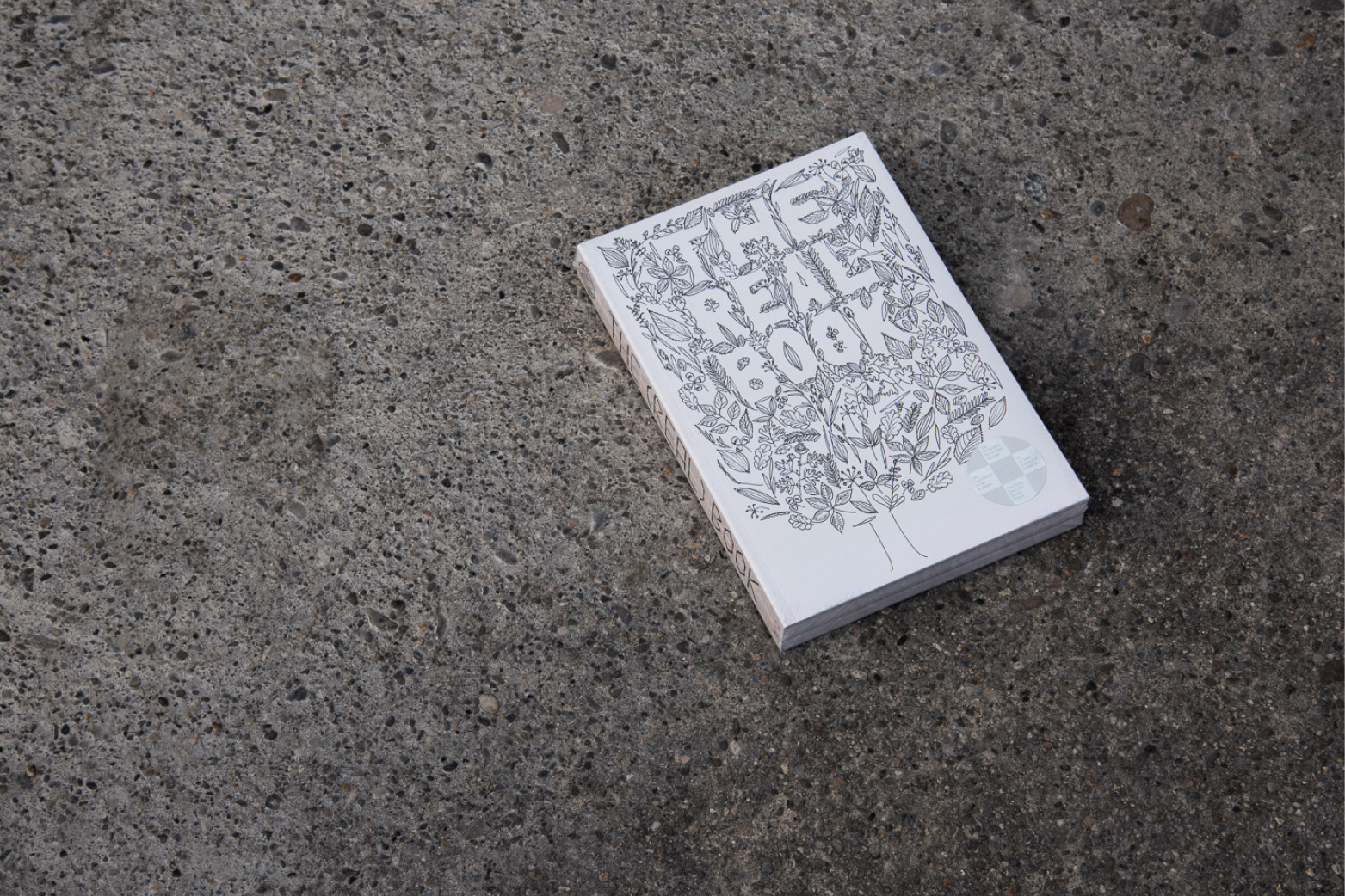
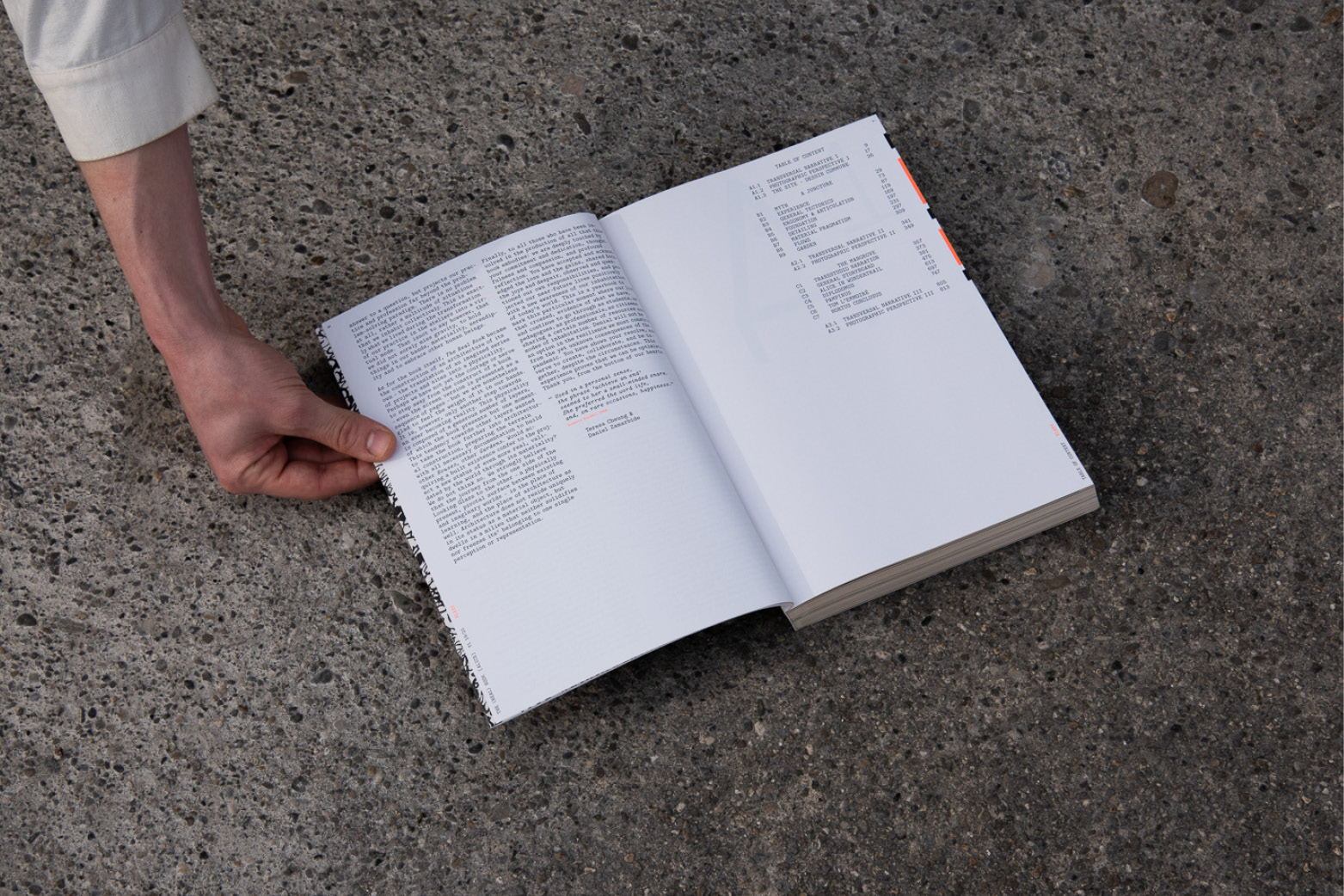
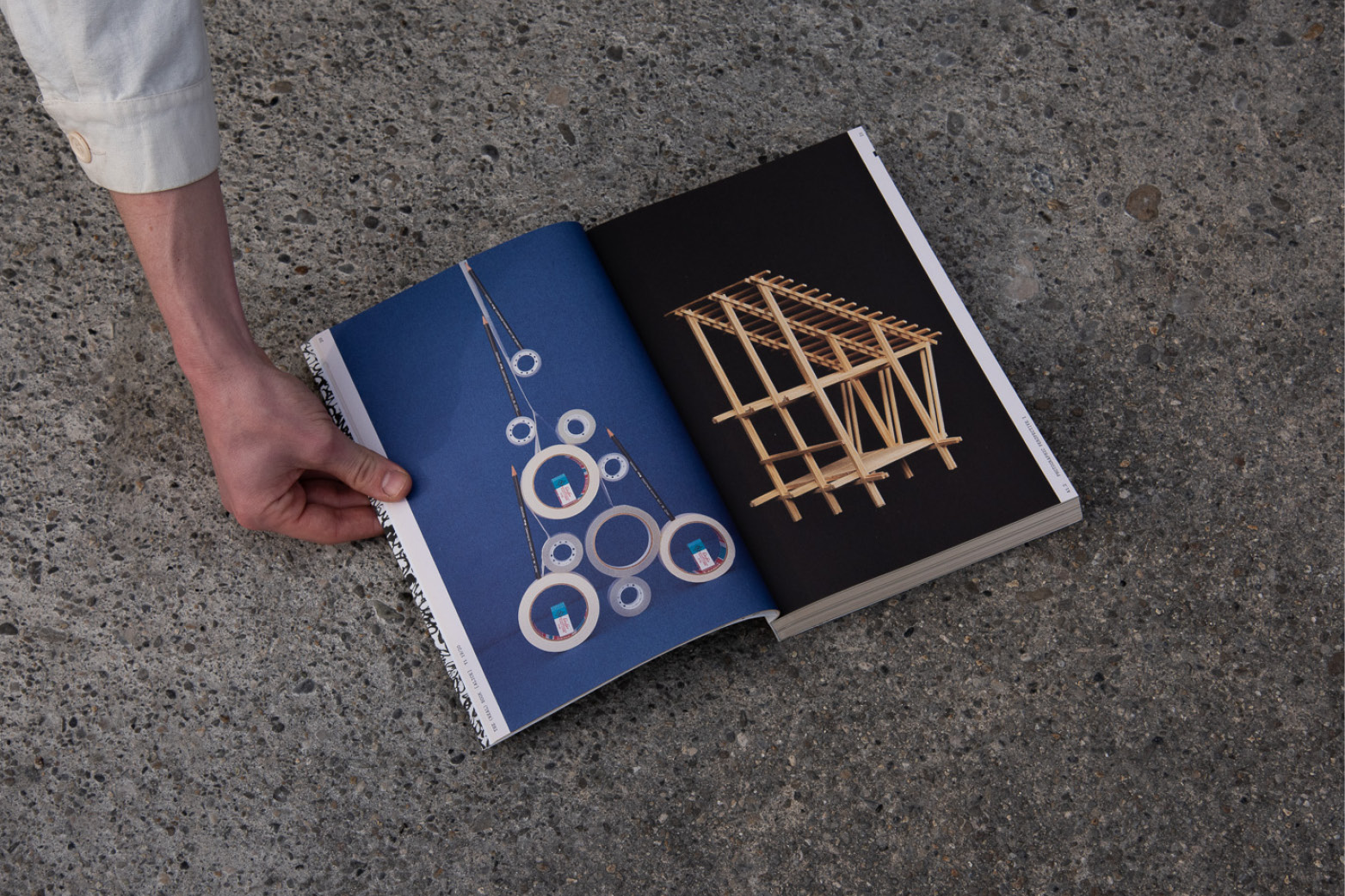
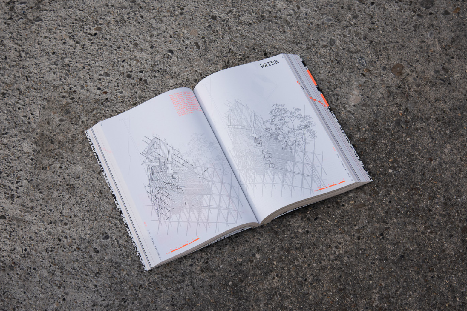
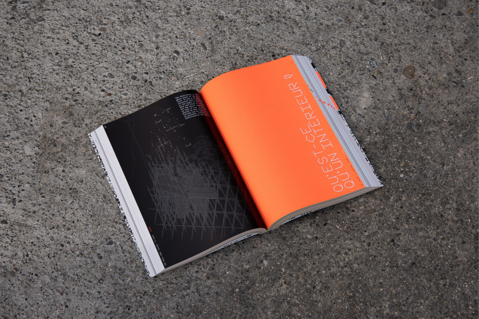
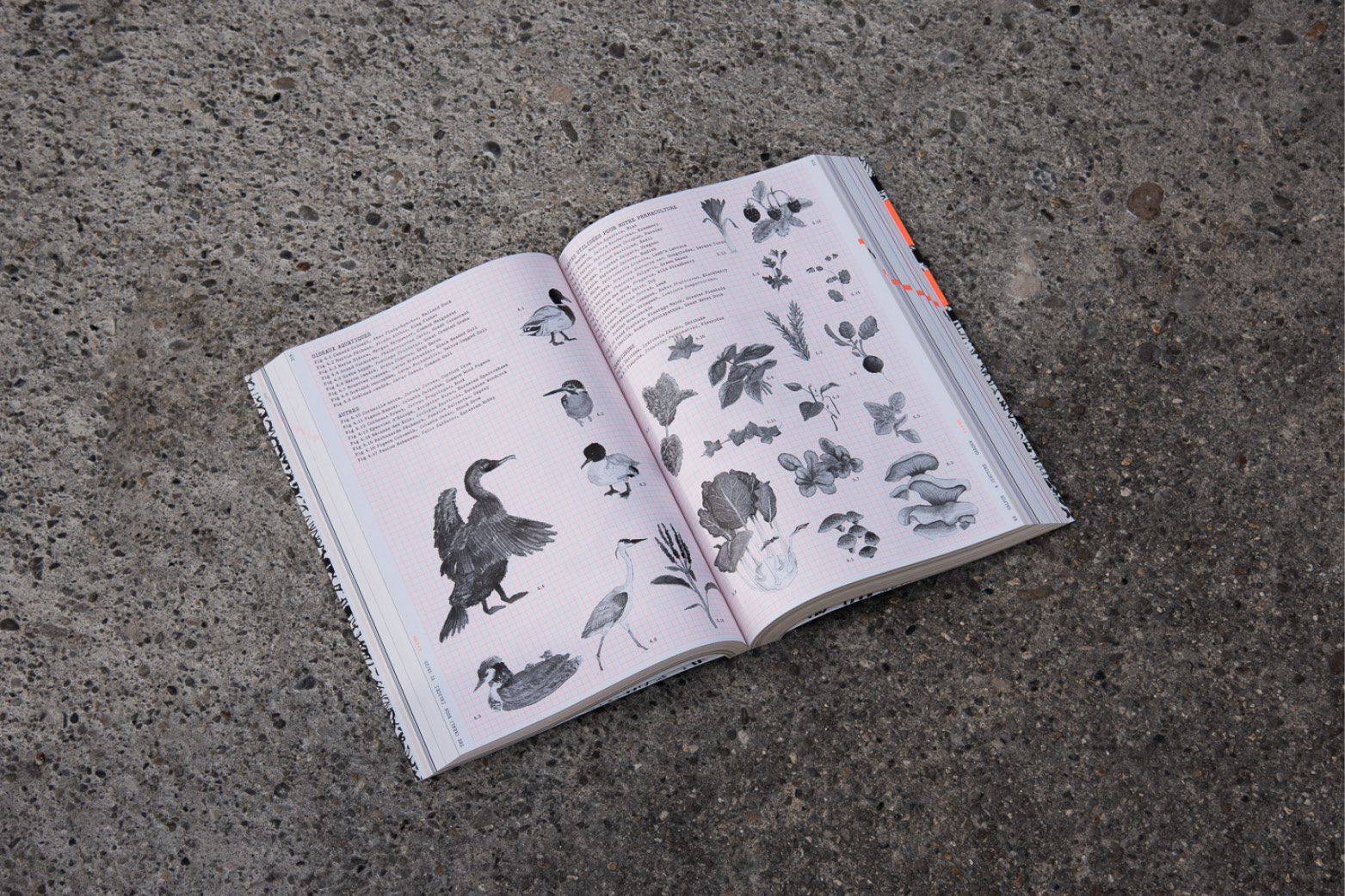
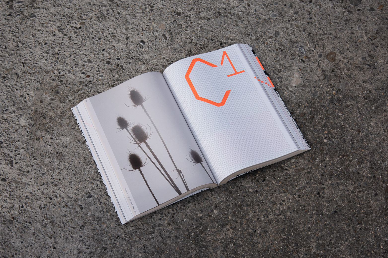
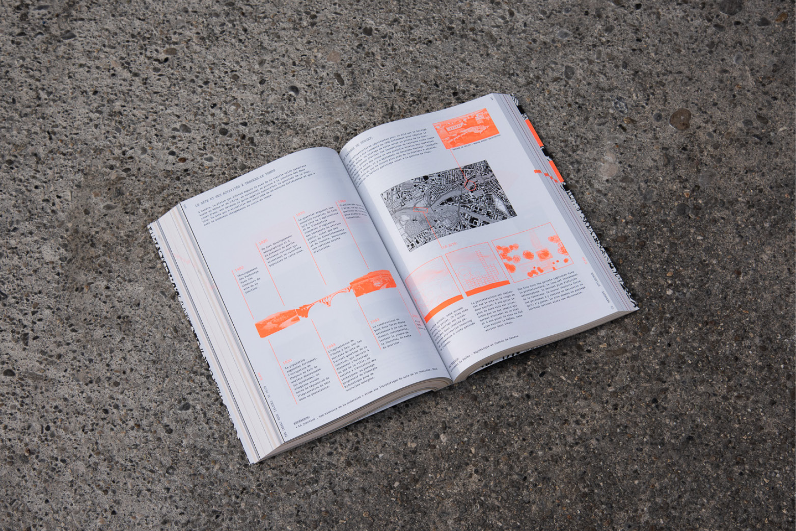
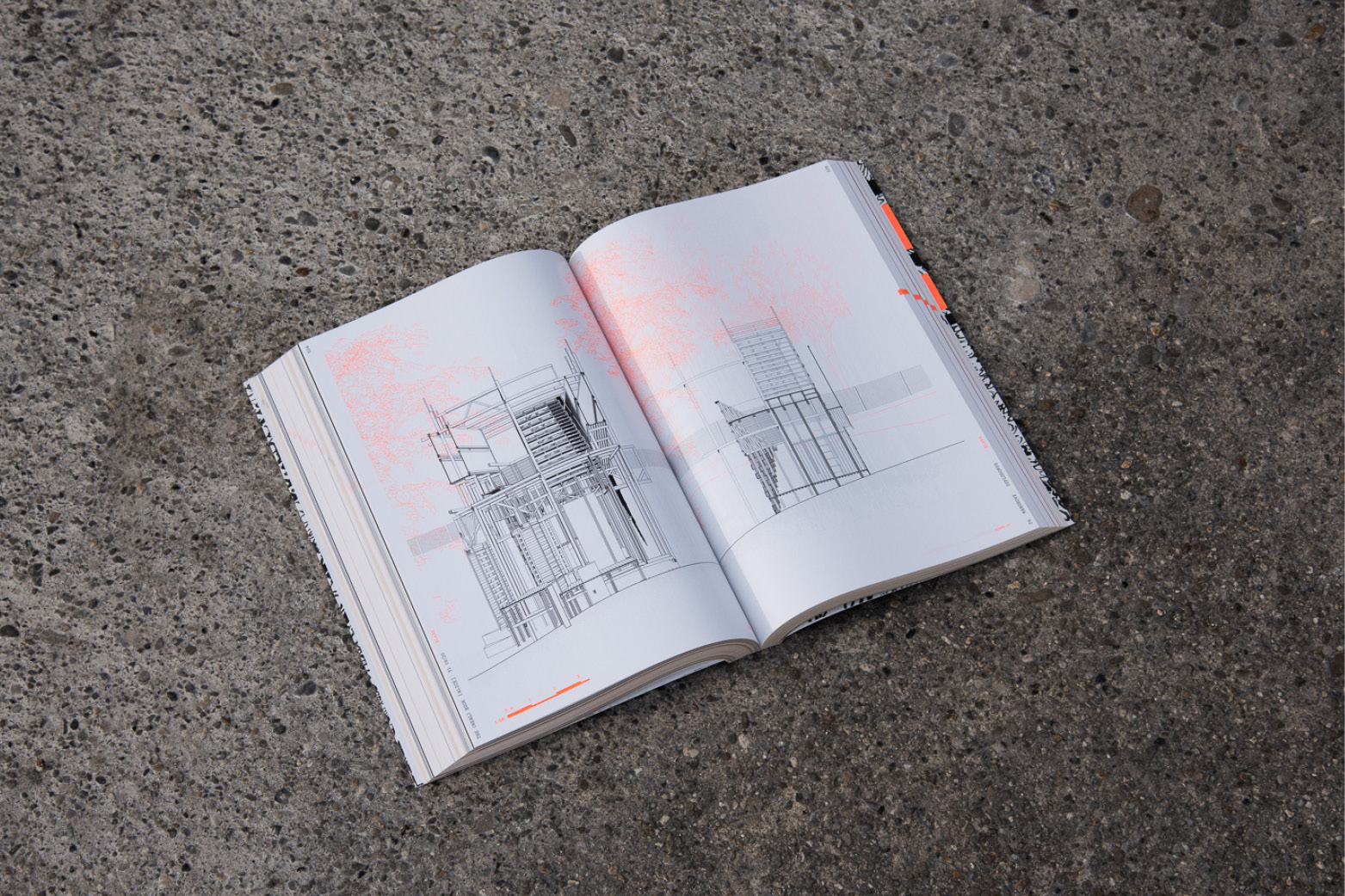
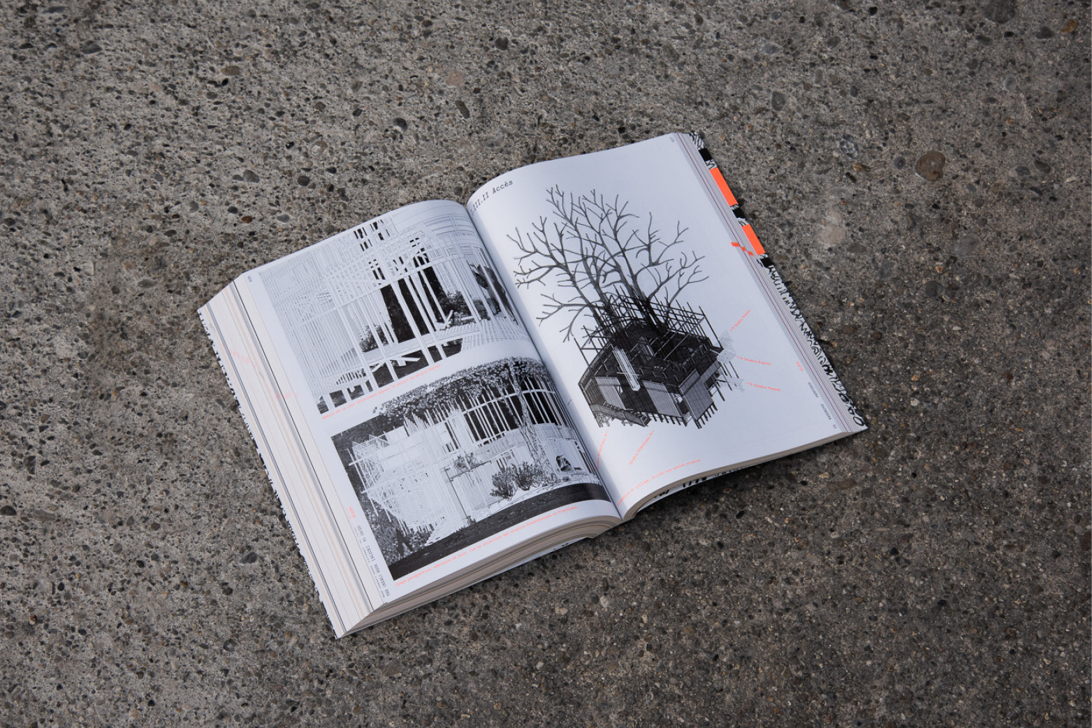
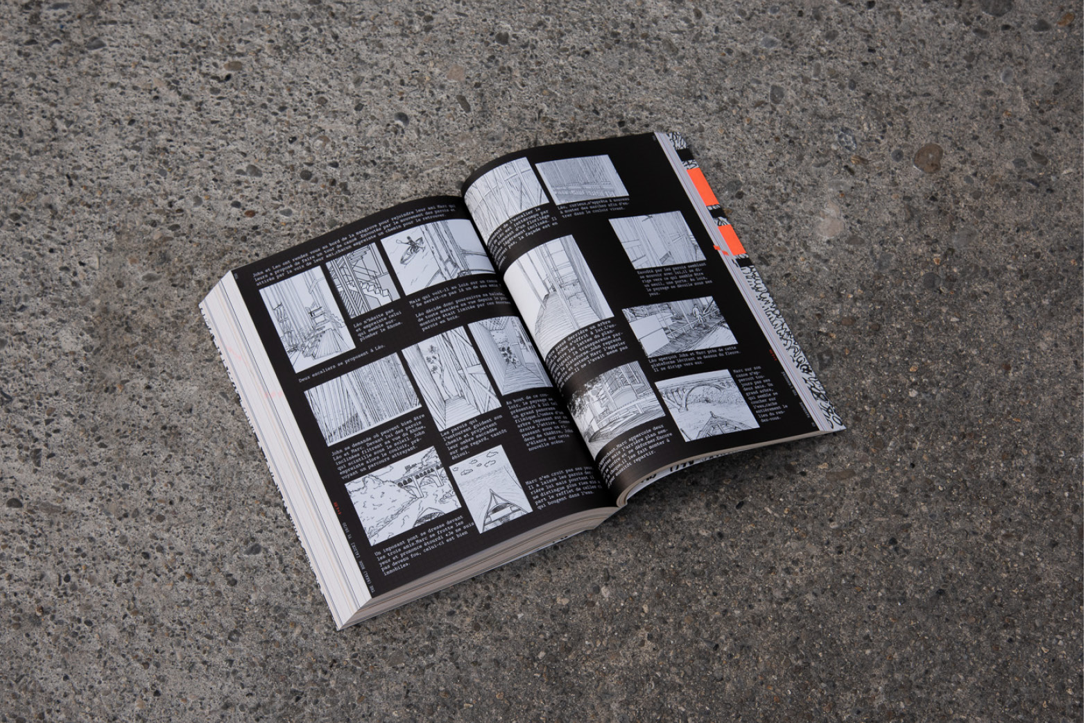
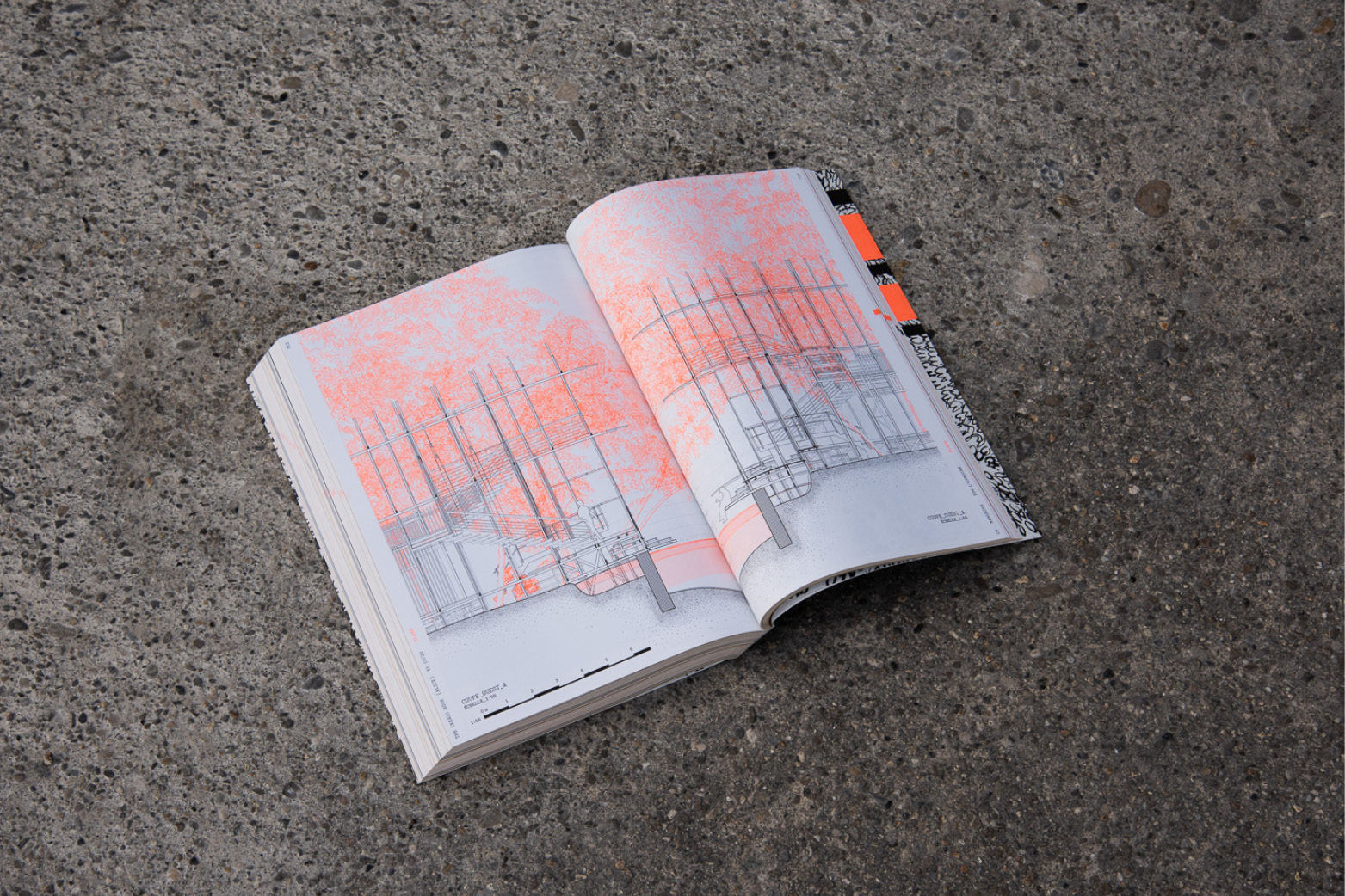
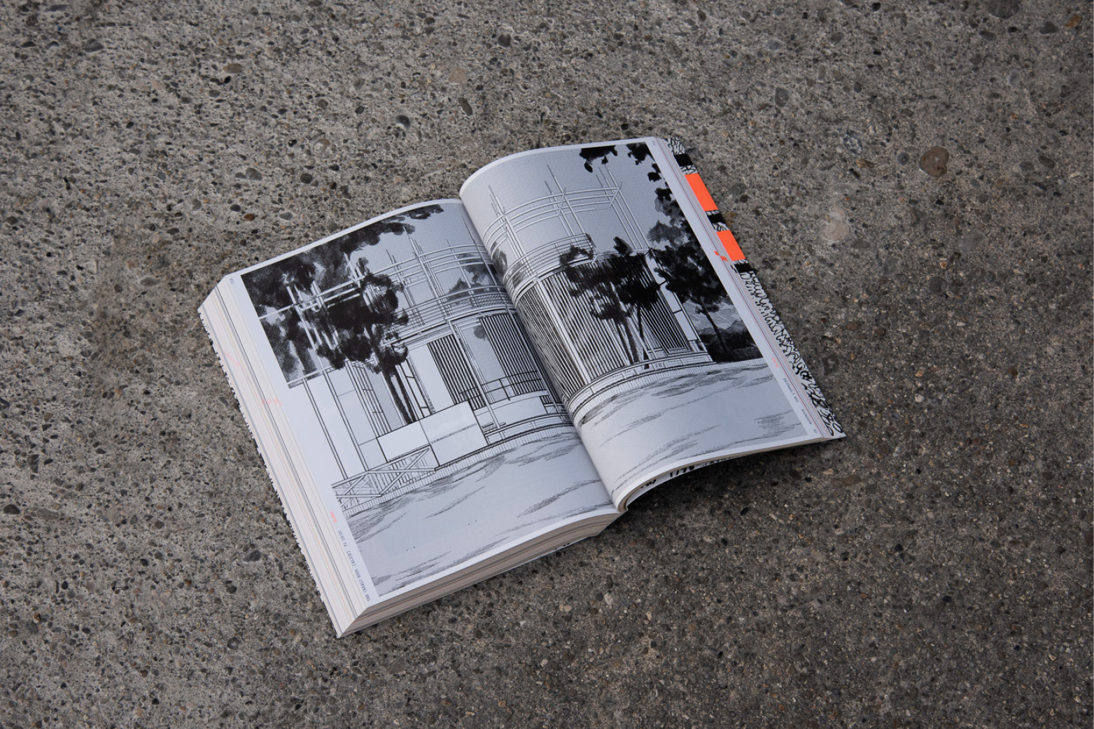
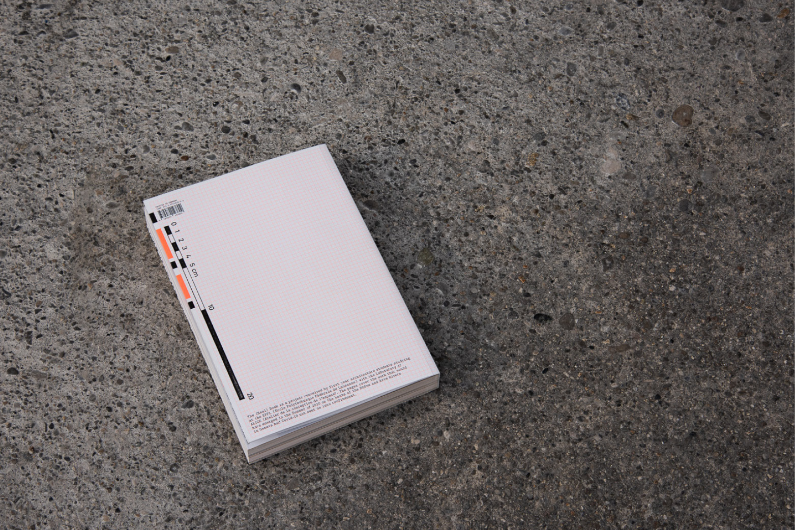
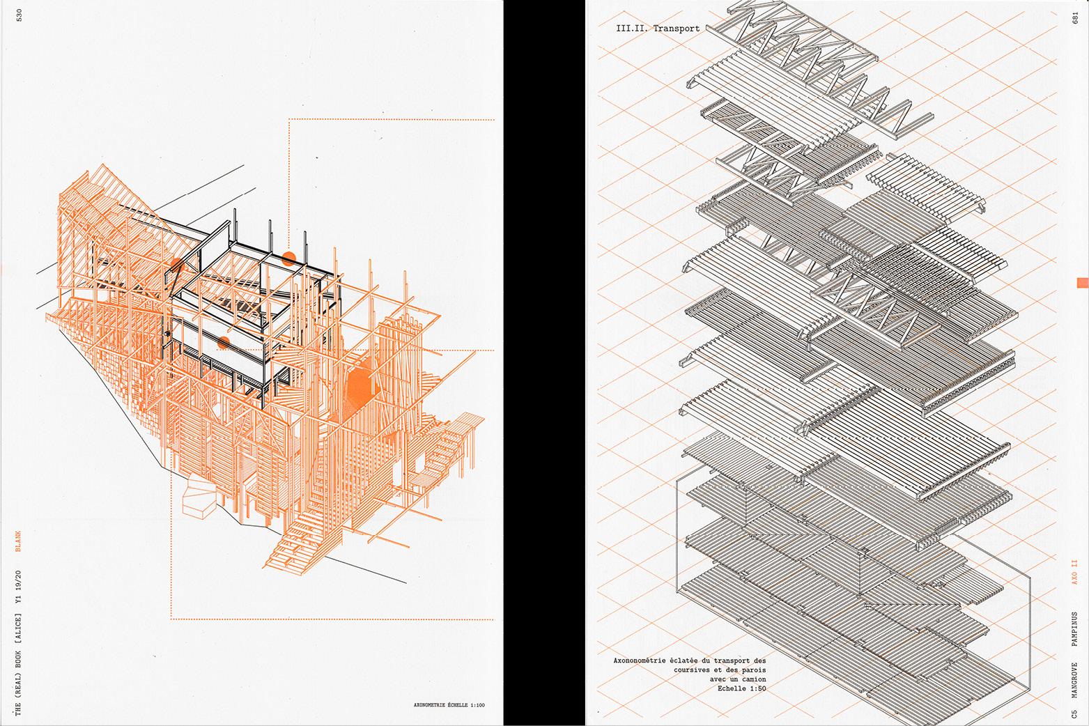
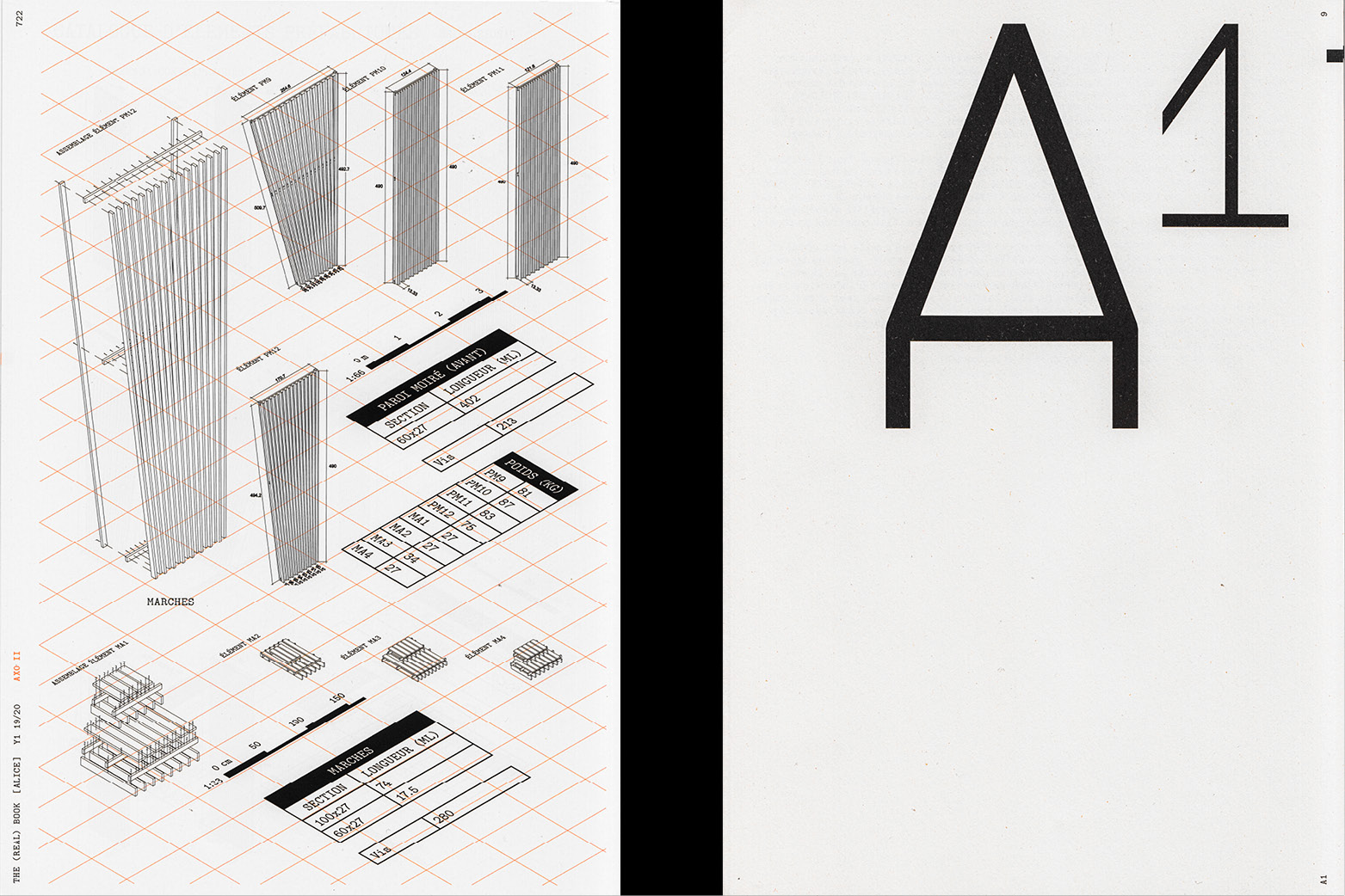
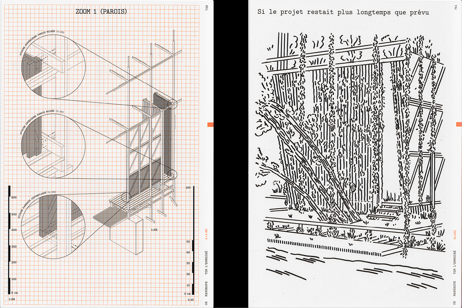
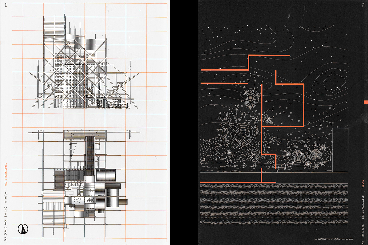
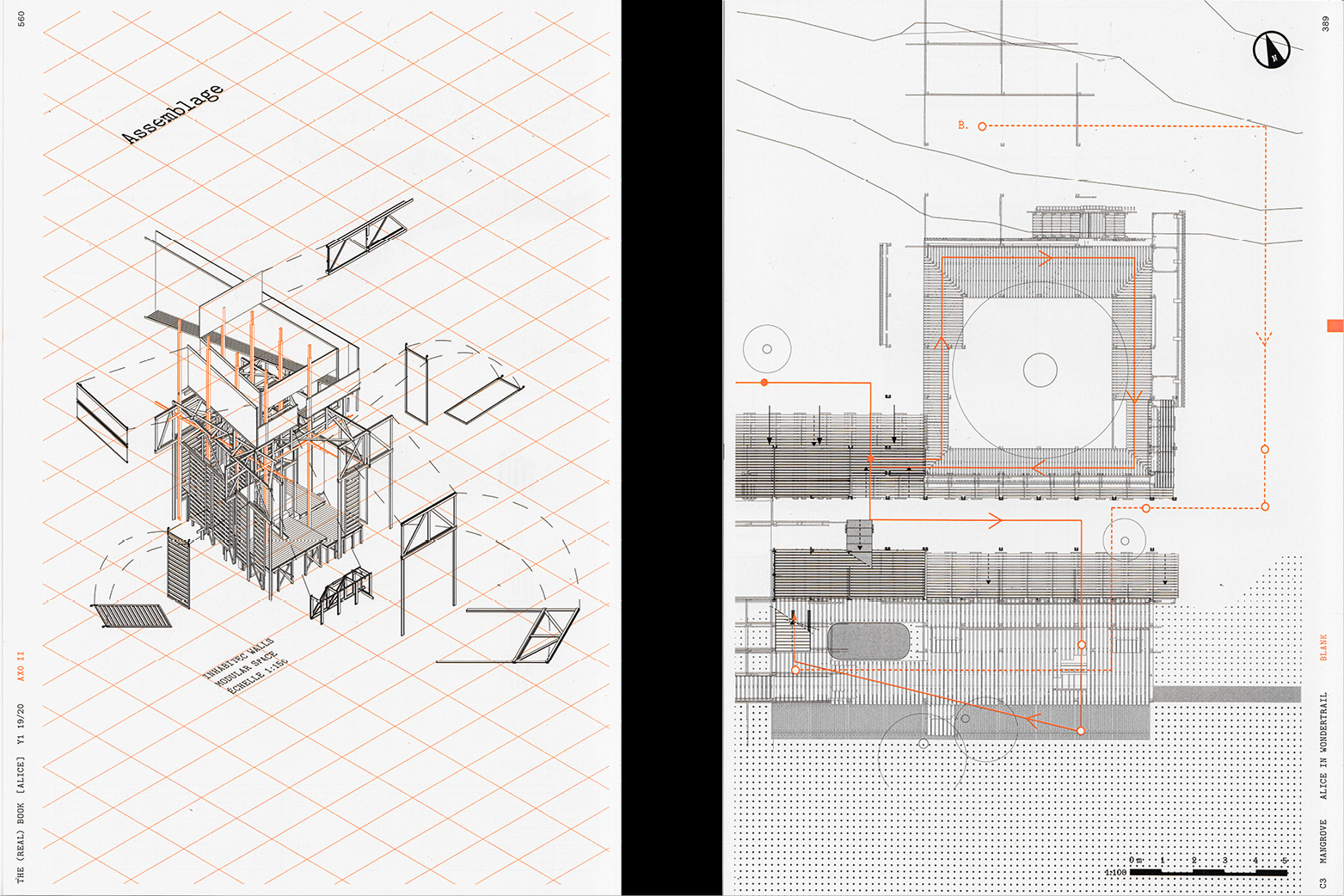
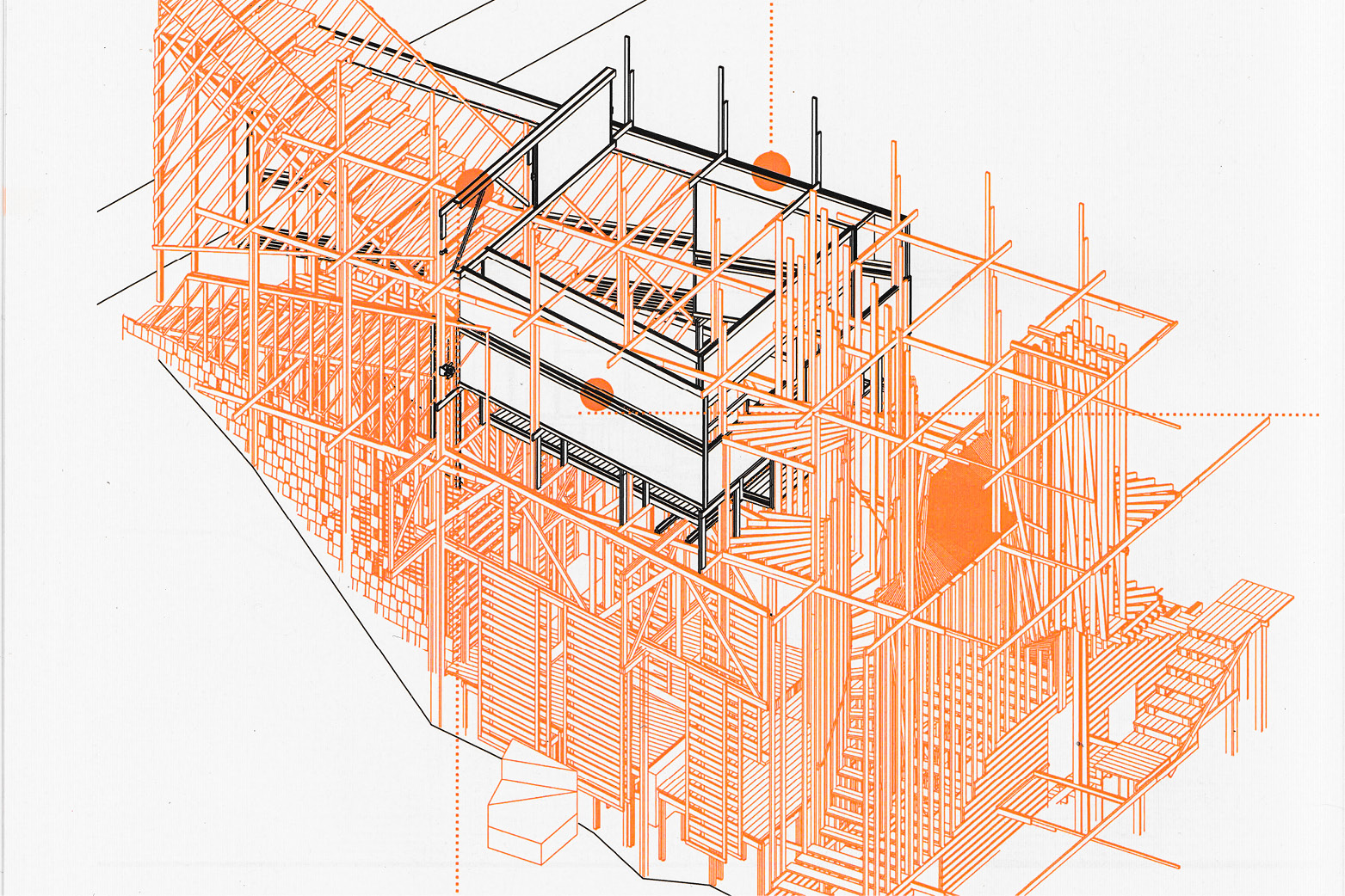
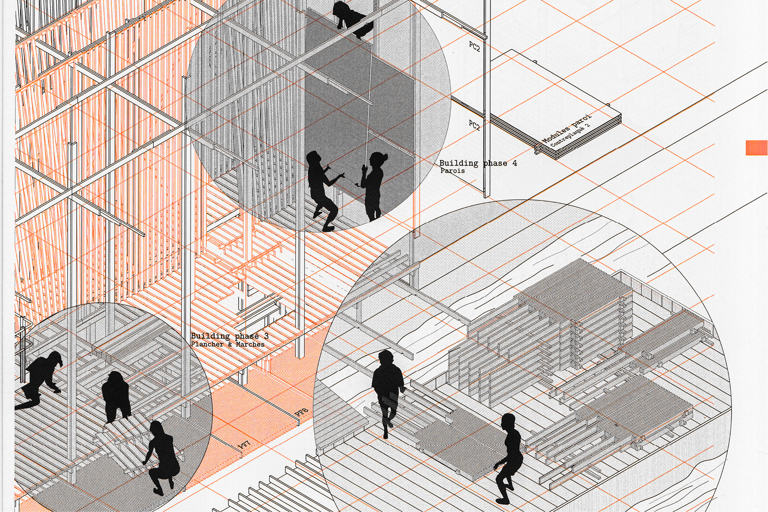
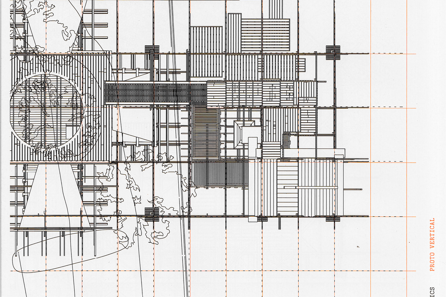
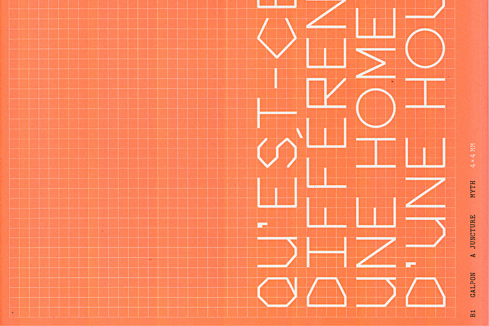
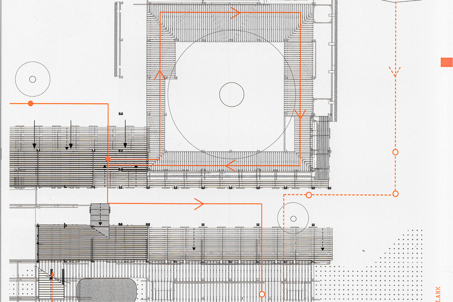
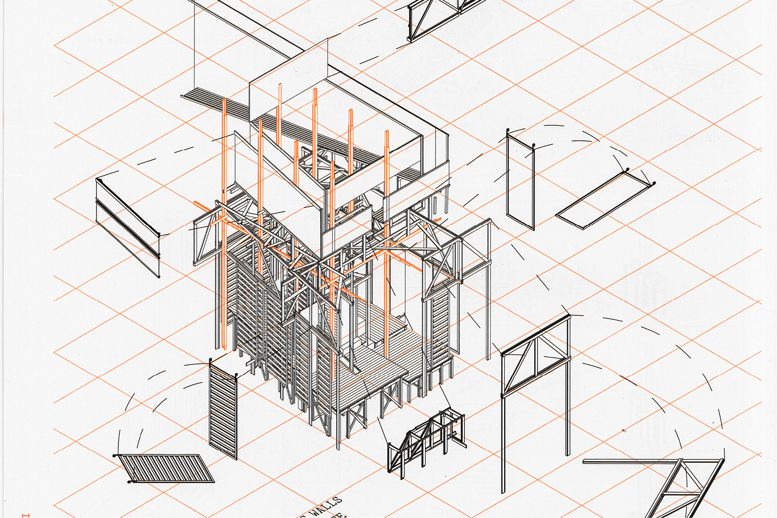
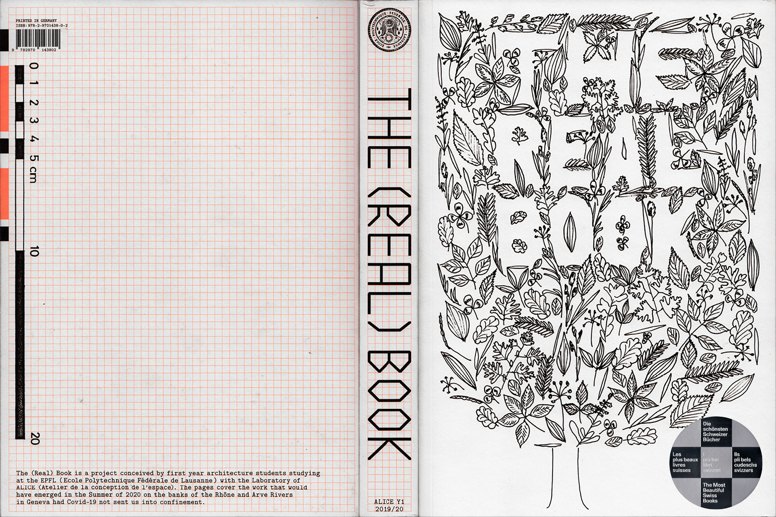
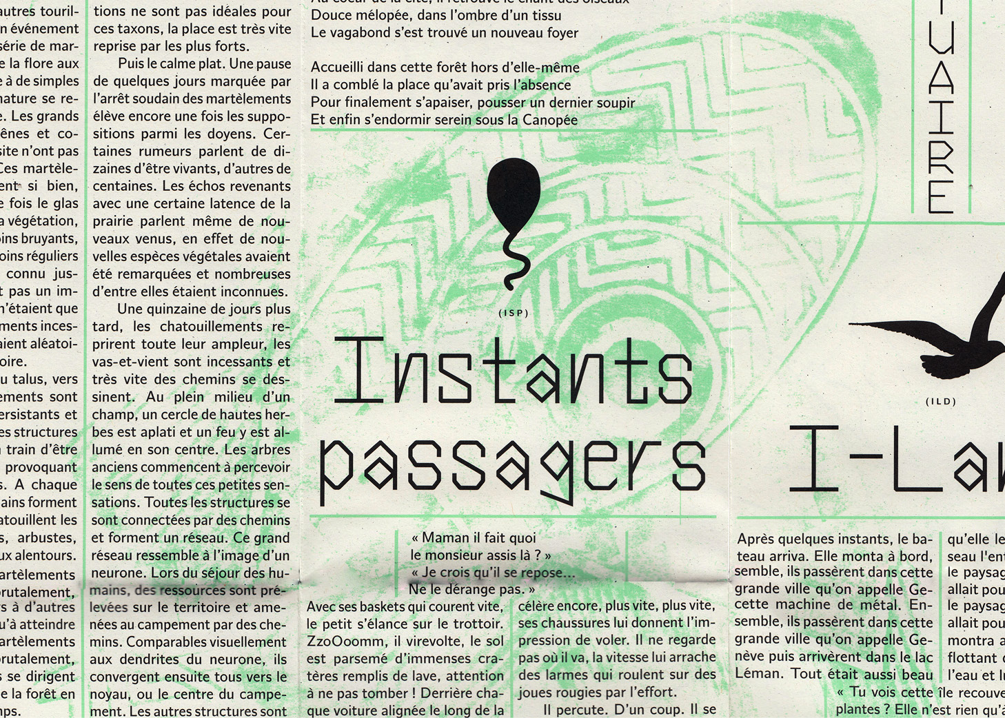
The (Real) Book is a project conceived together with first year architecture students (19/20) studying at the EPFL with the Laboratory of ALICE (Atelier de la conception de l’espace). The 828 pages cover the work that would have emerged in the Summer of 2020 on the banks of the Rhône and Arve Rivers in Geneva had Covid-19 not sent us into confinement. The physicality and scale of the book was intended to help us in virtual times to stay related to the physical world. The grid paper (4×4mm) which has been extended by a few additional matrices was our basic support structure that created a link to the proto-structure of ALICE.
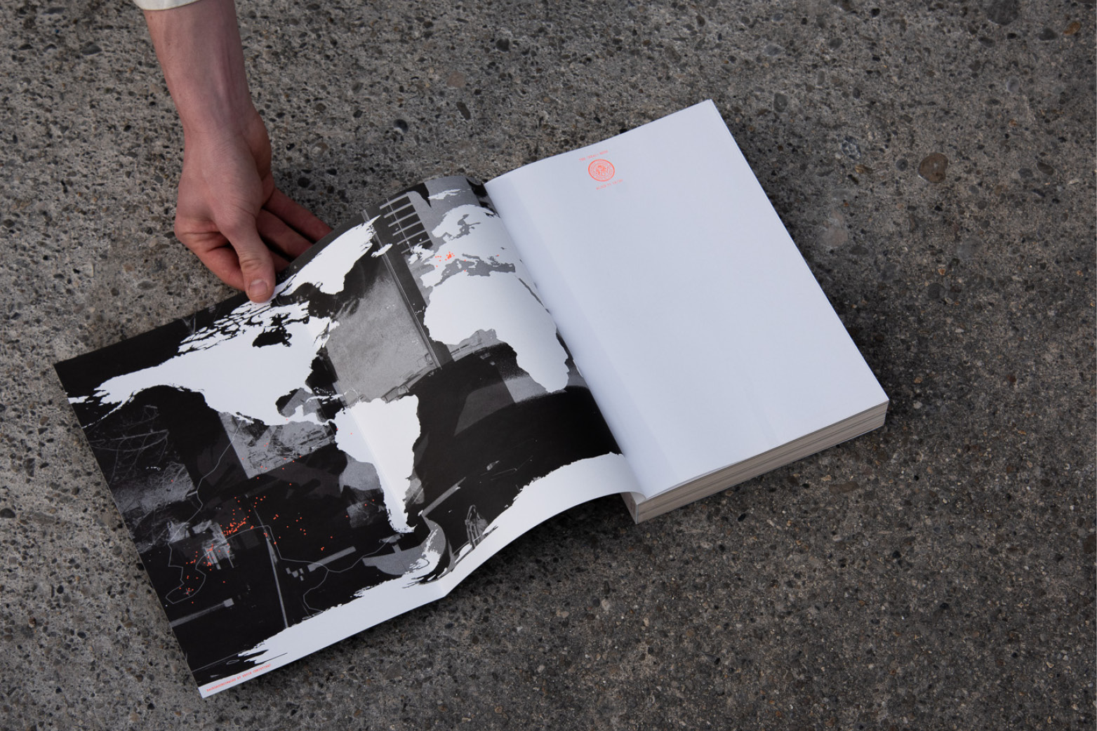
Thanks to all the students and the team members of ALICE for your energy and patience. The pandemic drove us apart as bodies and into platforms. We have been drawing and writing into grids. And we have been drawn into a grid ourselves. After months of close collaboration in the atelier, the team suddenly found itself physically fragmented. The map on the inside cover visualizes where the individuals who contributed to the book have been located during the first confinement in Switzerland and abroad. The three photograpic perspectives have been contributed by students of CEPV. The book is available on request through ALICE.
The (Real) Book
ISBN 978-2-9701438-0-2
196 × 284 × 30 mm
828 pages
two/four-color offset
print: Eberl & Kösel
2020 – 2021
1.865 kg
Kids Manifest
Poster with and for the KidsUni of Floating University Berlin using FloatingMono and FloatingMono Stencil. Two-colour risoprint by Drucken3000.
2021, Poster, Manifest
Floating Stencil Writing Tool
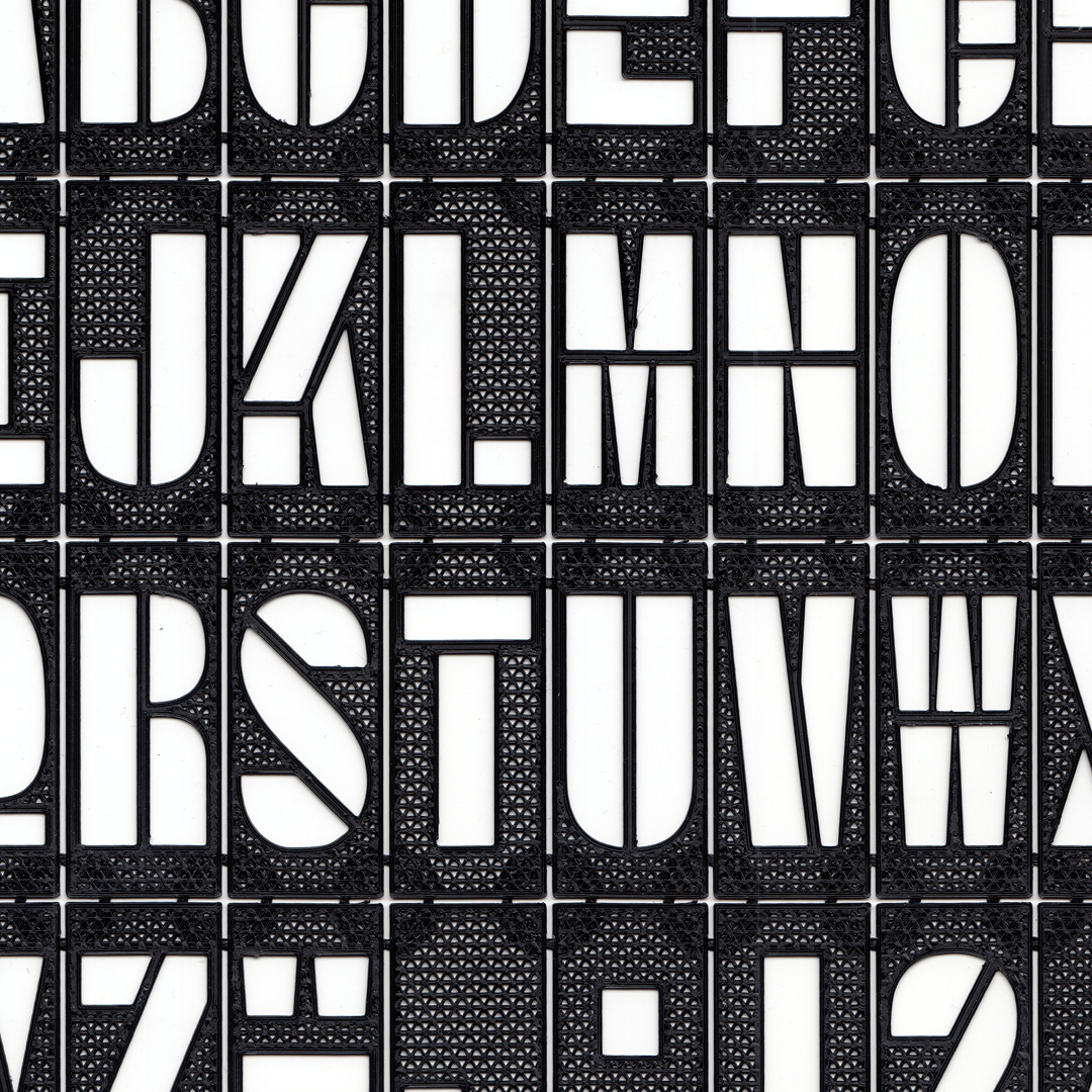
Floating Mono Stencil Writing Tool developed together with Manuel Potterat. The tool is made with a 3D printer and consists of a solid and a flexible material which makes it foldable. The heights and widths of the individual types have been adapted to the dimensions of standardised wooden construction elements, what allows easy positioning and writing.
2021, 3D-print, Tool
Into Dwelling
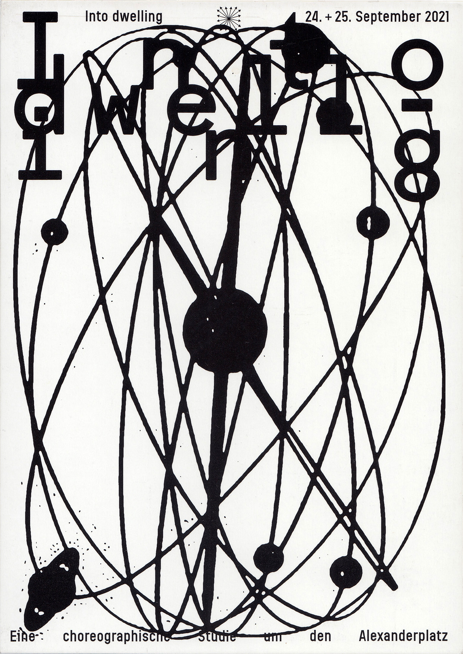
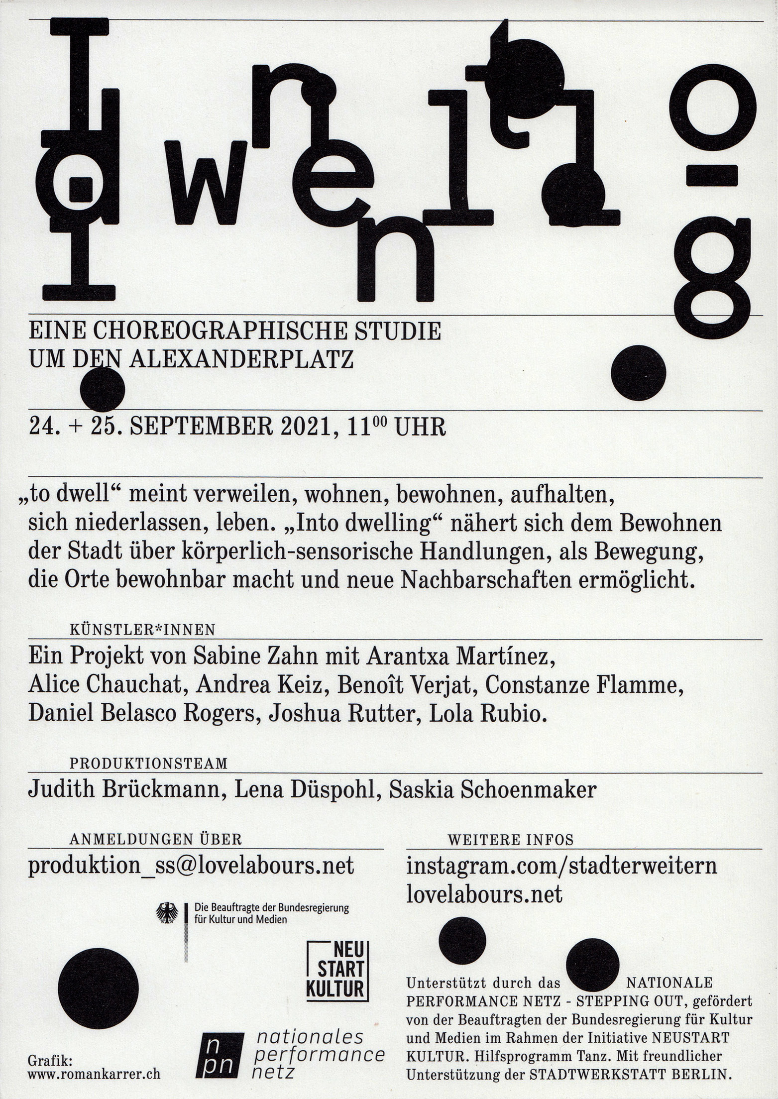
Visual and flyer for the format Into Dwelling. A choreographic study around Alexanderplatz. The visual is an abstract representation of the Urania World Clock.
2021, Flyer
(re)connecting.earth – Beyond Water
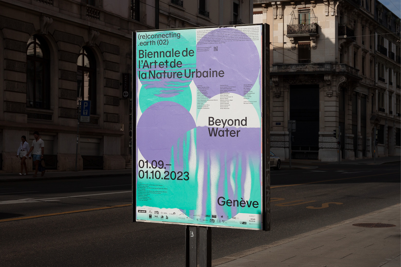
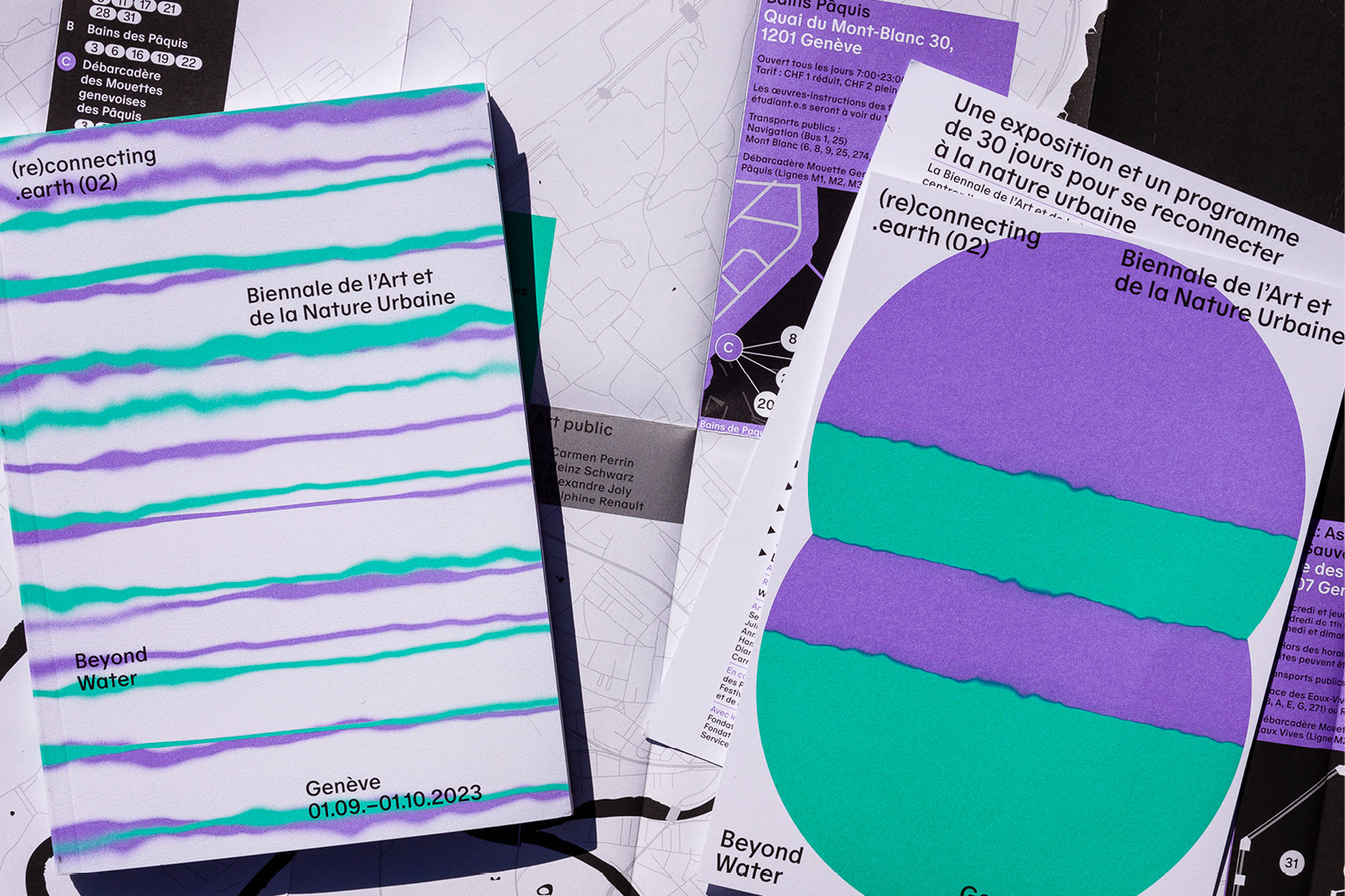
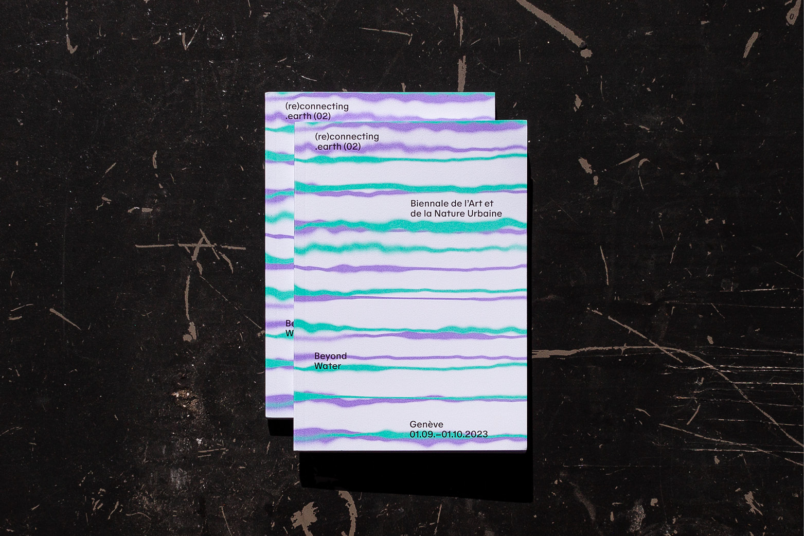
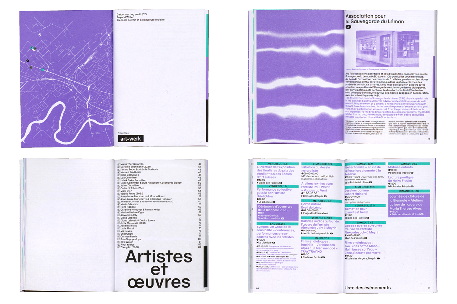
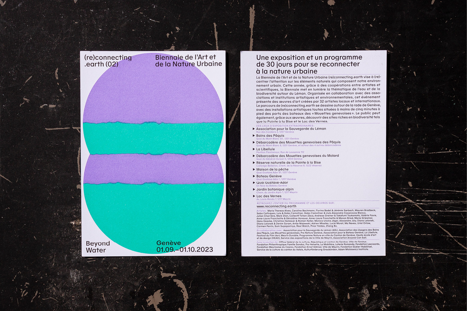
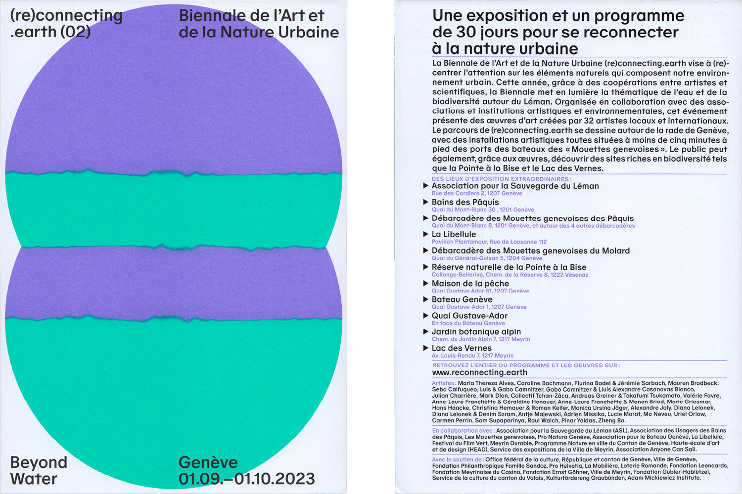
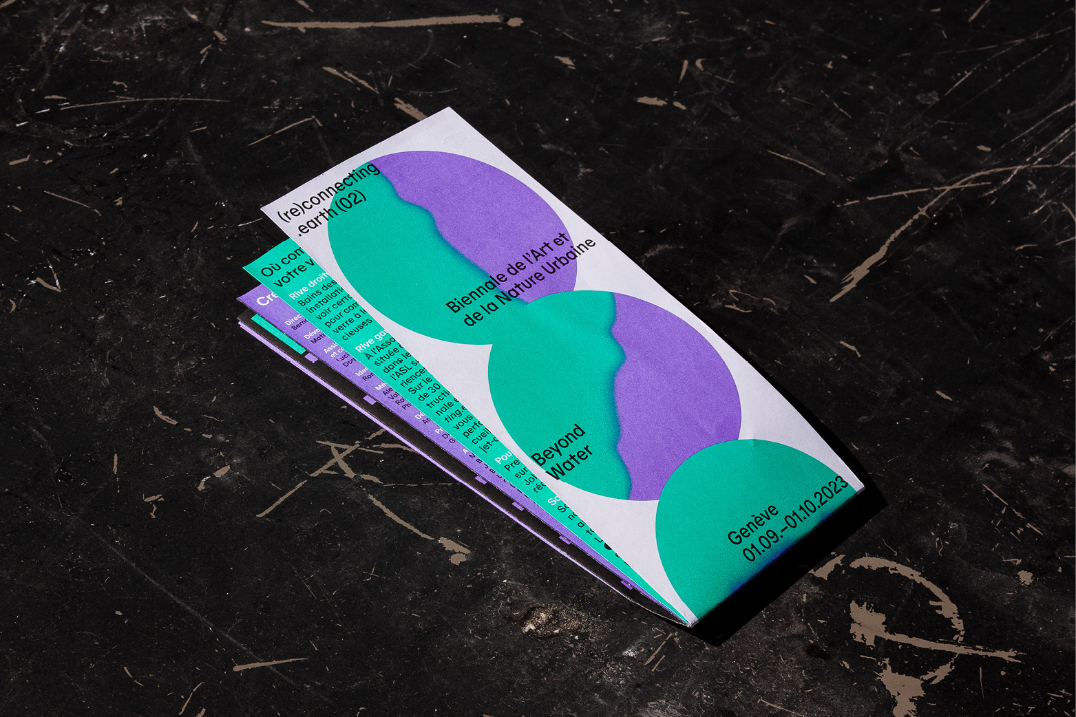
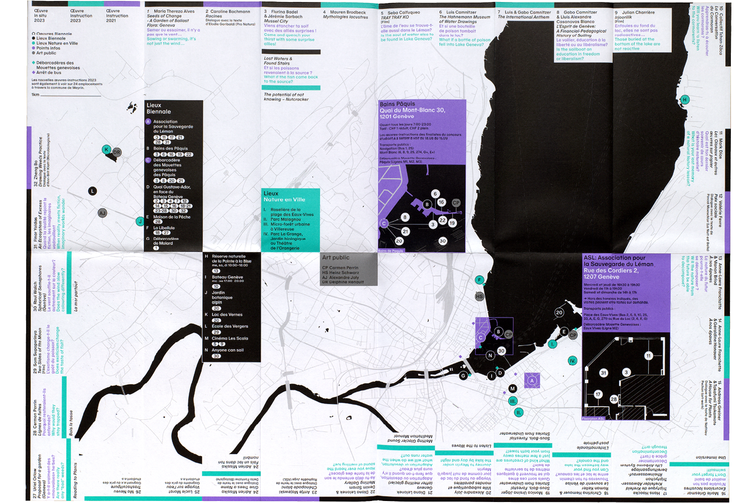
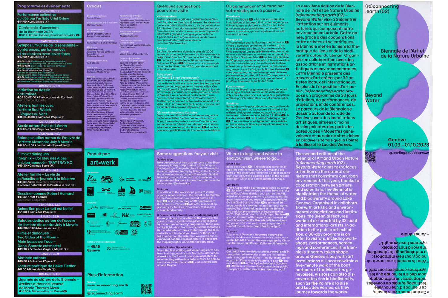
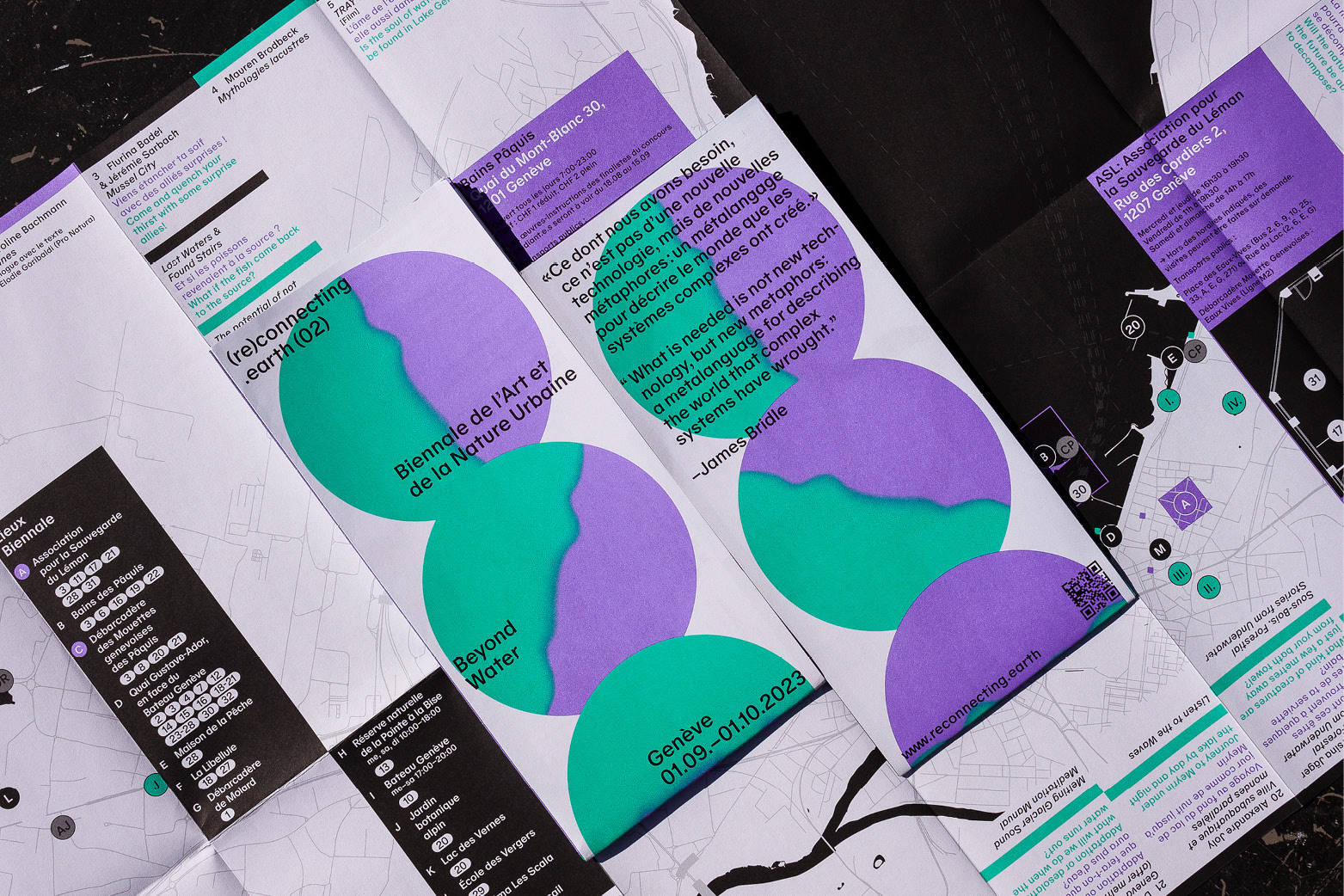
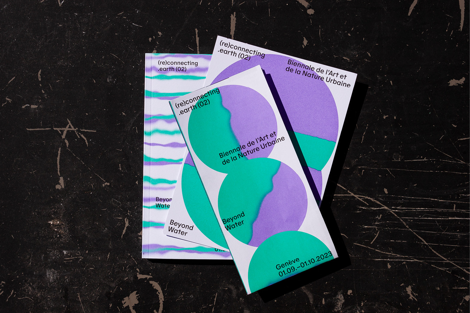
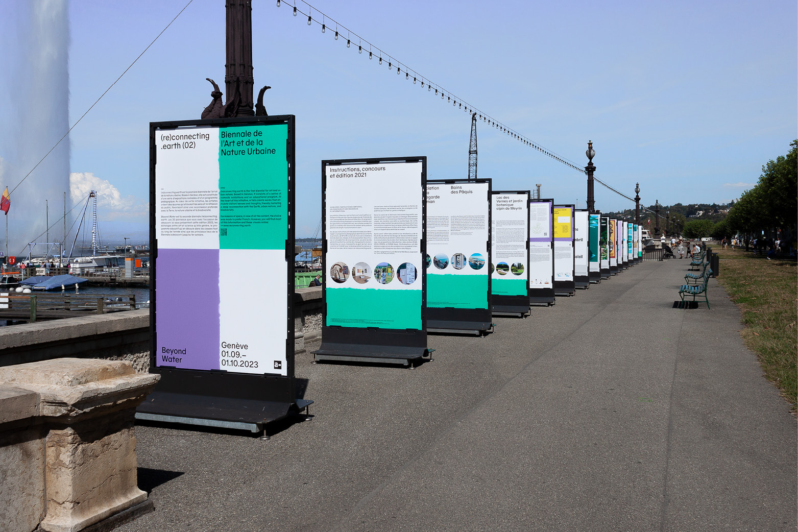
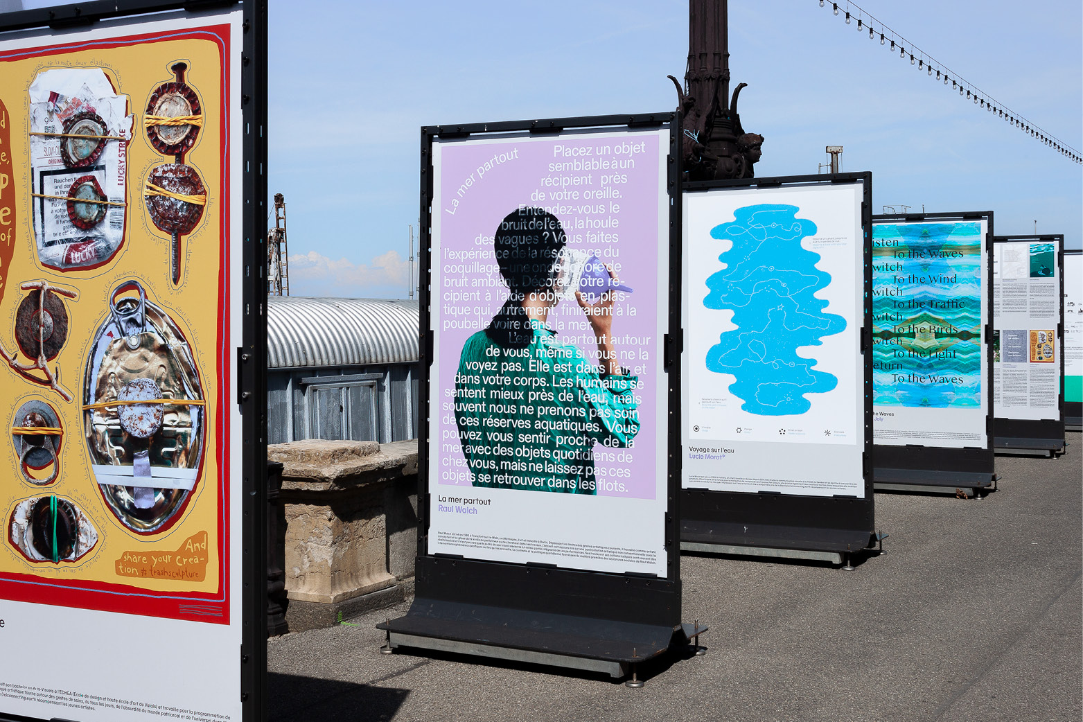
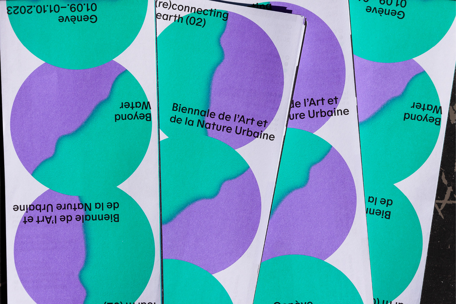
Visual identity for the 2nd edition of (re)connecting.earth under the theme beyond water. The visual concept was developed in collaboration with Emma Affoua Kouassi. The biennial of art and urban nature took place in Geneva during the month of September 2023. The exhibition series is curated by Bernard Vienat and realised by artwerk.
In this context, we designed various print and digital media such as posters, flyers, tshirts a folded map, a publication, a website, a social media concept and a series of panels that were placed in public space as part of the exhibition. The edition brought together 32 international artistic perspectives and was distributed in various locations throughout the city.
2023, Visual Identity, Various Media
Posters:
895 × 1280 mm
Offset print by Moleson, Geneva
Map:
594 × 420 mm (unfolded)
210 × 99 mm (folded)
Offset print by Trigger.Medien.Gmbh
Flyer and Publication:
148 × 210 mm
Offset print by Trigger.Medien.Gmbh
Website:
Developed with André Fuchs
Typeface:
Oracle, by ABC Dinamo
Contaminations
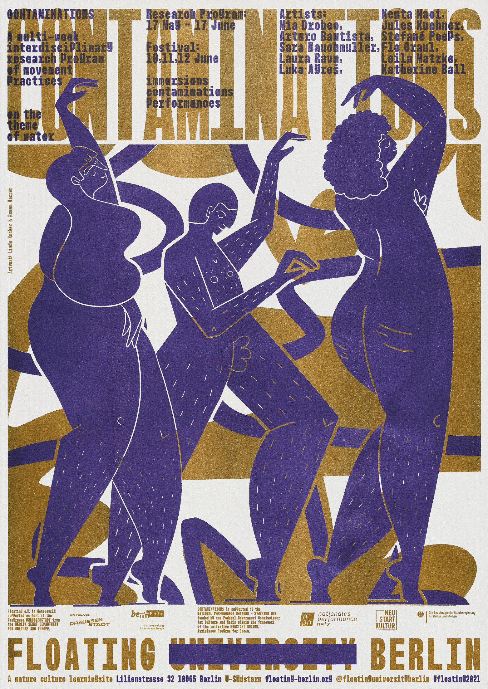
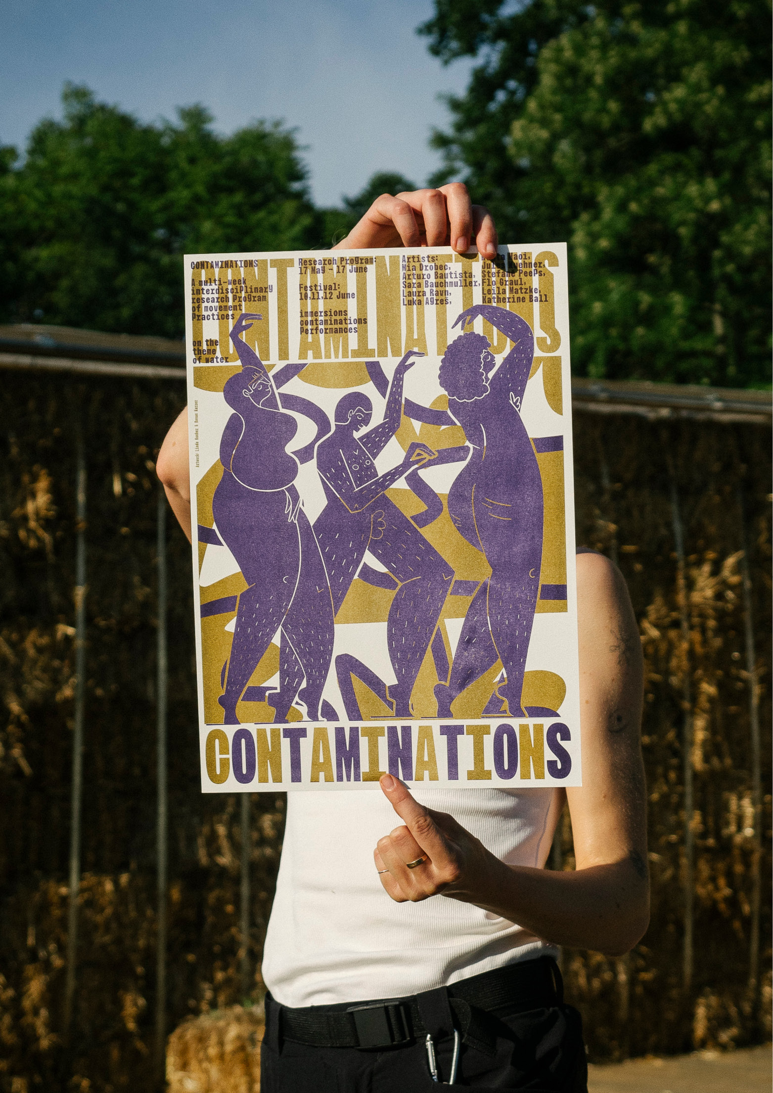
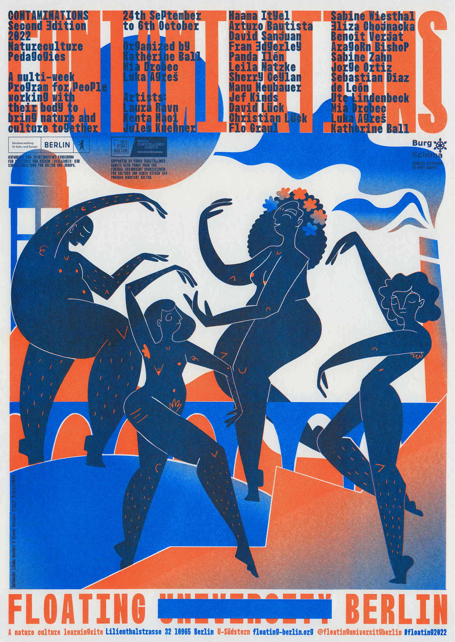
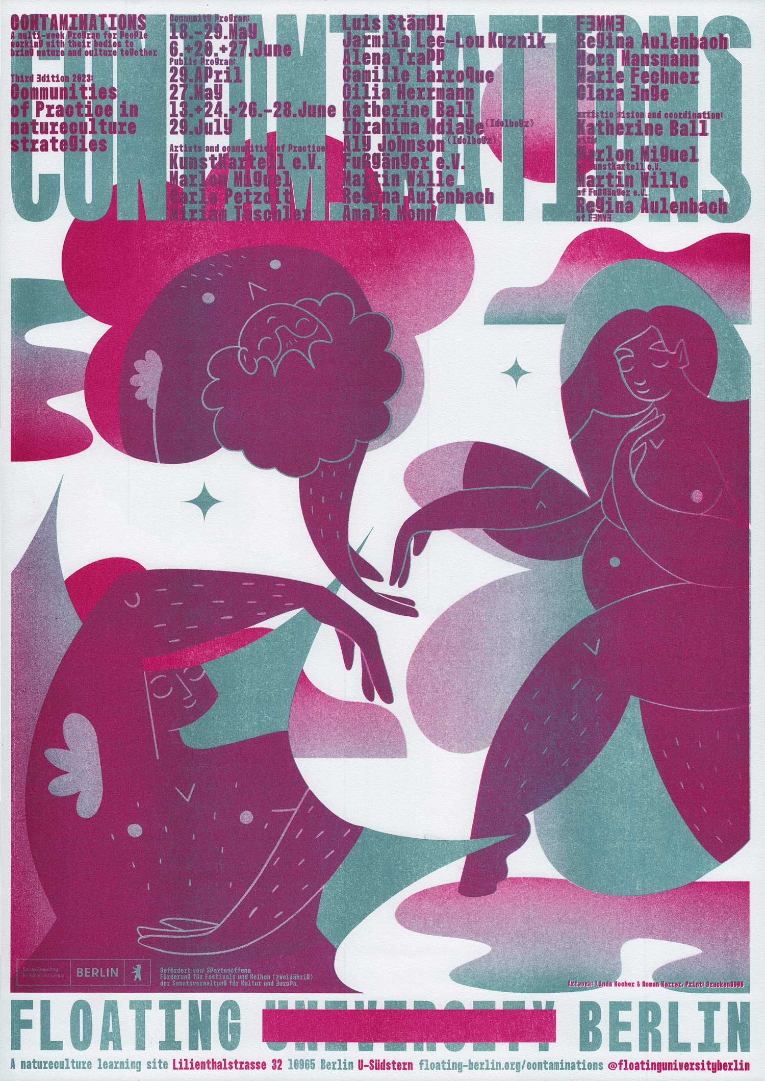
Yearly poster for the Contaminations Festival. The format is curated by Katherine Ball and friends and takes place at Floating University Berlin. The posters were made together with Linda Kocher.
2021, 2022, 2023, Poster Design, 420 × 594 mm each, Two-color risoprints by Drucken3000.
Learn(e)scapes
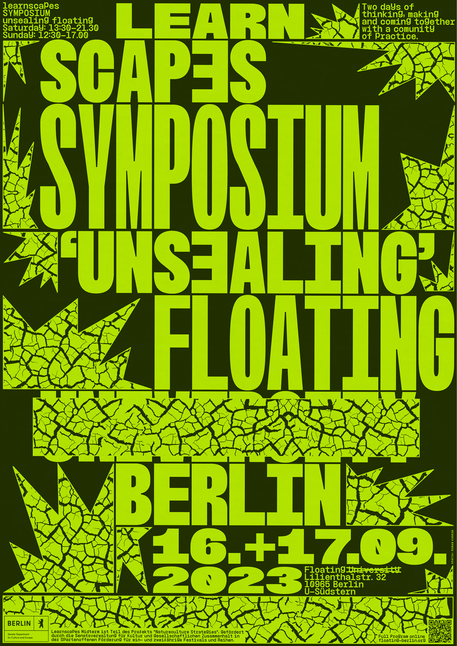
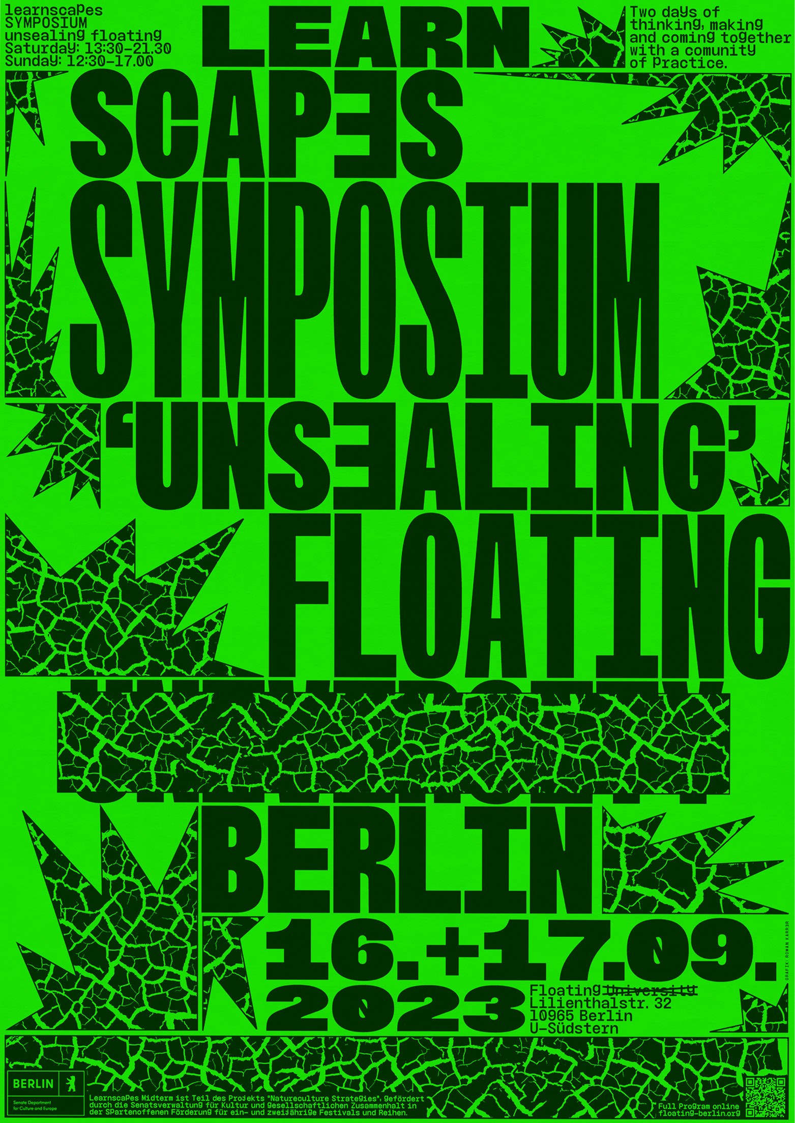
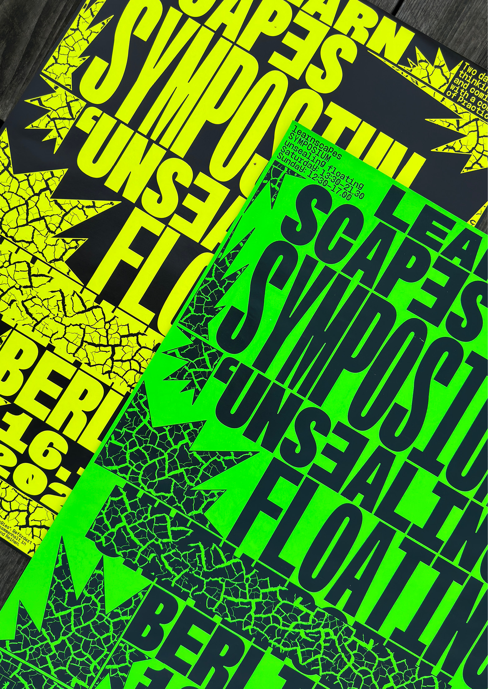
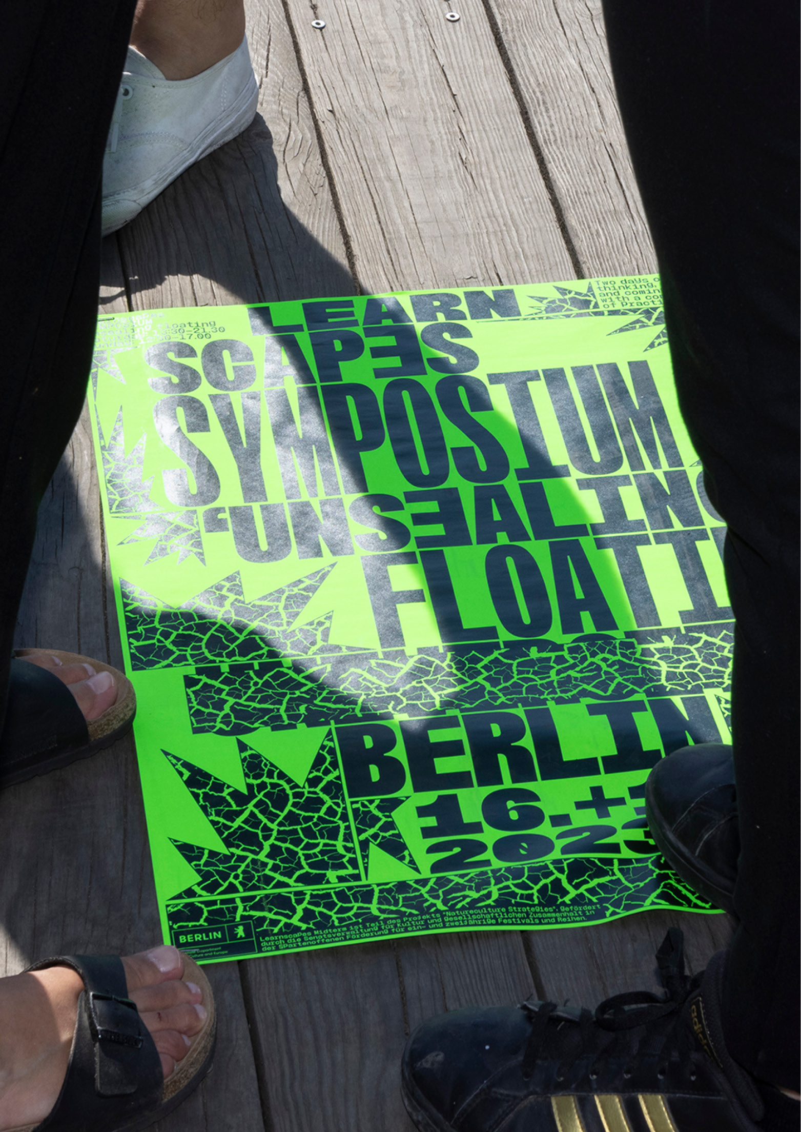
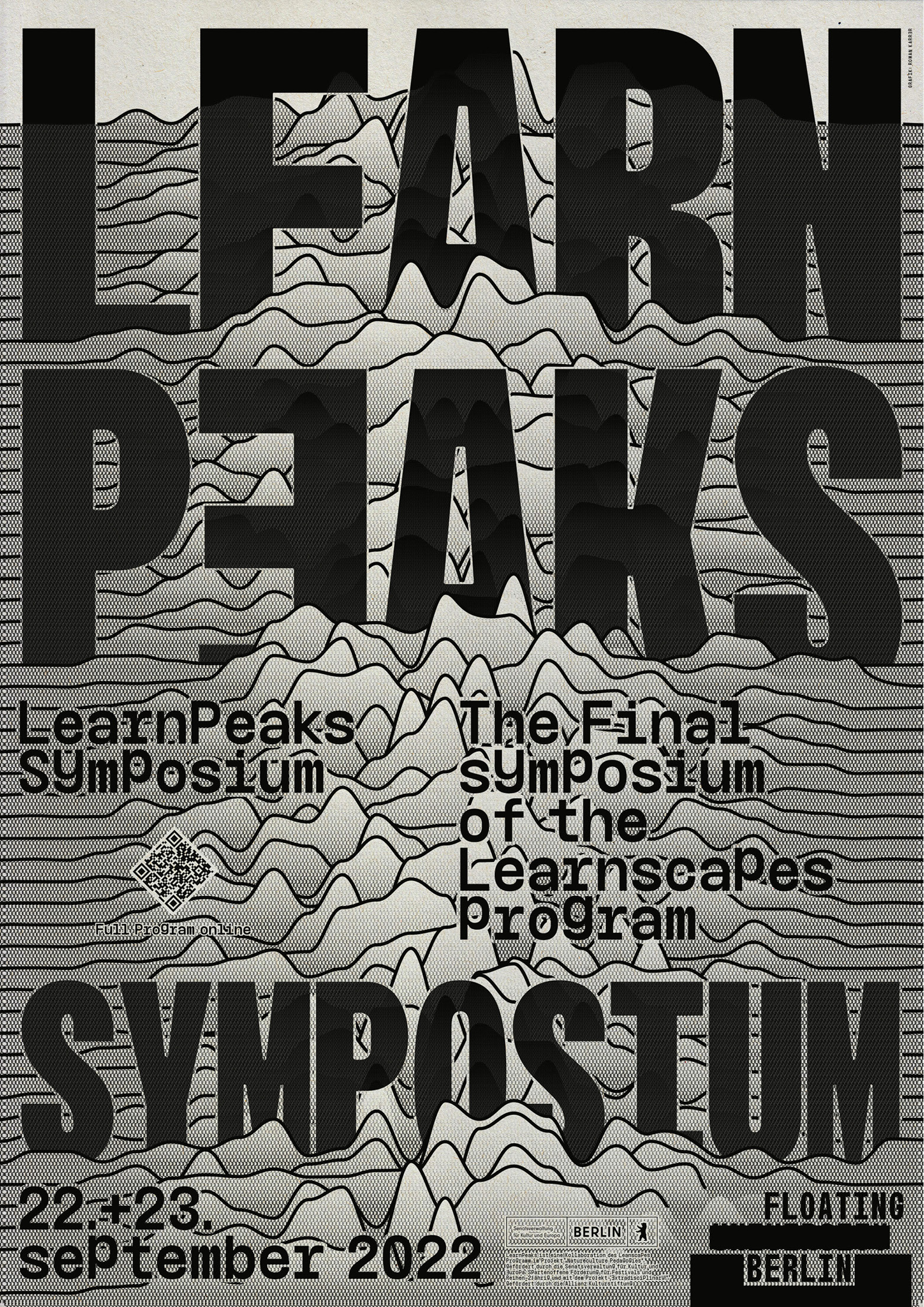
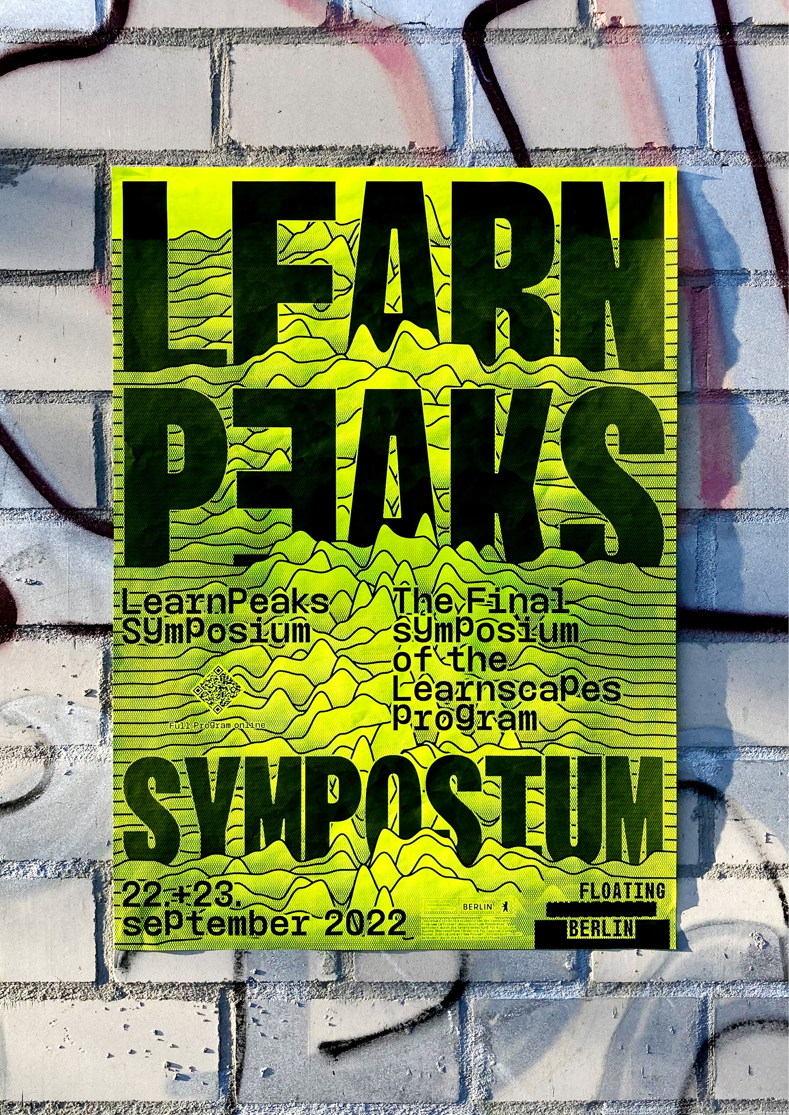
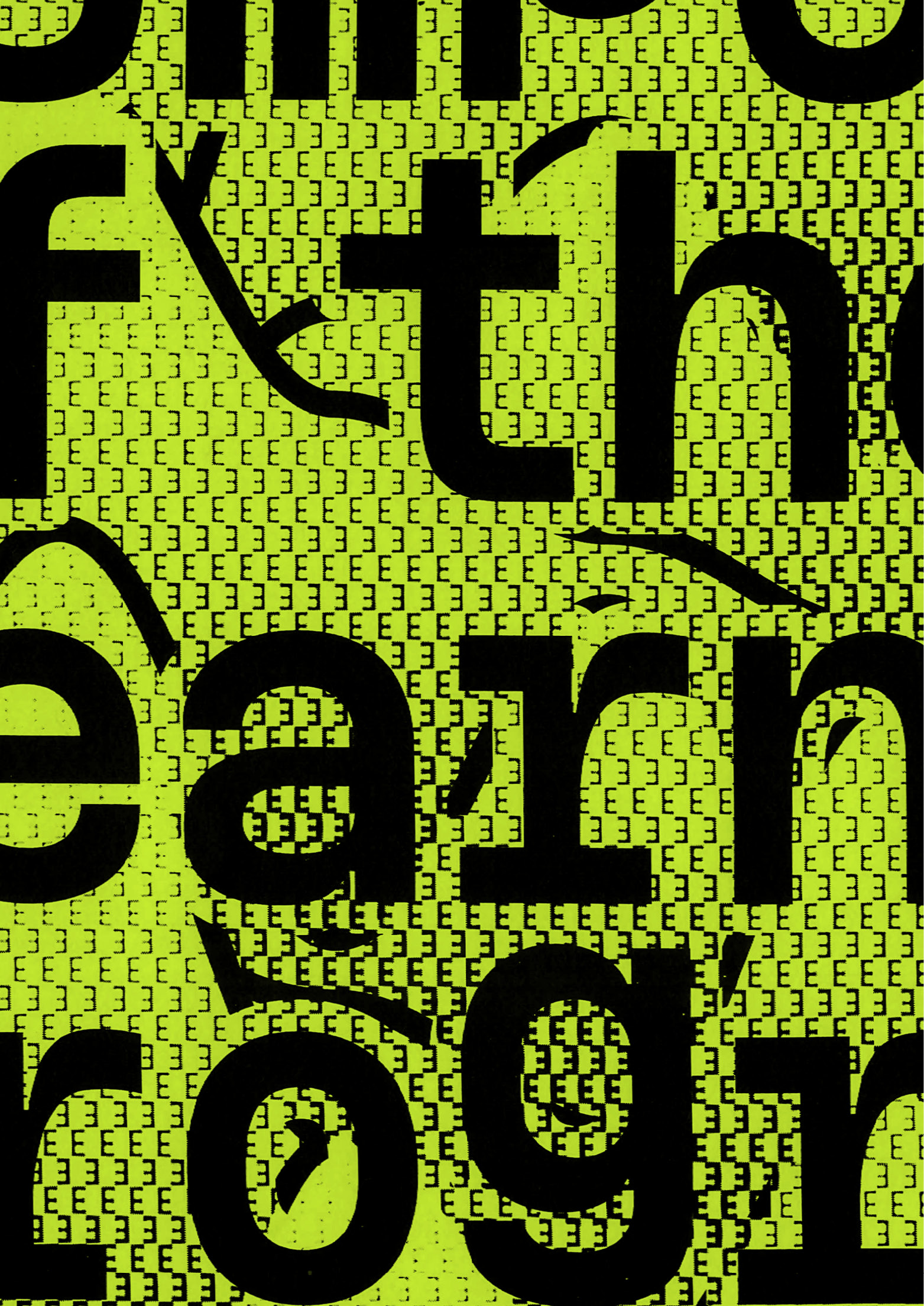
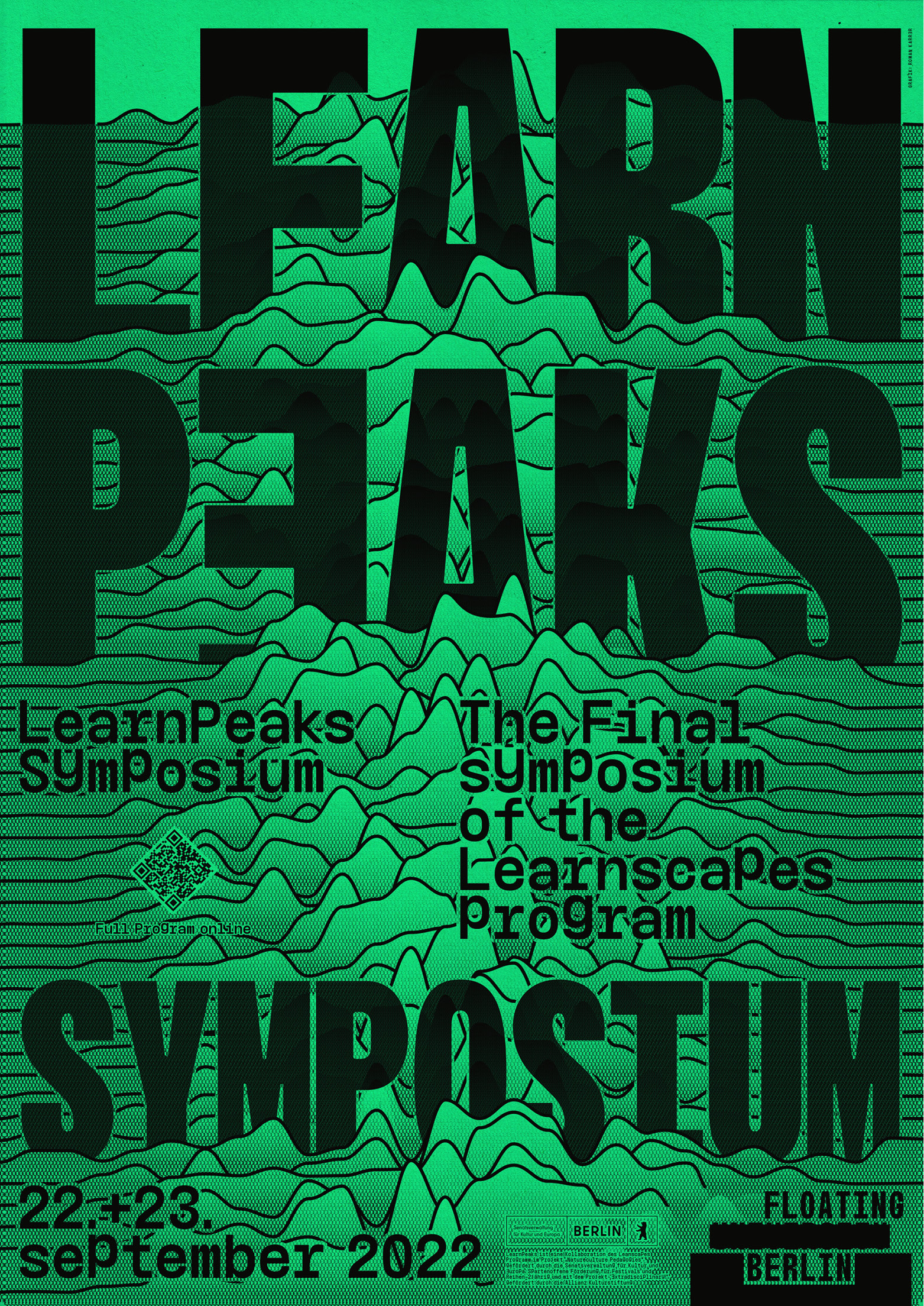
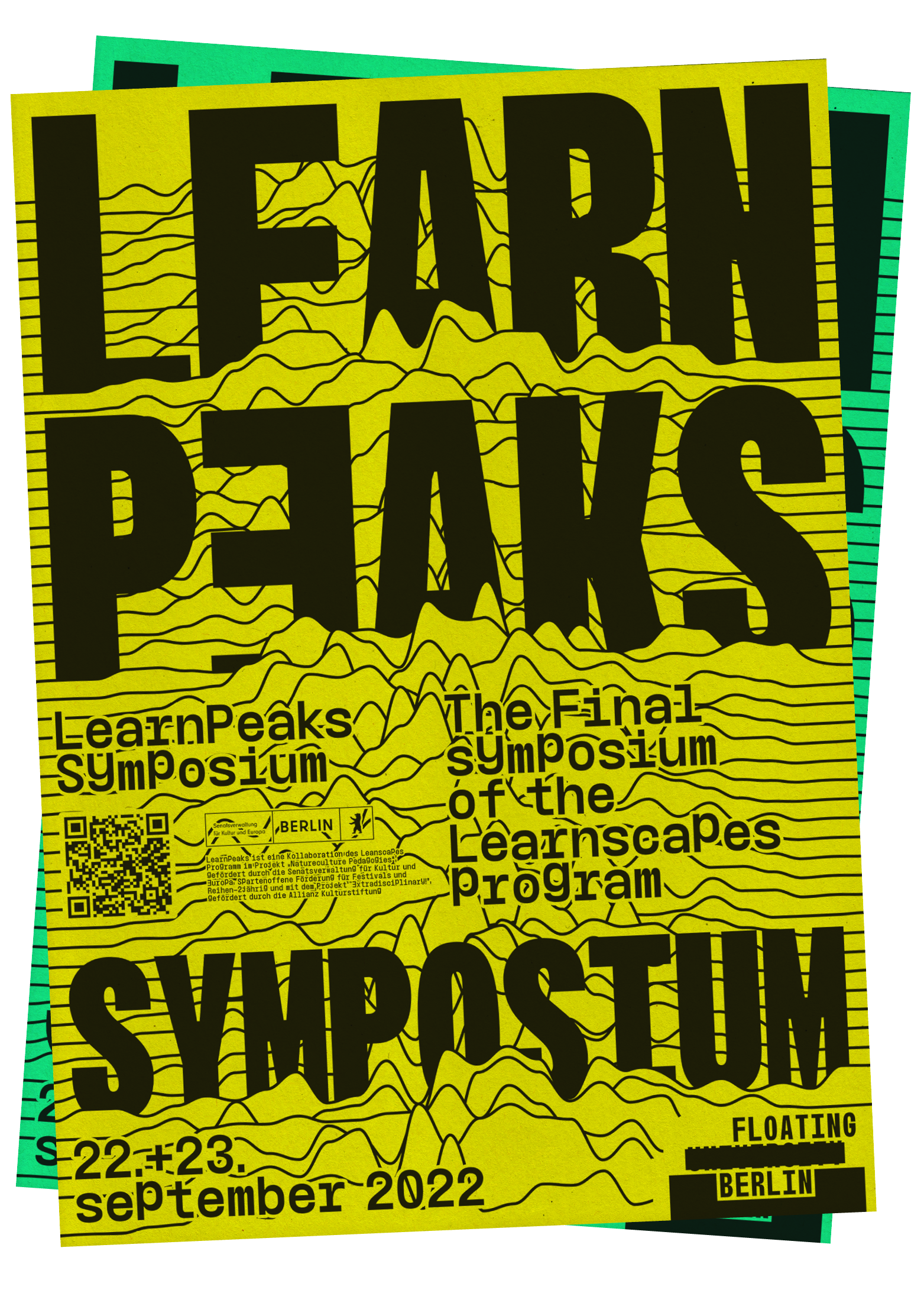
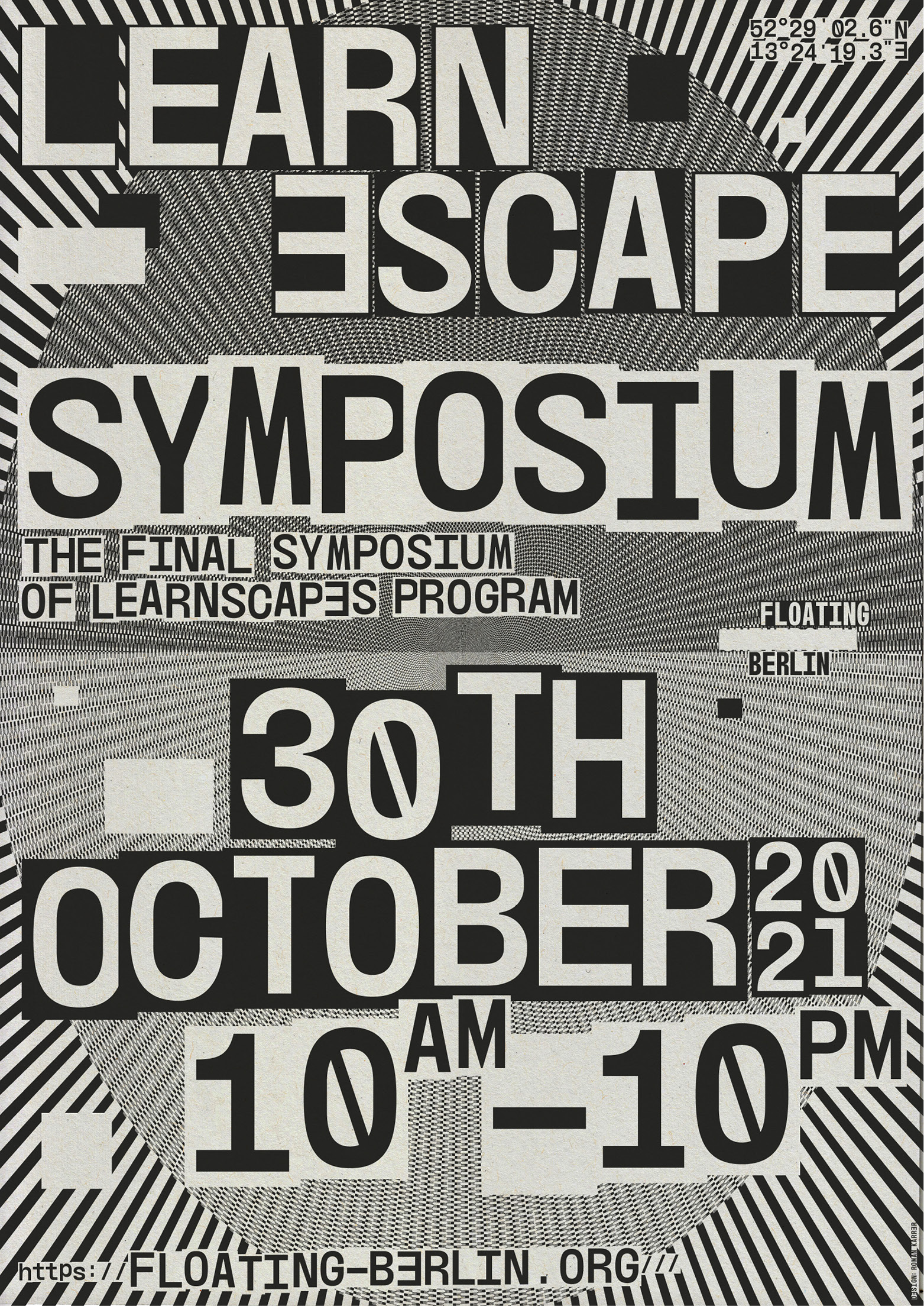
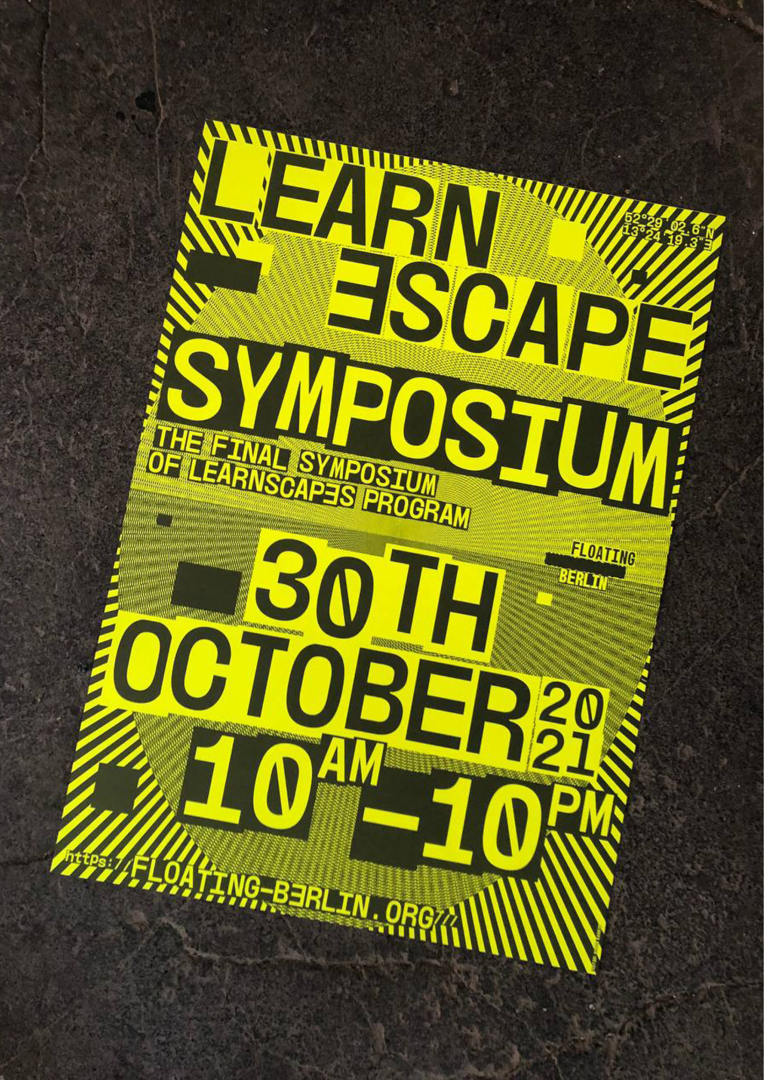
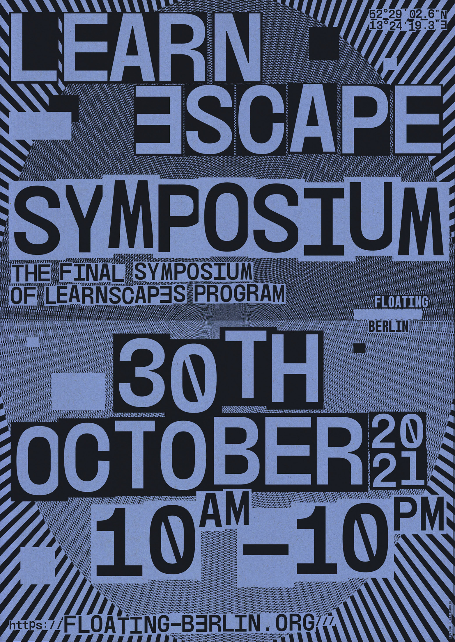
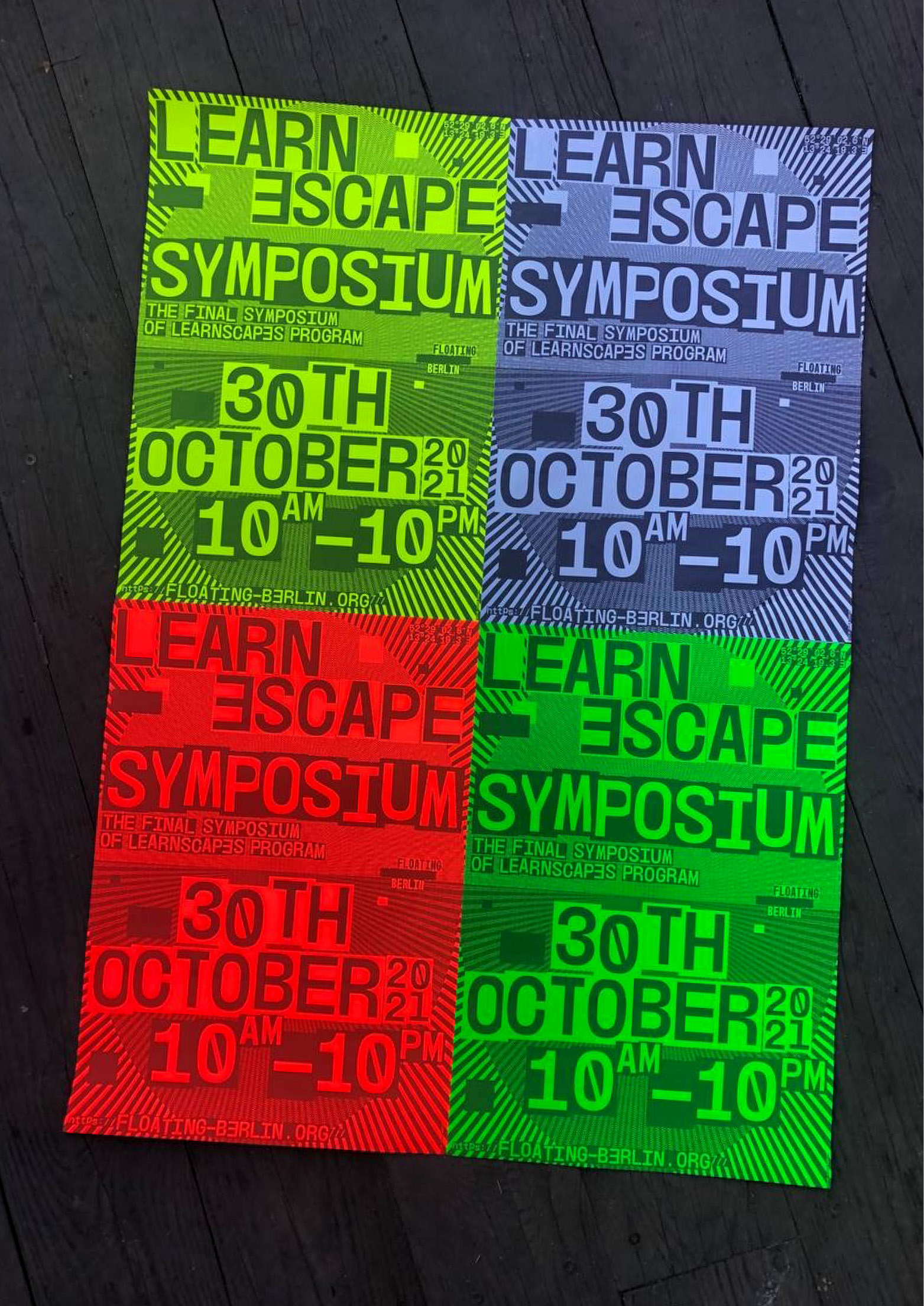
Yearly poster for the Learnscapes Program at Floating University Berlin. The black and white visual was printed on different neon-Papers.
2021, 2022, 2023, Poster Design, 594 × 841 mm
Contre Courant
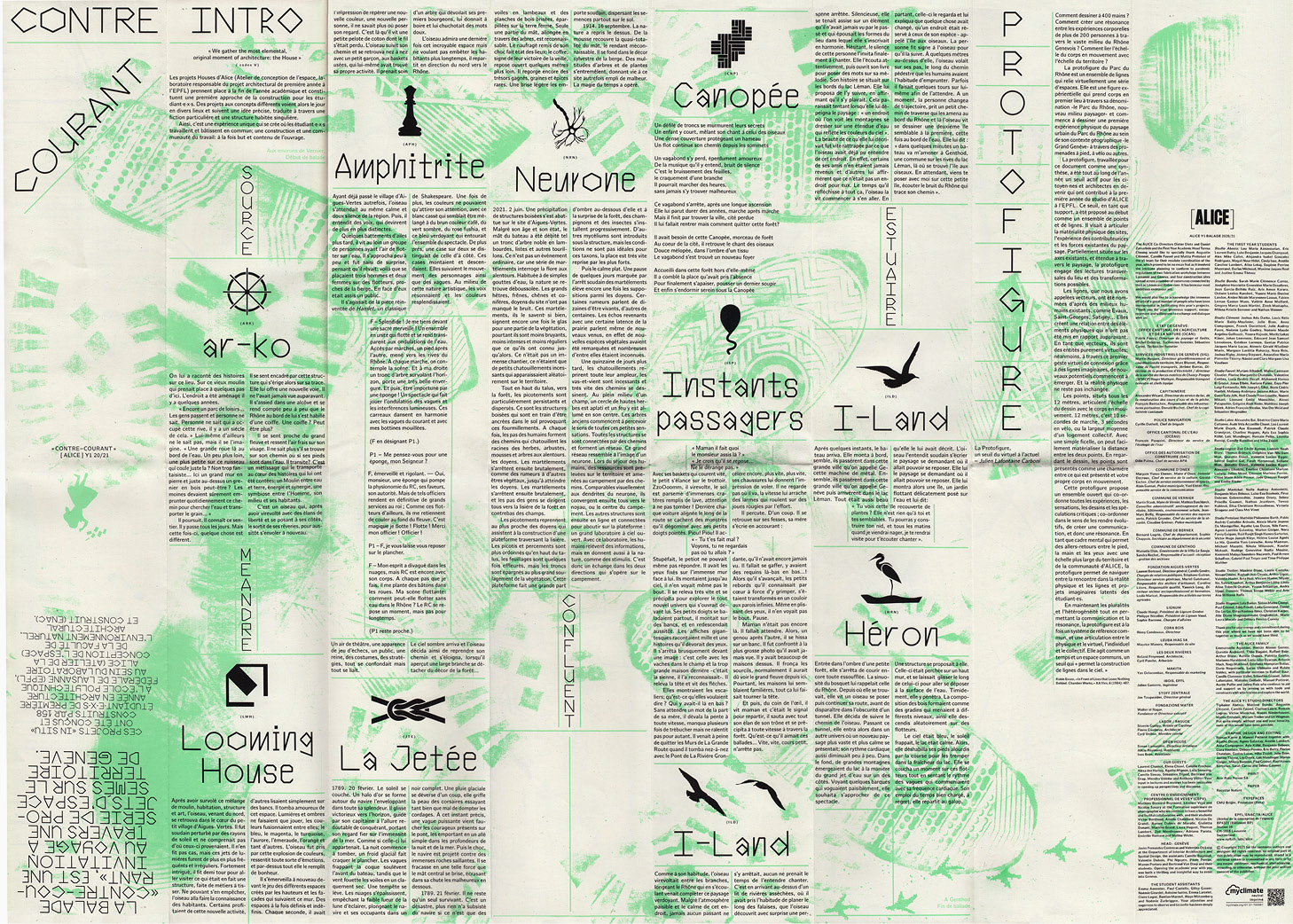
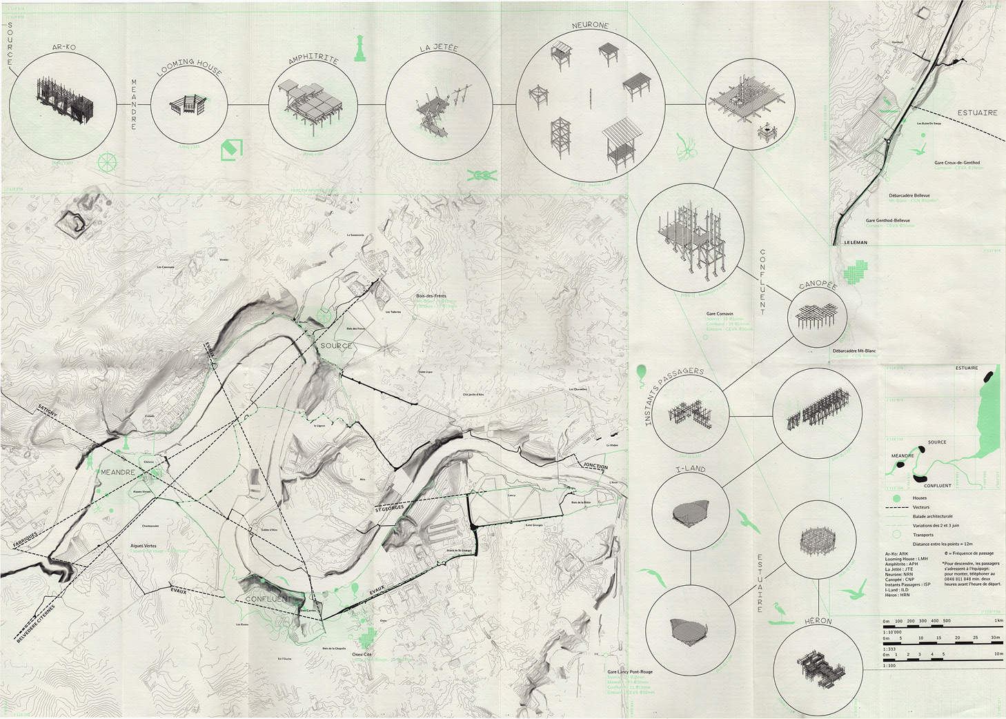
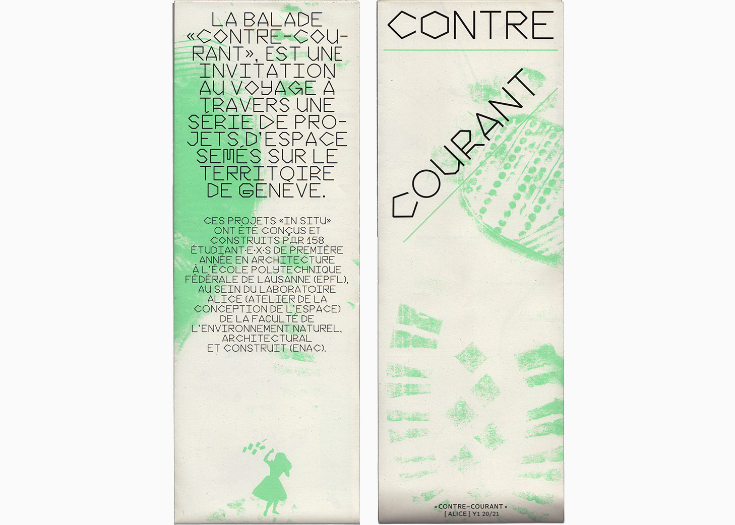
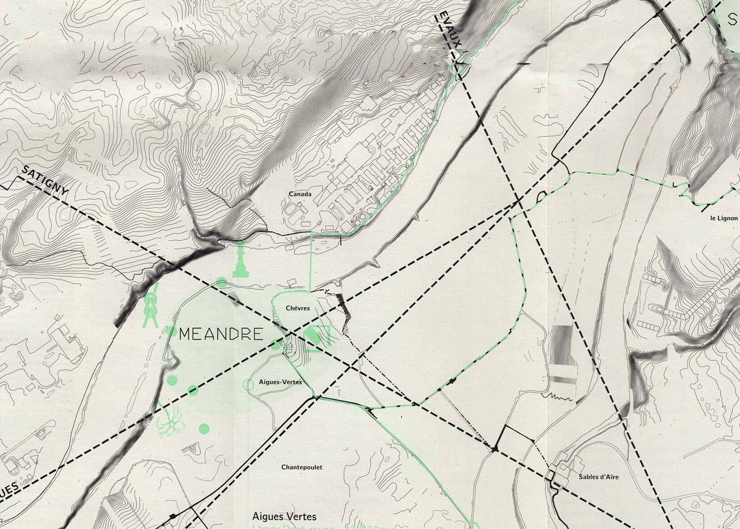
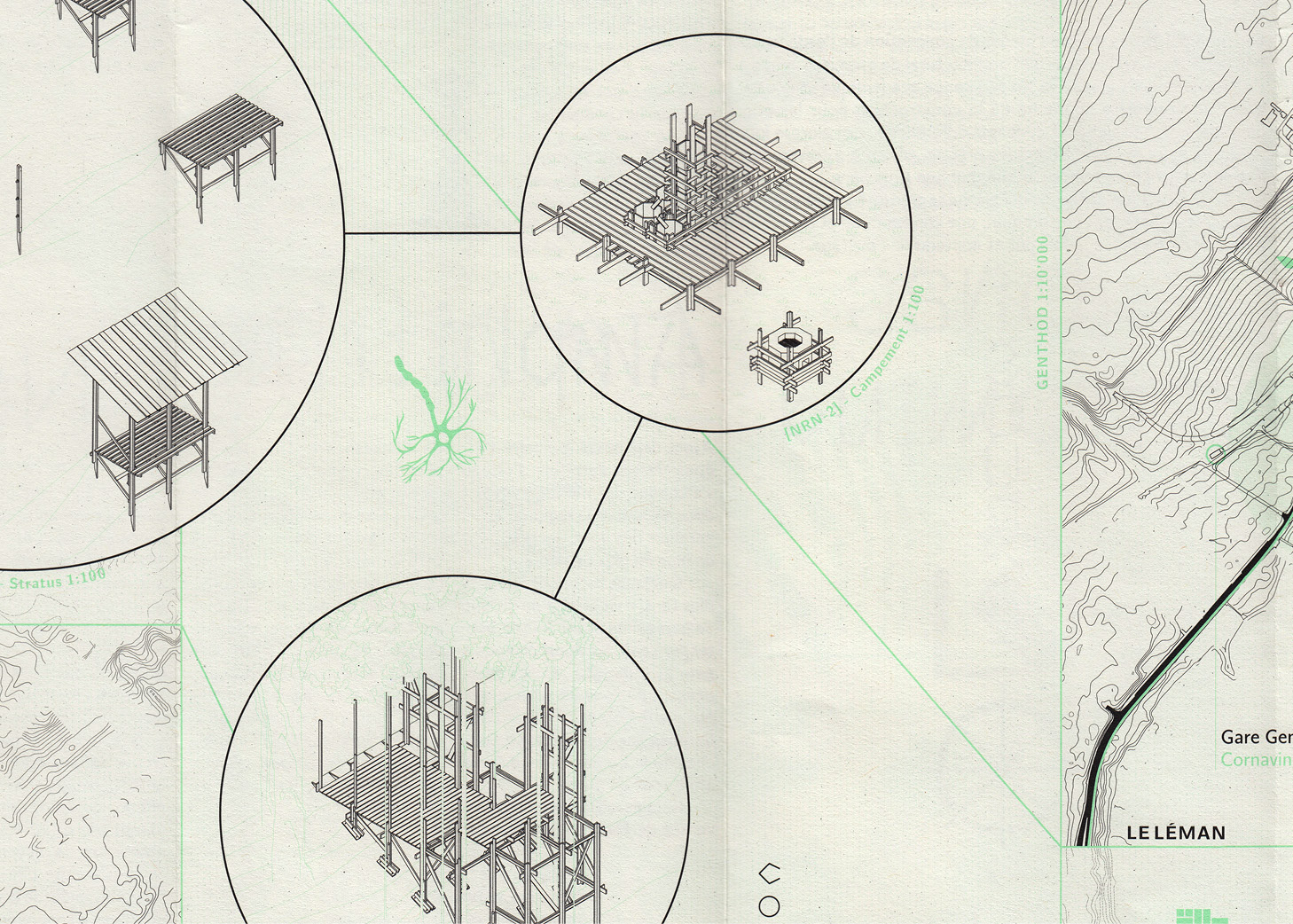
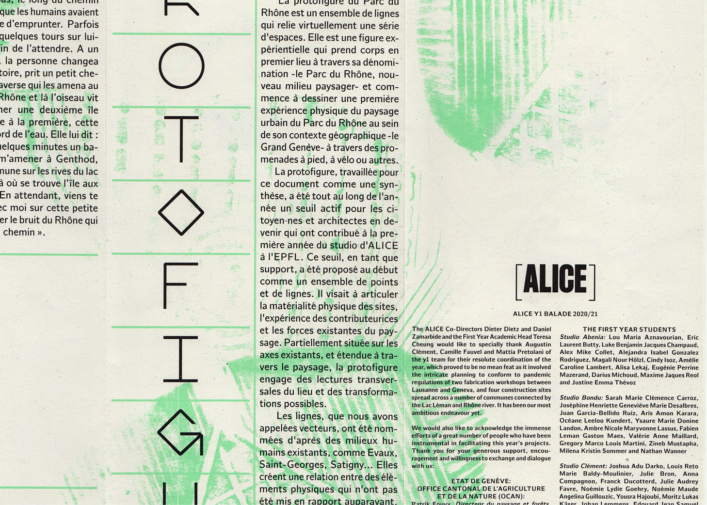
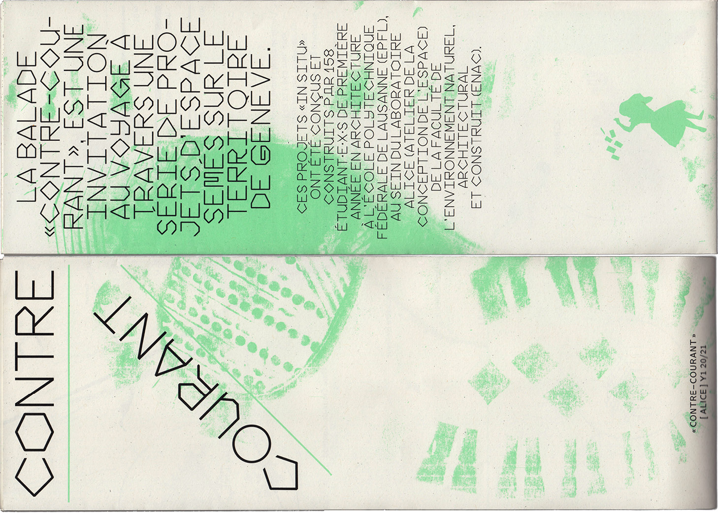
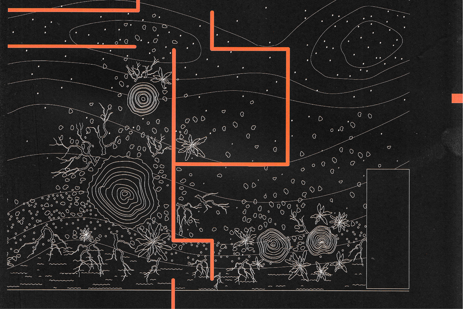
The map Contre-Courant was made with and for [ALICE] y1 20/21. The balade «Contre-Courant» is an invitation to wander through and inhabit a series of site-specific projects located across a series of four sites in the territory of Geneva that have been conceived and constructed by 158 first year architecture students studying at the Ecole Polytechnique Fédérale de Lausanne (EPFL) with the Laboratory of ALICE (Atelier de la conception de l’espace). Their Houses/Gardens take place on four different sites in Geneva: Genthod, Aigues-Vertes, Vernier and Onex.
Design and editing together with Manuel Potterat, Agathe Ducos, Agnes Galantay, Amélie Lambert, Anna Compagnon, Ayla Kölbl, Benjamin Beboux, Clara Vaudaux, Débora Pereira, Eric Butty, Florine Chatelain, Gustav Lucas, Hiba Znaidi, Julie Bron, Justine Thévoz, Léo Duyck, Loic Mundinger, Marion Gisiger , Milena Sommer, Paul Crisinel, Raúl Sartorius, Sarah Carroz and Selma Gaumet.
841 × 594 mm
Paper: Recystar Nature
Typefaces: CMU Bright, Prototype (Beta)
two-color offset print by Atar Roto Presse SA
2021
Monthly Program Floating University 2023


Monthly program leaflets foar Floating University 2023. Each one bilingual (en+de) printed in one colour riso on A4 double-sided and folded.
2023
Format: 210 × 297 mm, folded to 105 × 297 mm
Printing: Drucken3000, Berlin (Alexander Branczyk & Florian Haberstumpf)
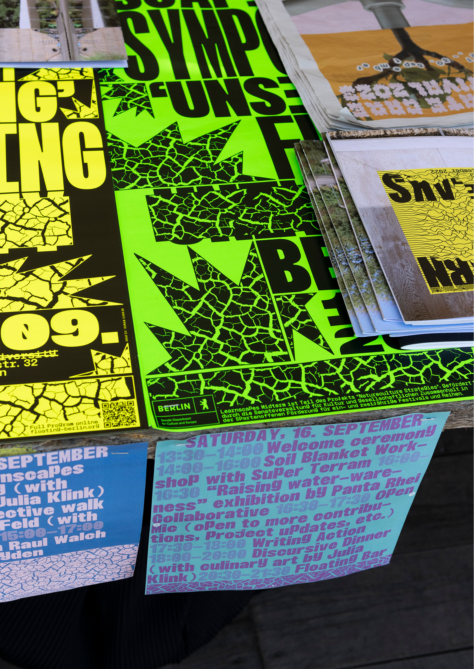
Unsealing Floating


Printed documentation for the The Learnscapes Program at Floating University in 2023, titled Unsealing. The Publication documents the collaborative exploration of transforming the site, where the vision of replacing the asphalt basin with a biologically filtering gravel system could allow for swimming, irrigation, and groundwater replenishment. The project was coordinated by Kristin Laz, Text editing + copywriting: Kristin Laz, Julia Klink, Image editing: Lisa van Heyden, Cover illustration: Kristin Laz, Photography + Illustrations: Kristin Laz, Rosa Merk, Raul Walch, Lena Löhnert, Markus Bader, Laura Bertelt, Lisa van Heyden, Club de Bridge.
Learnscapes 2023, Documentation
Typefaces: Minipax, FloatingMono
Print: trigger.medien.gmbh
Paper: one-sided yellow fluorescent paper
Format: 148 × 210 mm (A5)
Volume: 48 pages
Digital Version
Stadterweitern
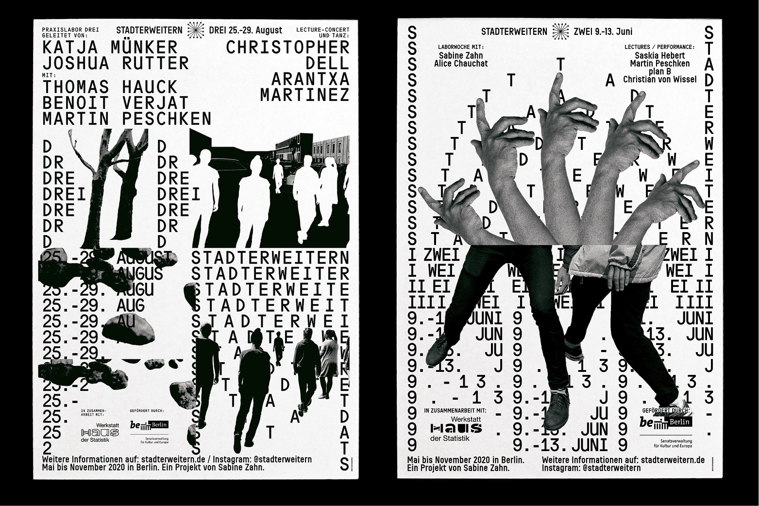
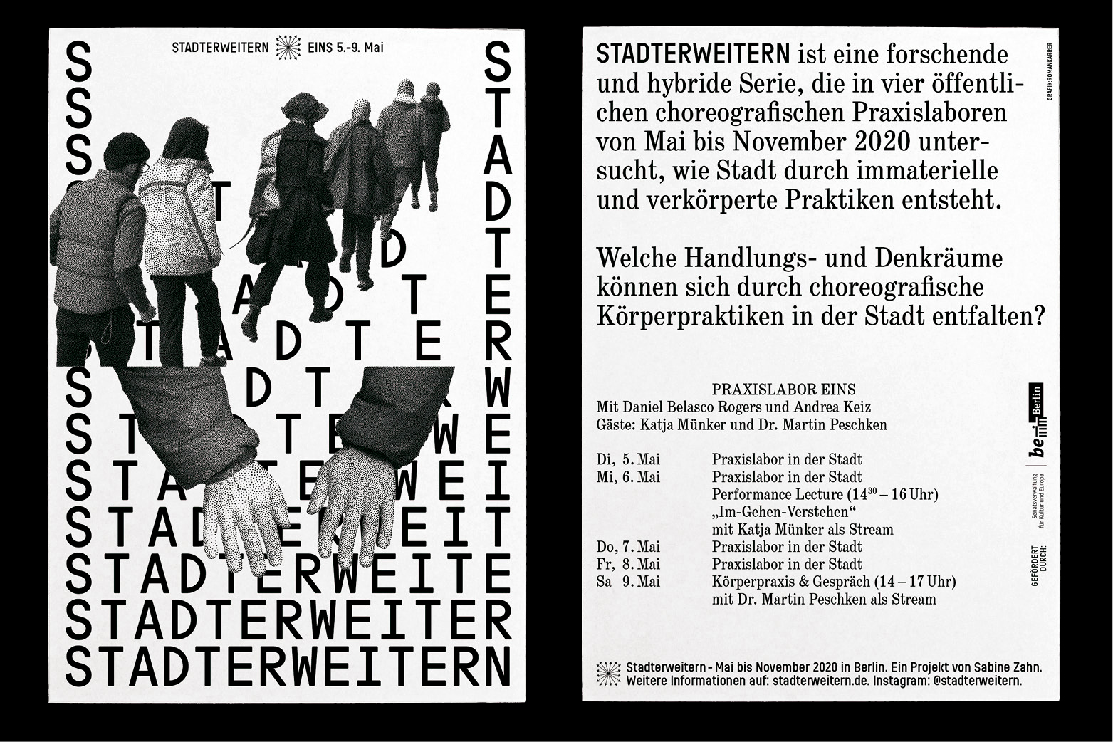
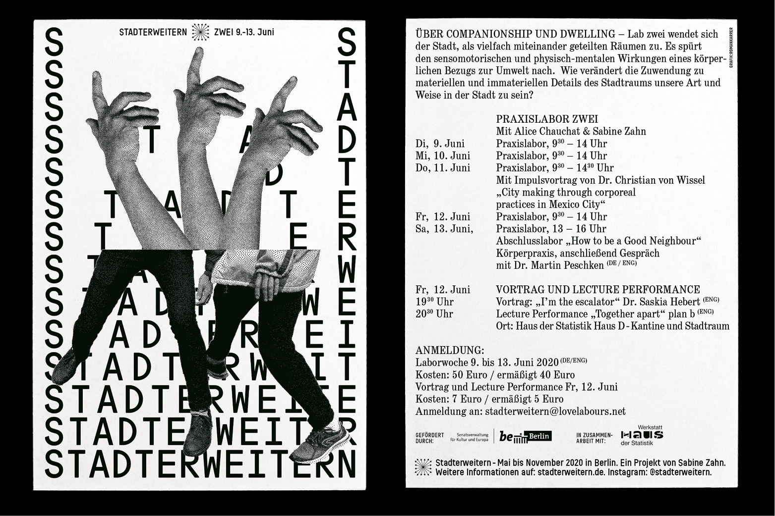
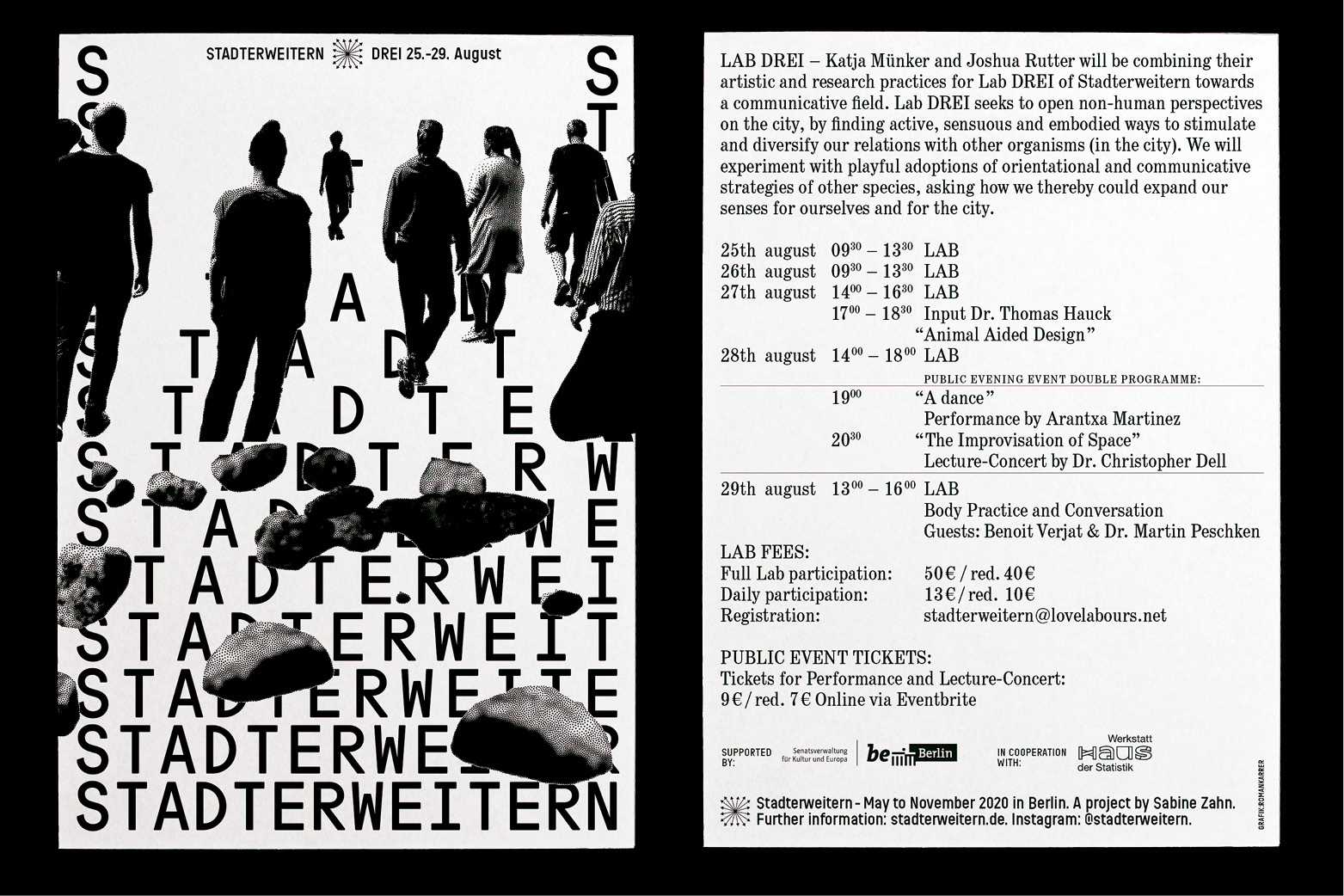
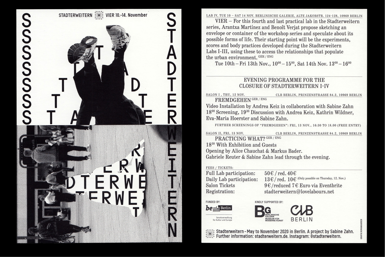
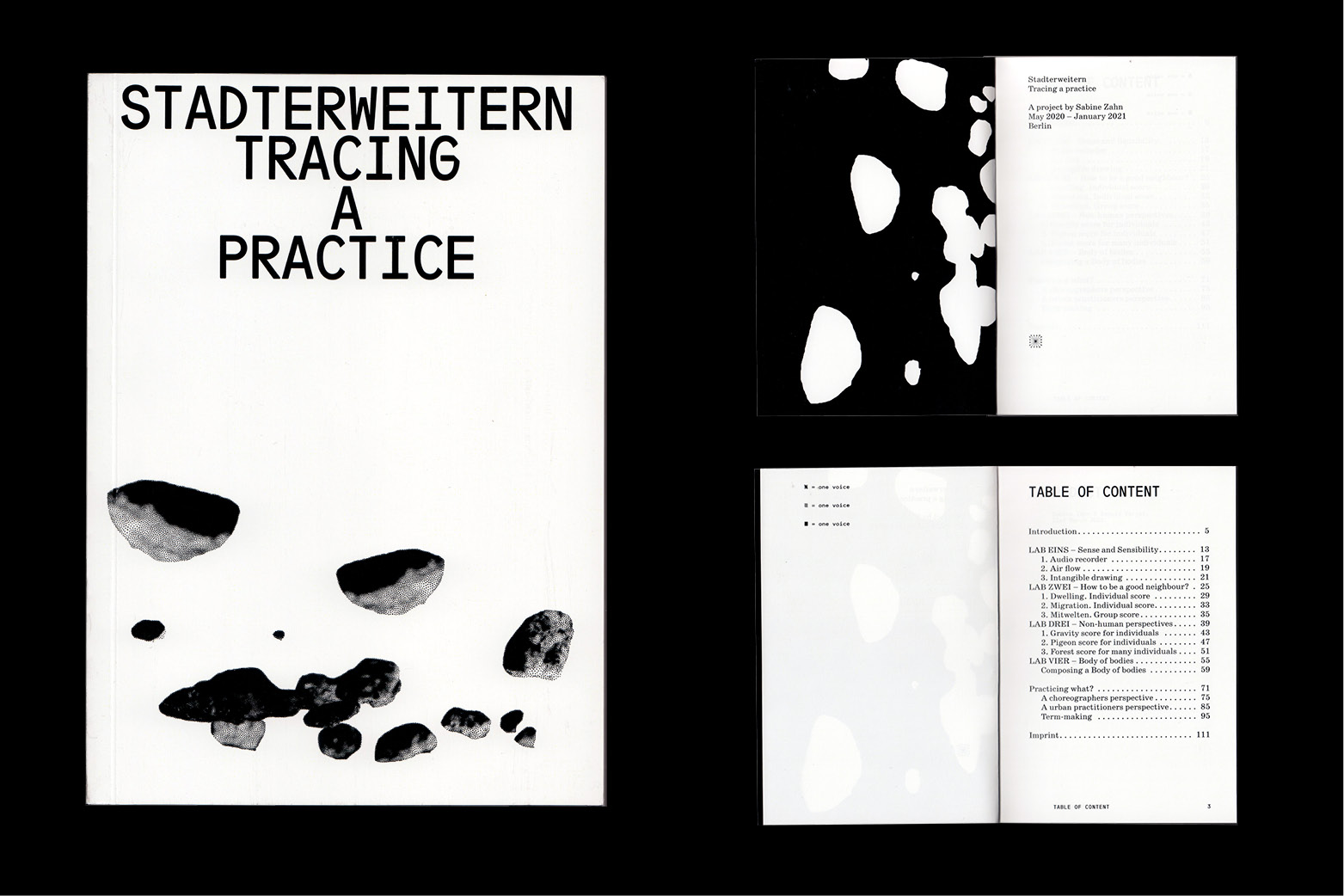
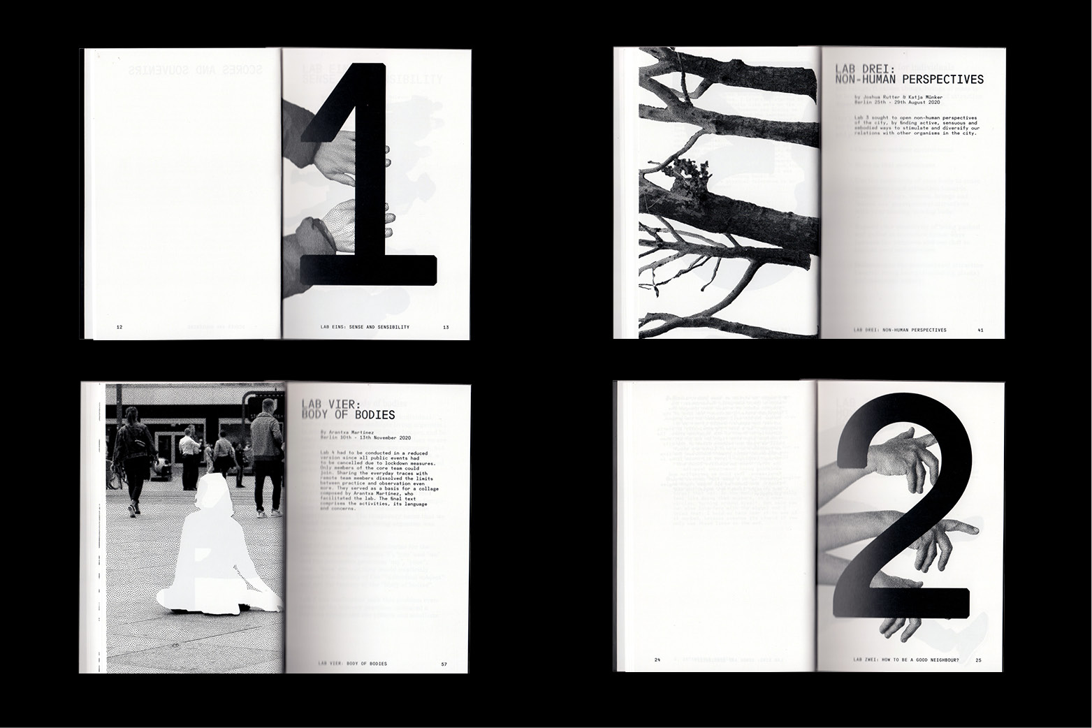
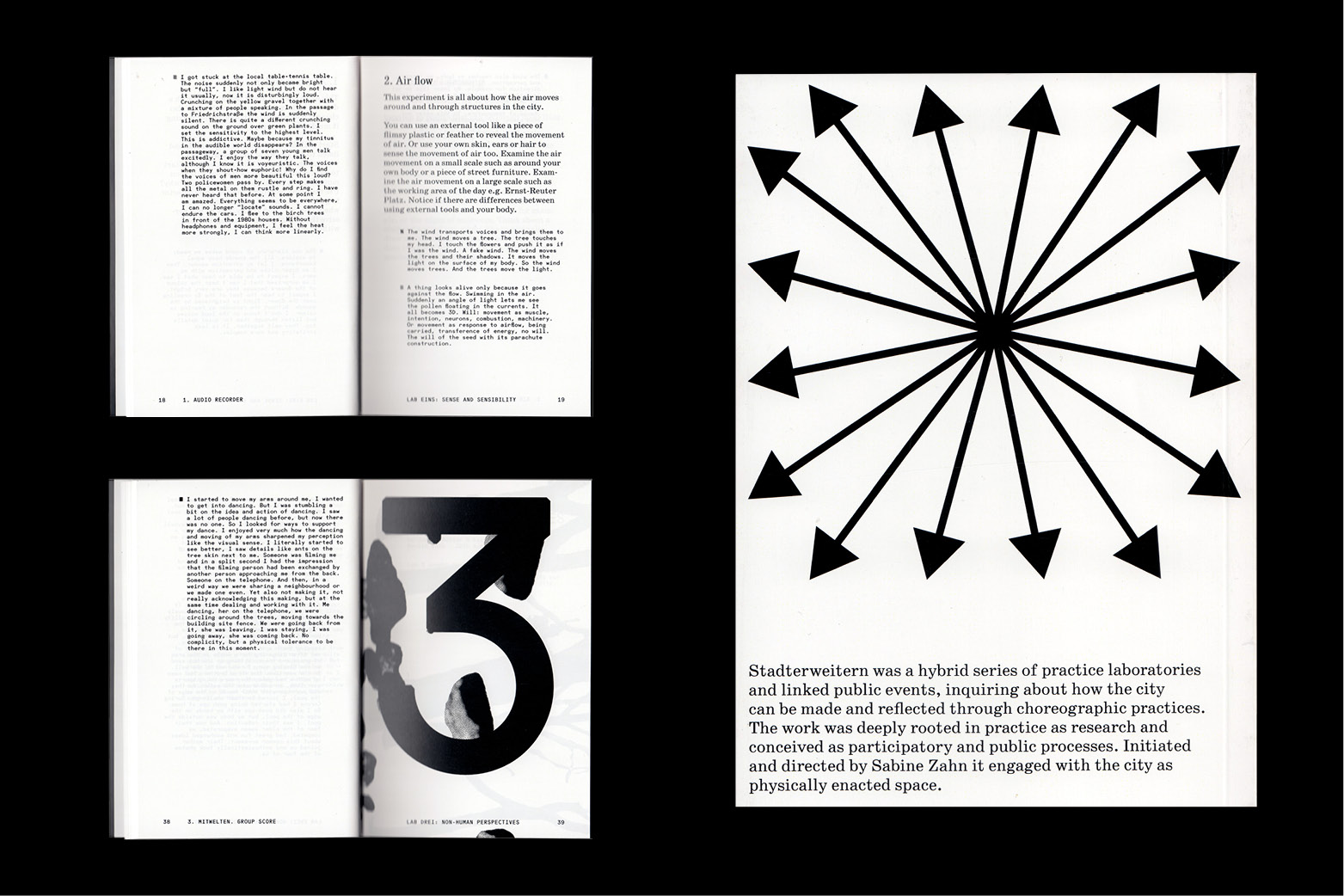
Visual Identity for a Project by Sabine Zahn. Stadterweitern is an exploratory and hybrid series of events that addresses the question of how the city is made through immaterial and embodied practices. Stadterweitern focuses on concrete aesthetic and choreographic practices. Applied to urban space, the aim is to unfold spaces of possibility for the life of the city, for thinking about and designing the city.
The format practices, trains, develops and unfolds a way of dealing with the complexity of physical co-existence in the city. This approach is experimental and open, characterized by a somatic and playful understanding of development processes and an exploratory attitude. Instead of expanding the city physically beyond the city limits through new housing developments, as was the case in the 19th century, possibilities for expansion through an extended approach to the city are practised and named.
2020, Communication, Printed Matter, Website, Social Media
FLOATING UNIVƎRSITY 2021
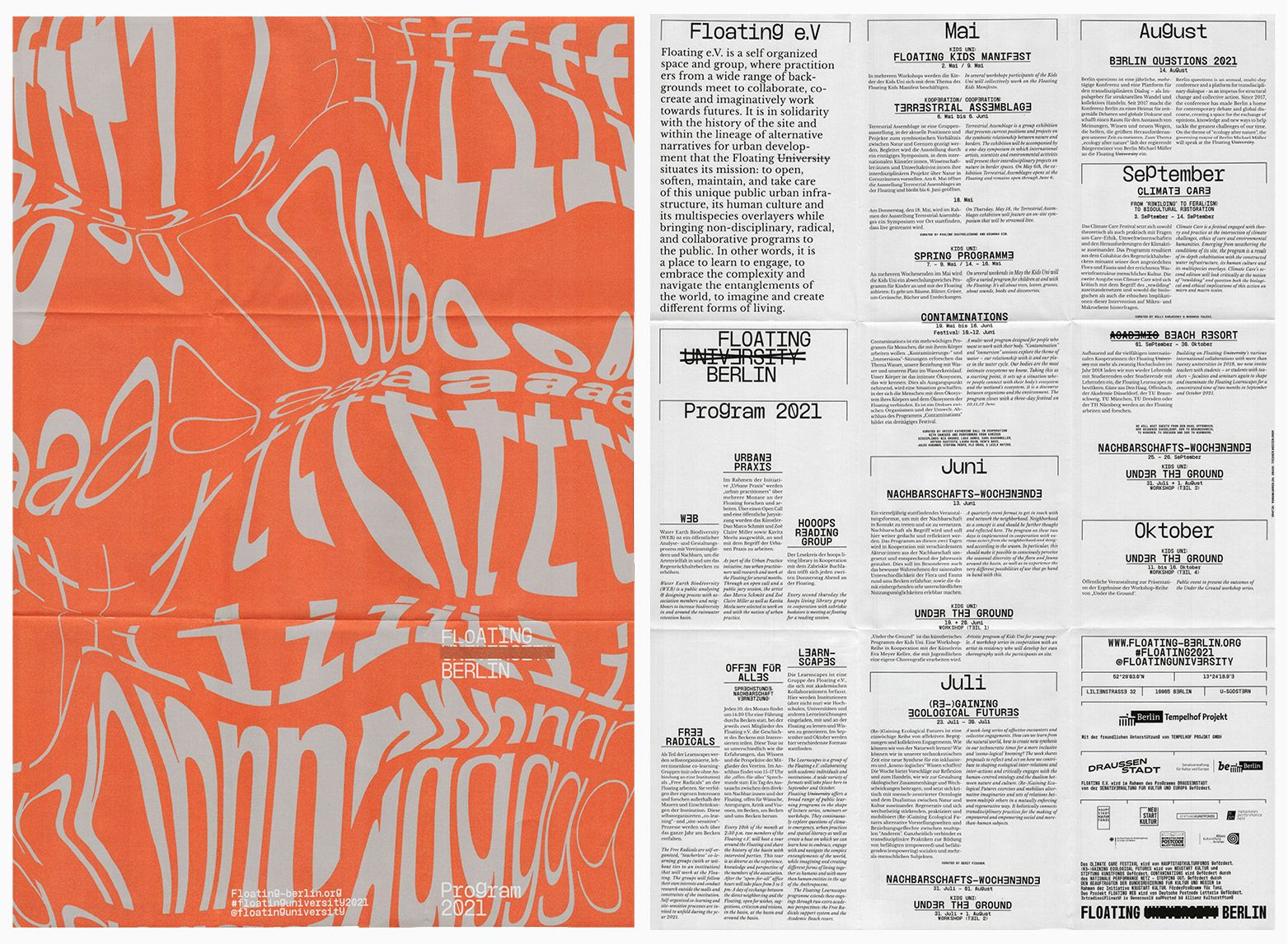
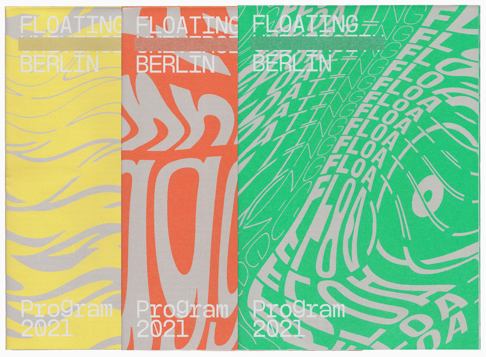
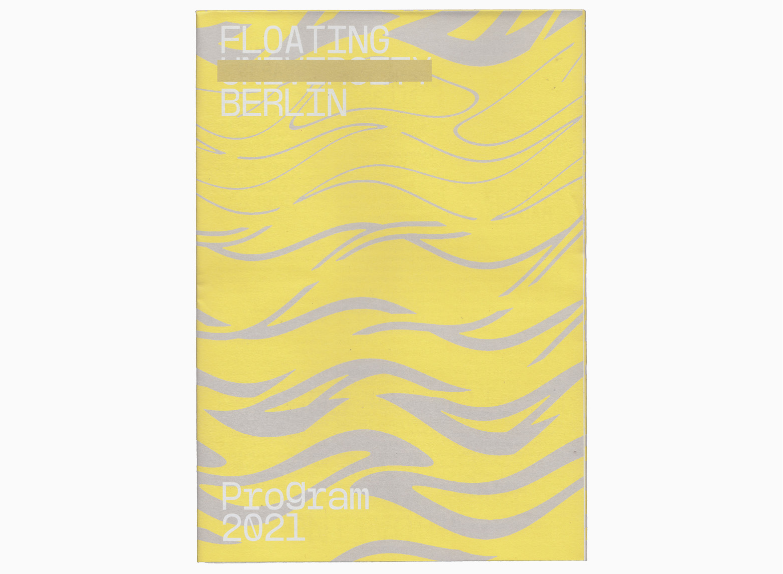
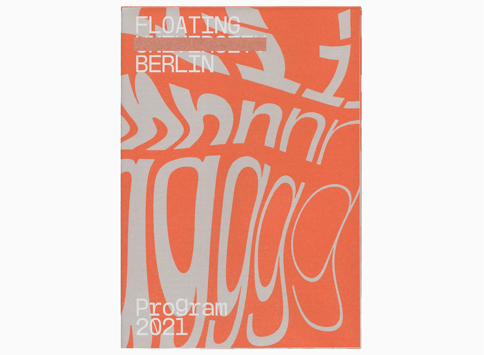
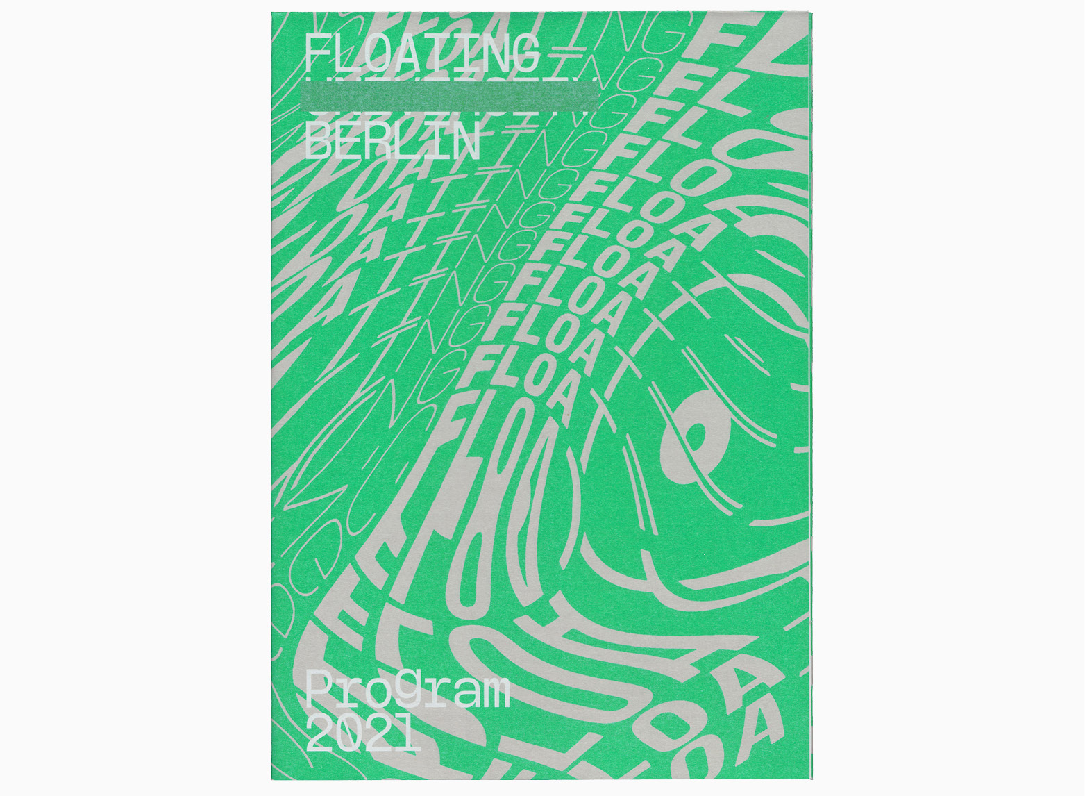
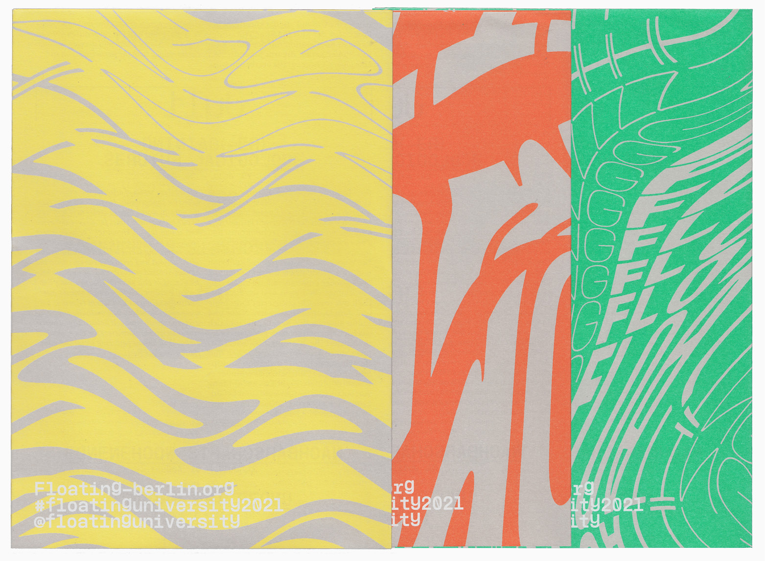
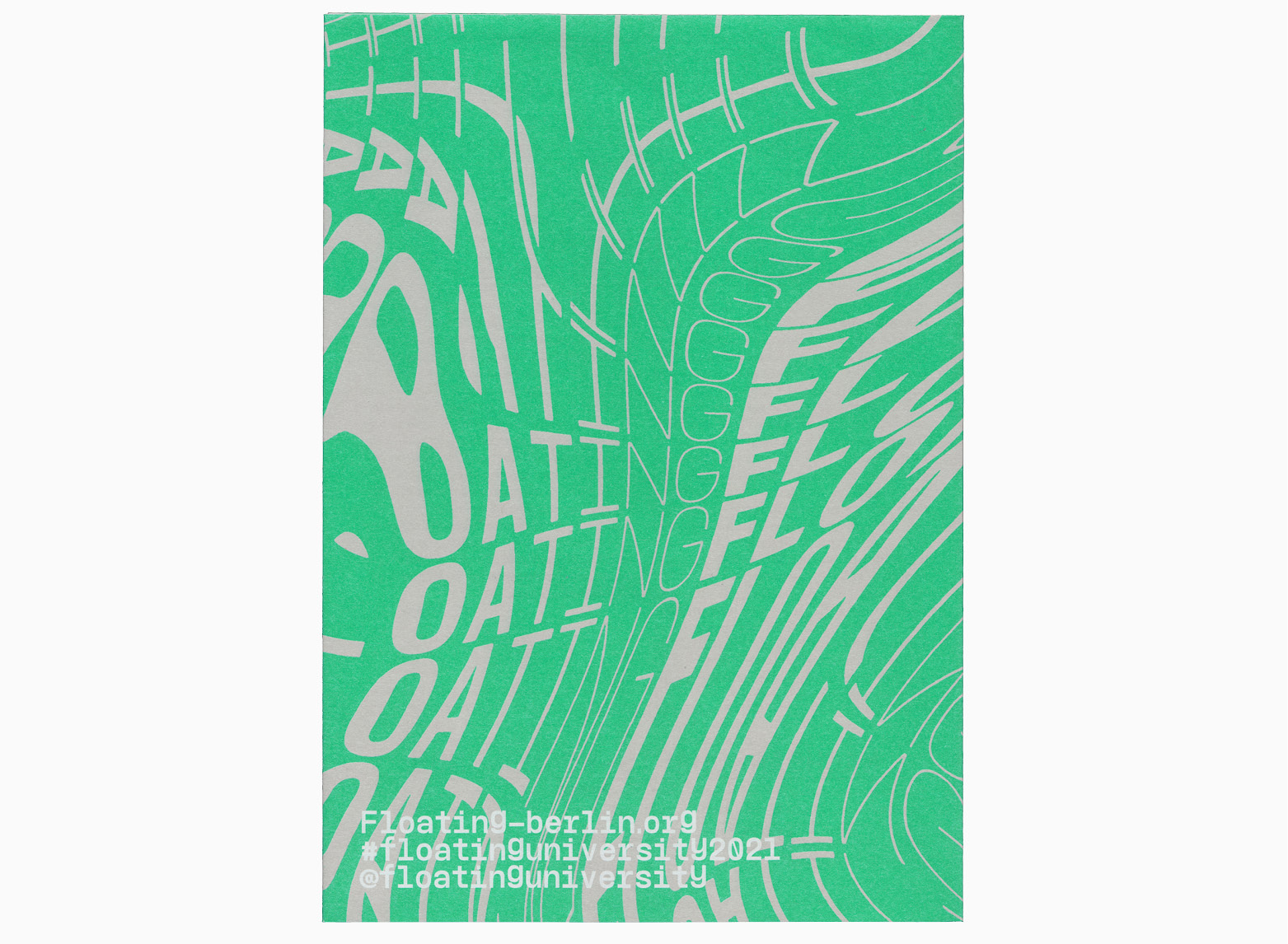
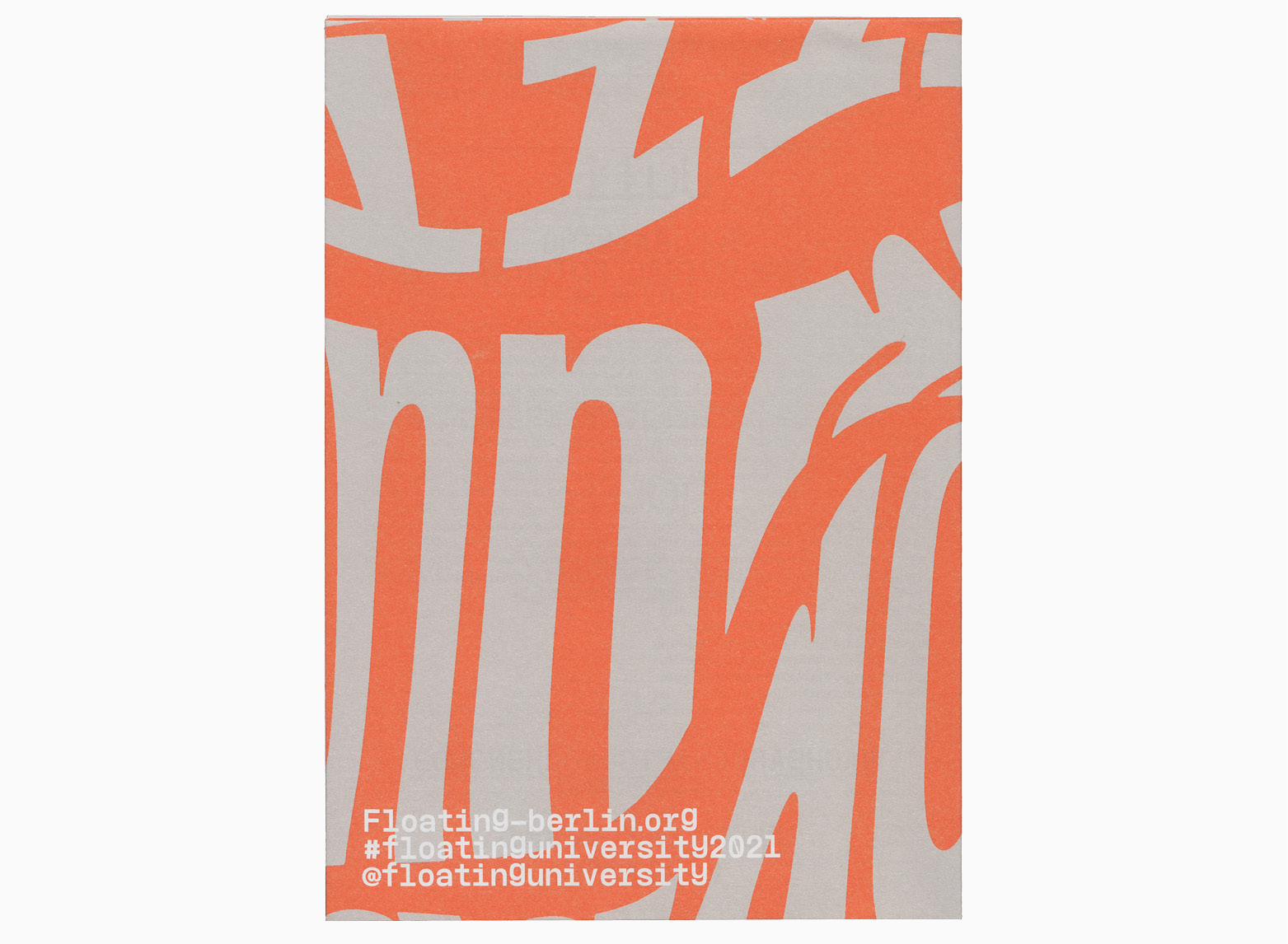
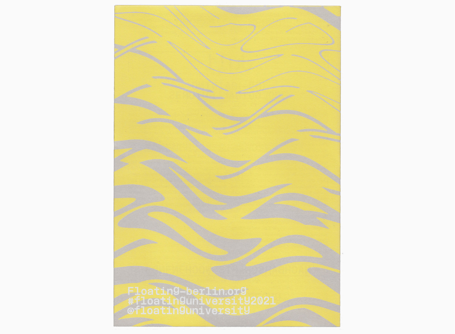
Printed annual program for Floating University 2021. The leaflet provided an overview of the various programs and activities of the Floating e.V. during the open season.
The folded poster was printed with three different typographic compositions on the frontside and a steady backside for the information layer.
420 × 594 mm (unfolded)
140 × 198 mm (folded)
Typefaces:
Floating Mono, Libre Baskerville
Offset print by Trigger.Medien.Gmbh
2021
CLIMATƎ CARE
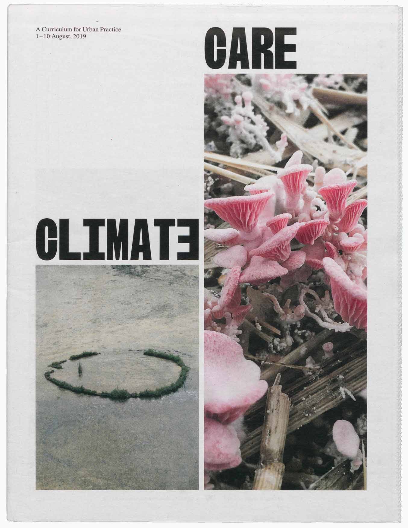
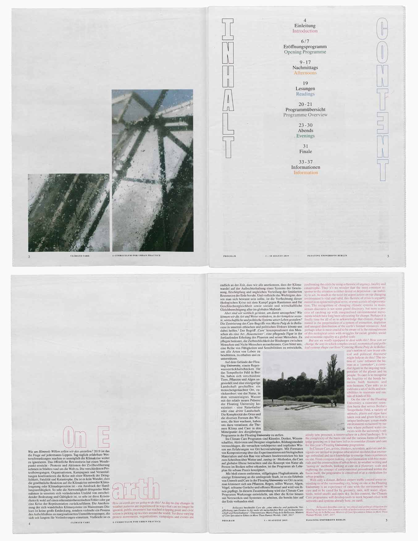
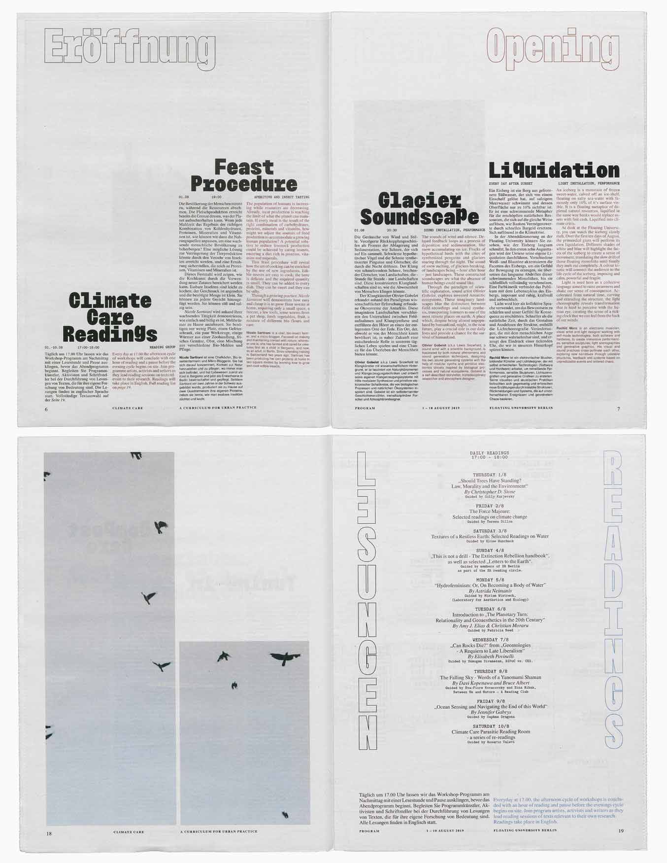
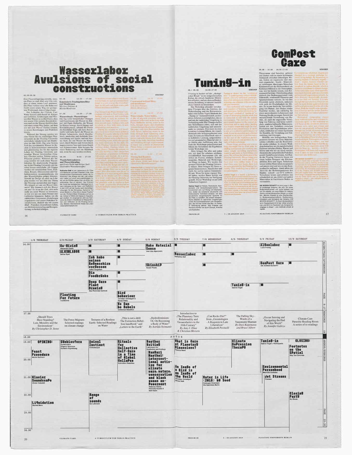


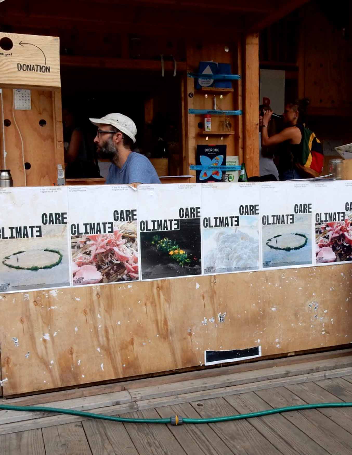
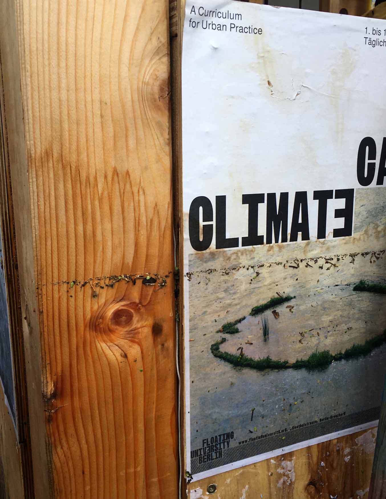
Communication and Identity for Climate Care – A curriculum for Urban Practice. The Format was curated by Gilly Karjevsky & Rosario Talevi for the Floating e.V. August 1-10, 2019. The Festival explored correlations between environment, urban practice, art and education by devising a program for climate challenges. In this context, I was asked to design the various communication media and social media content. In collaboration with ATLAS/STUDIO, a digital archive was created to archive the project and make the acquired knowledge accessible independently of time and space.
2019, Identity, Communication, Storytelling, Archiving
VoteTogether.eu
Vote together is a project that encourages voters to participate in the 2019 European elections and to spread awareness of these elections and their importance in the face of the ever-increasing power of populism and nationalism across Europe. As a consequence of my participation in the Eurolab (2018), which took place in the framework of the biennial Forum on European Culture, I was invited by Between Bridges to support the campaign conception and implementation. The process and the people I got to know inspired and touched me a lot. It was a pleasure to be a part.
2019, Political Campaign
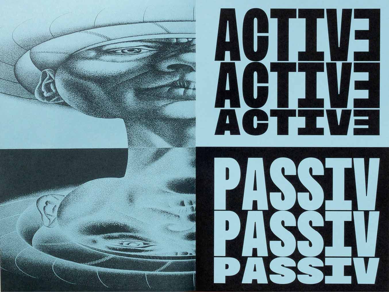
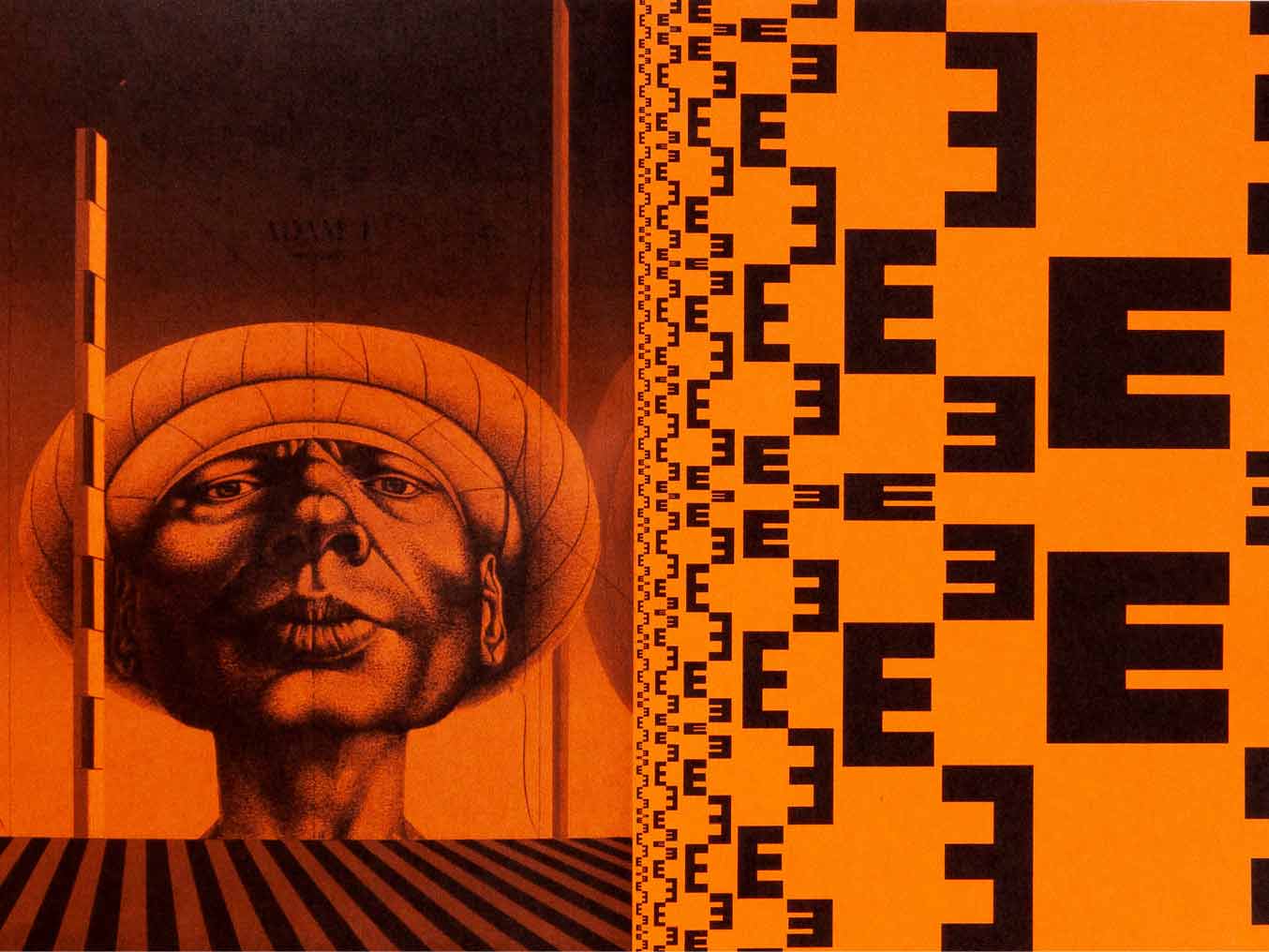
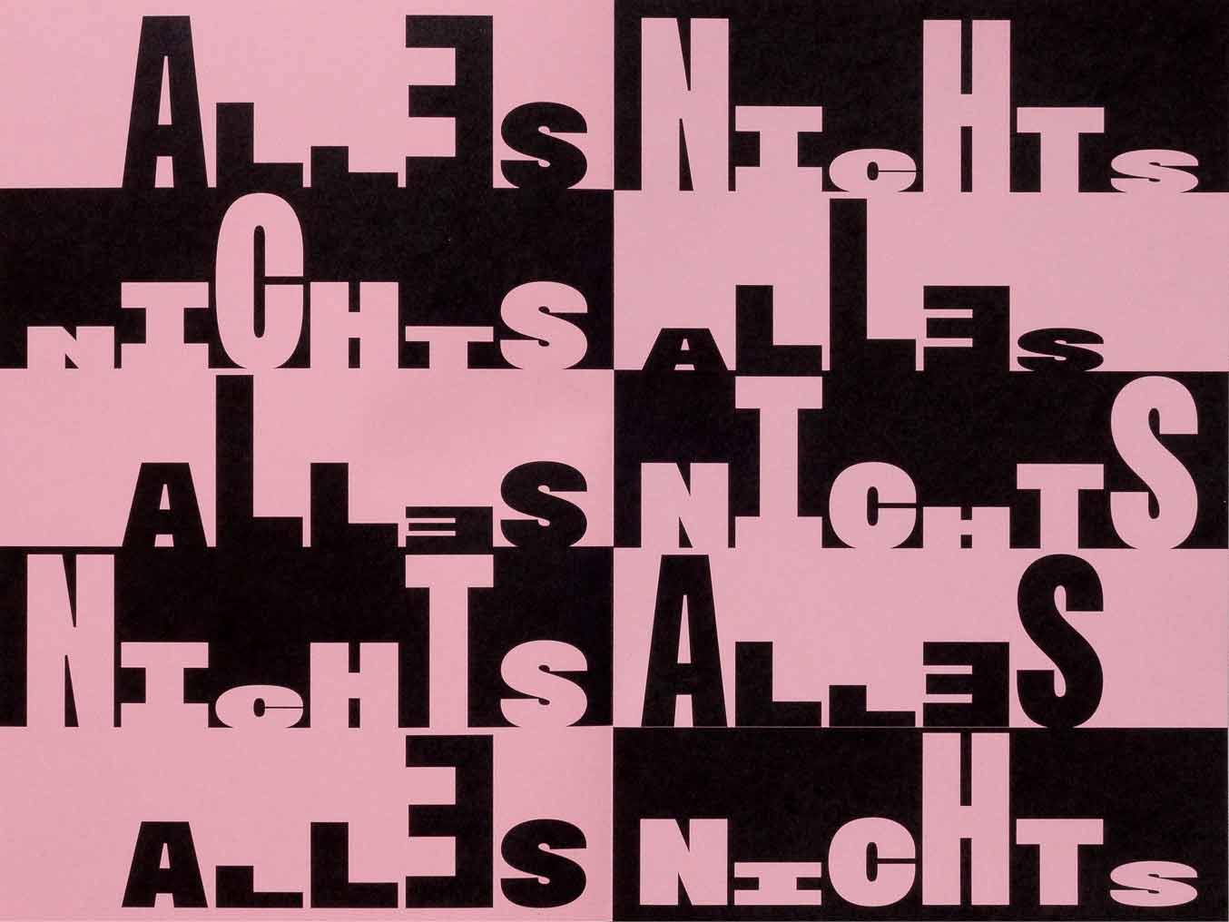
L’homme construit
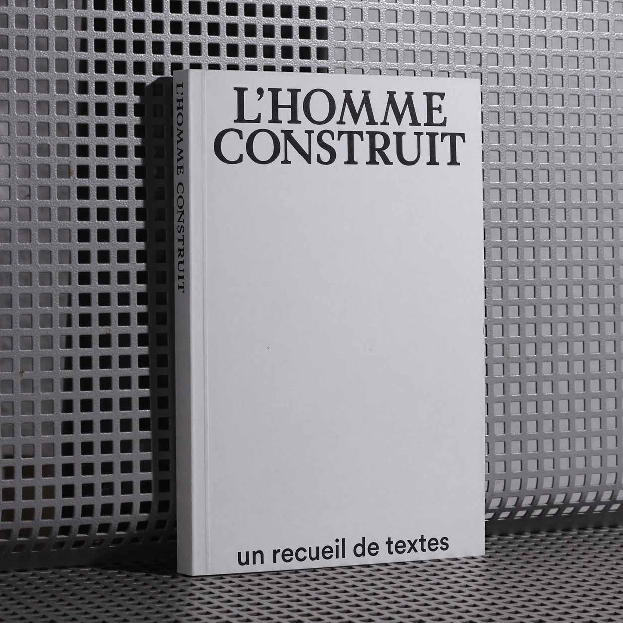
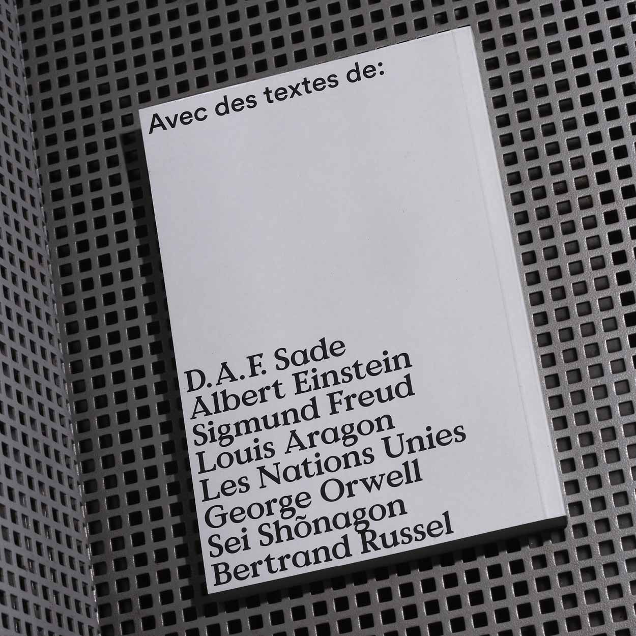
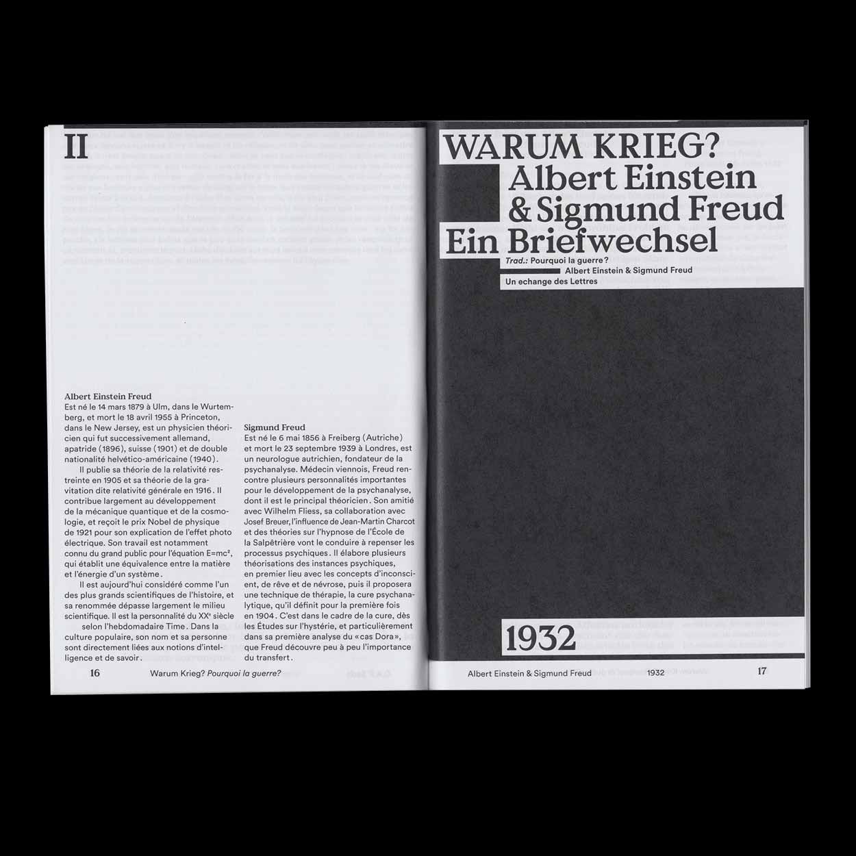
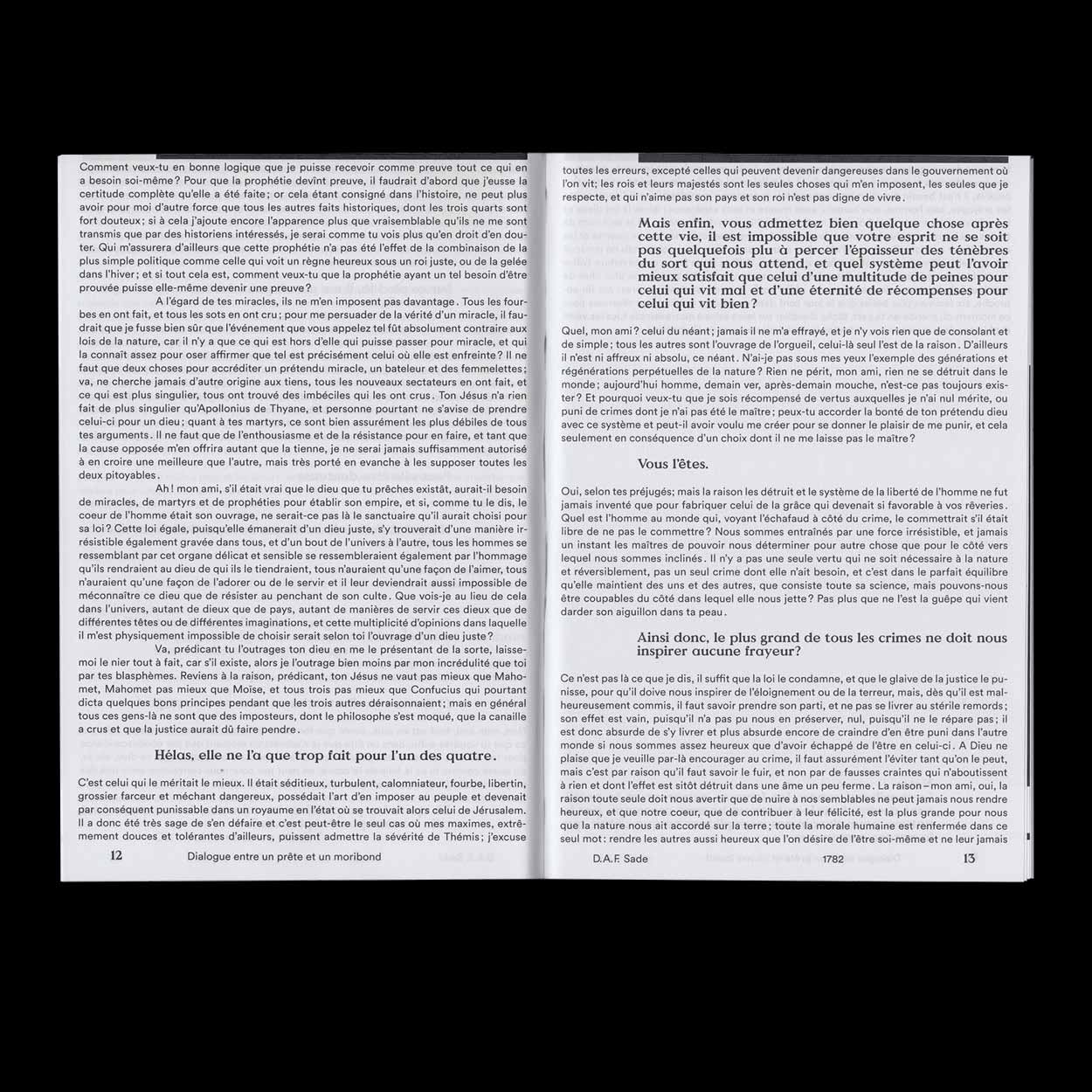
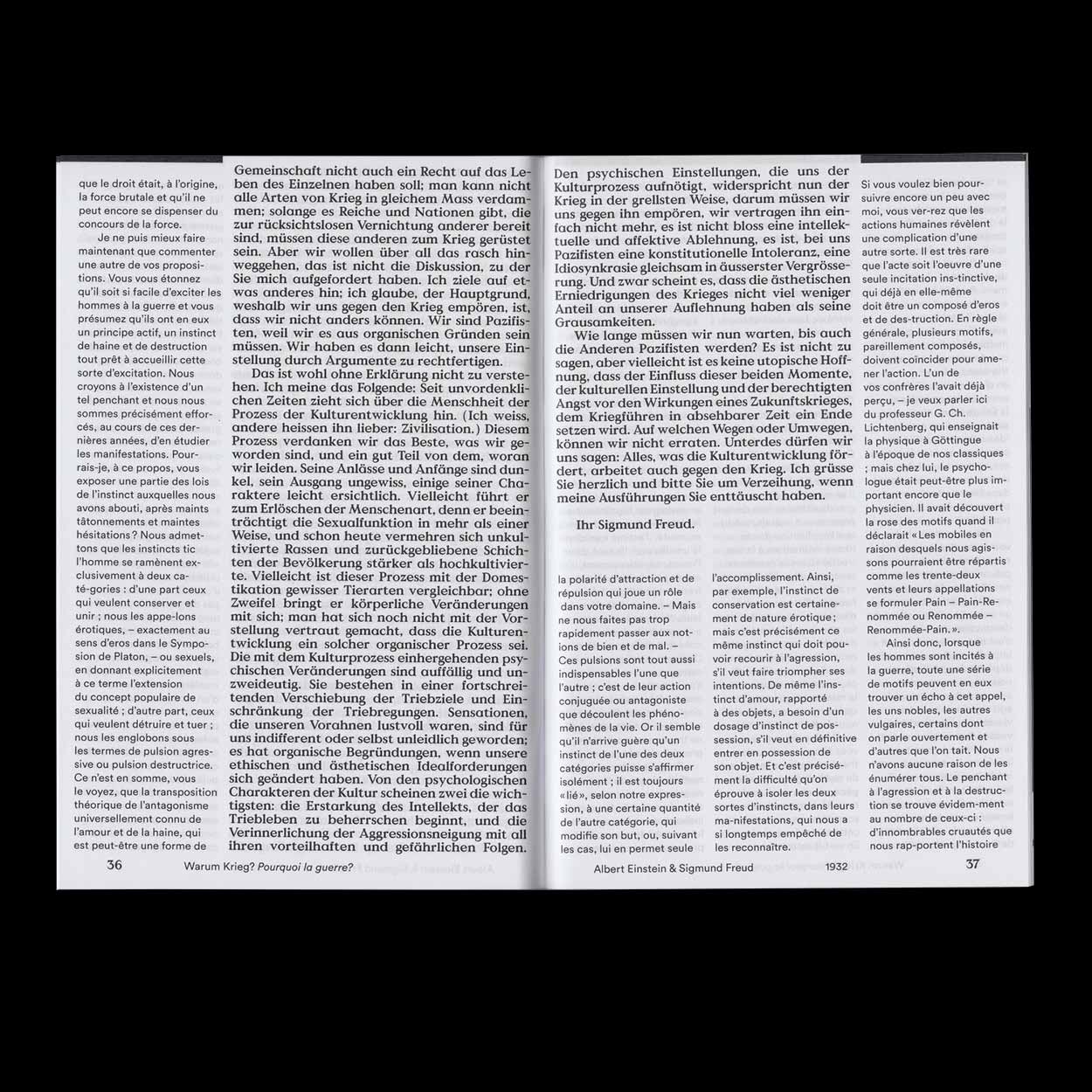
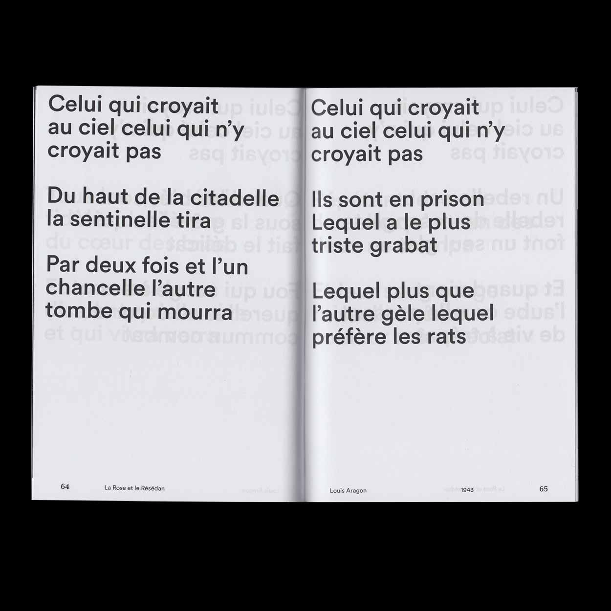
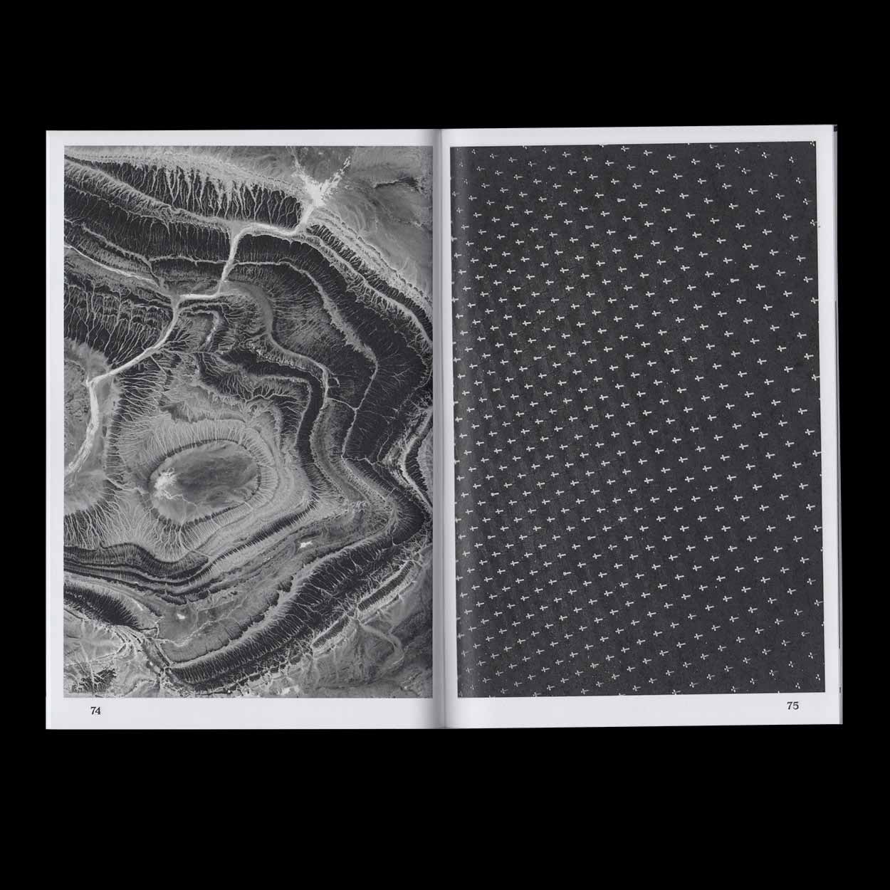
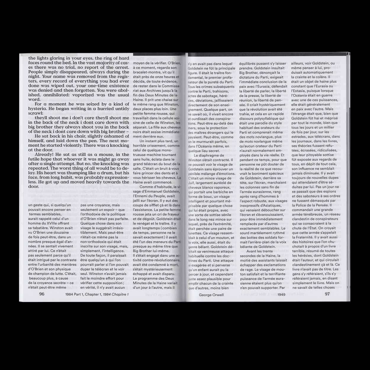
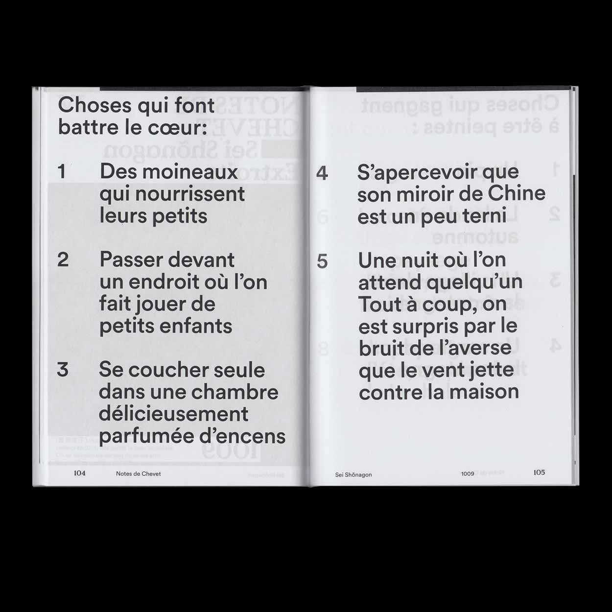
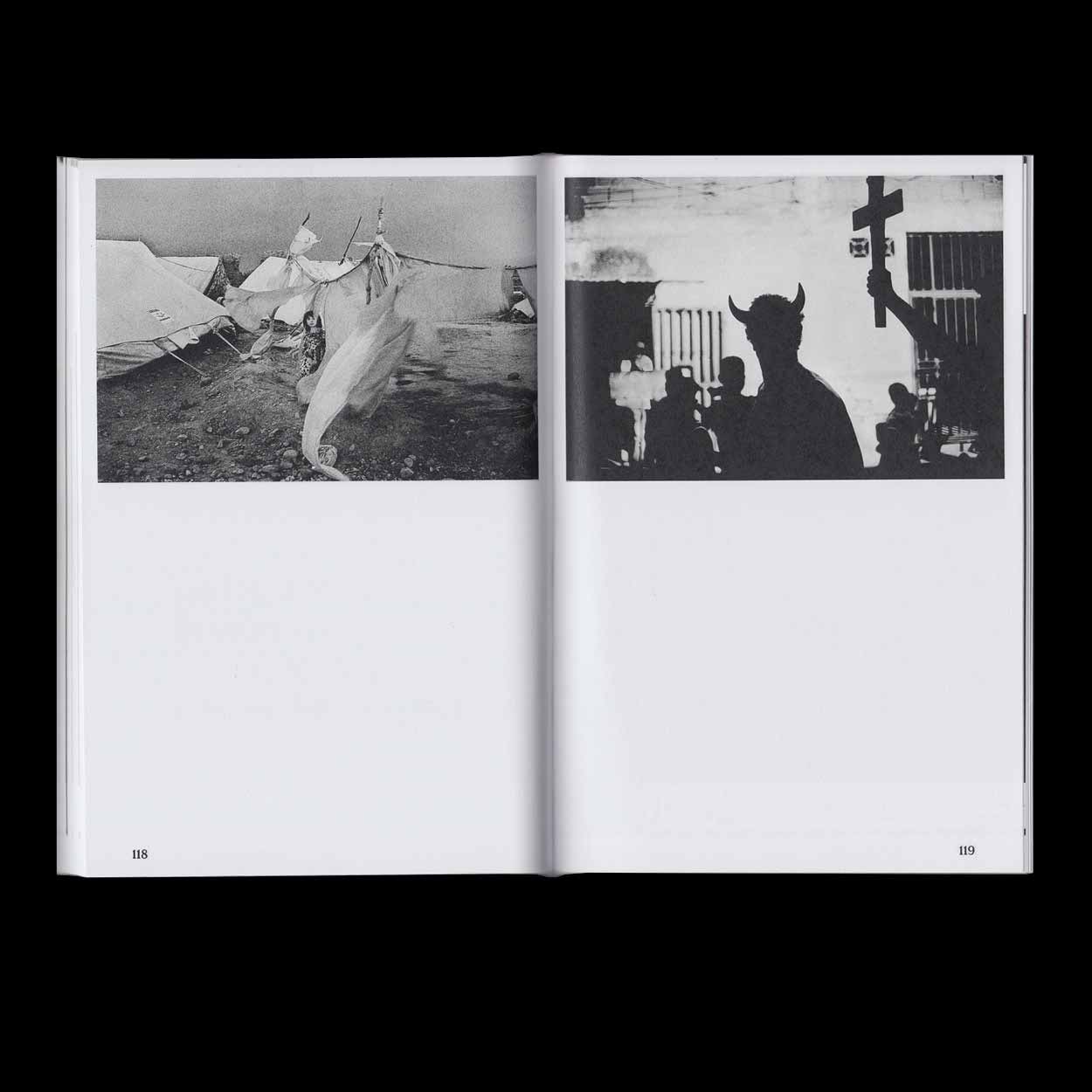
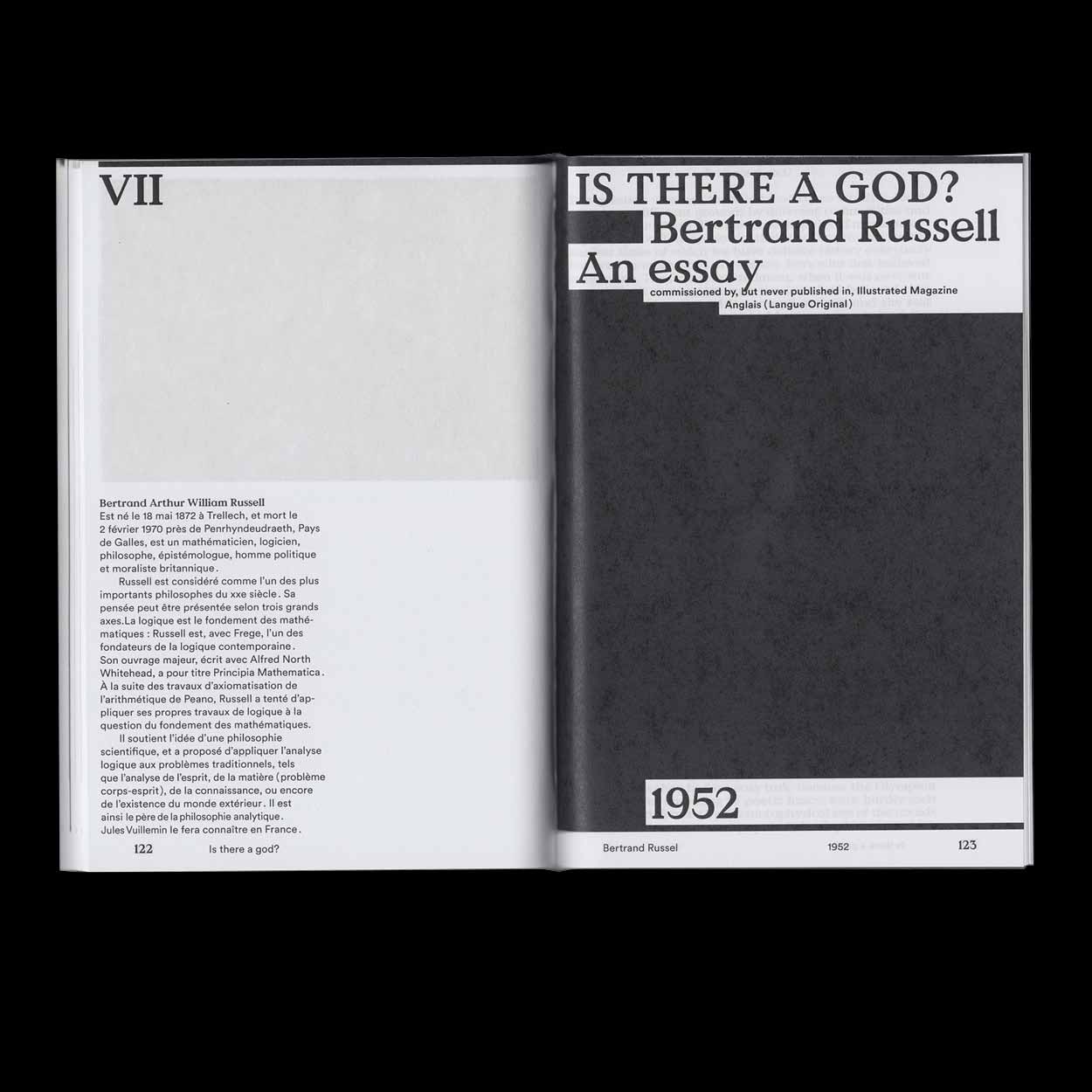
L’homme construit is a multilingual collection of texts from Albert Einstein & Sigmund Freund to George Orwell as well as D.A.F. Sade. The book contains a total of seven text excerpts from different times, places and contexts, all of them relevant to the intellectual construction of our understanding and construction of the world. In addition to the texts, the book contains three image series which allow the reader a visual access to the topics dealt with in the texts.
2017, Book, 130 × 190mm, 130 p., realized at ECAL
Floating Thursdays
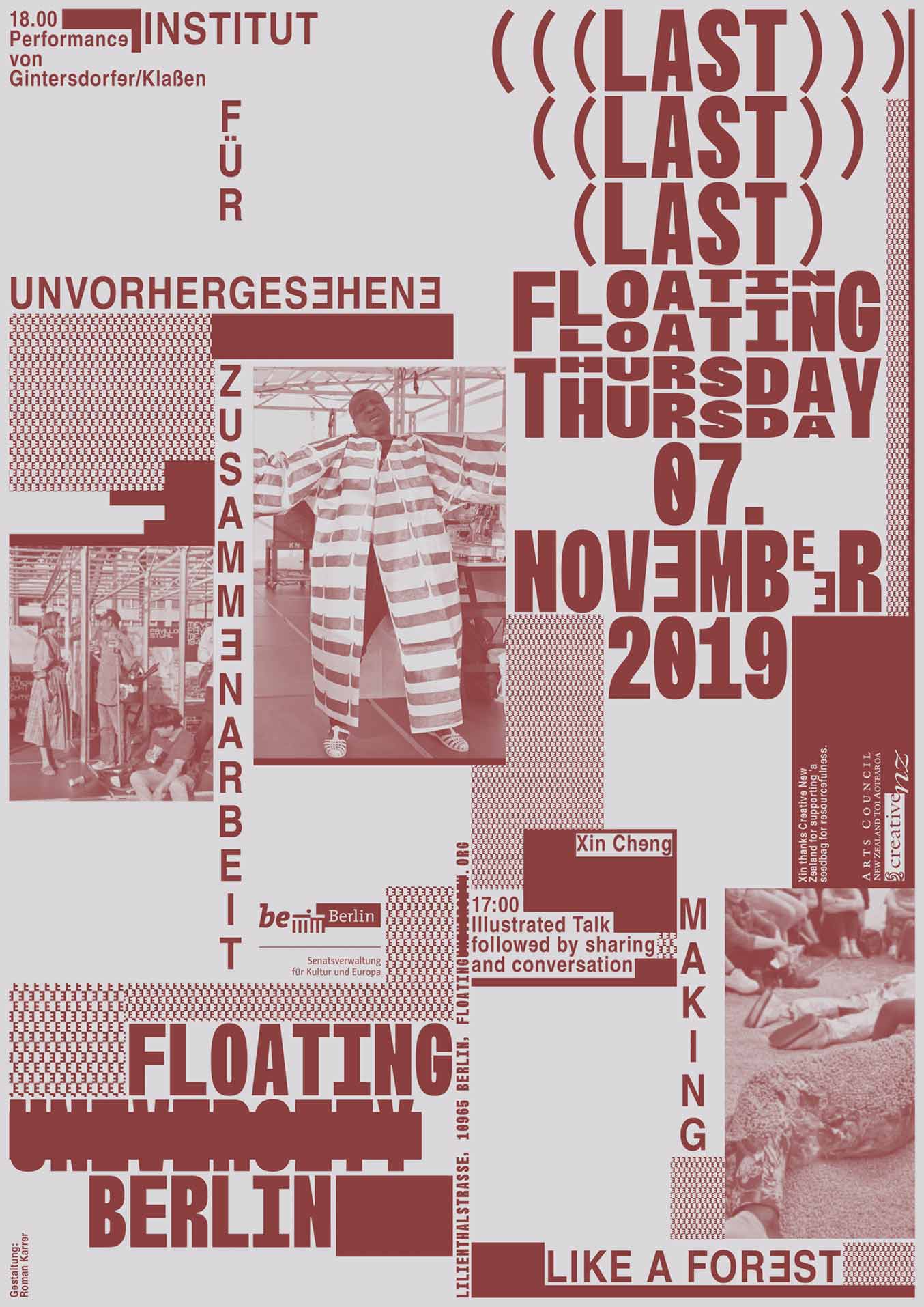
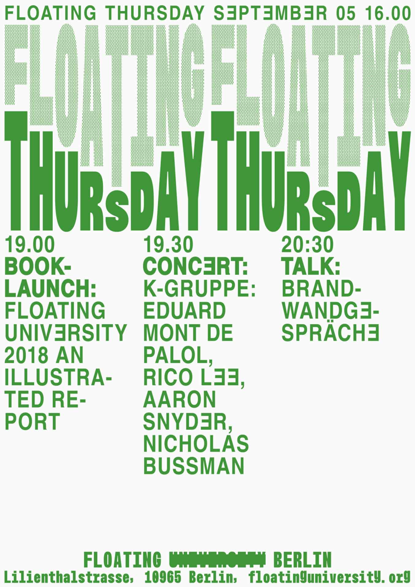
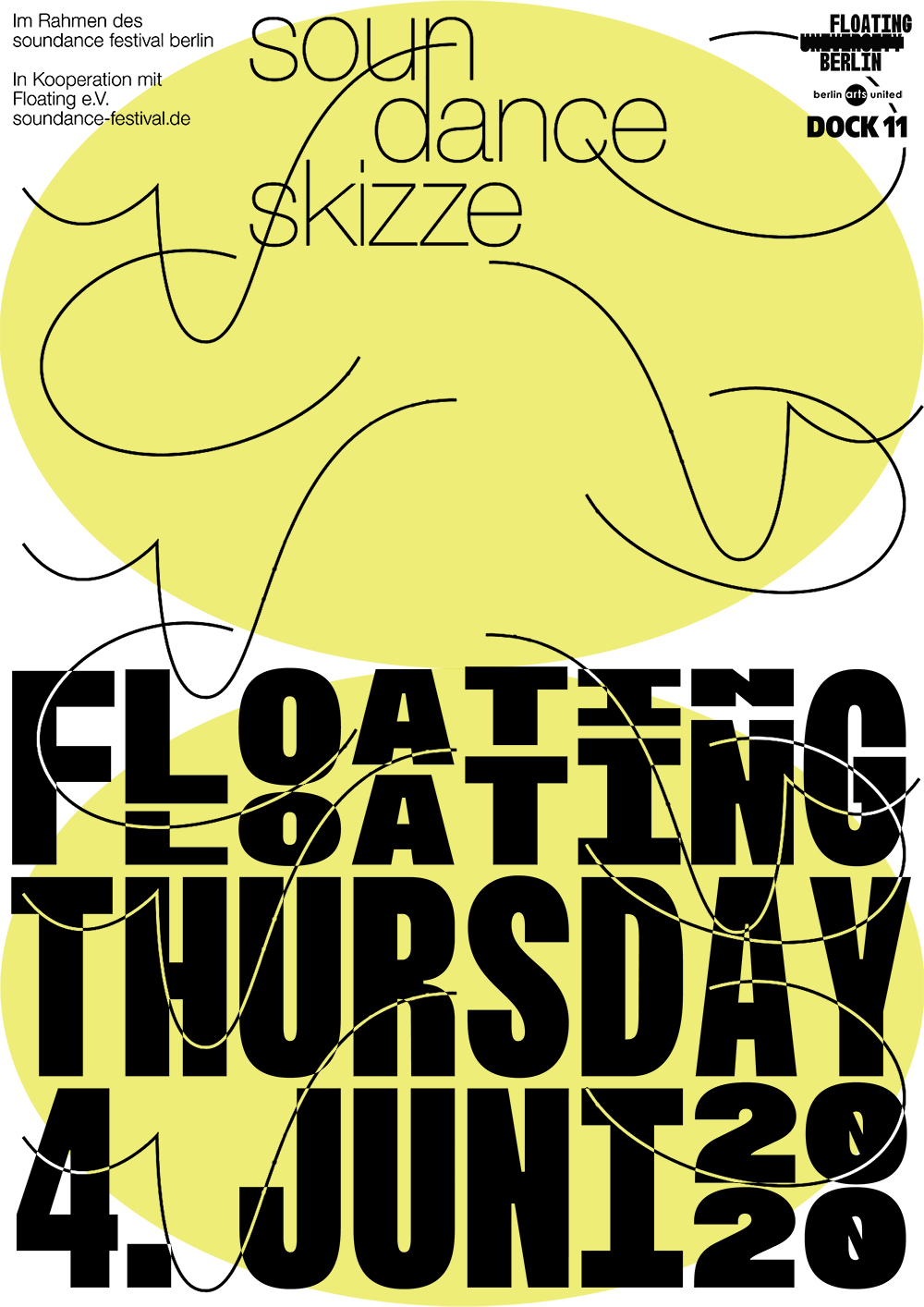
To announce the program of the Floating Thursdays, I designed a monthly poster and various social media content in 2019. The Floating Thursdays opened the doors of the Floating University to the public on the first Thursday of each month. In addition to an open bar and site visits, there were various program formats that were offered and designed by the association members and others.
2019, Posters, A2
Female Voices
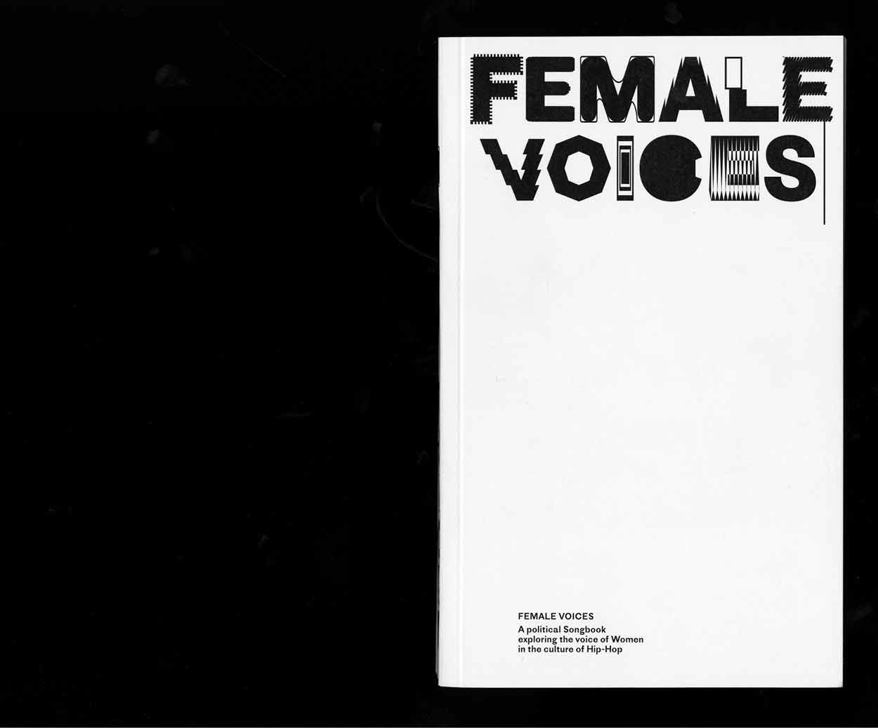
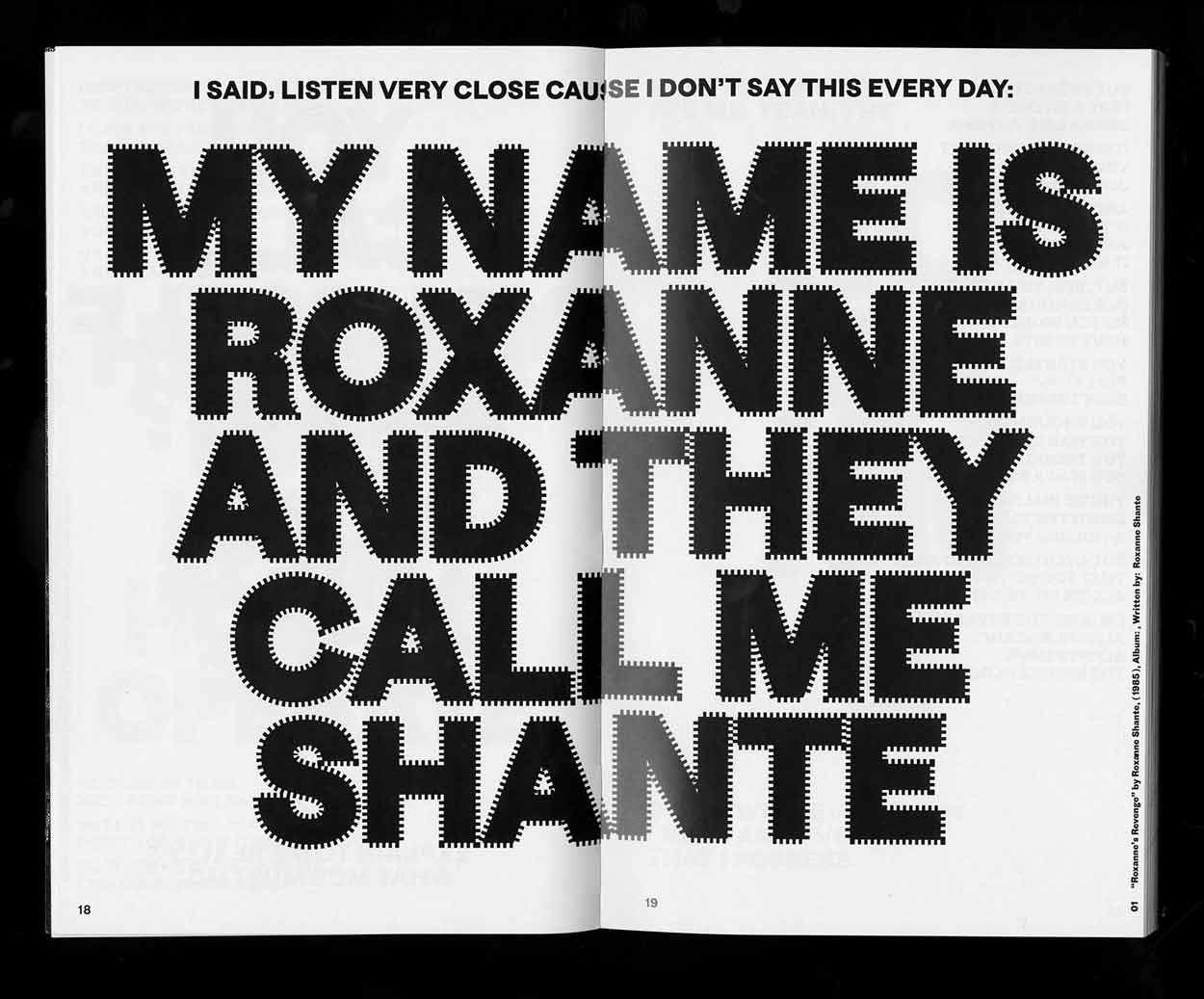
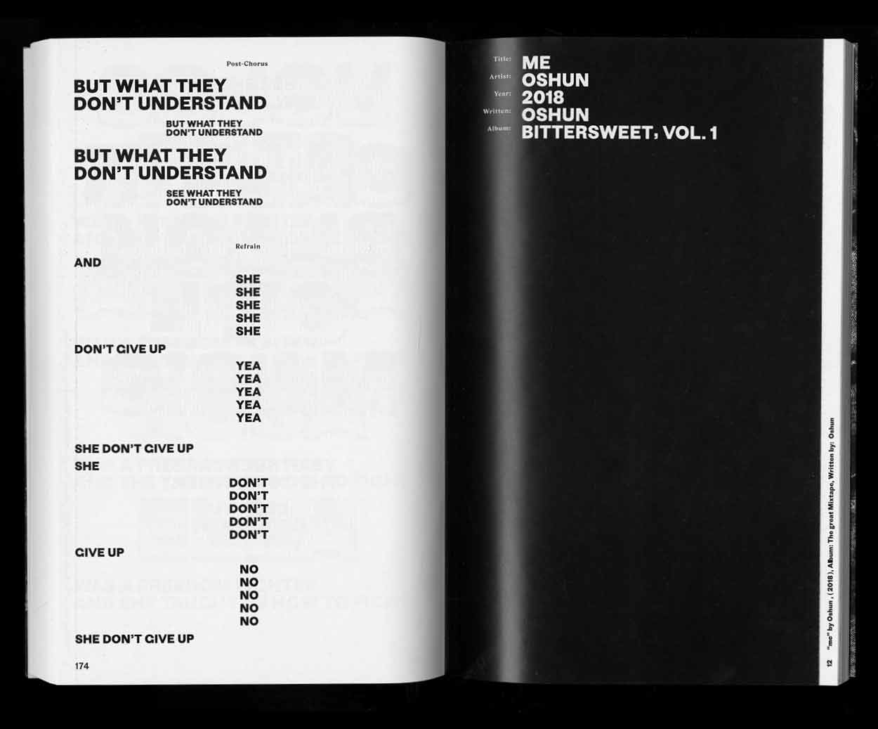
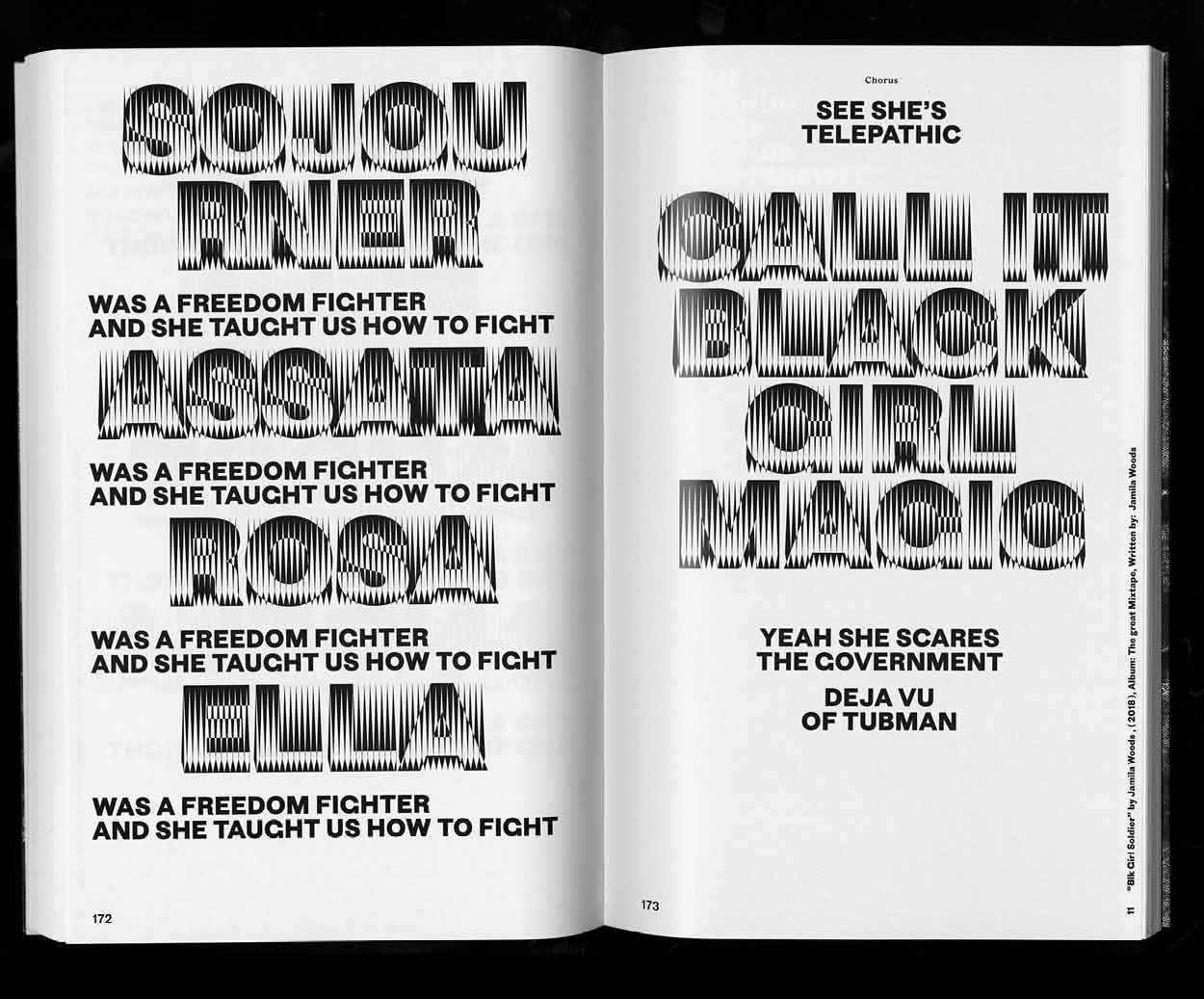
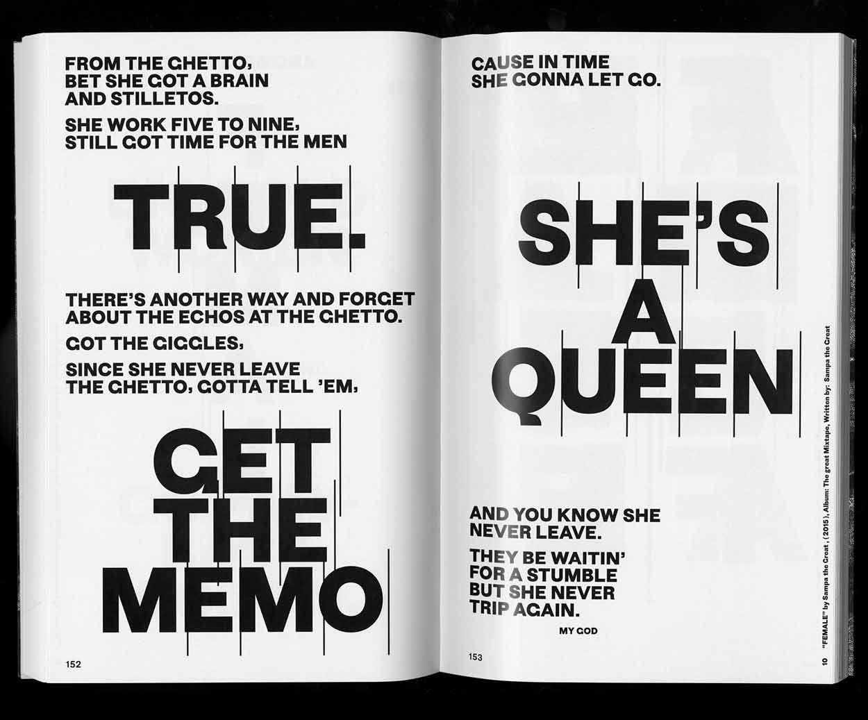
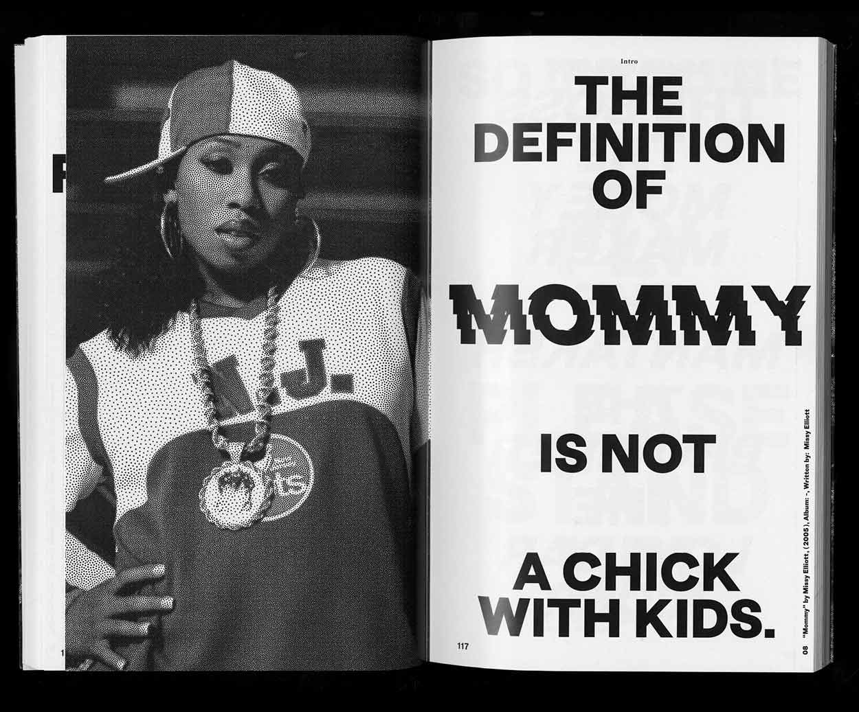
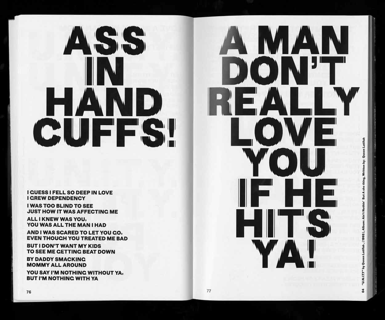
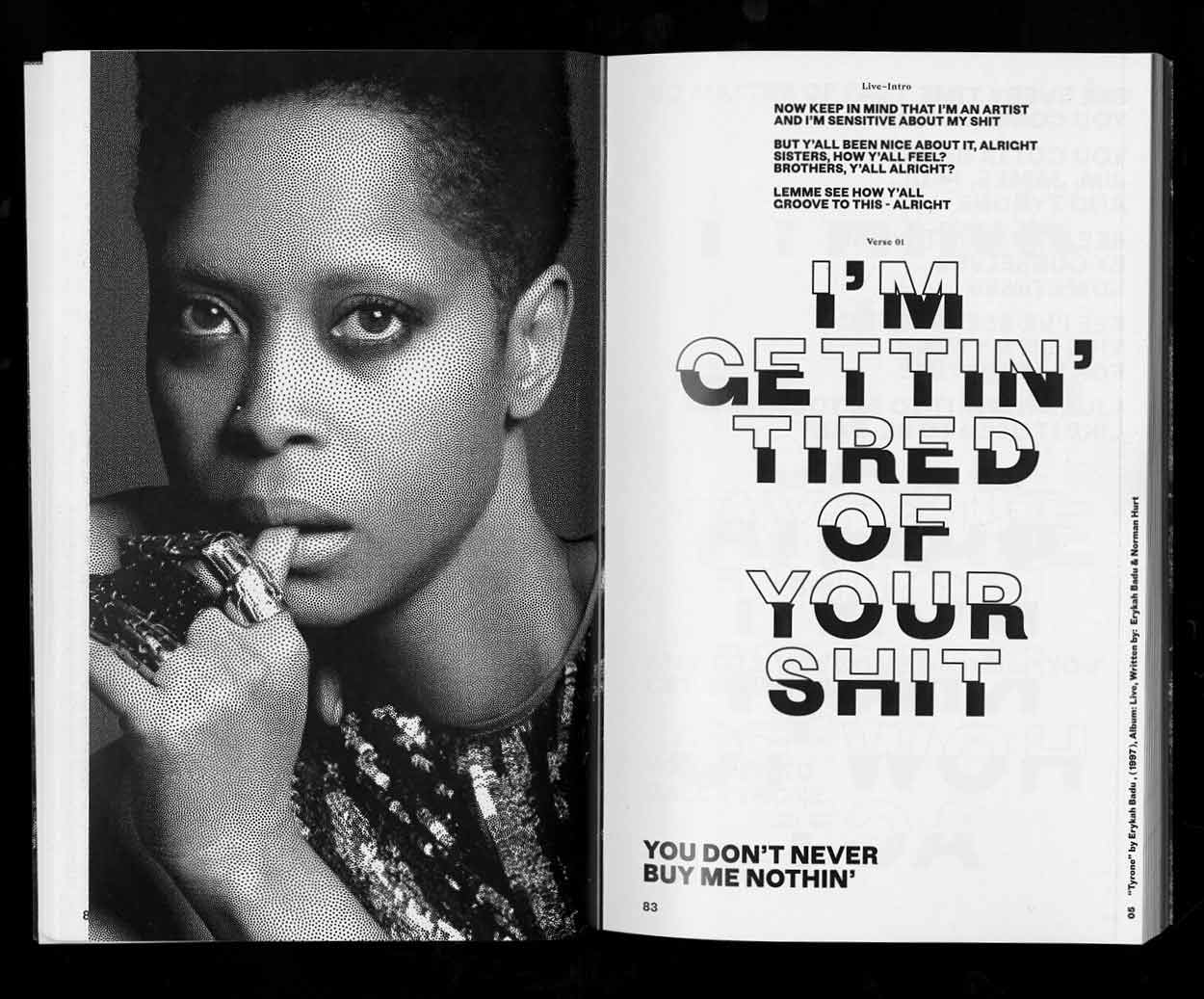
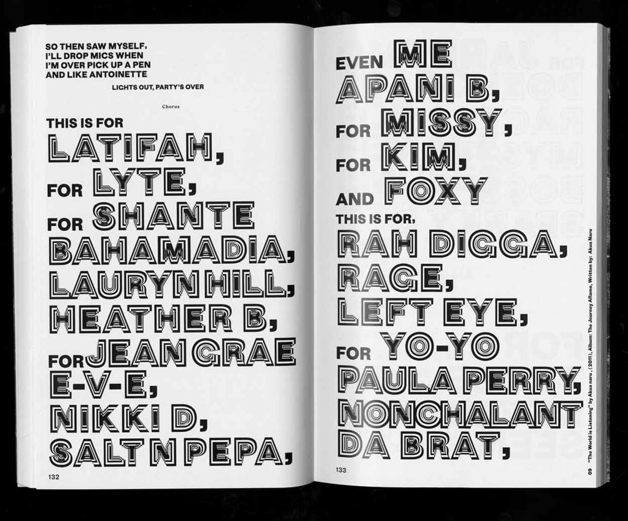
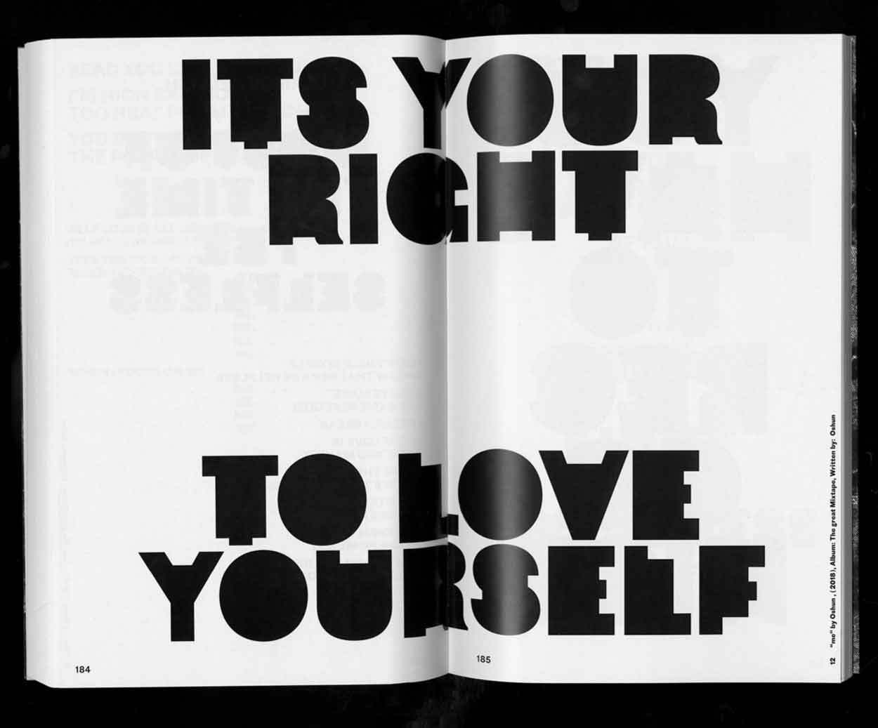
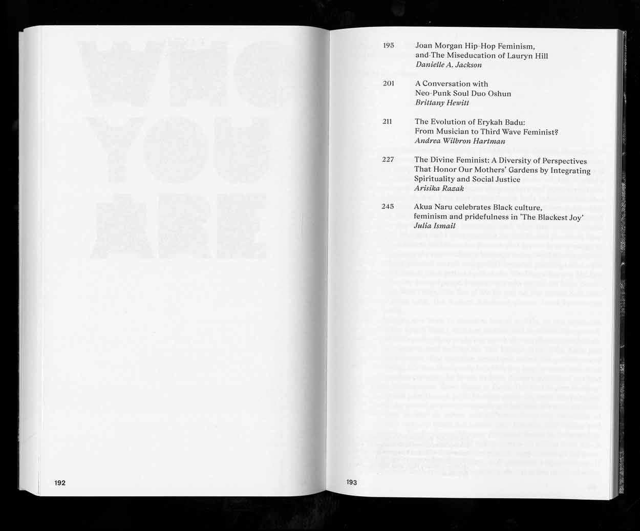
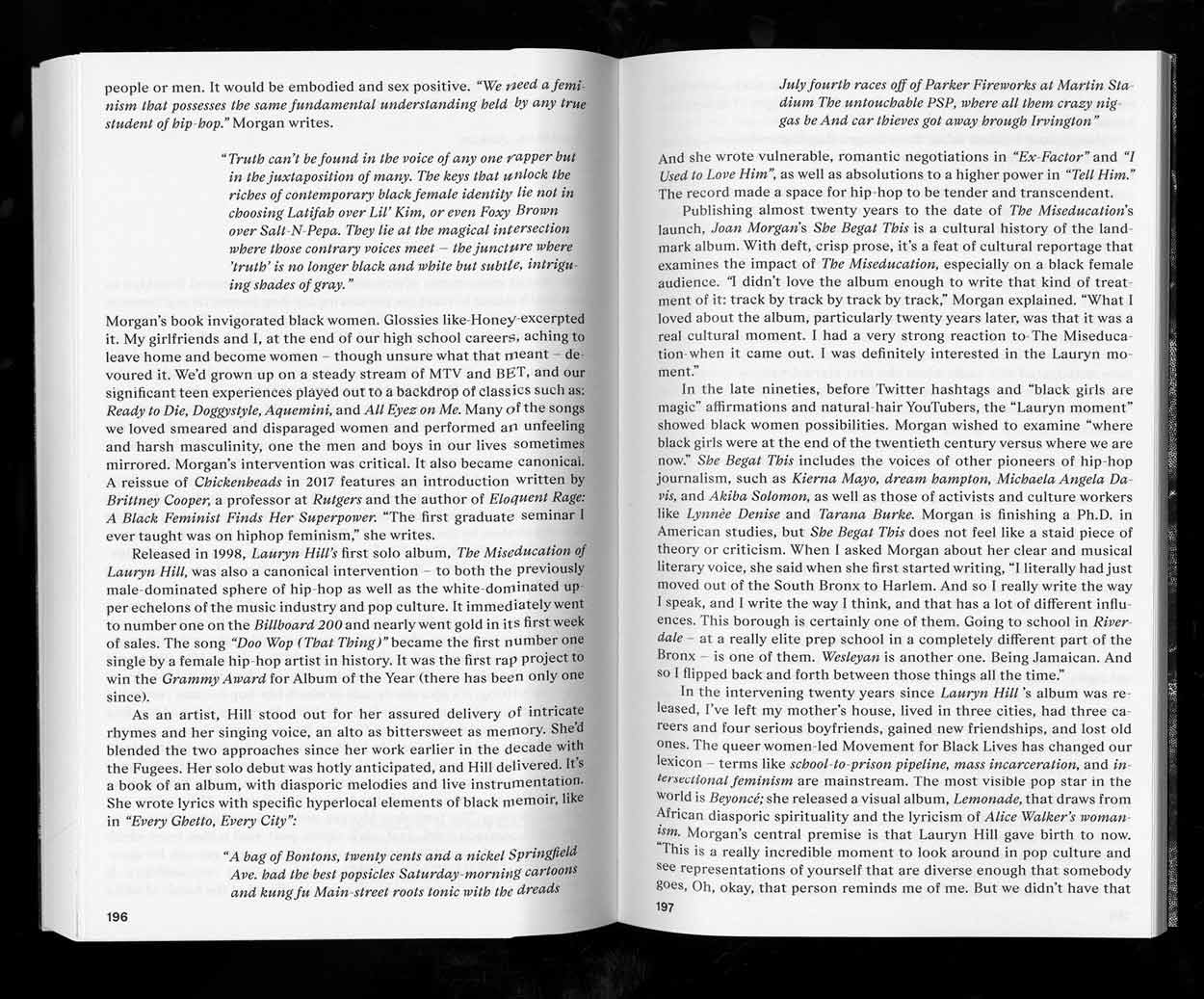
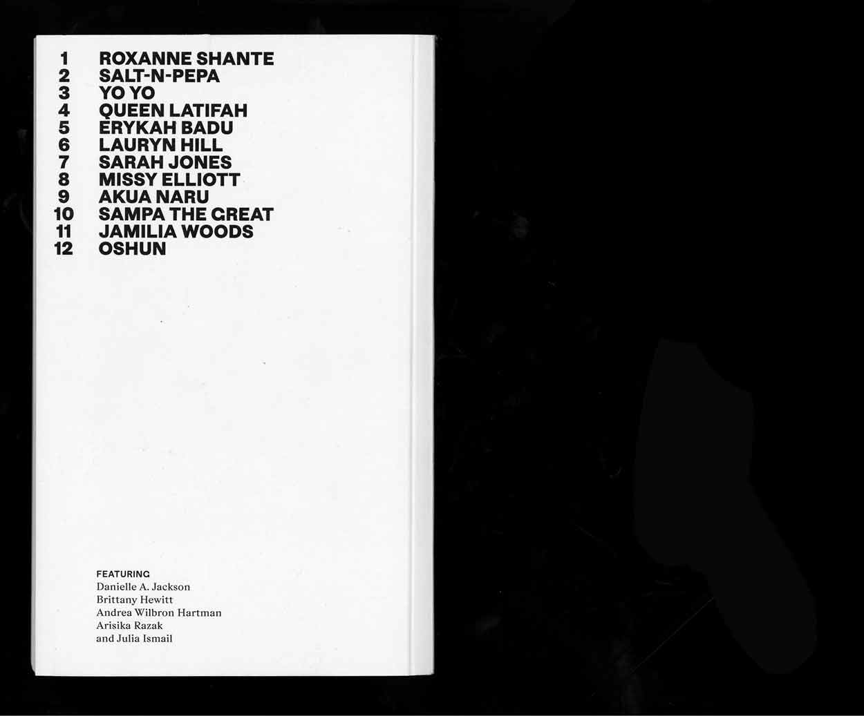
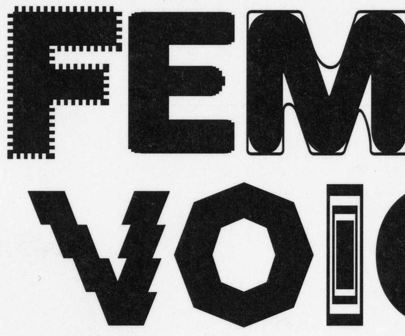
Exploring the voice of womxn in the culture of hip-hop. Female Voices – A Songbook tracing the presence of womxn in hip-hop culture from the 1980s to the early 2000s. The book is divided into two sections. The first section features a compilation of twelve socially conscious hip-hop songs that embody female empowerment and serve as inspiration for people of all genders worldwide. Each song is accompanied by a custom-designed typography, created specifically for its presentation. In the second section, readers will find five theoretical texts that contextualize the featured artists and delve into the history of feminism within hip-hop culture. Thanks to Pamela Ohene-Nyako from Afrolitt for your time and input.
2018, Political Songbook, 130 × 210mm, 248 p. realized at ECAL
Where from? Where to?
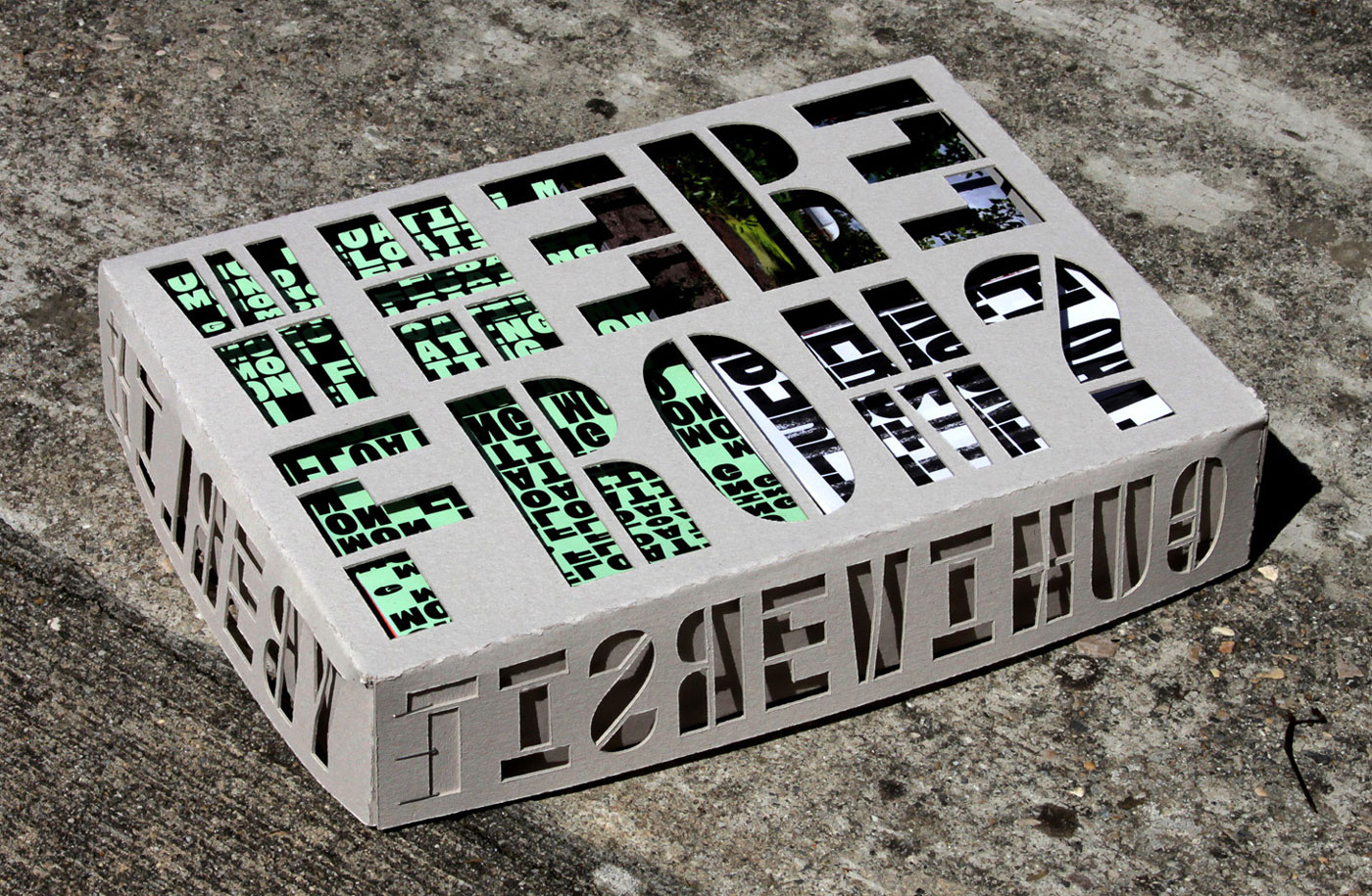
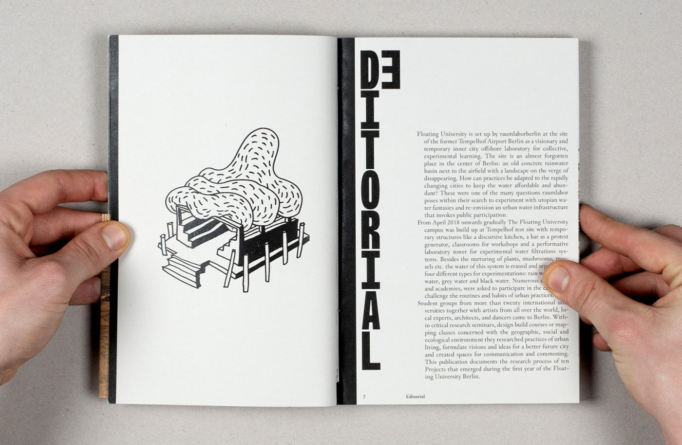
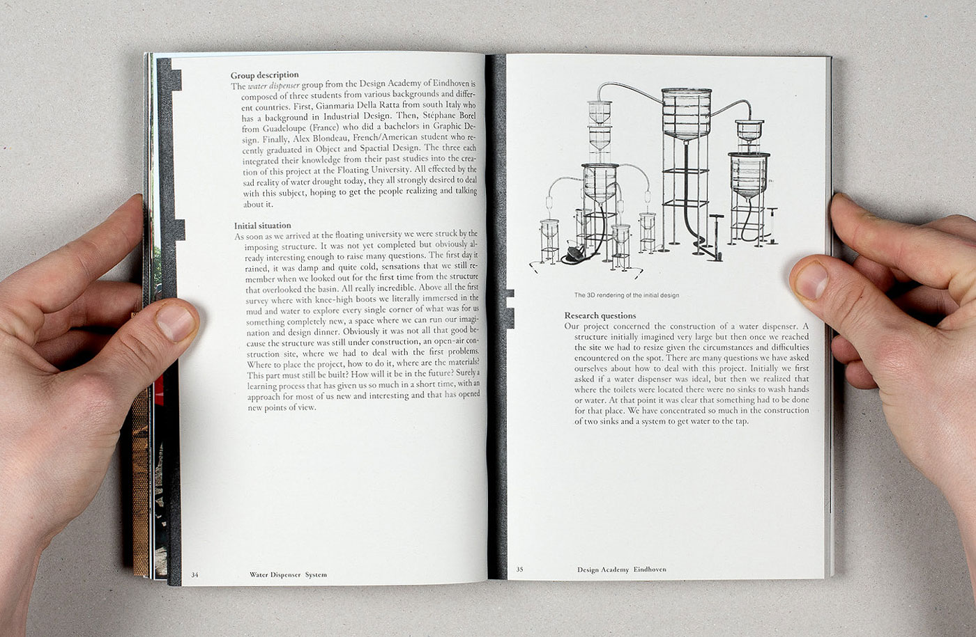
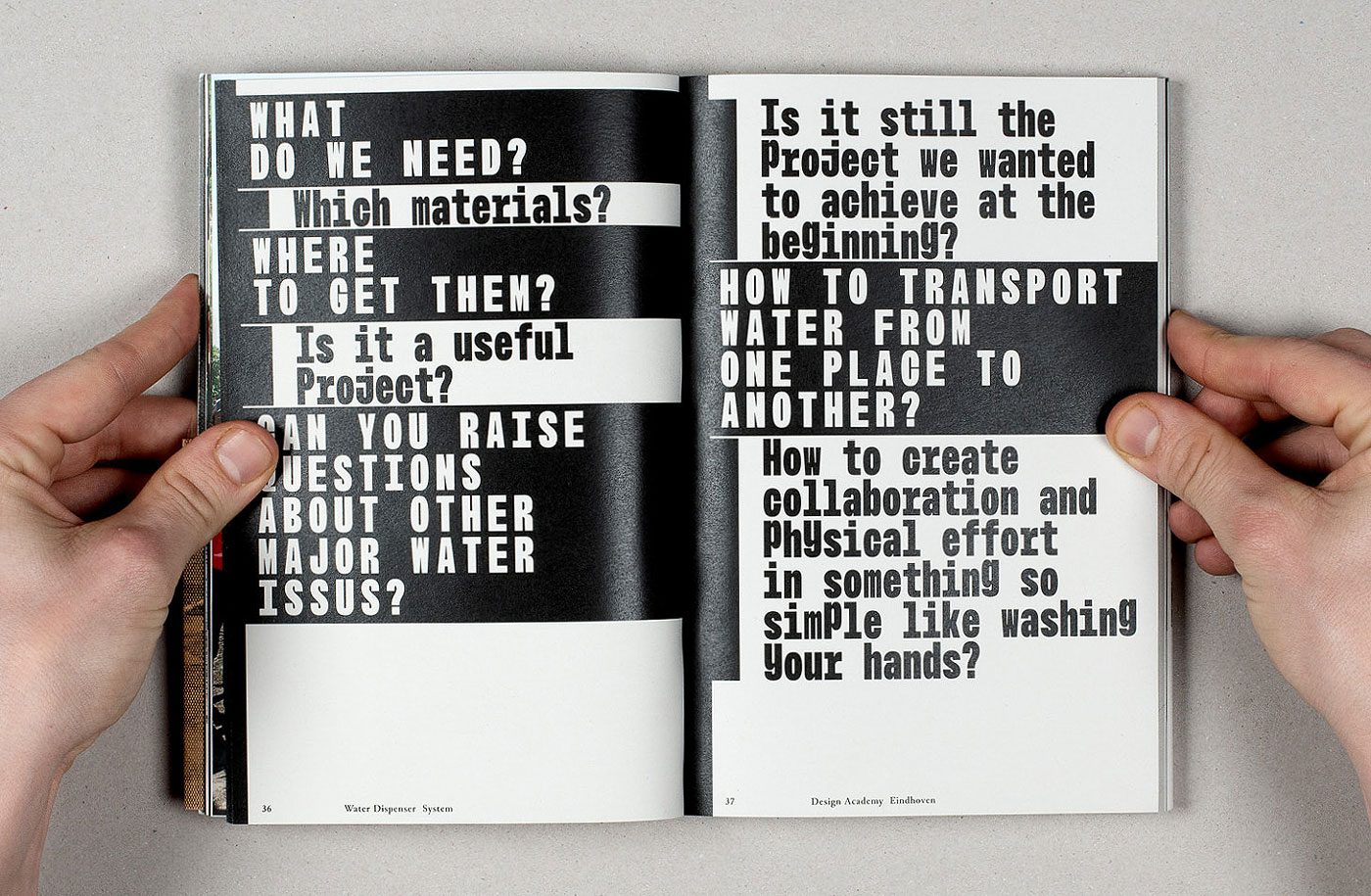
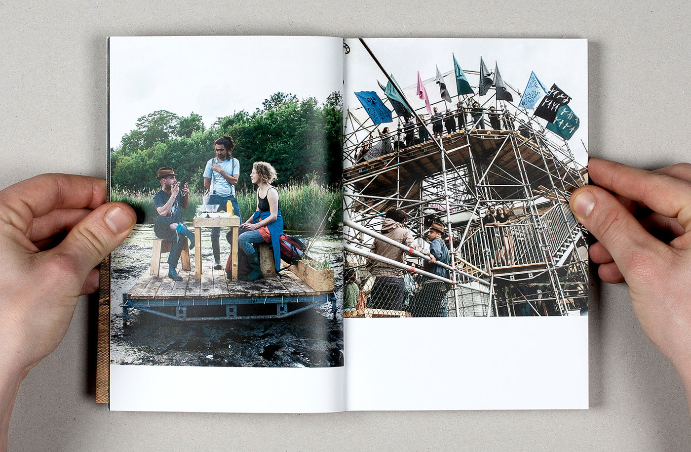
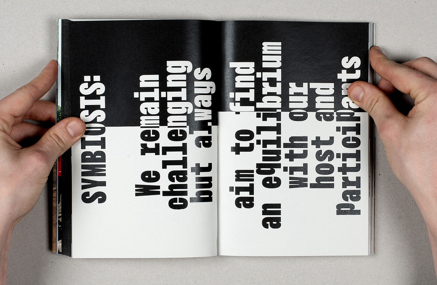

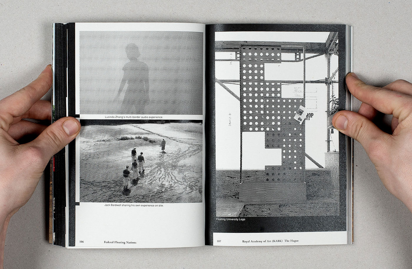

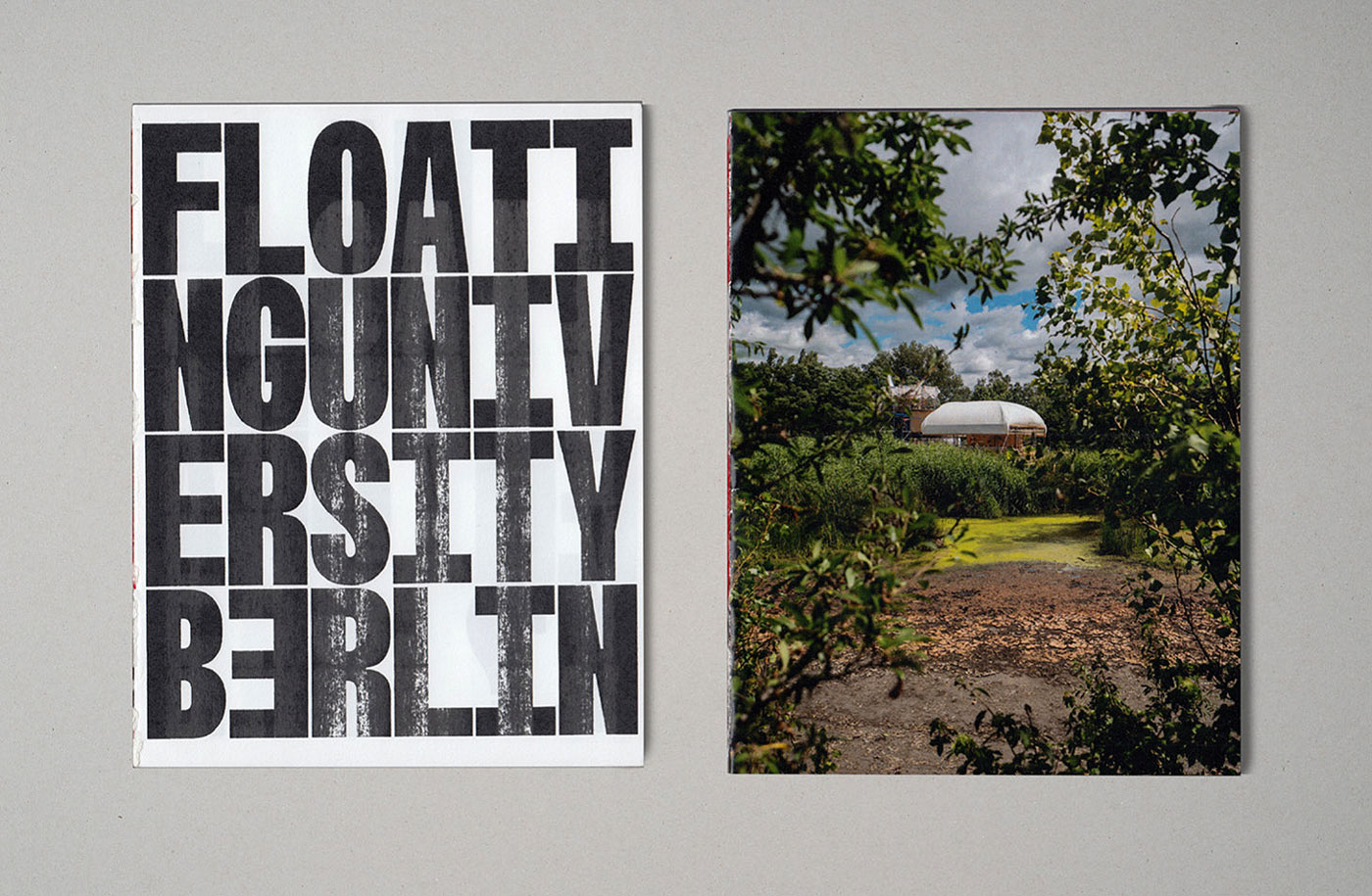
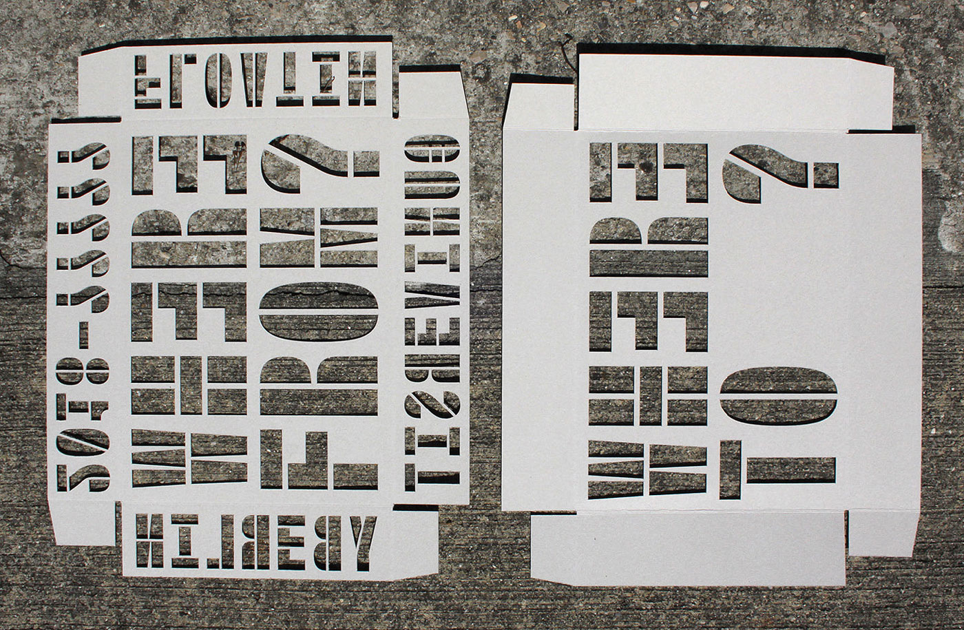
For my Diploma at ECAL I realised an Archive for the The Floating University Berlin, a visionary offshore laboratory for collective, experimental learning, which was initiated by Raumlabor Berlin in 2018. Working in close exchange with the initiators and actors, I transformed the visual language of the project that I started to develop in 2017.
The result is a modular book/edition that tries to capture what happened on the site during eight month of program. The different objects are relative to each other (1:1, 1:2, etc.). Some are communicating about the past, others about the future, others about the unknown. In addition, I continued to work on an open toolbox containing a type system and various creative tools.
2019, Archive, Editing, Editorial Design,
Diploma Project at ECAL supervised by Guy Meldem & Aurèle Sack
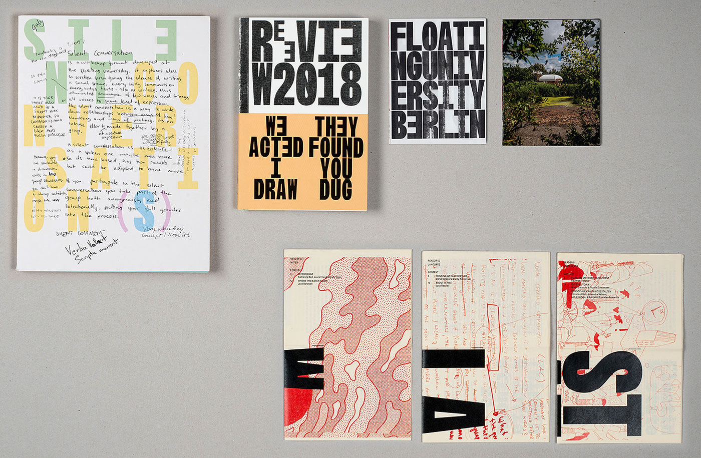
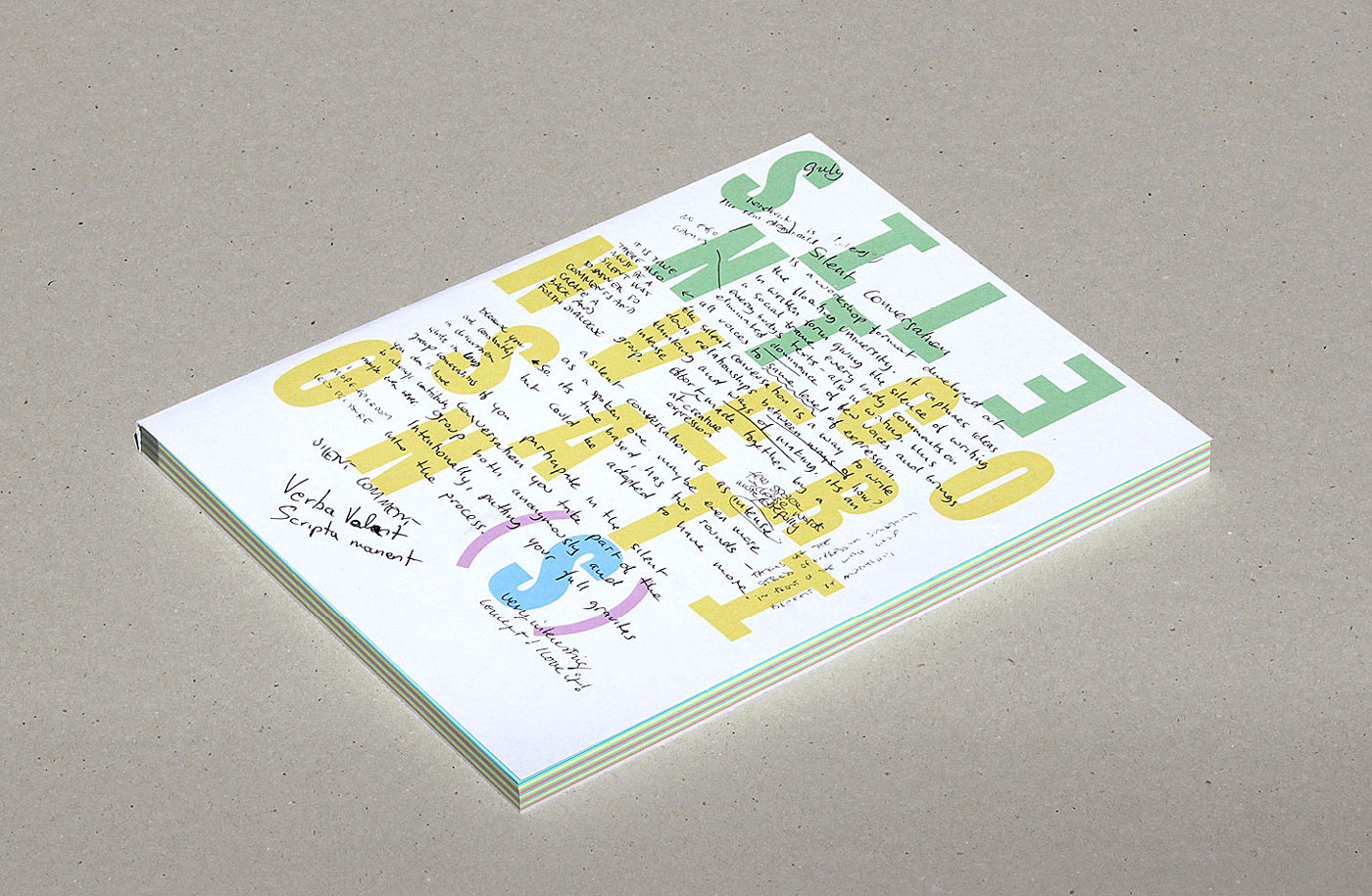
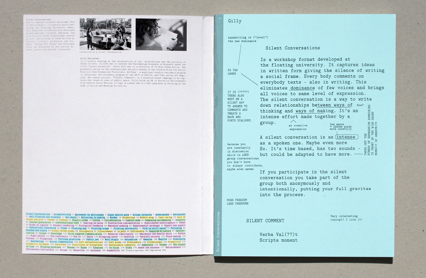
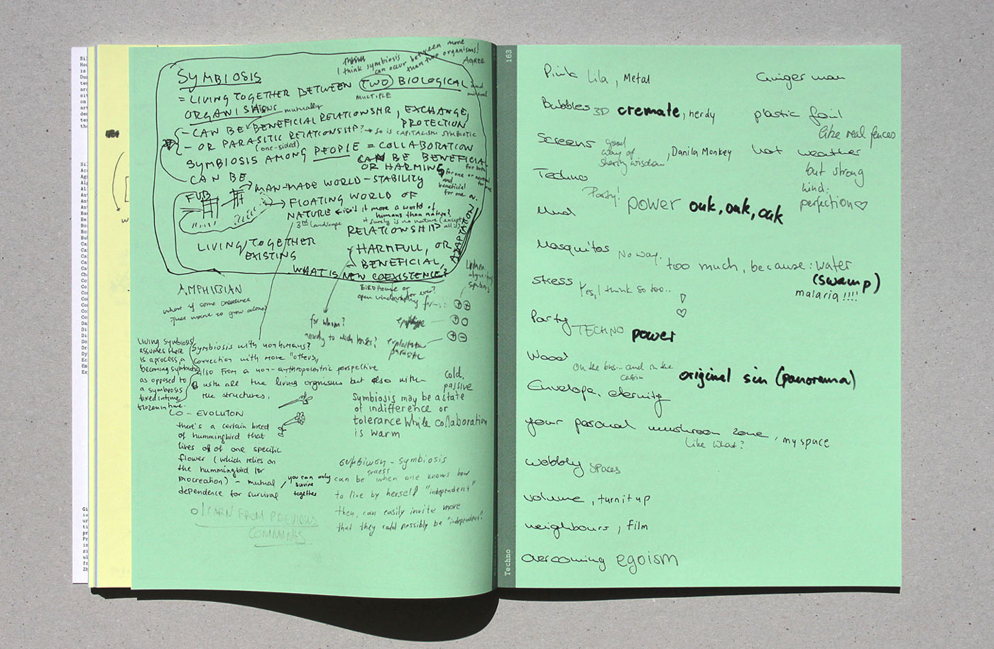
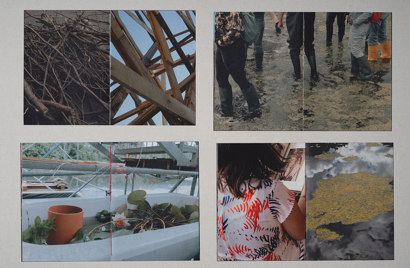
Silent Conversations (1:1)
Archive of a Workshop Format by Gilly Karjevsky
210 × 280mm, 205 Pages
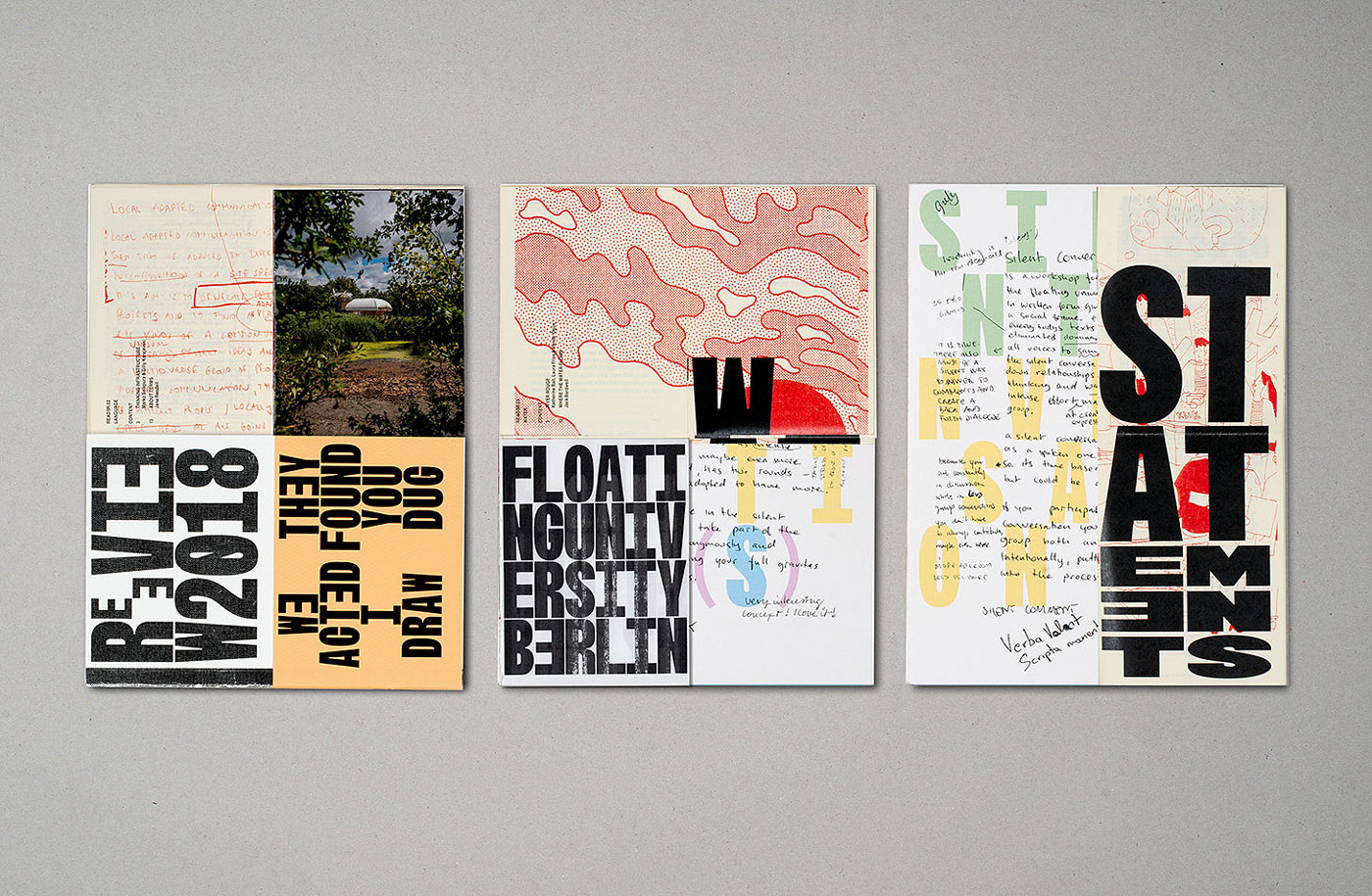
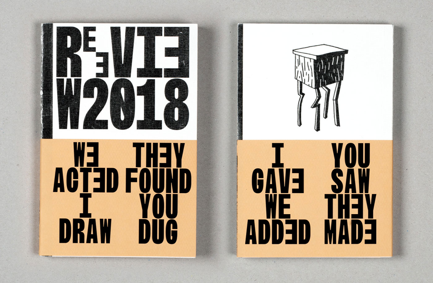
Review 2018 (1:2)
Student Documentations
140 × 210mm, 218 Pages
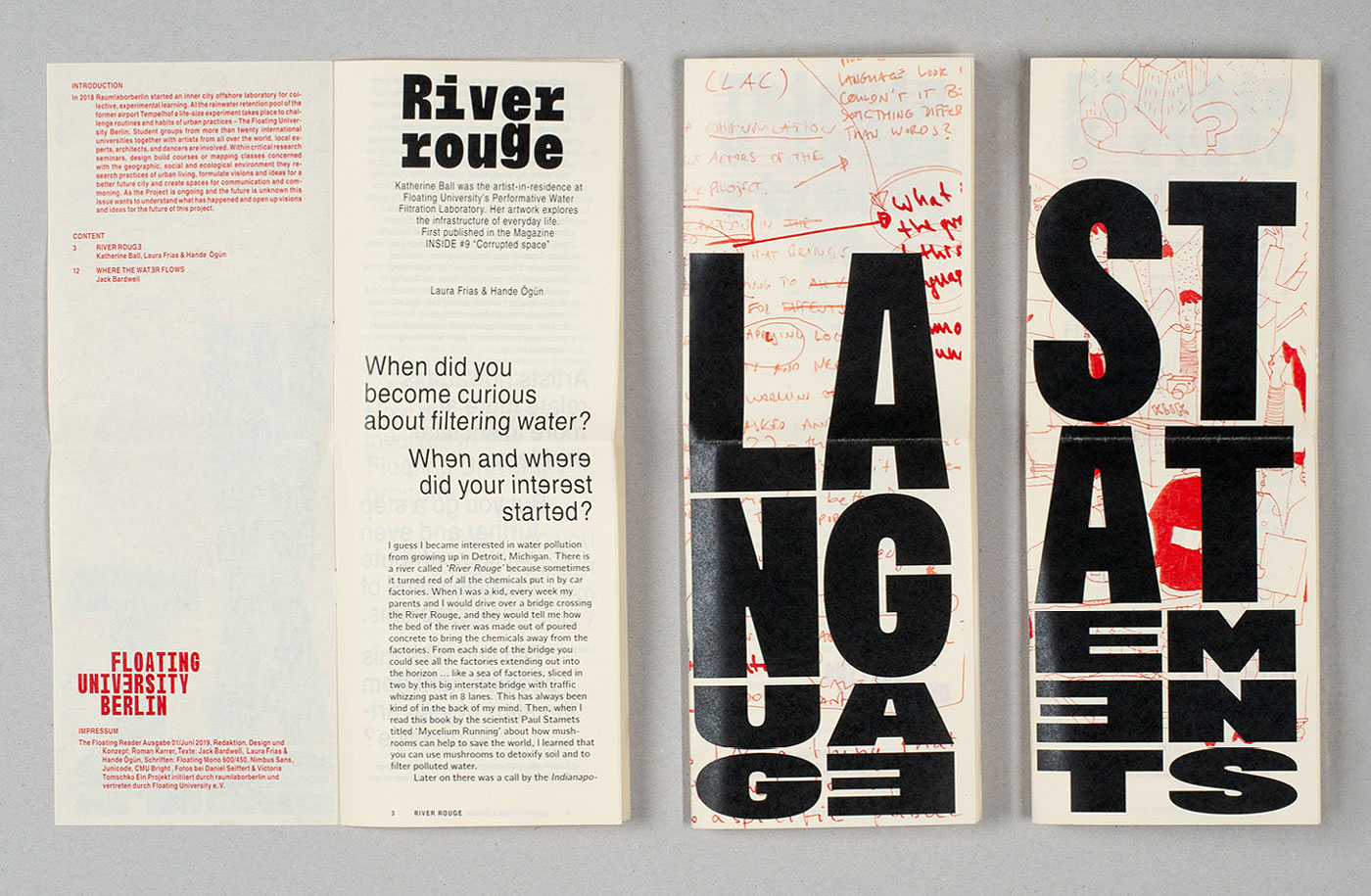
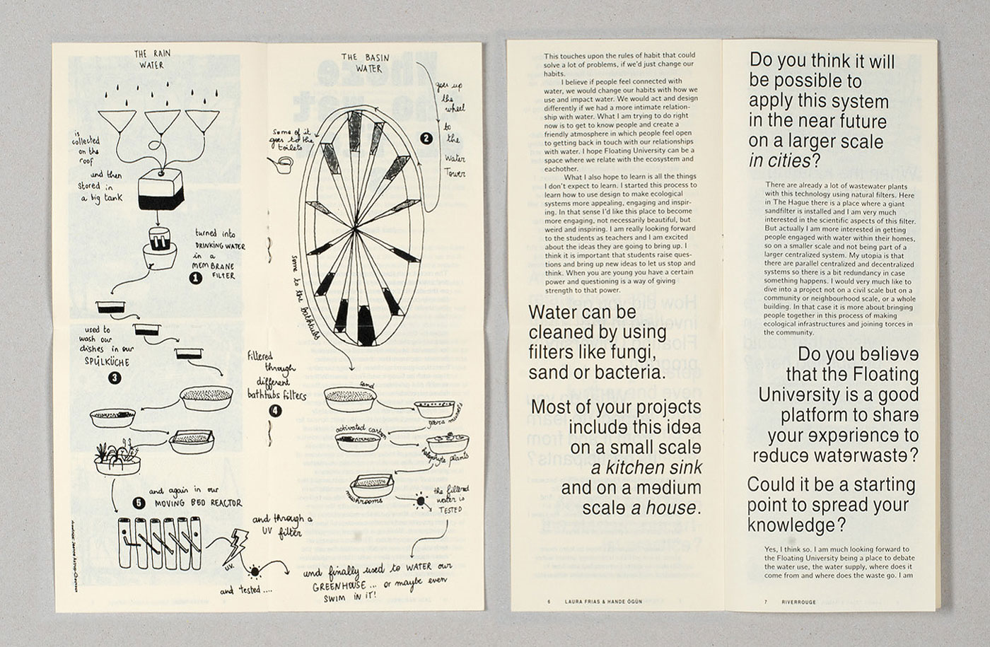
Readers (1:2)
I Statements
II Language
III Water
105 × 280mm, 28 Pages each
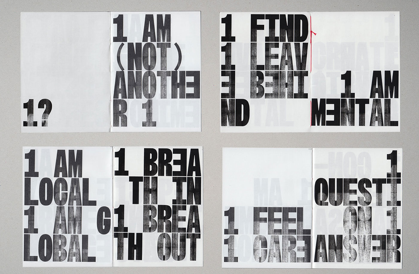
Fragments (1:4)
Mental / Physical
105 × 140mm, 60 Pages each
One is not another one
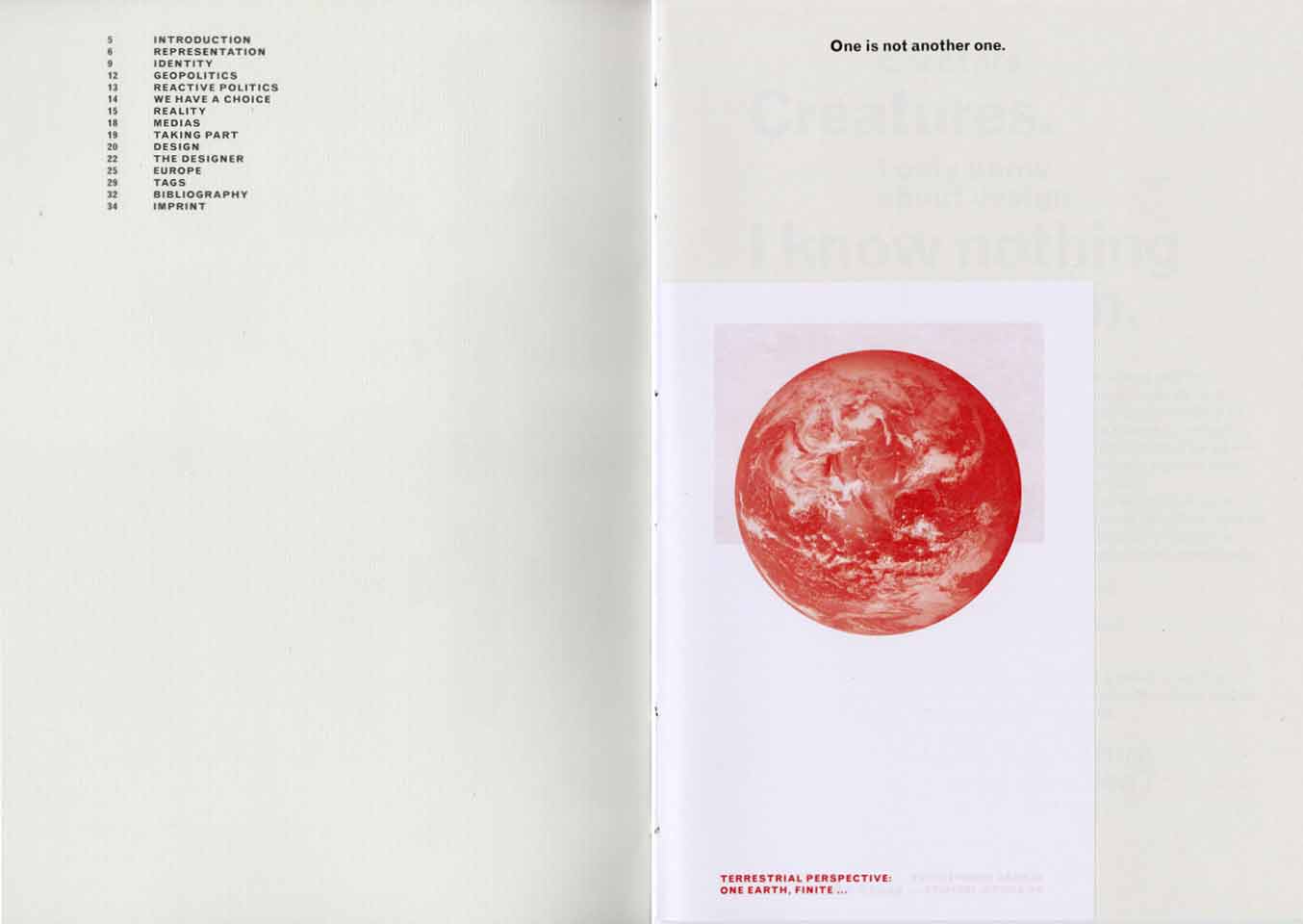
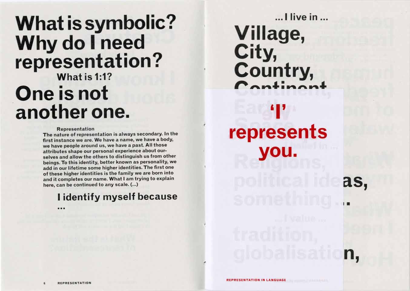
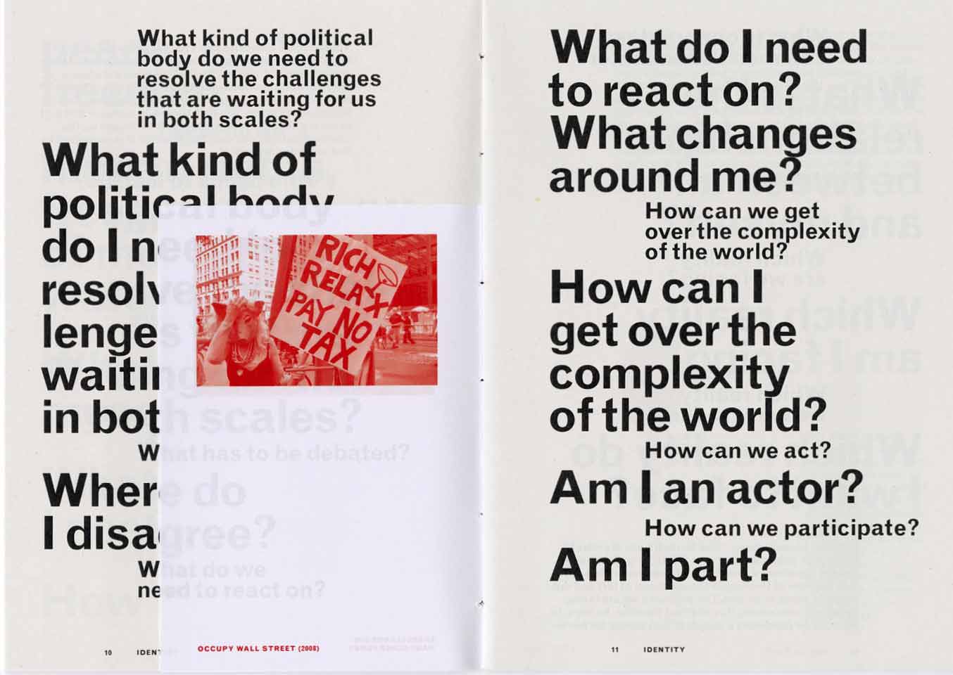
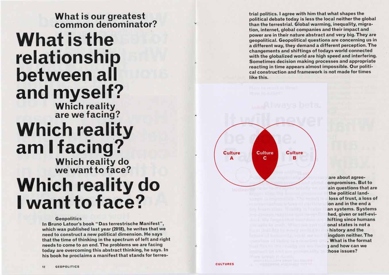
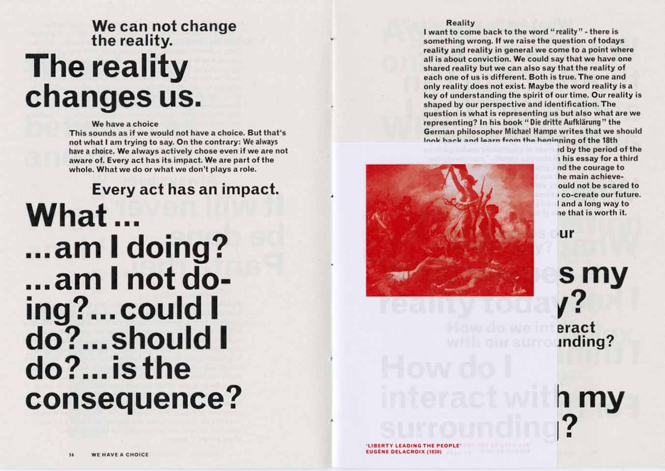
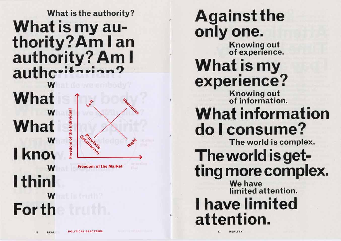
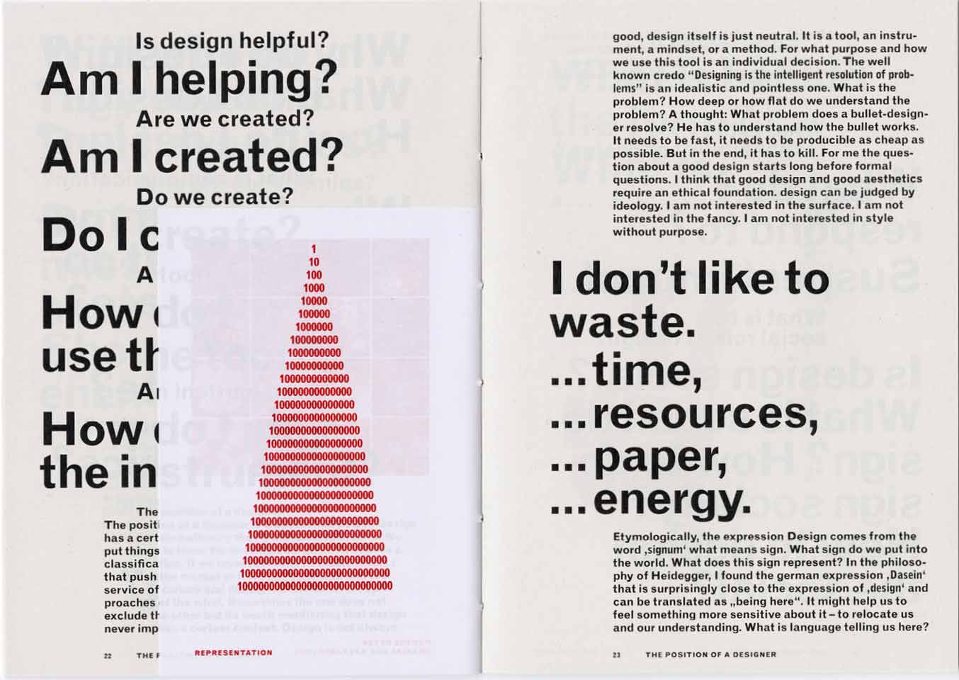
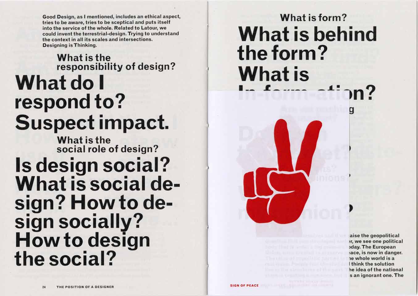
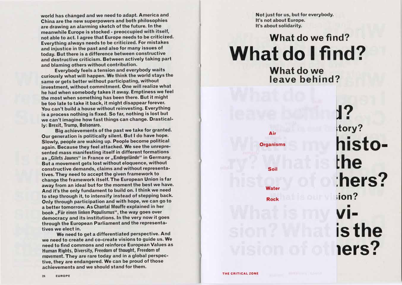
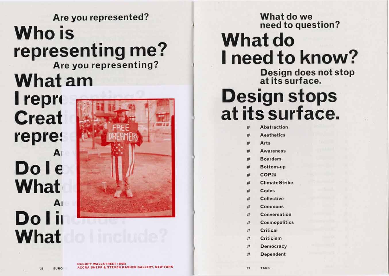
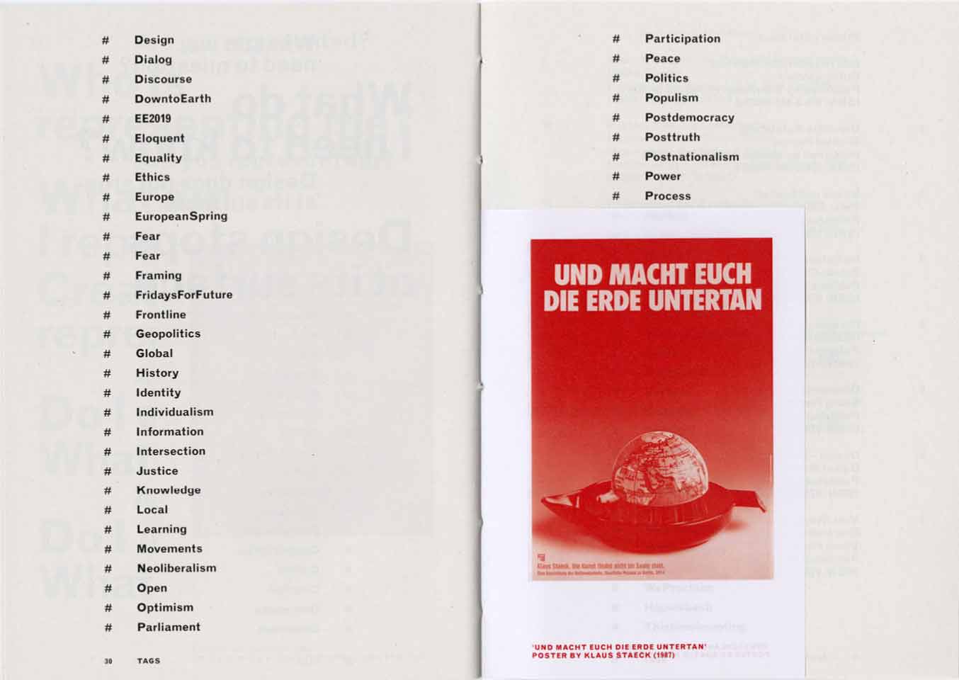
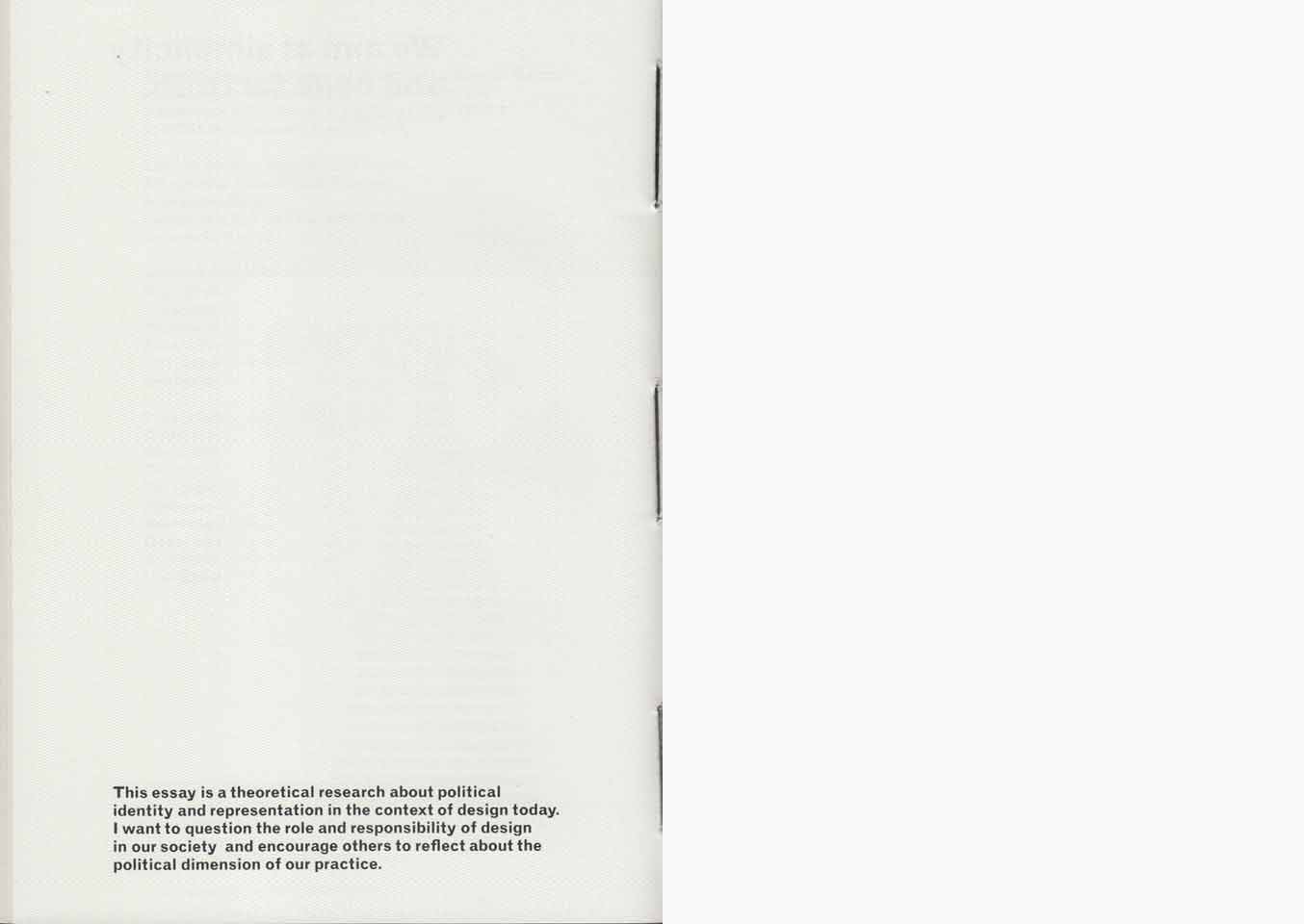
One is not another one is an essay about political identity and representation in the context of design today. My aim was to question the role and responsibility of design in our society and to encourage others to reflect on the political dimension of our practice. The geographical focus of my research is Europe, but the phenomenas are applicable to many entities. I do not have the intention to make a point. I want to raise questions. I want to open space rather than define it. I hope that the answers will follow.
2019, Essay, A5/A6 realized at ECAL, 36/72 p.
Mode Suisse
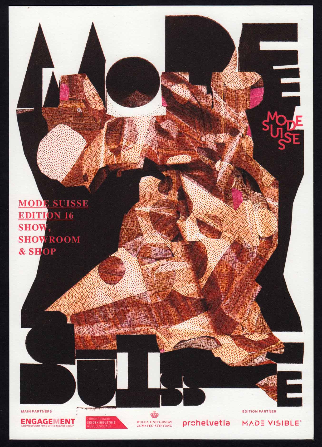
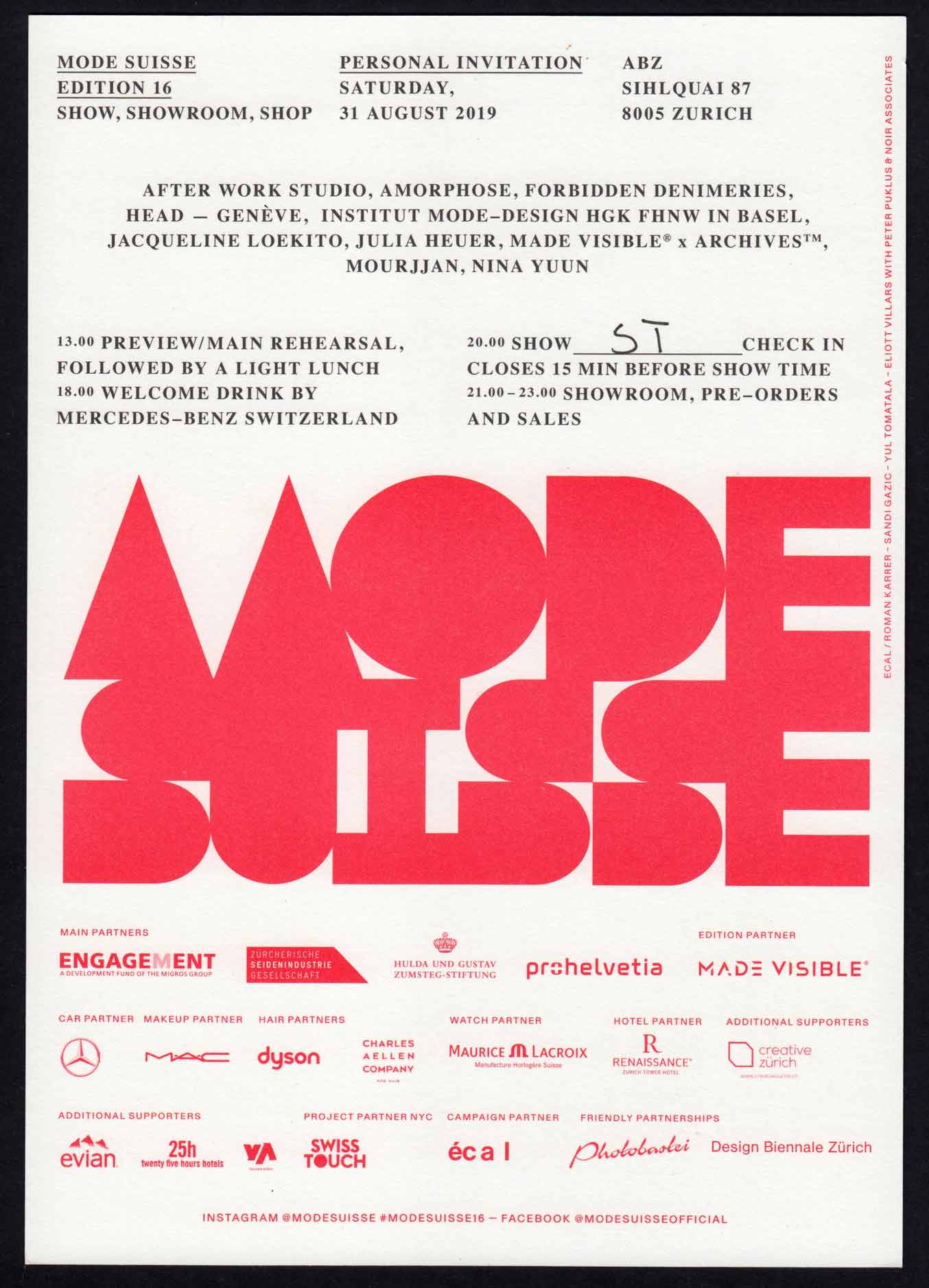
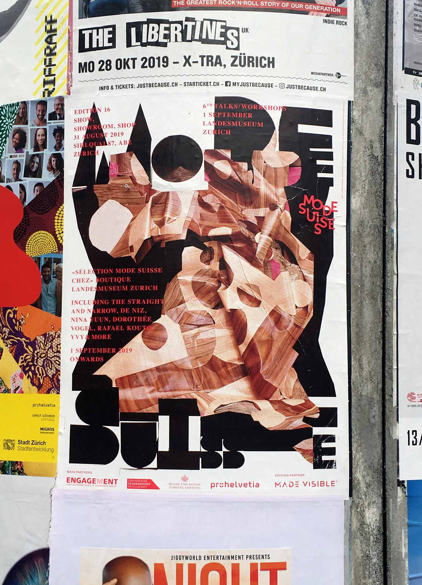
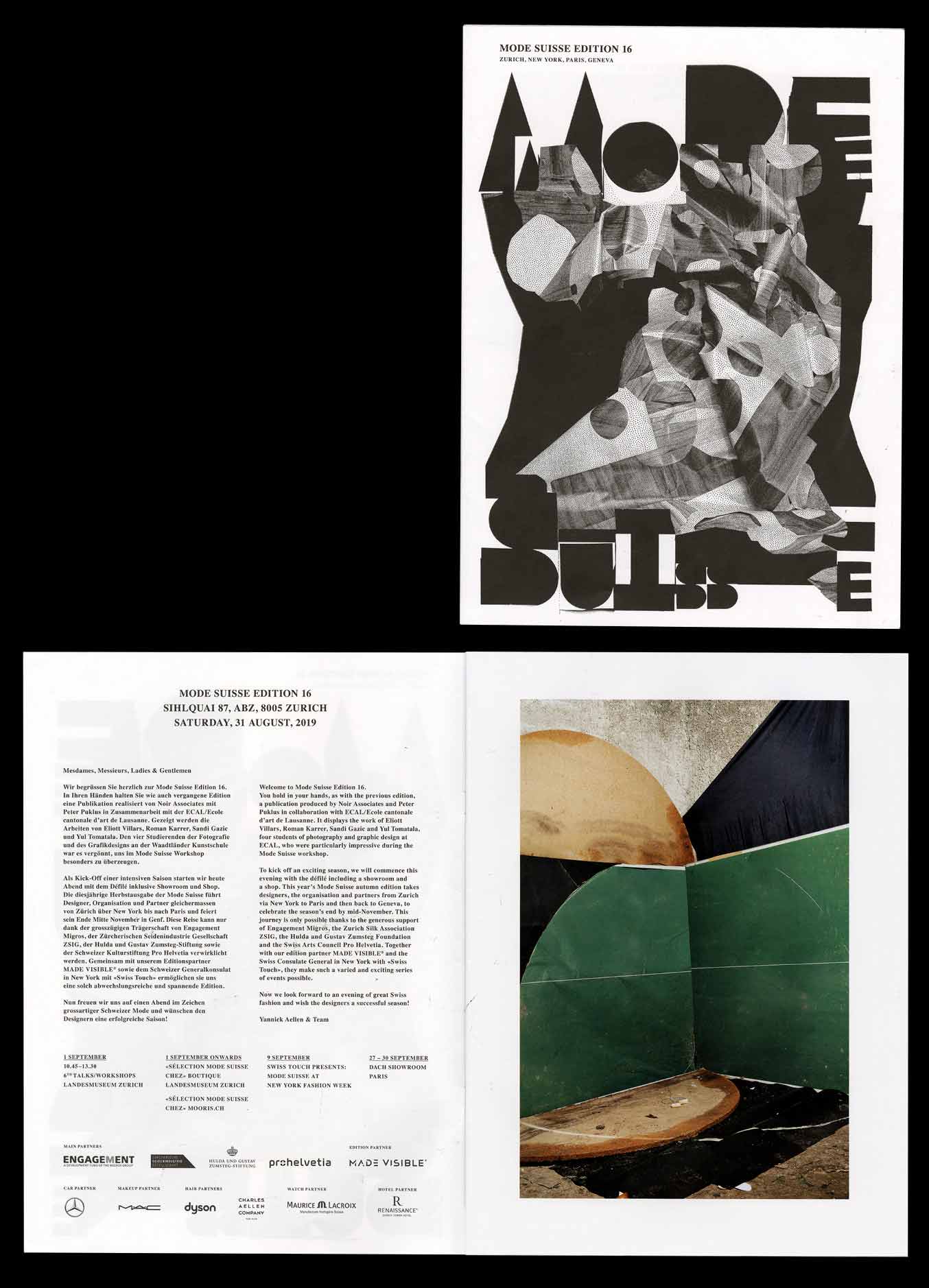
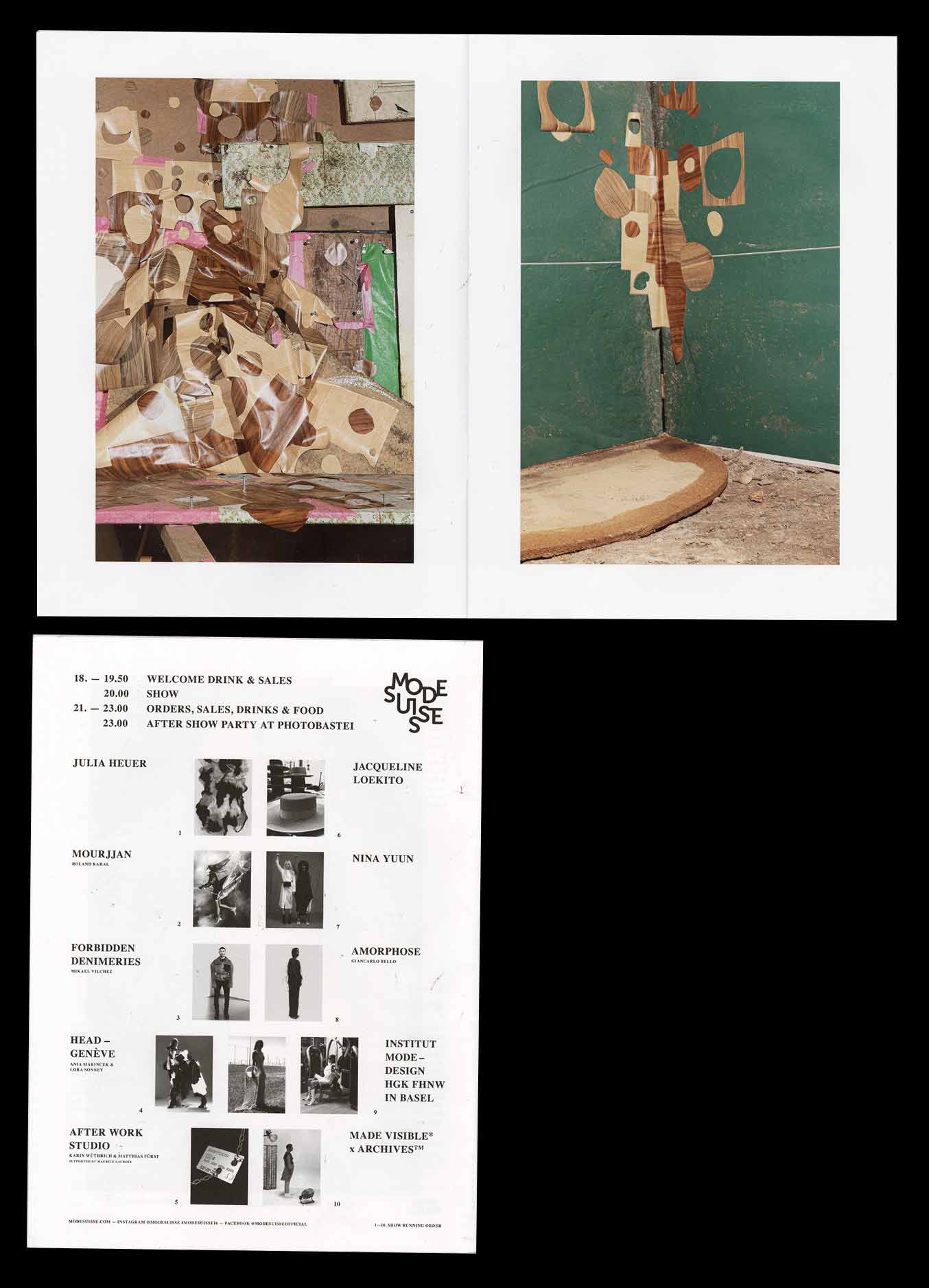
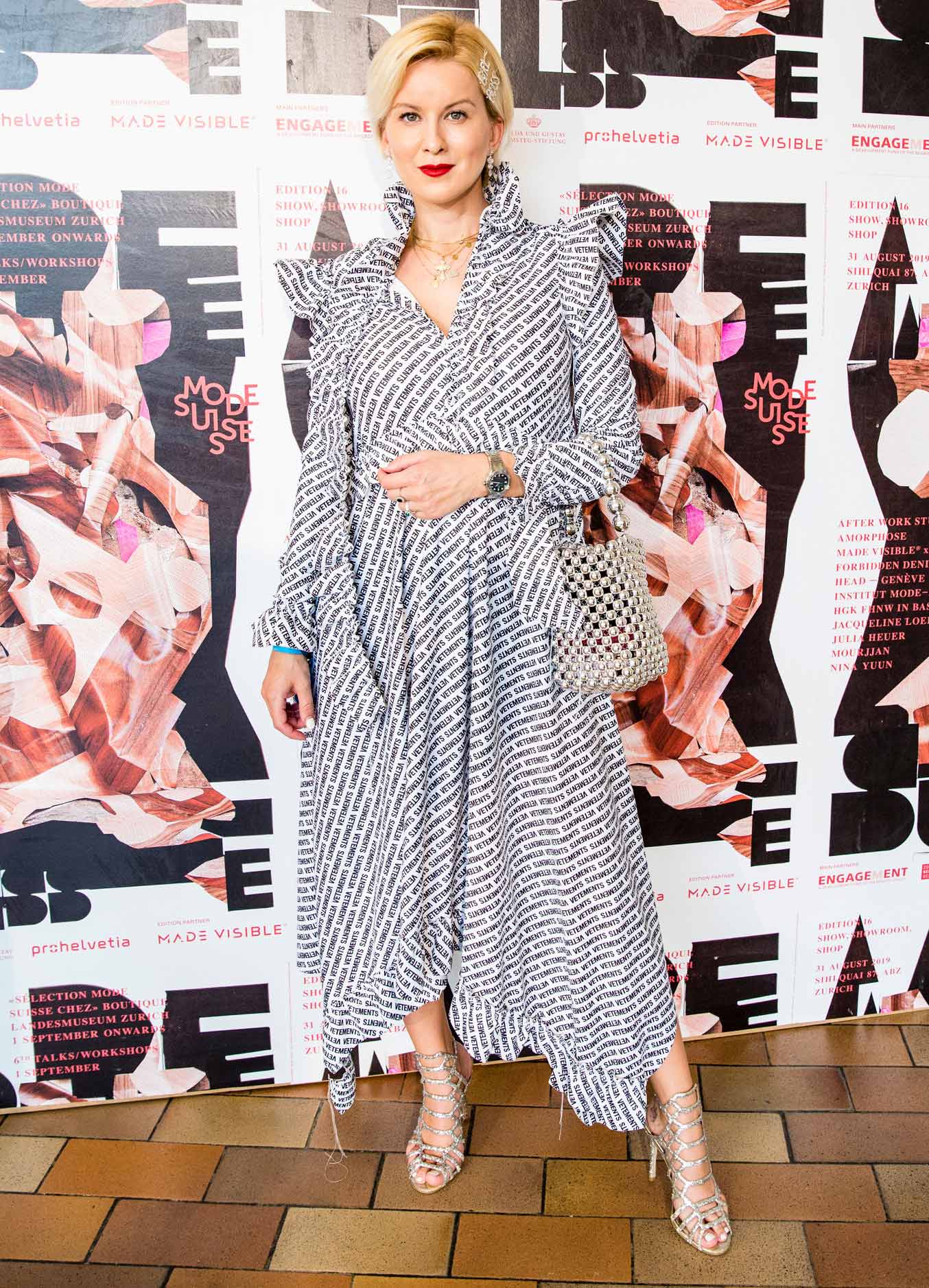
Visual Identity for Mode Suisse #16 – In collaboration with Sandi Gazic, Yul Tomatala, Eliott Villars.
2019, Campaign, Visual Identity, Art Direction, in collaboration with ECAL, Peter Puklus and Noir Associates
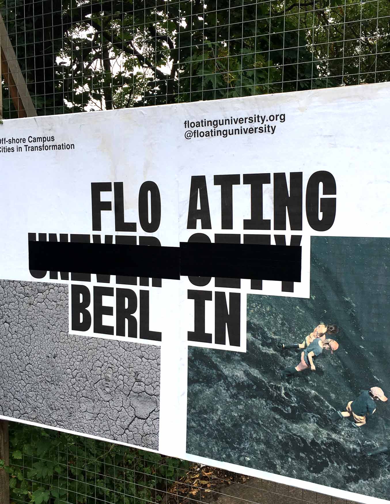
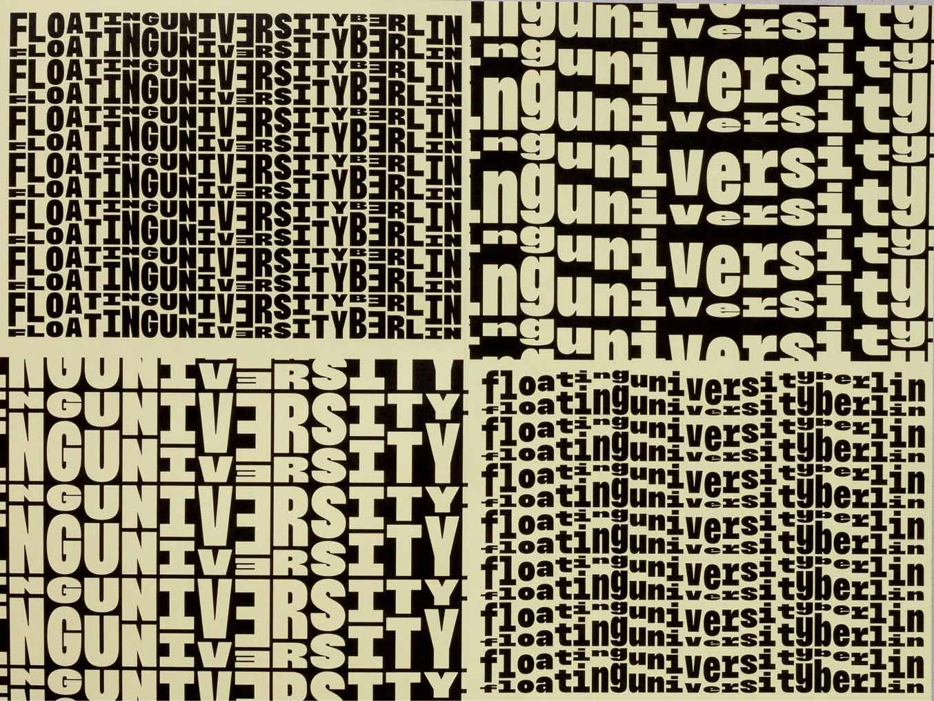
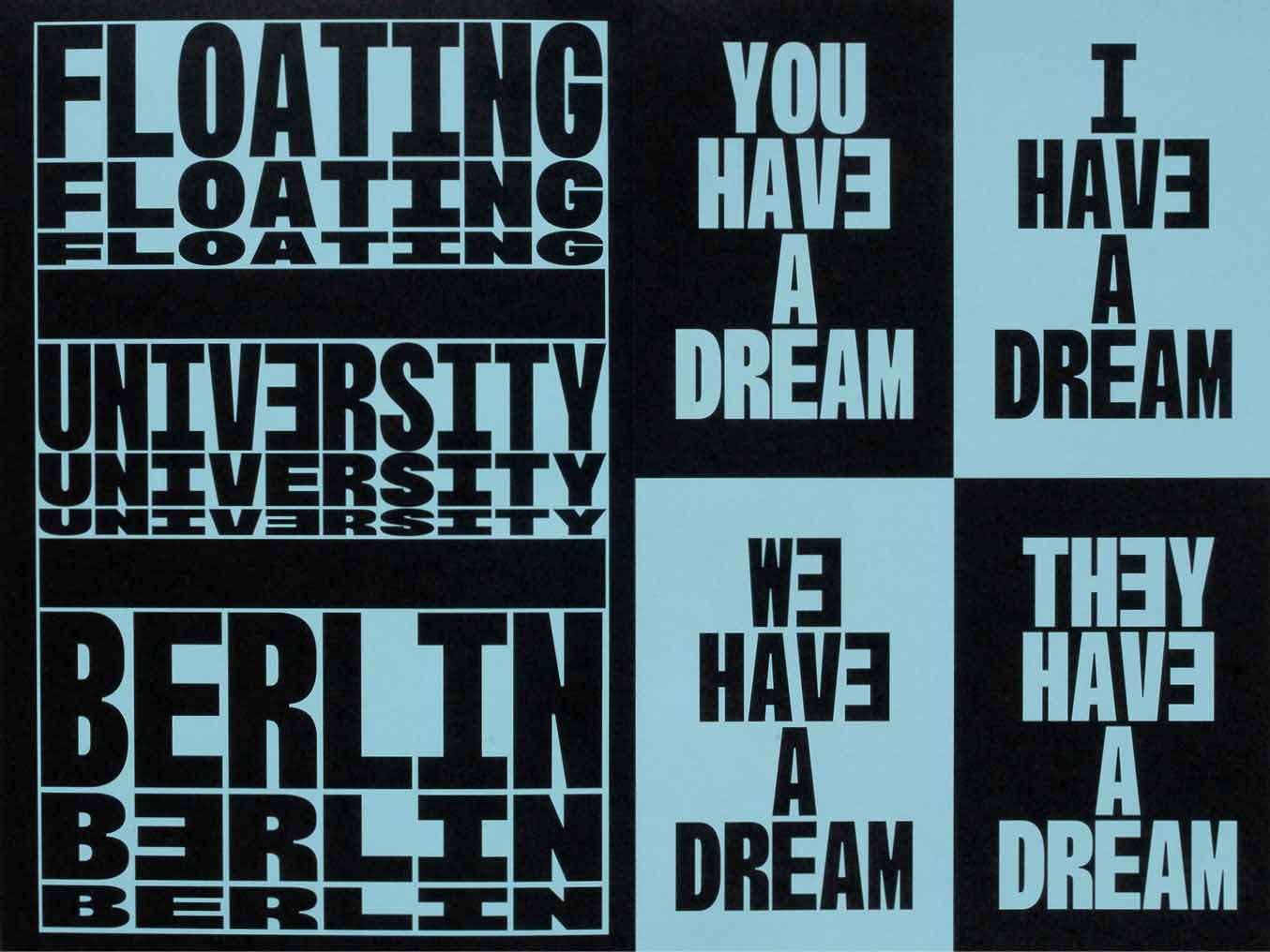
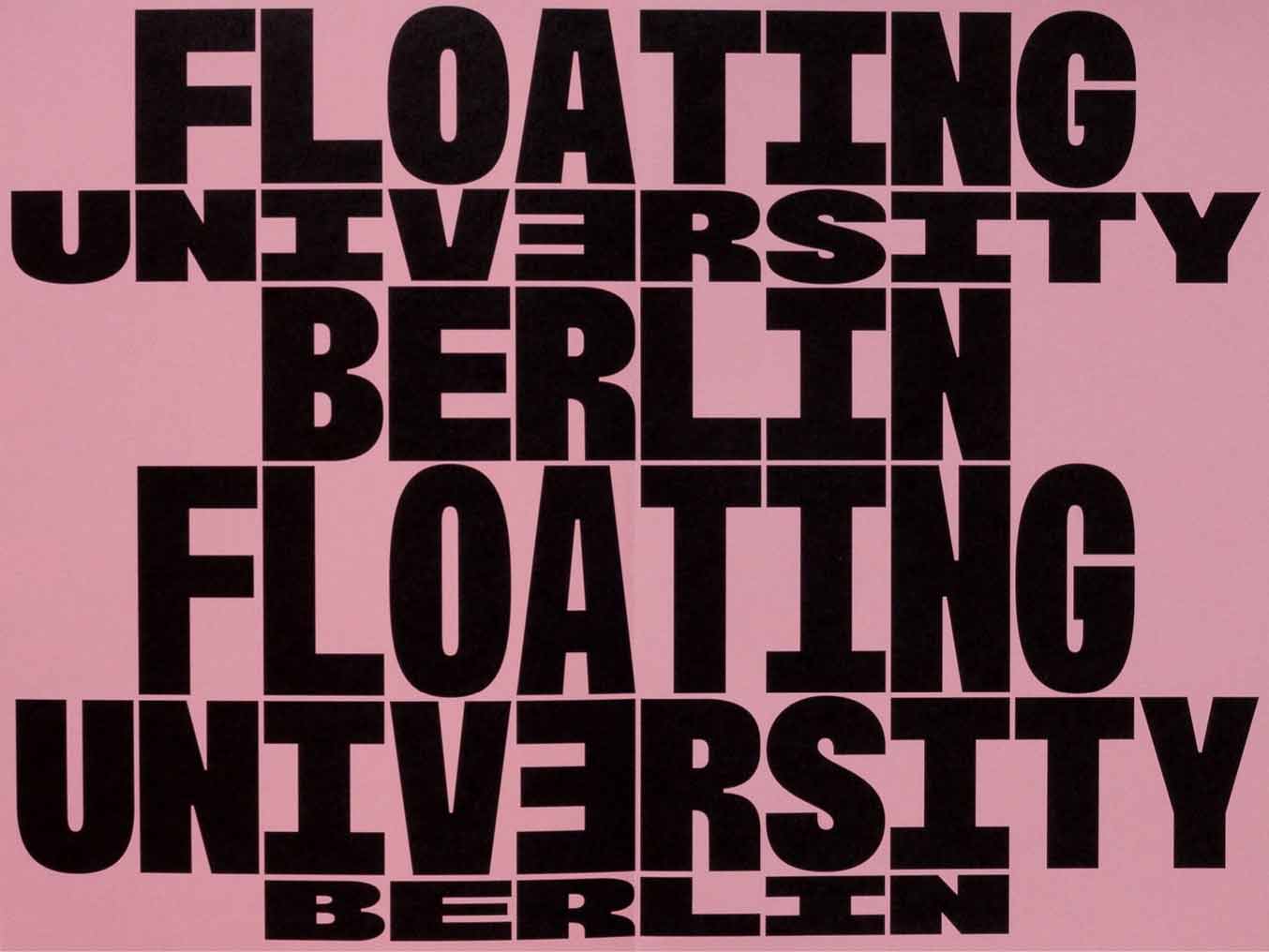
FLOATING UNIVƎRSITY BERLIN
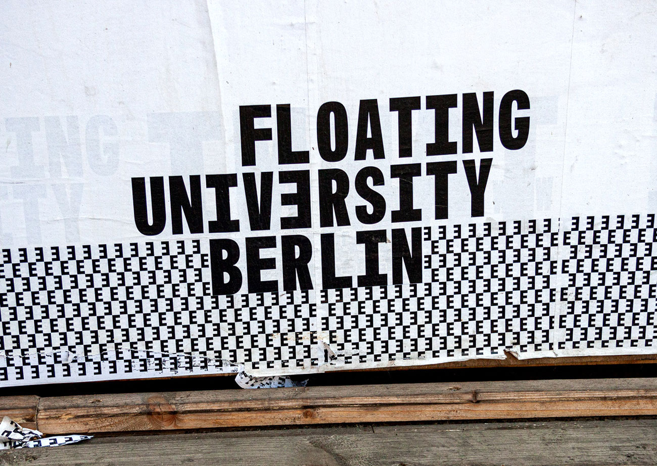
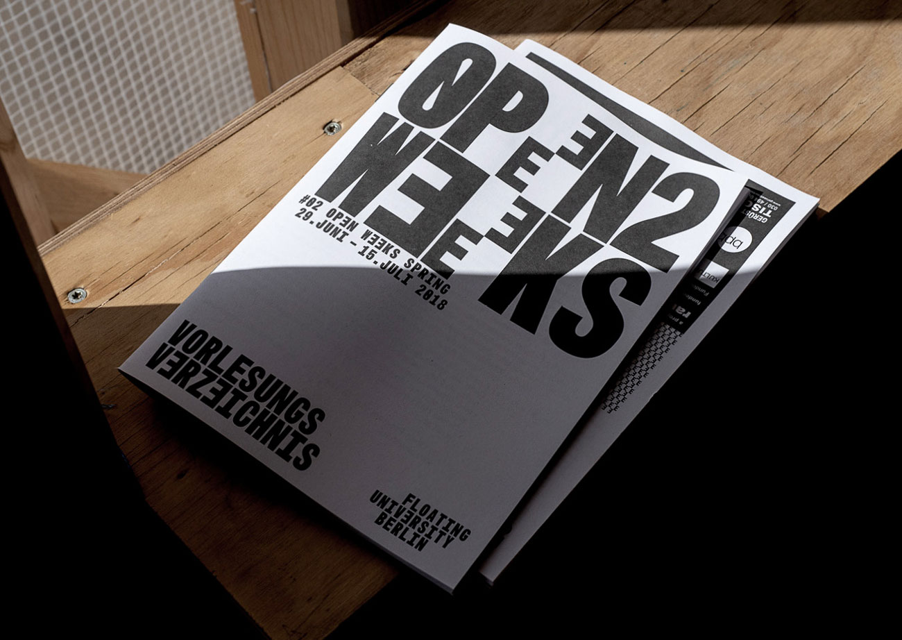
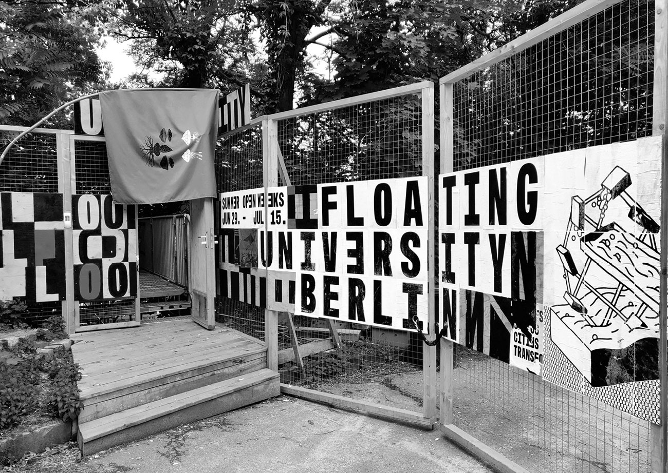
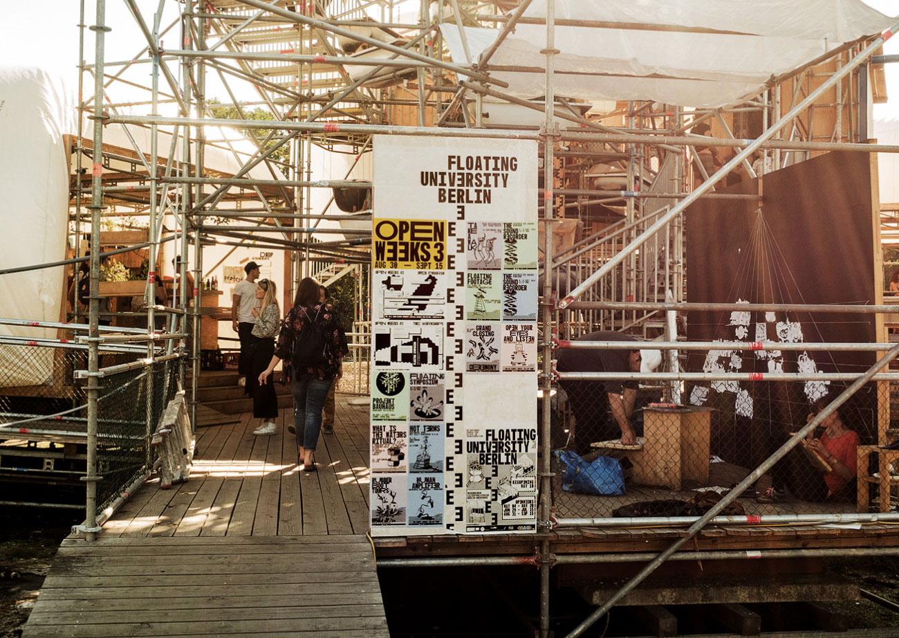
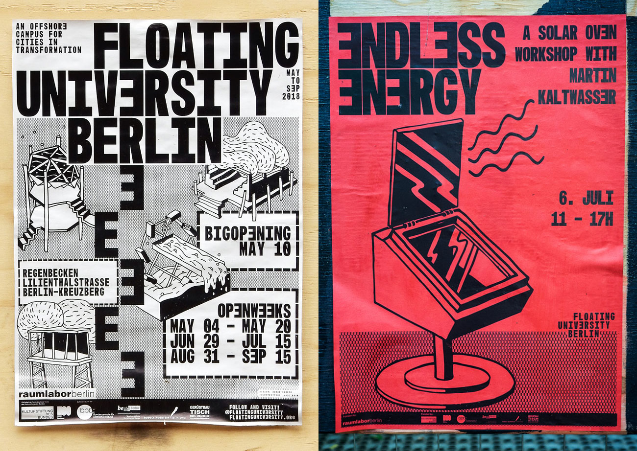
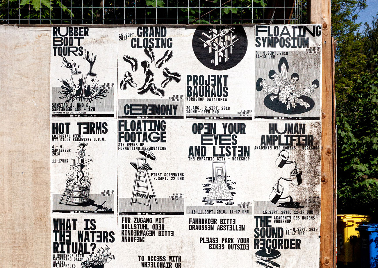
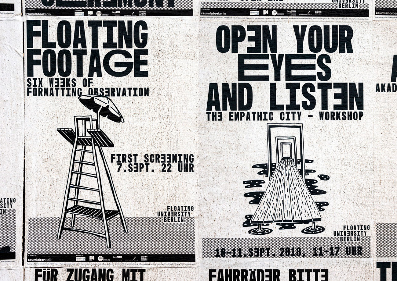
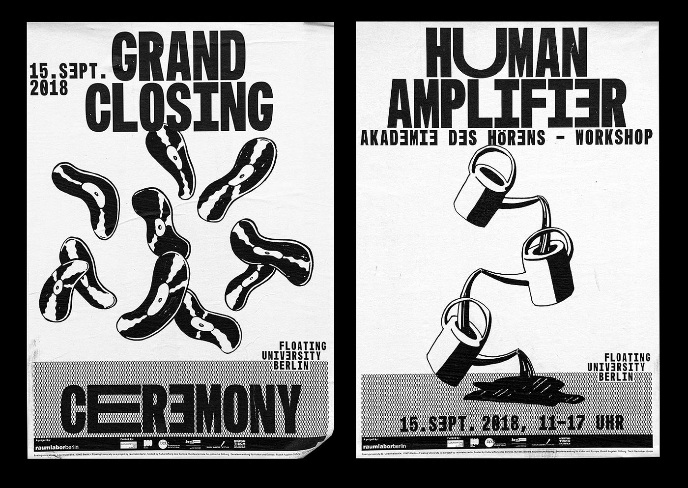
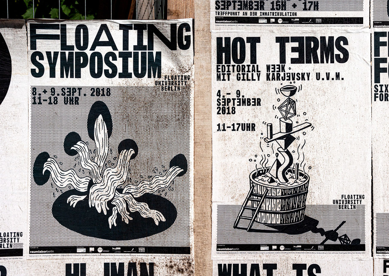
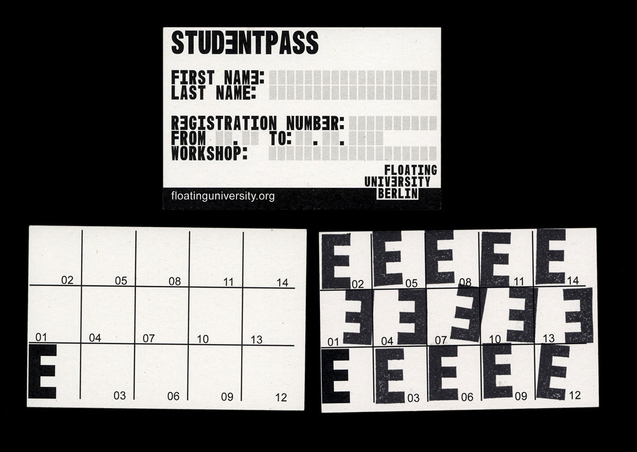
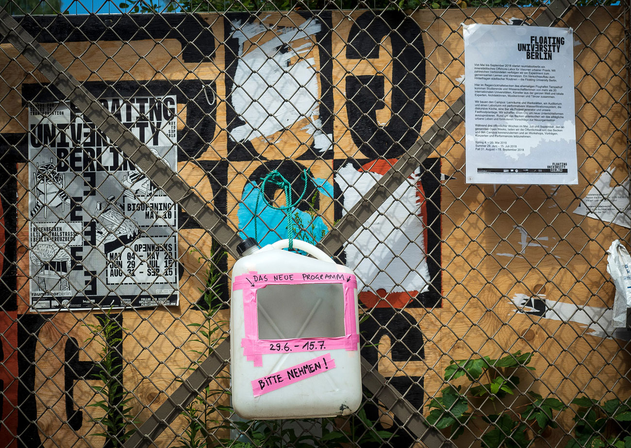
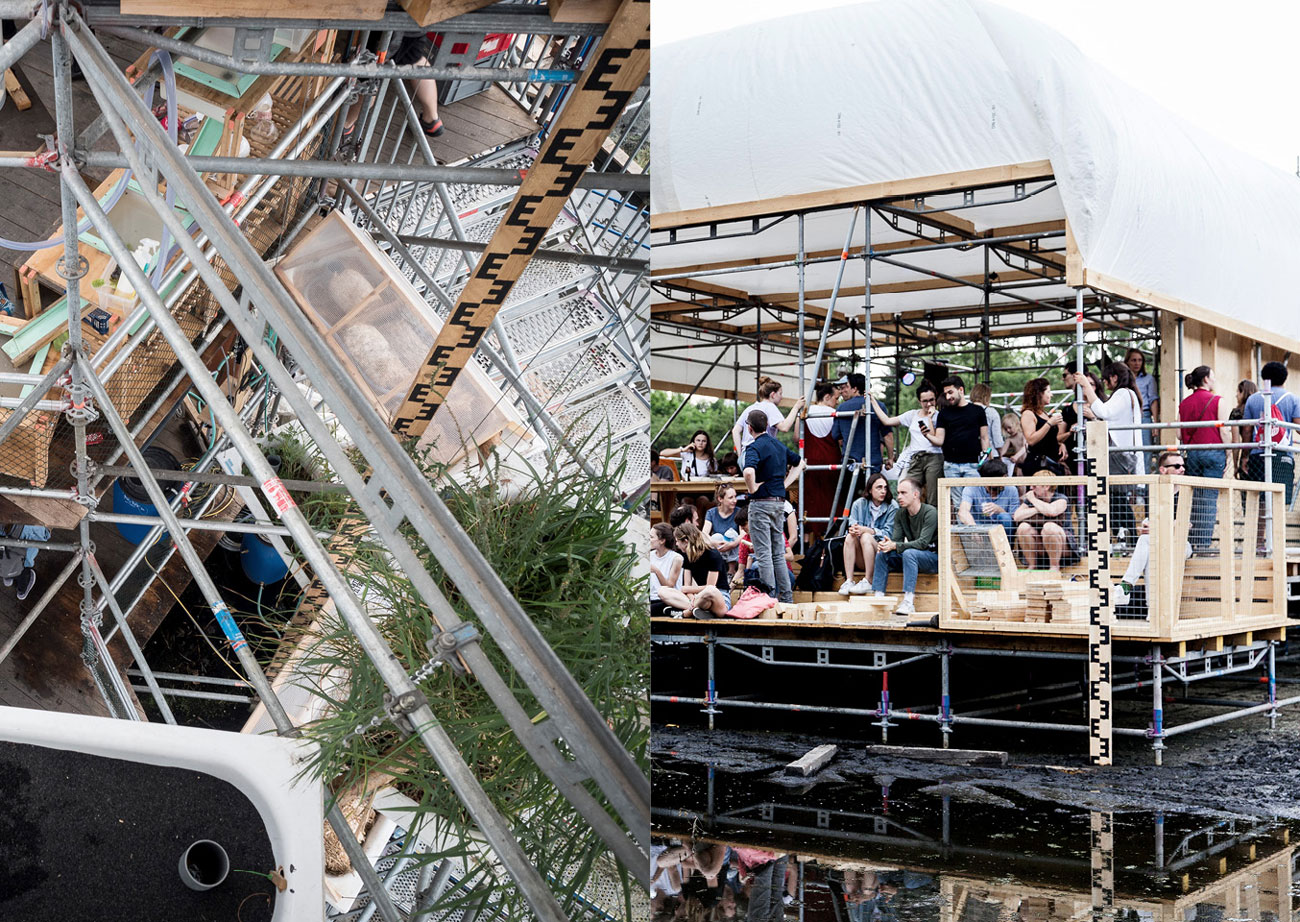
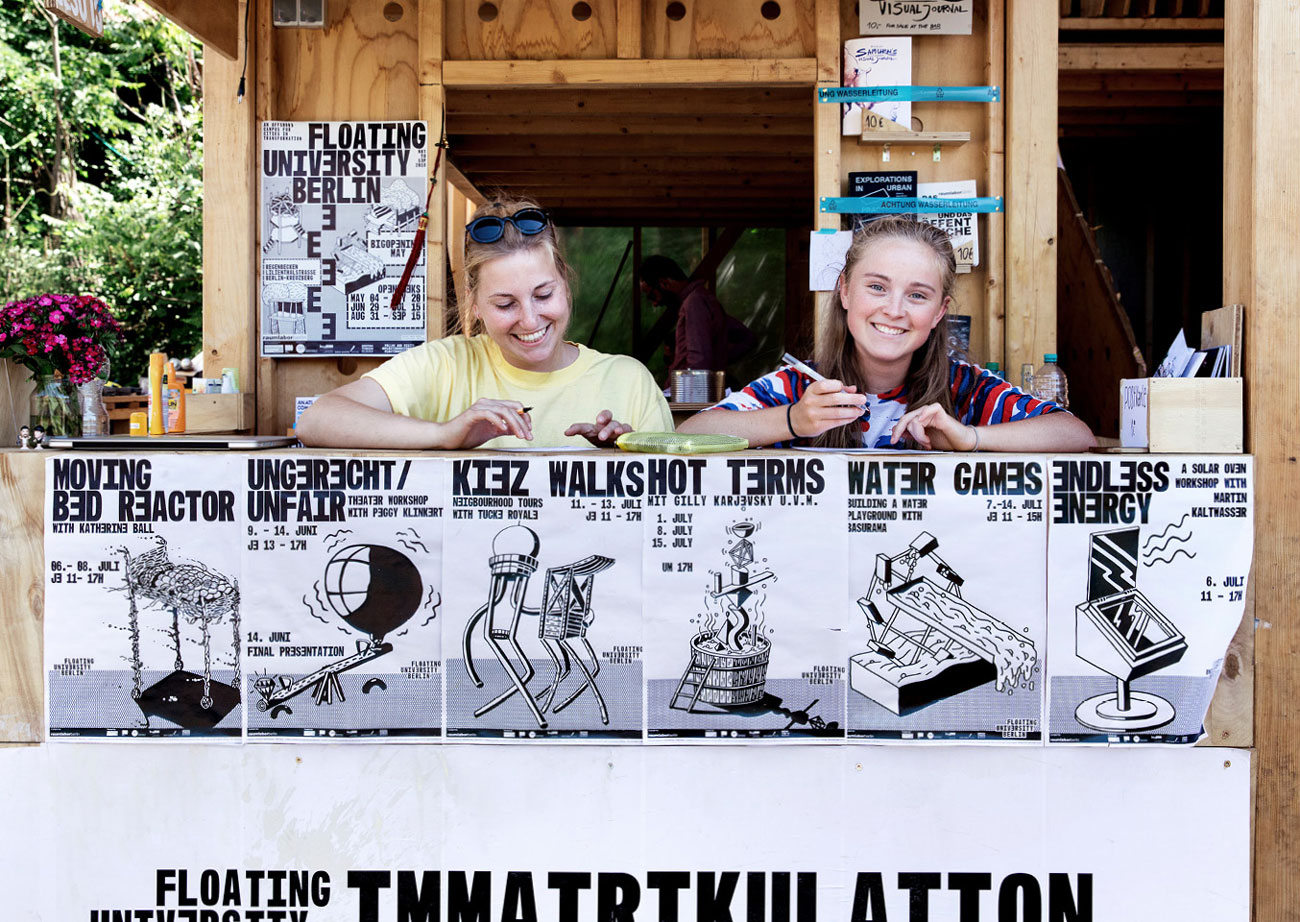
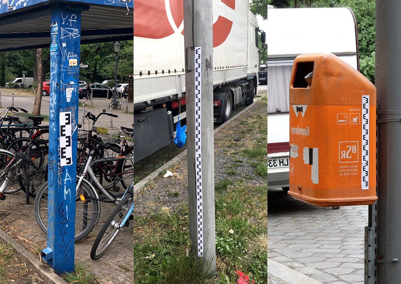
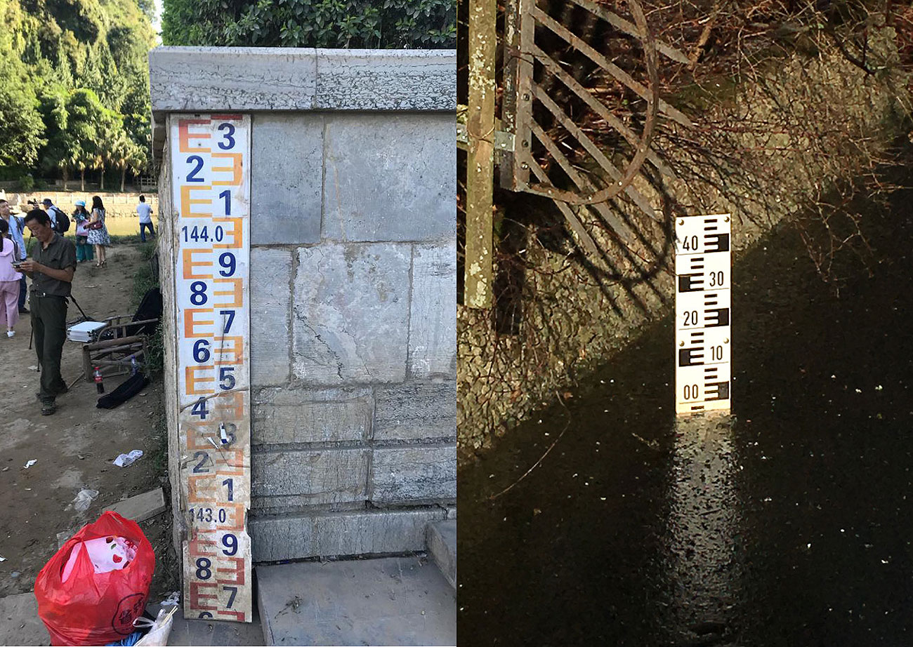
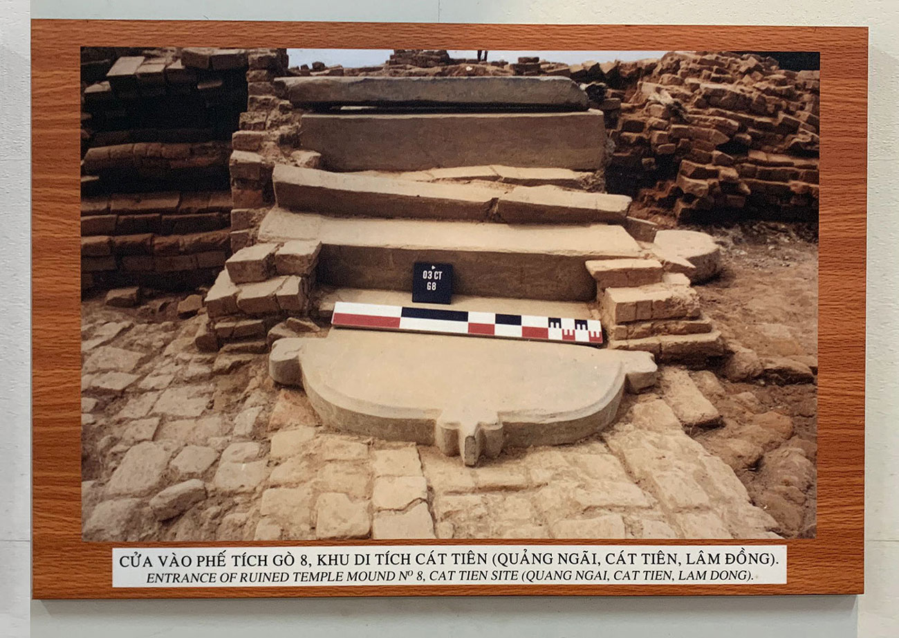
For the Floating University Berlin I created the visual-identity. The identity is based on the the waterlevelmeter a tool that one can find in many different waters like rivers and lakes to measure the waterlevel. Based on this vernacular aesthetic I created a fully responsive modular system based on a custom monotype together with DIN-Formats.
The Toolbox containing grids and other elements is opensource and democratic and was made accesible to everybody that is or was involved. Following those Guidelines, various media like posters, website, student-passes, navigation- and informationsystems, scenographic elements on the site, programs, flyers etc. have been created by Annabelle Dorn, myself and others. Illustrations by Joel Roth and Annabelle Dorn.
2018, Visual Identity, Toolbox, Typeface, System, Scenography, Intervention, Various Medias
Supervised by Jonas Wandeler, Initiated by raumlaborberlin, realized at ECAL
Jihad
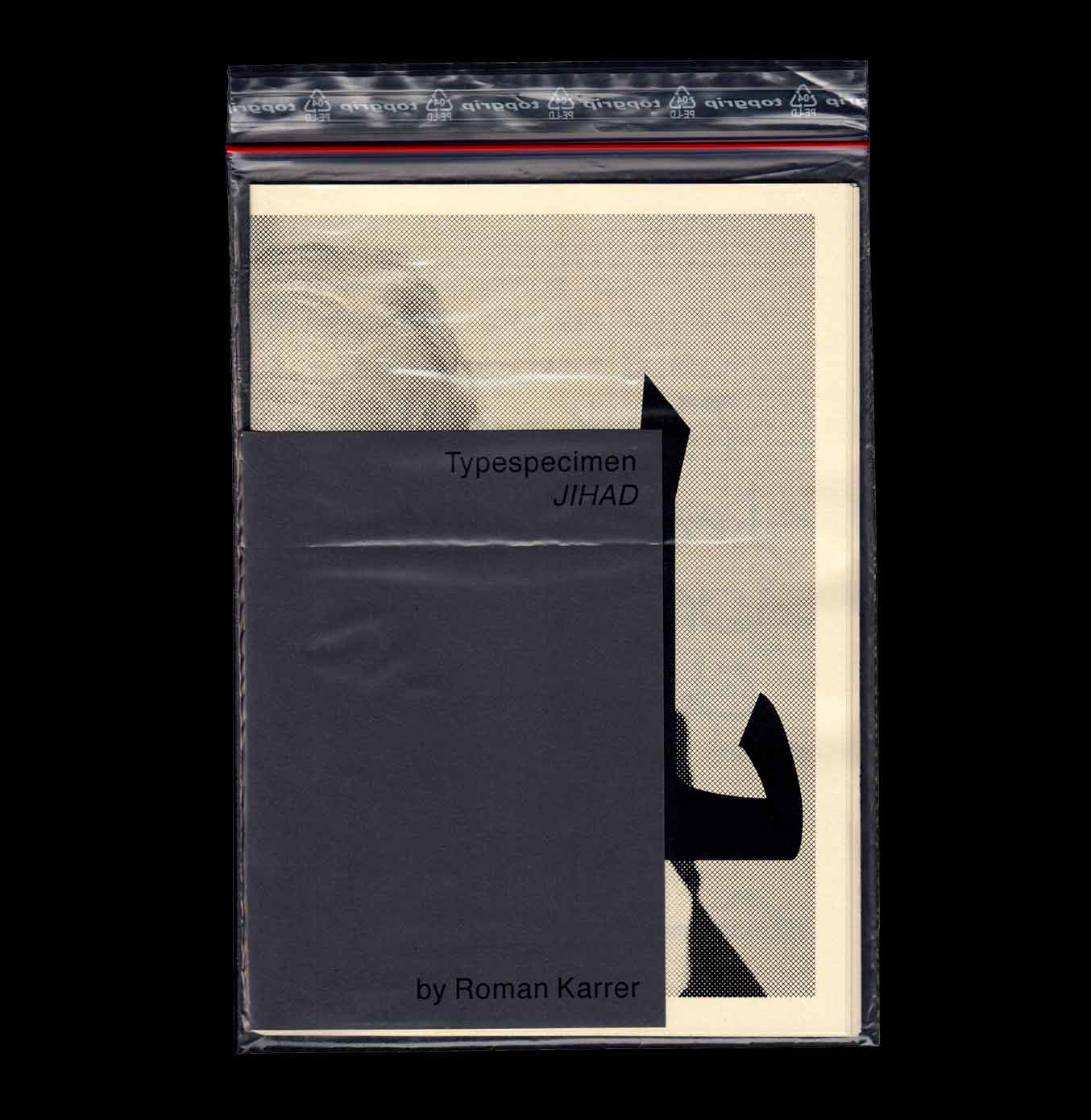
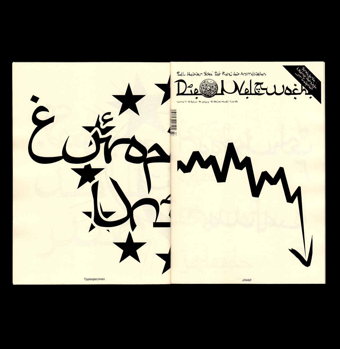
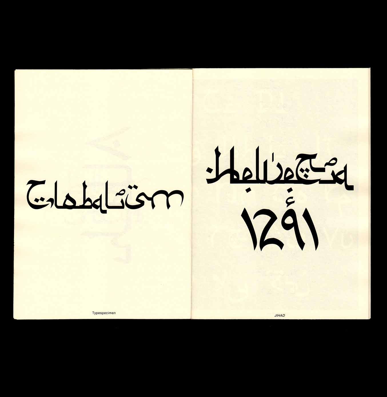
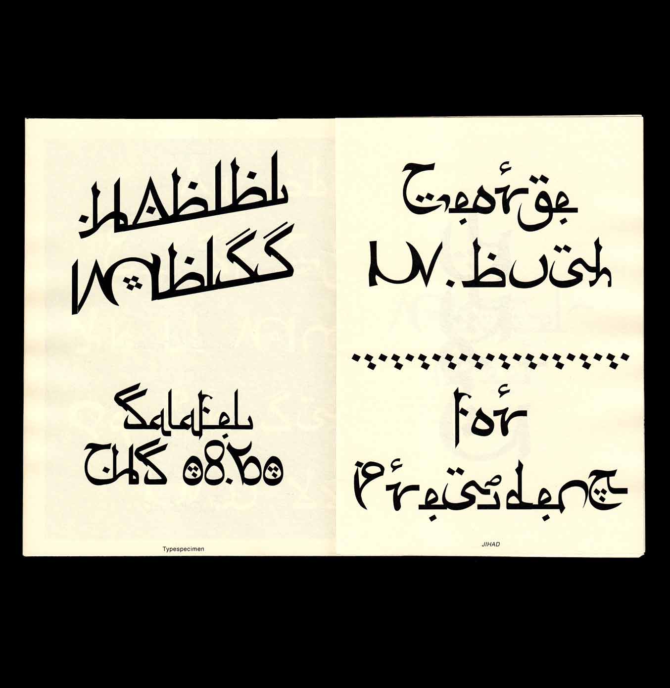
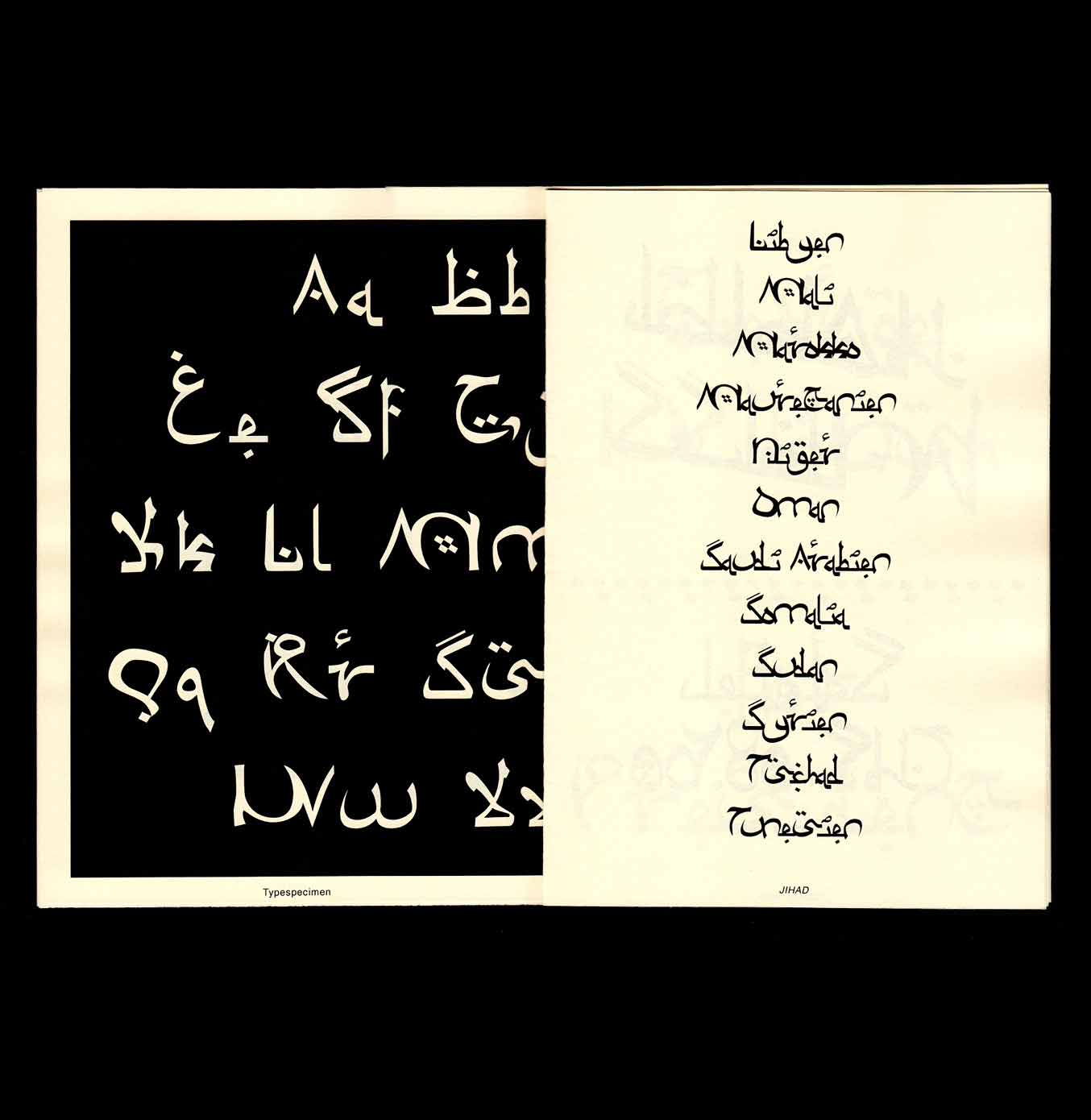
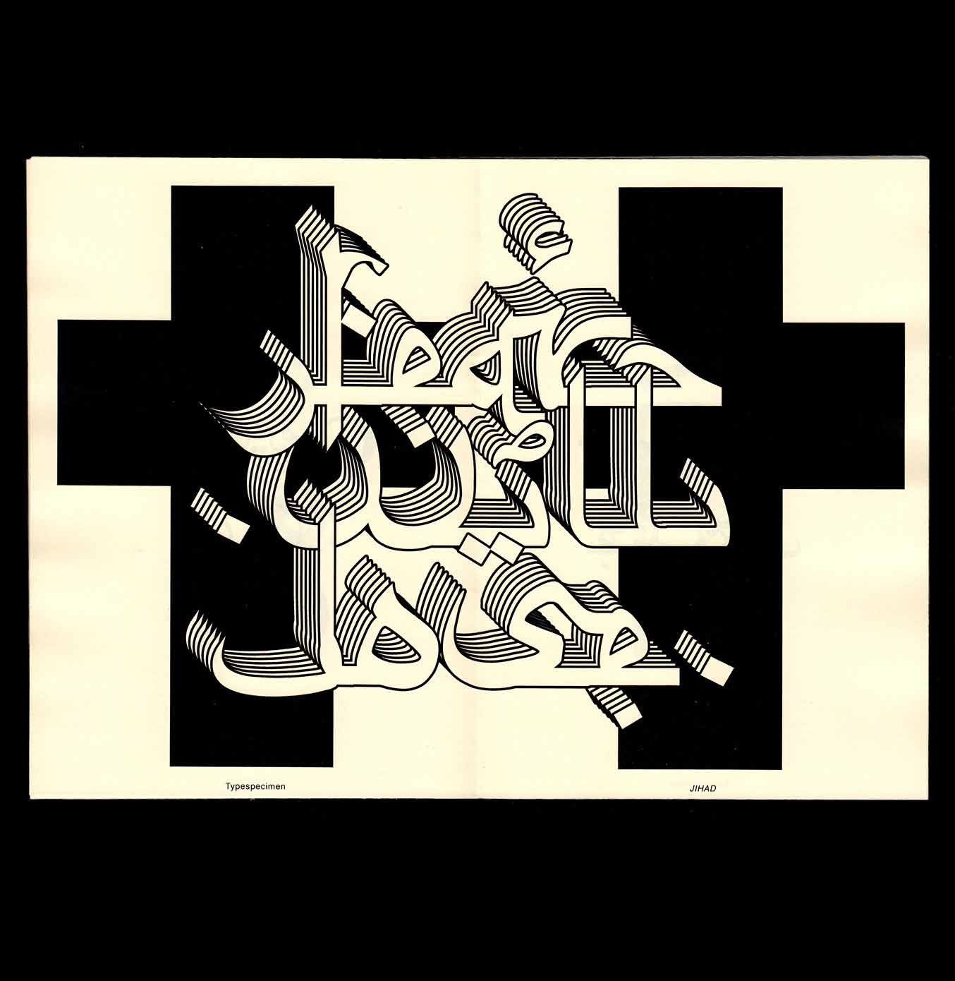
The conceptual typeface Jihad is a personal project that was developed while I was teaching German in a refugee camp for one year. The hybrid writing wanders between the aesthetics of Arabic and Latin writing and plays with our perception of the foreign and the familiar. With this project I wanted to create a critical commentary on the widespread fear of foreign cultures and help in the intercultural dialogue.
2016, Conceptual Typeface and Specimen, A5
I do (not) agree
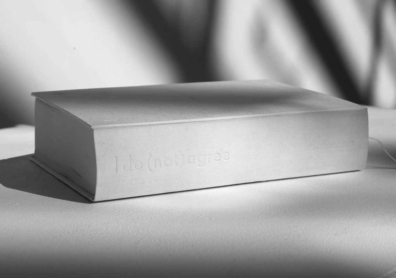
I do (not) agree is a conceptual work around policies in the age of the internet. During a week in June 2018 I collected all policies that I agreed with. To visualize the absurdity of that content I created this book with around 1000 pages. It would take a bit more than 13 hours to read it.
2018, Book, A4, realized at HFG Karlsruhe, 957 p. supervised by Sereina Rothenberger & Urs Hofer
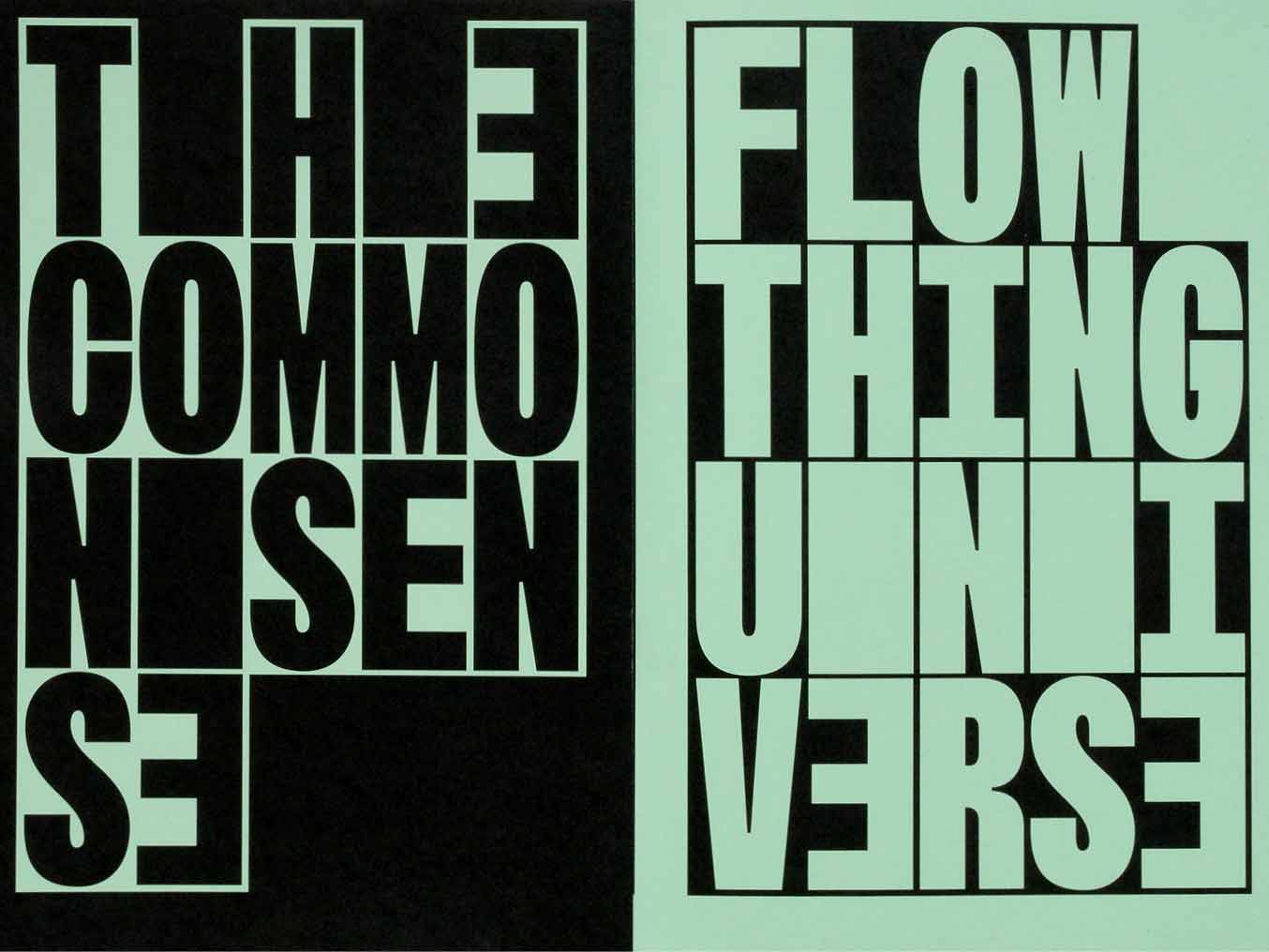
Trans #35 Bruch
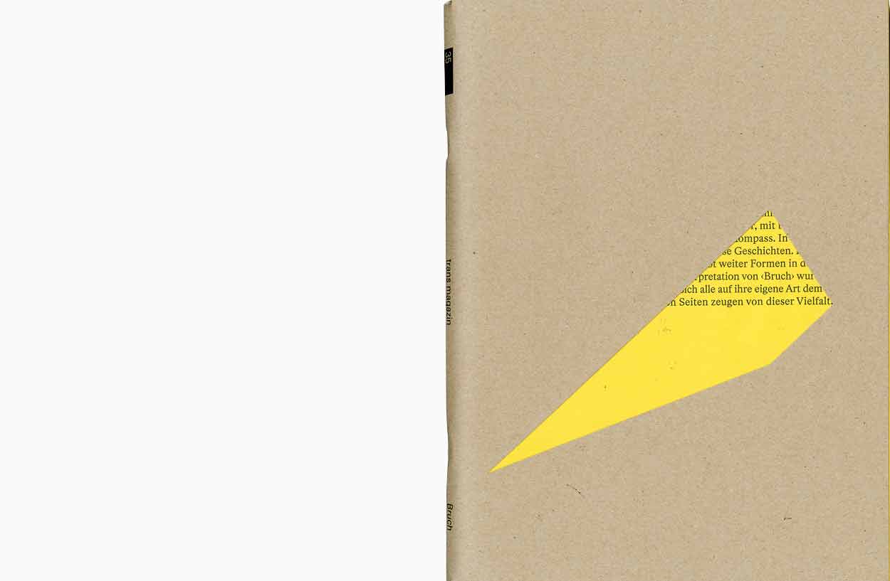
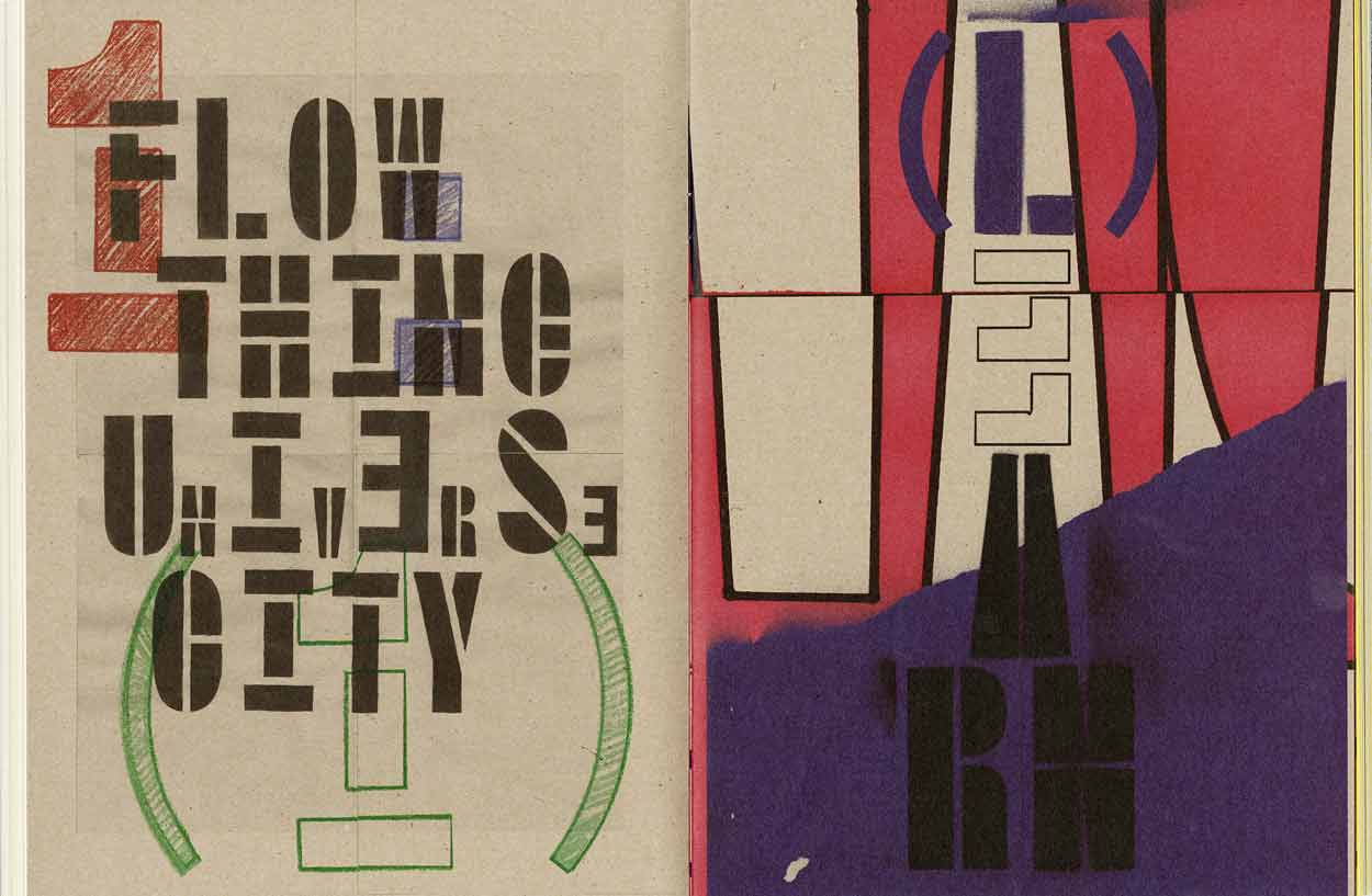
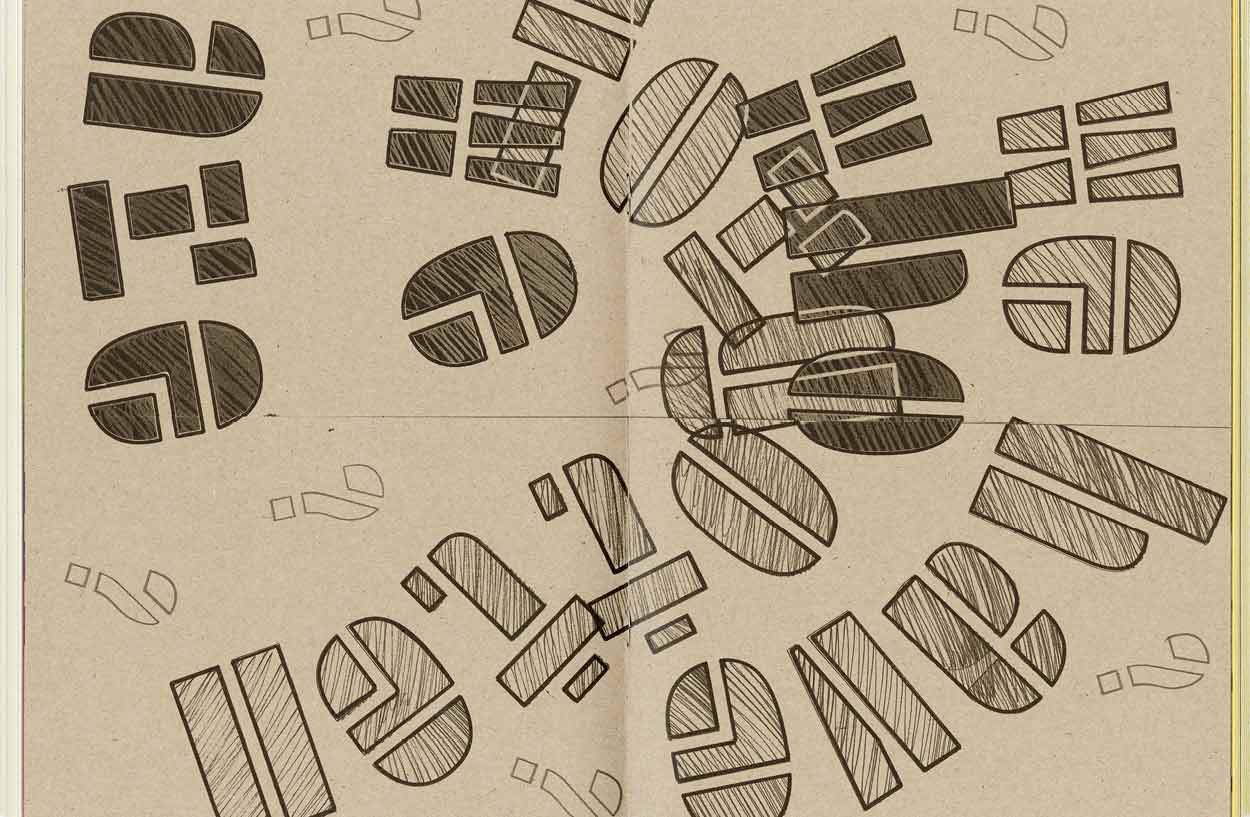
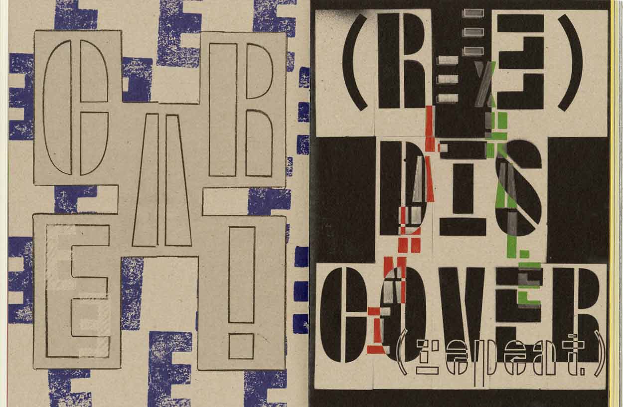
Flow Thing Universe City – A more personal interpretation and representation of the Floating University. Reproductions of manual work on paper using the Floating Mono Stencil. The work was published in the centerfold of the Trans Magazine #35 The issue was called Bruch (German for ‘break’ or ‘fraction’). Art direction and overall design by Pierre Benoit & Théa Giglio
2019, Feature, 210 × 280mm, 16 p.
Workshop Week
To announce the workshop week in autumn 2018 at Ecal, a visual concept developed in cooperation with Sandi Gazic was selected and realised. The identity was applied on animated and printed medias inside the campus. Thanks to Dinamo for letting us use your Typeface.
2018, Identity, Animated Posters, realized for ECAL
Floating Mono Beta
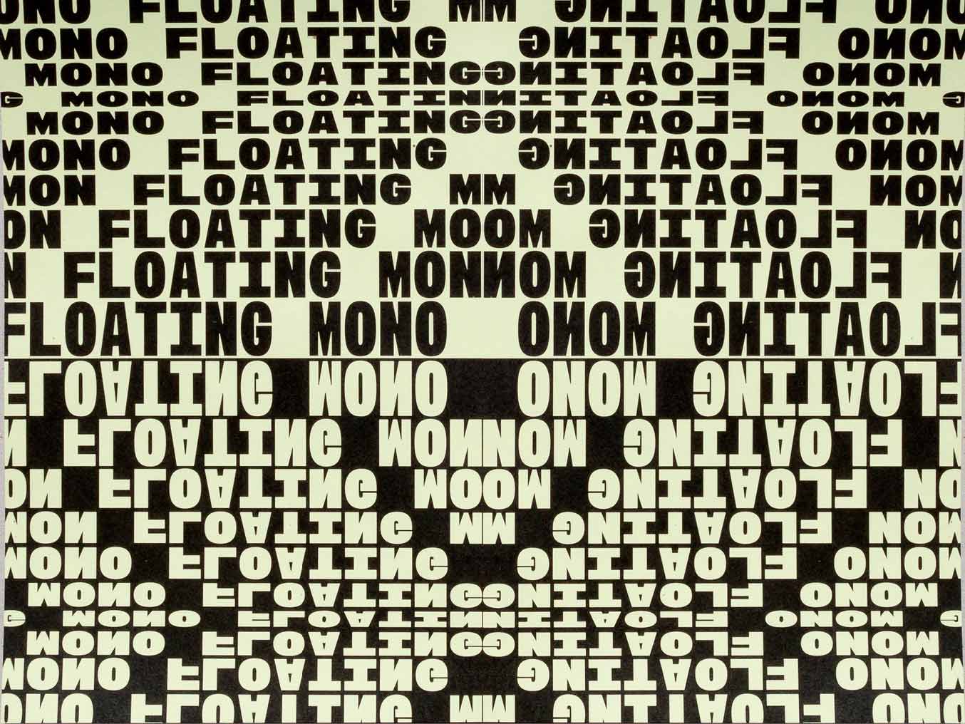

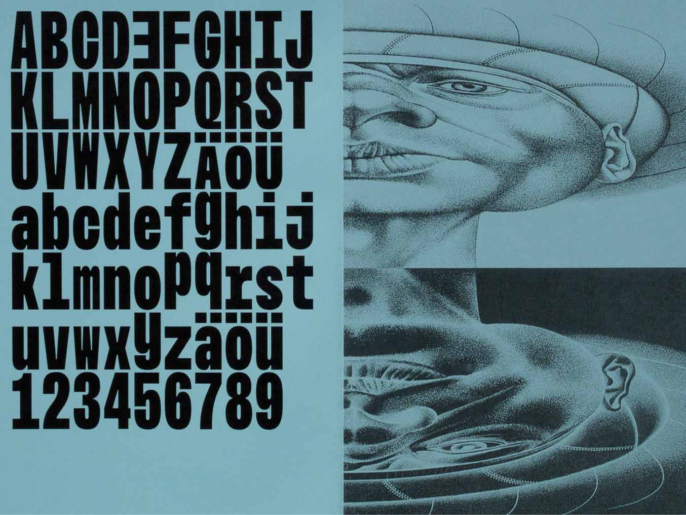
The Floating Mono is a typeface that I developed for the Floating University Berlin. Since 2018 I am constantly working on improving and expanding it. The Monospaced font is inspired by the water level meter which can be found in different waters like lakes and rivers to measure and observe the water level. In 2019 I have added a variable height axis to the font to make it more playful and fluid. The work is ongoing.
2019, Variable Typeface, realized at ECAL
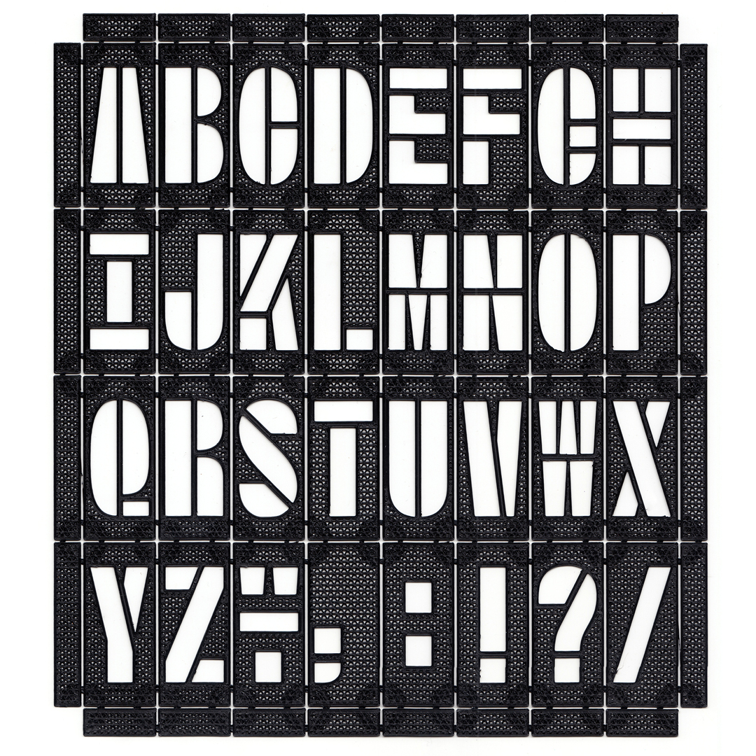
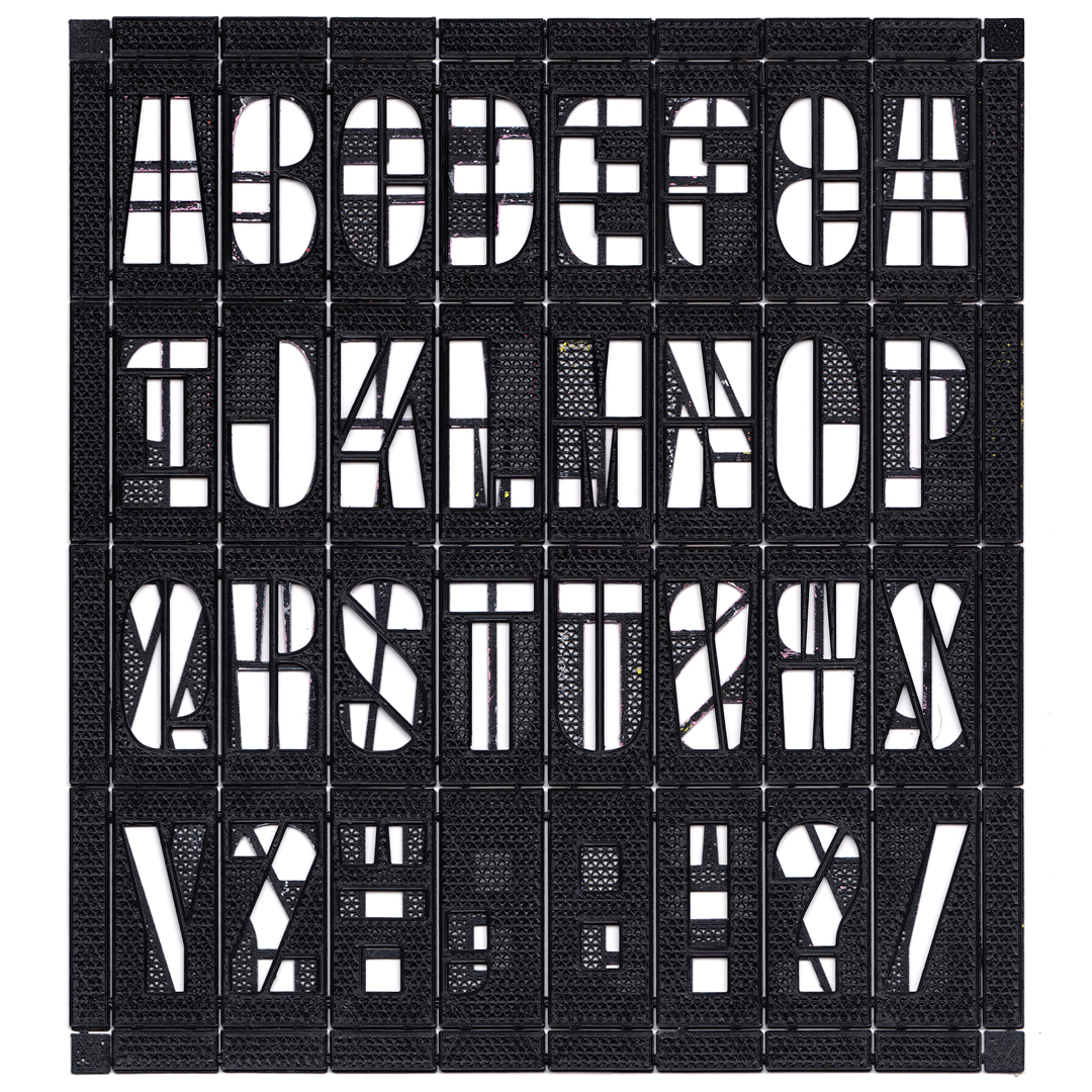
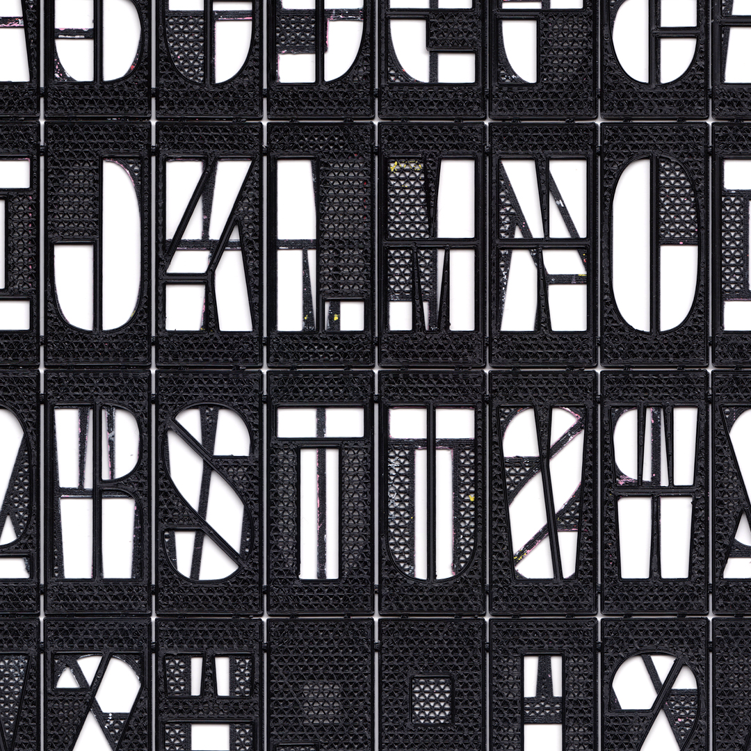
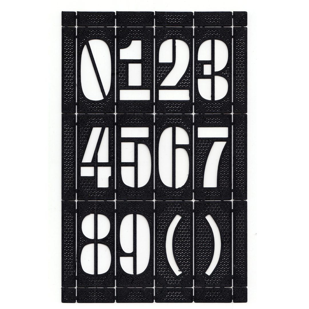
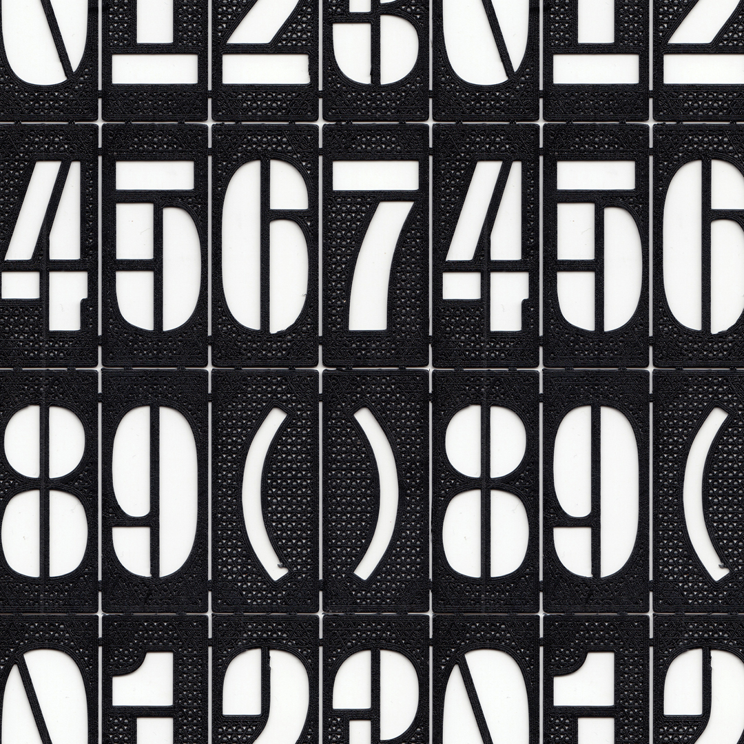
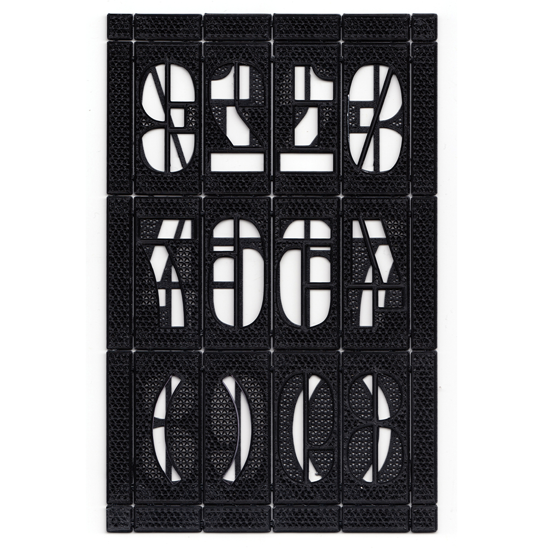
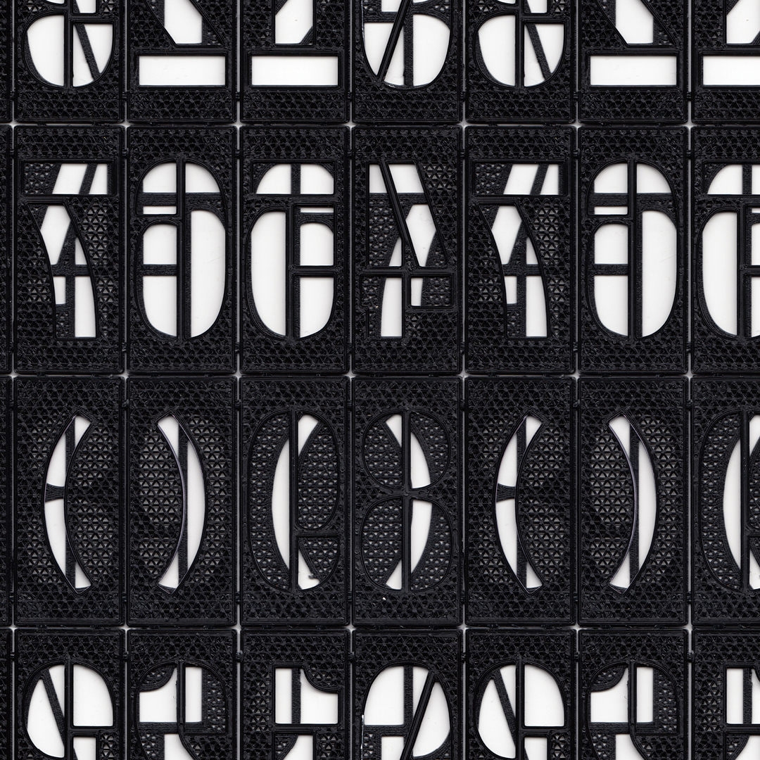
Floating Mono Stencil
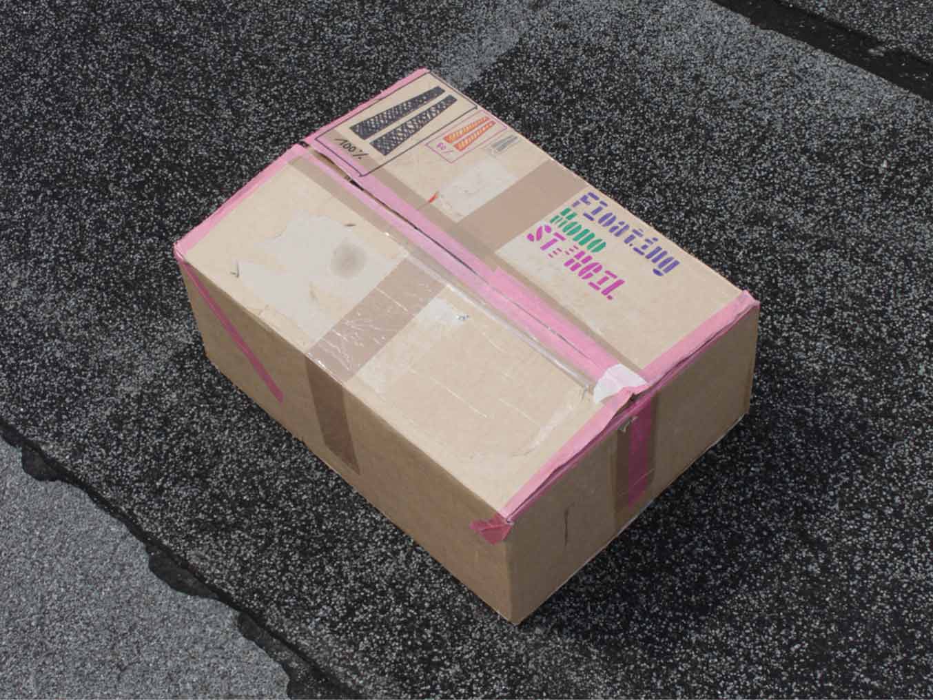
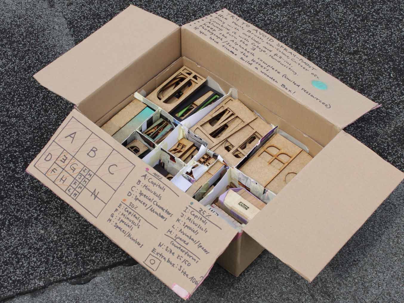
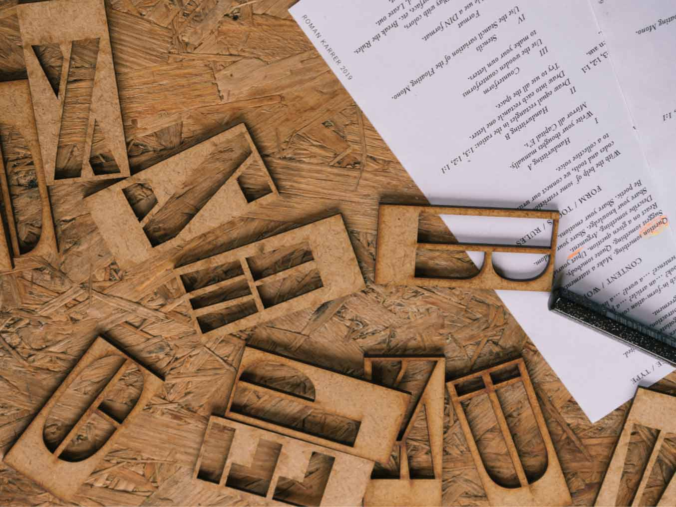
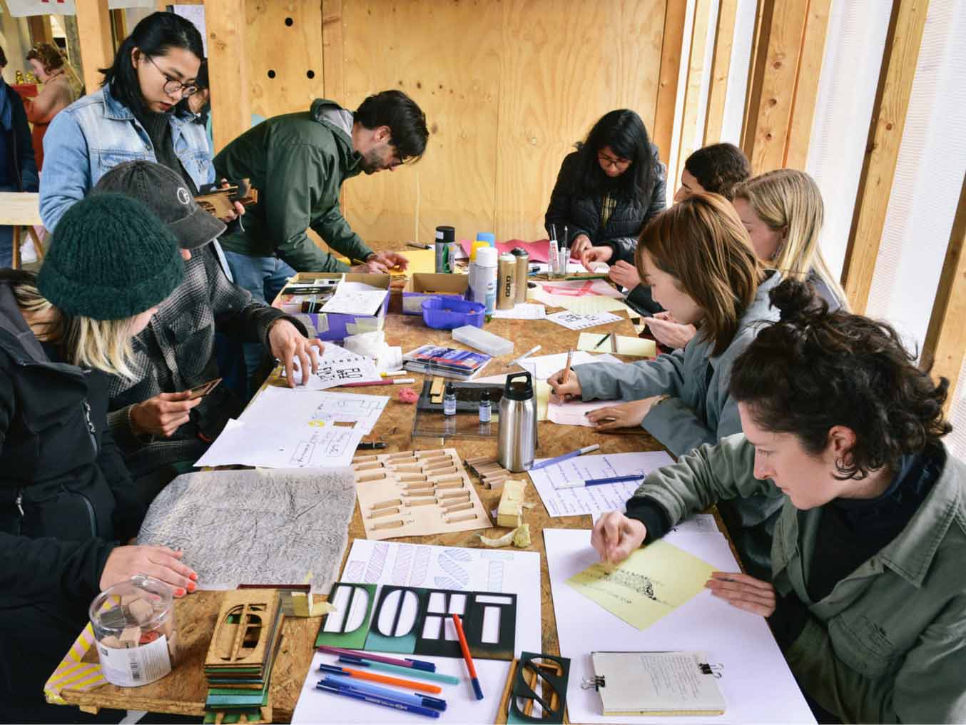
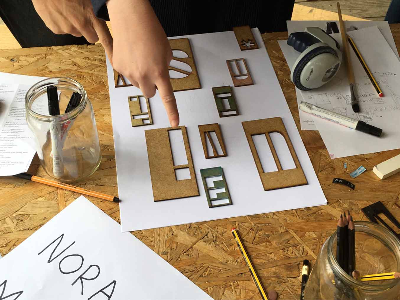
The Floating Stencil is a materialized version of the Floating Mono. The toolbox comes in four relative sizes, each of them increasing in fractal dimensions. The character set is an integral part of the thinking infrastructure of the Floating University Berlin. The idea behind it was to create a physical connection between architecture and Graphic Design or Language. The toolbox was used by me and other actors in the context of the project at different moments and for different purposes.
2019, Typeface, Toolbox, realized at ECAL
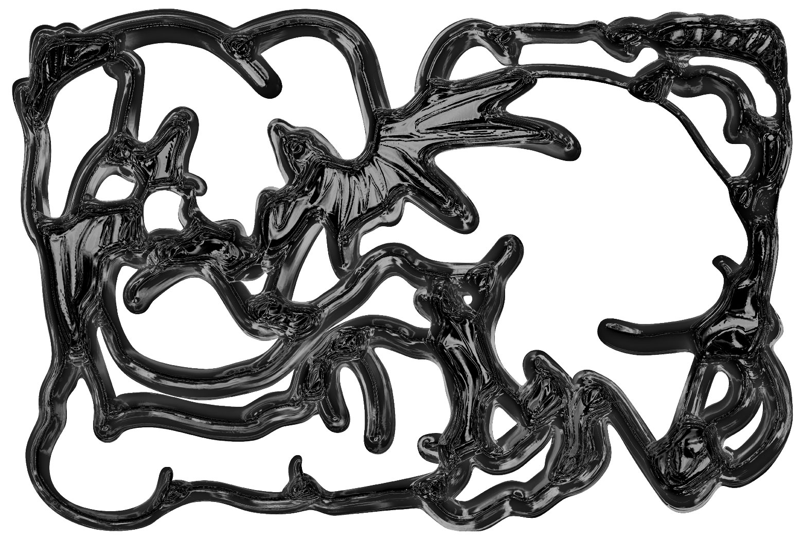
The problem is not the problem
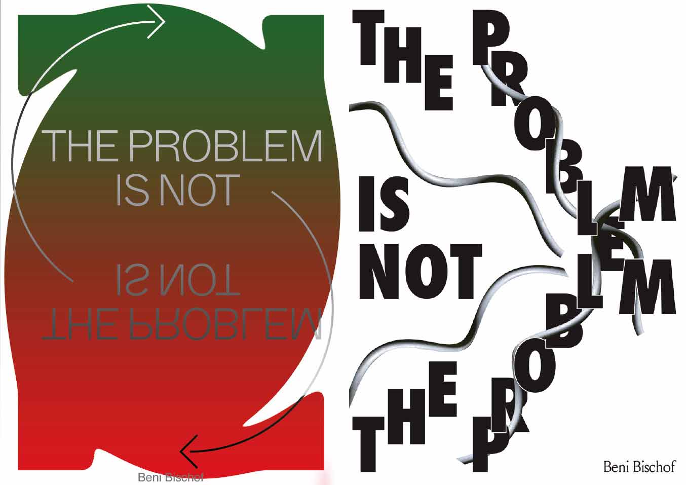
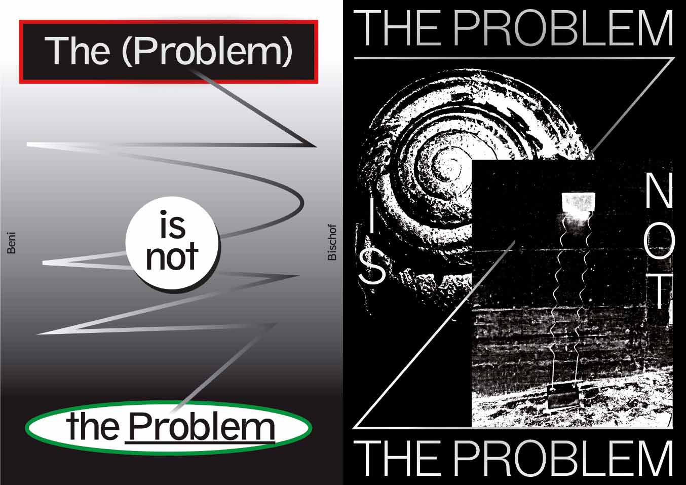
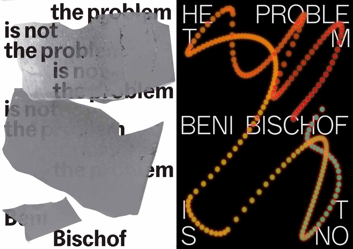
Methodical poster series that interpret the quote “The problem is not the problem”, which I found in the book “Texte 1” by the Swiss artist Beni Bischof.
2017, Posters, realized at ECAL
Club Vacances
Contribution to the zine Club Vacances which was initiated and curated by my friends Thomas Prost & Elise Connor in summer 2018.
2018, Illustration, Contribution
‘STRUCTURAL’
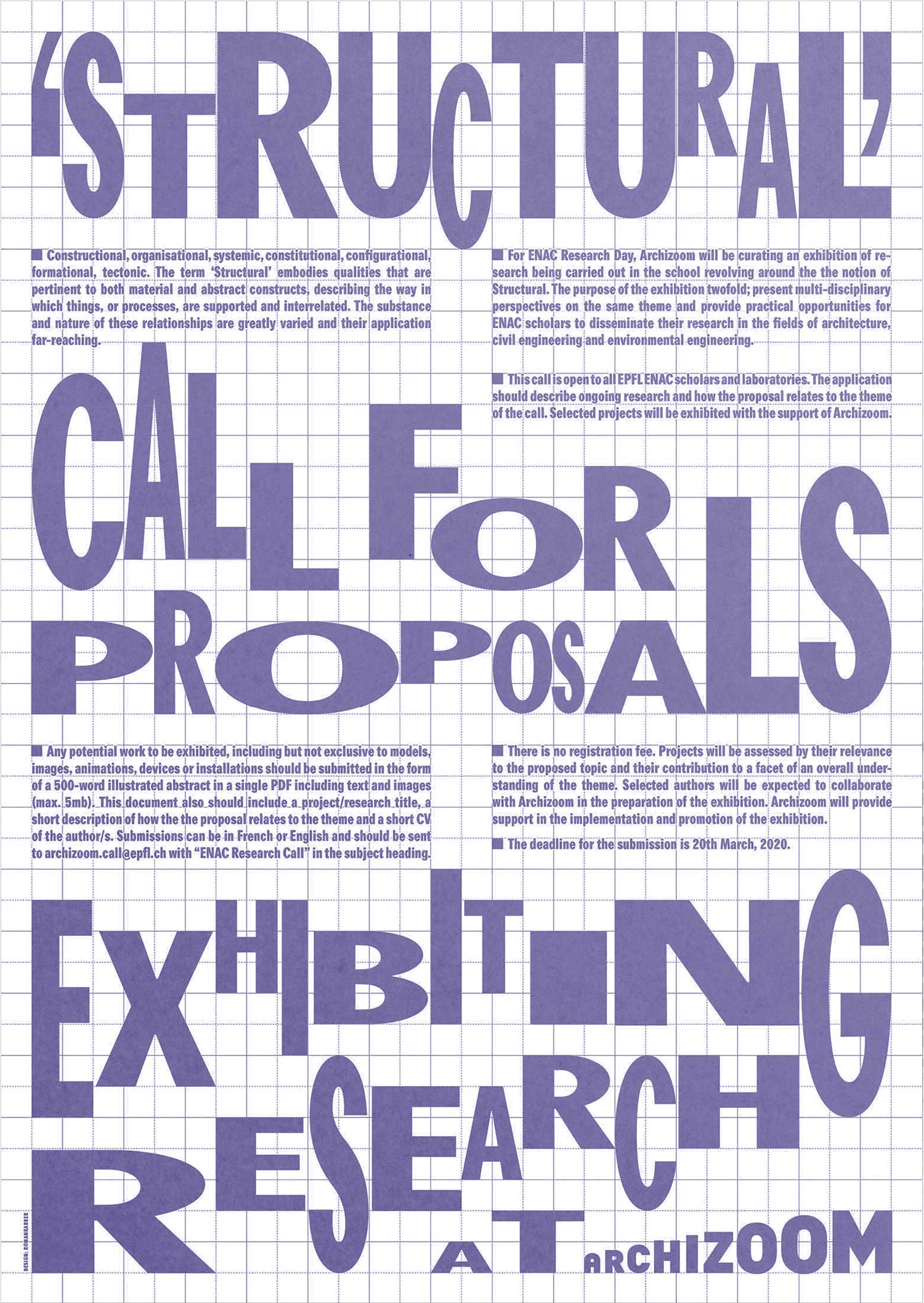
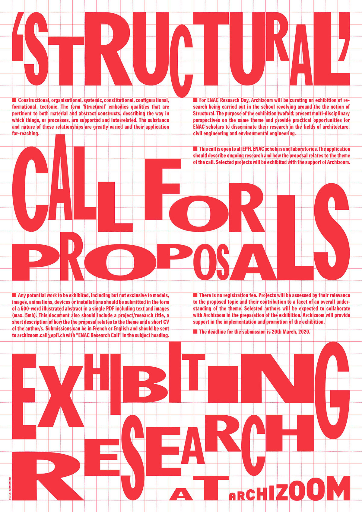
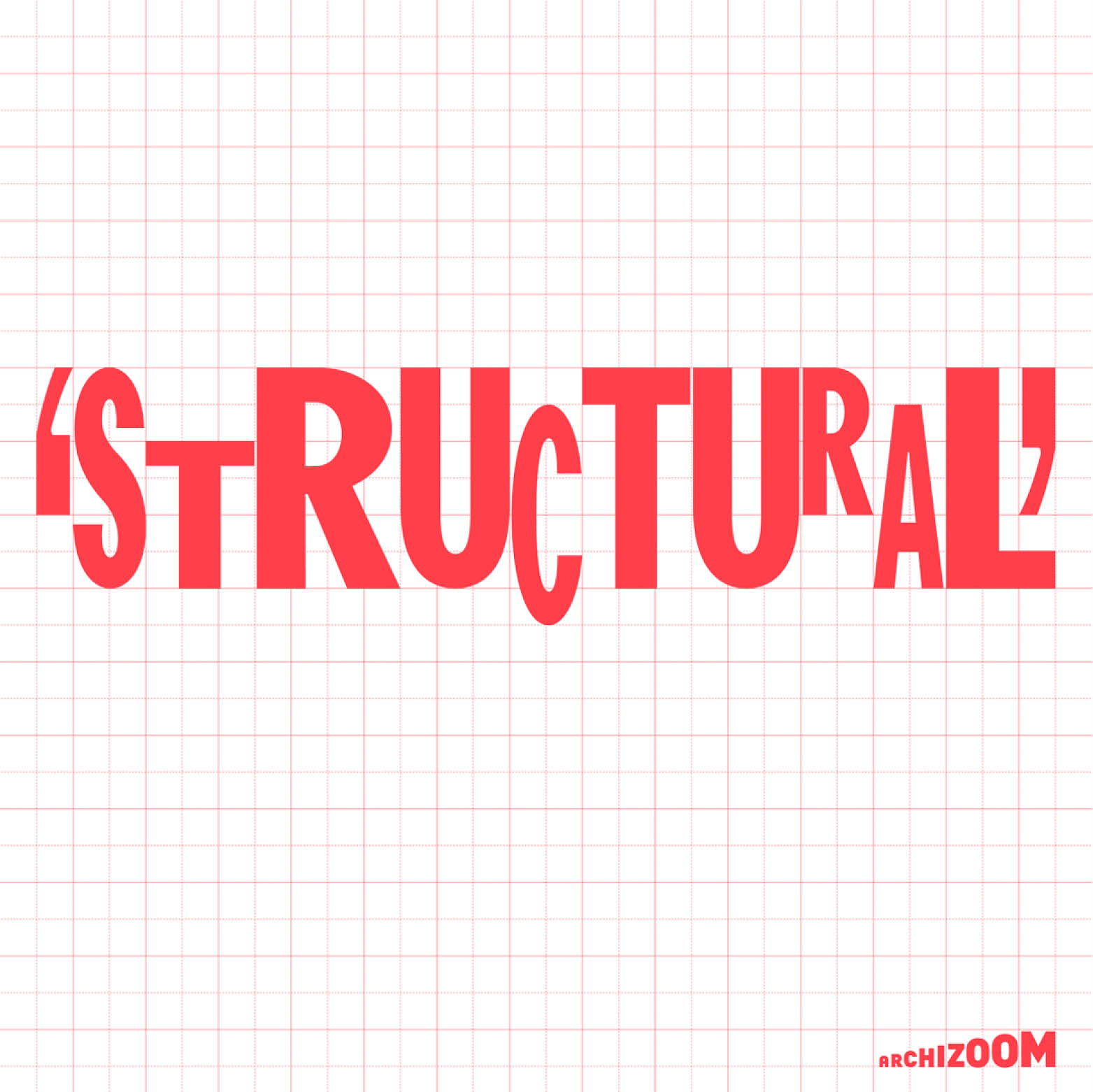
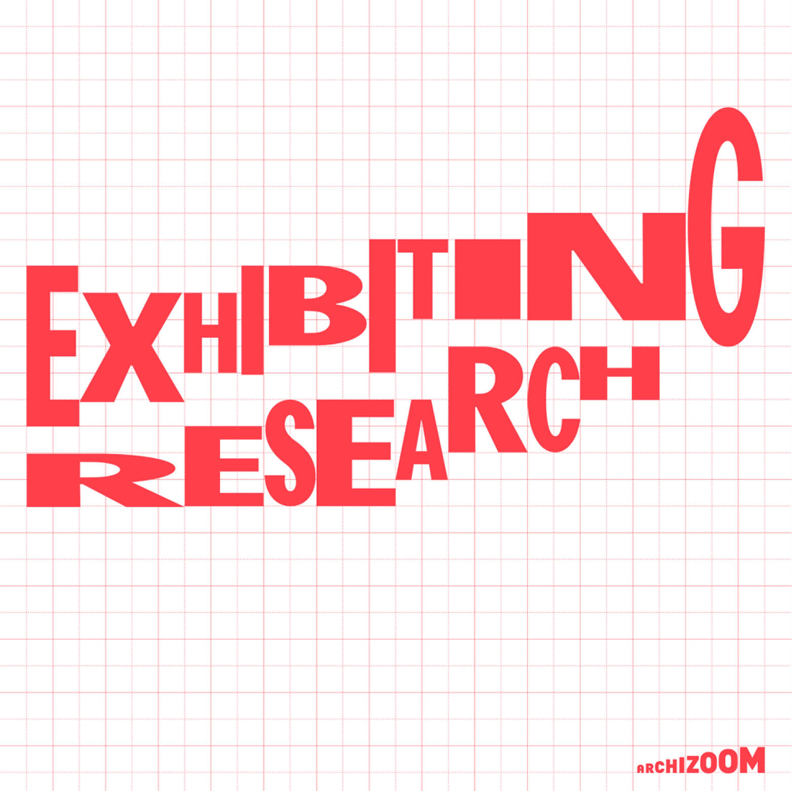
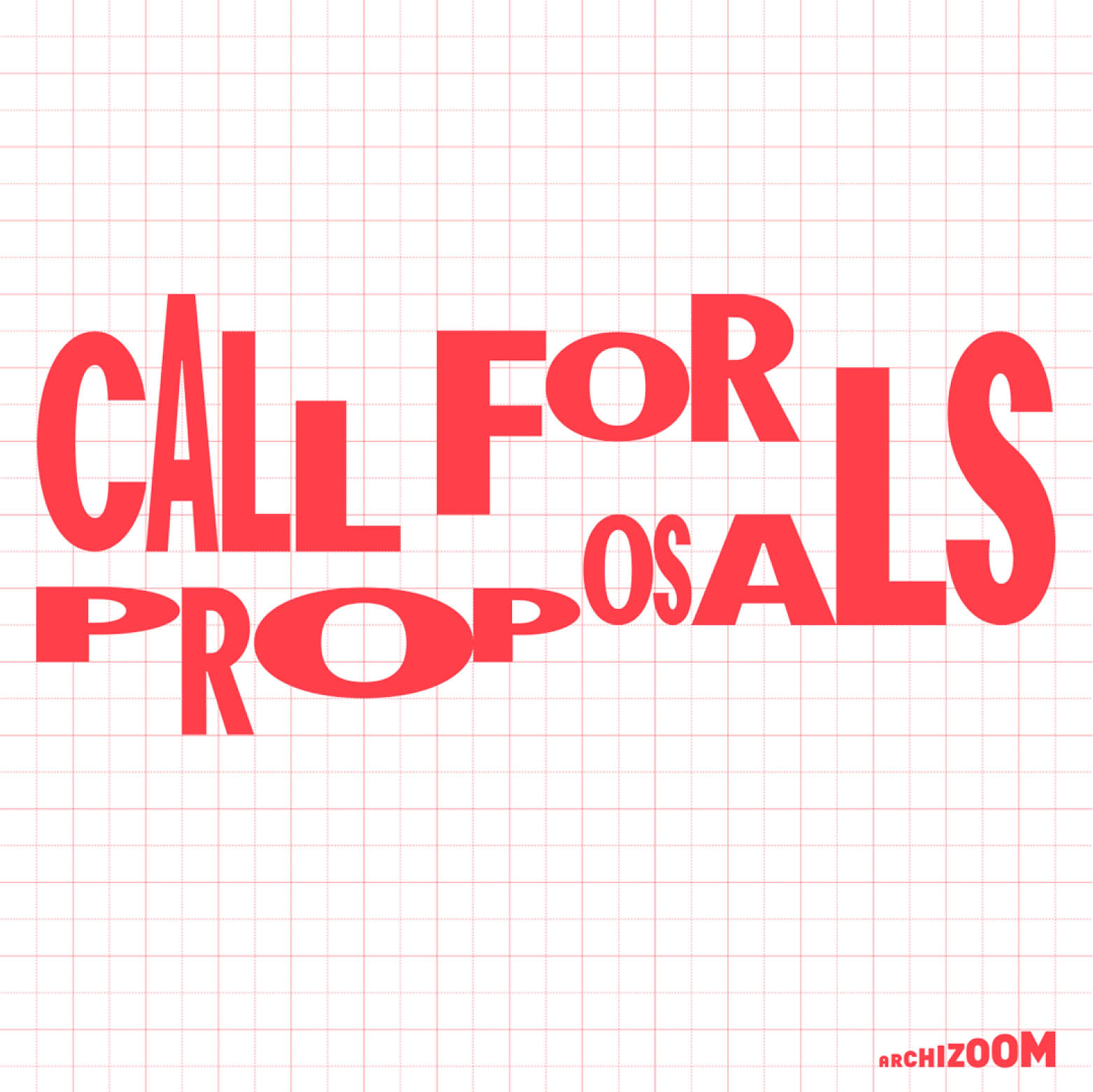
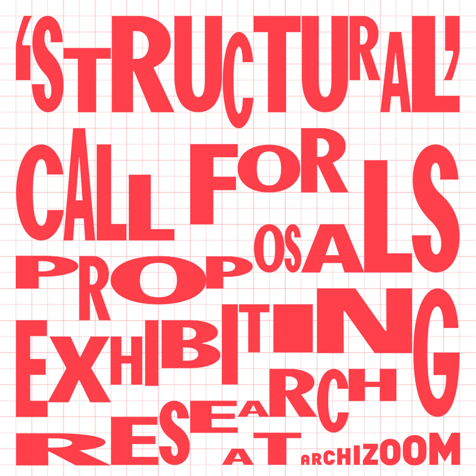
Lettering and Poster for the Announcement for the Open Call ‘Structural’ – Exhibiting Research. Made for Archizoom in Lausanne.
2020, Poster, Lettering
FIREFLY
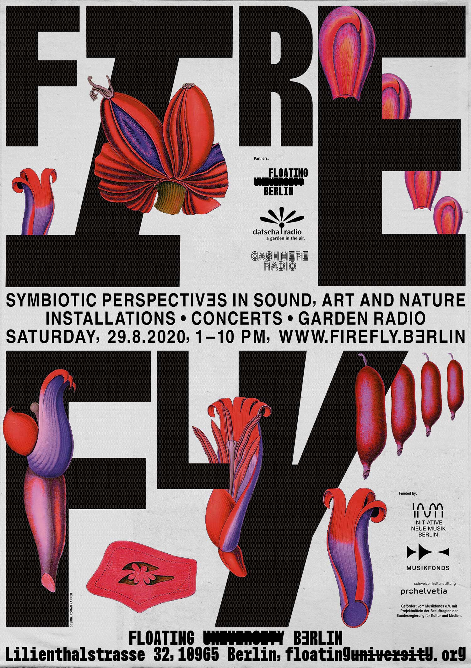
Poster for Firefly – symbiotic perspectives in sound, art and nature. A format for sound installations, concerts, experimental electronic music and a garden radio happening at the Floating University Berlin.
2020, Poster
How I feel today

What I feel today is a small zine about abstract emotional line-drawings that I drew every day in summer 2017.
2017, Zine, Illustration, A5, 28 p.
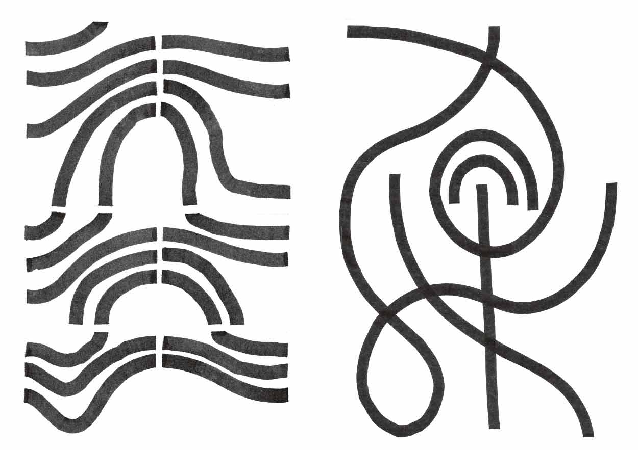
Sandkasten
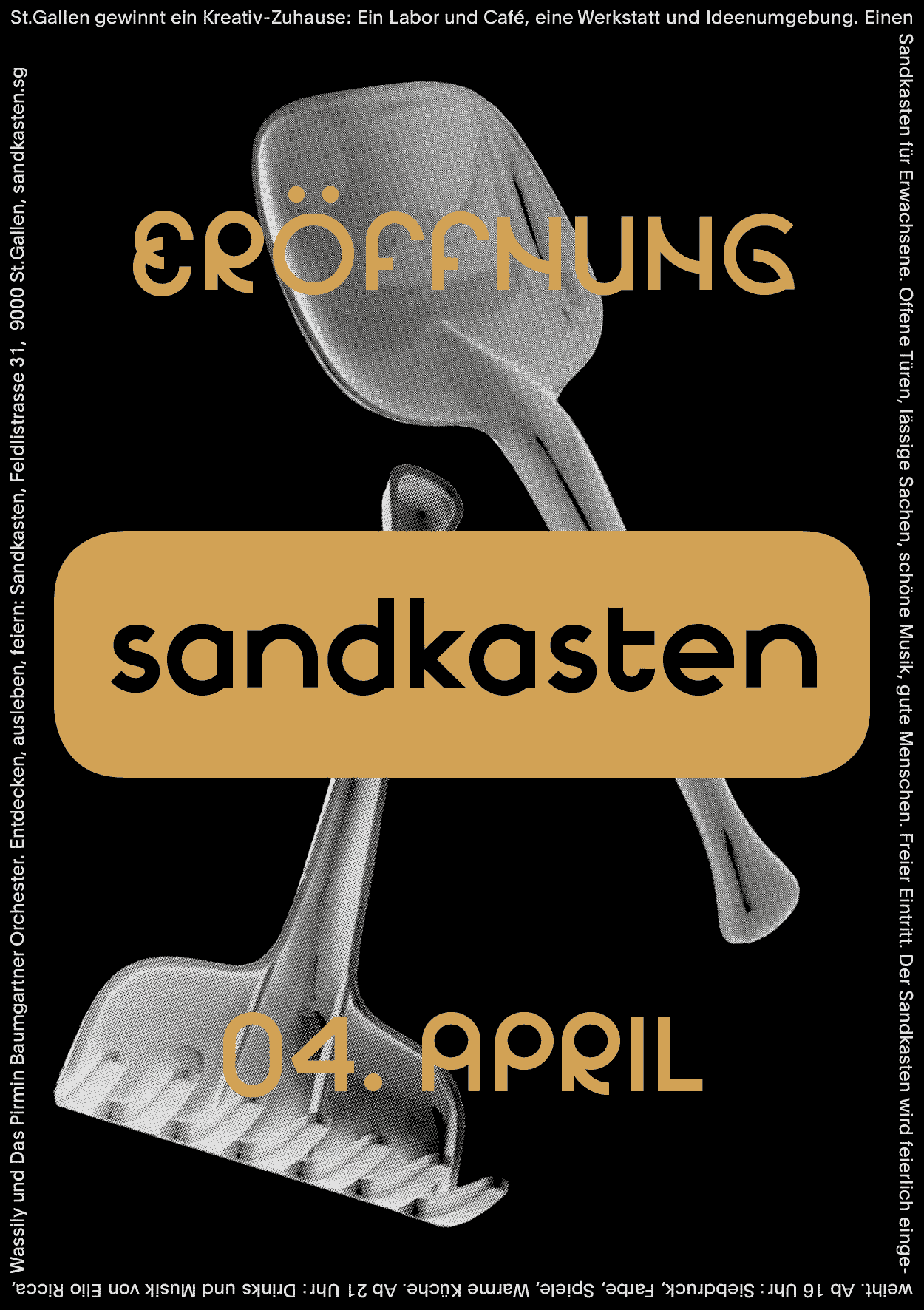
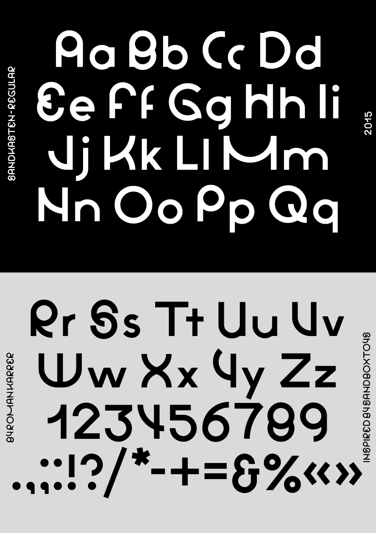
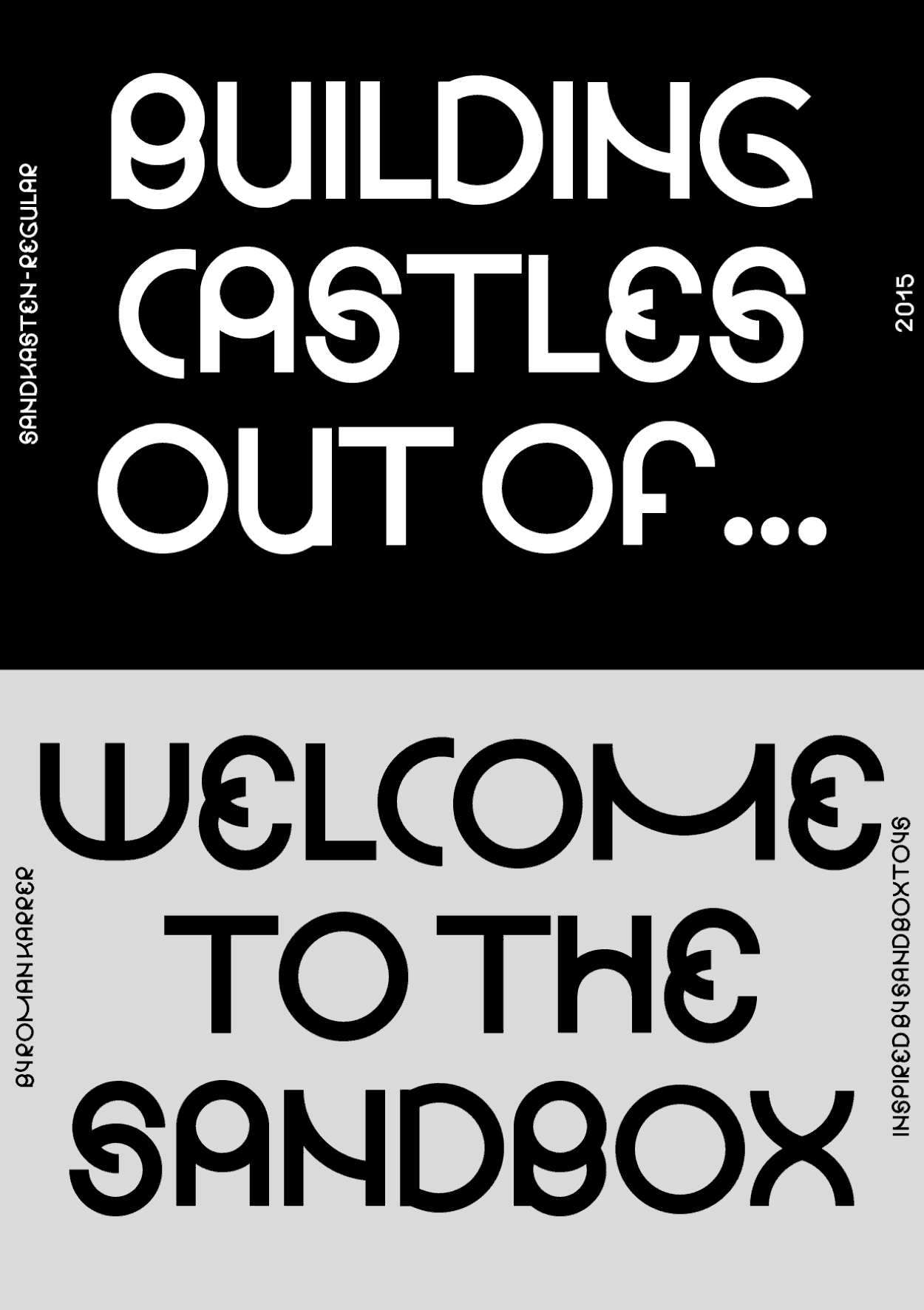
For the creative workspace Sandkasten (German for ‘sandbox’) that is located in St.Gallen, I developed a new identity. In this context, I created different printed media using a custom typeface that is inspired by the round shapes of sandbox-toys.
2016, Identity, Typeface, Poster, Commissioned work
Karōshi
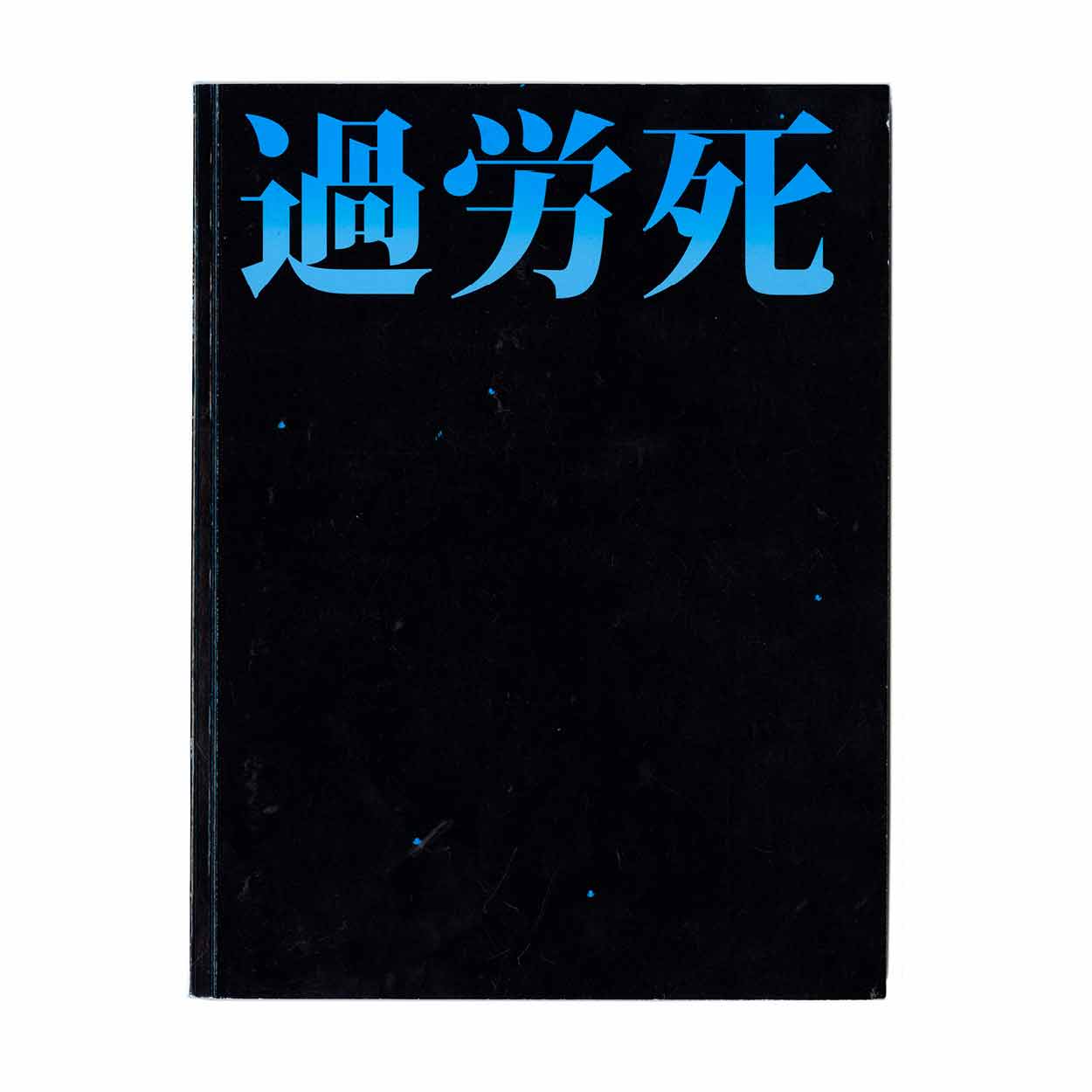
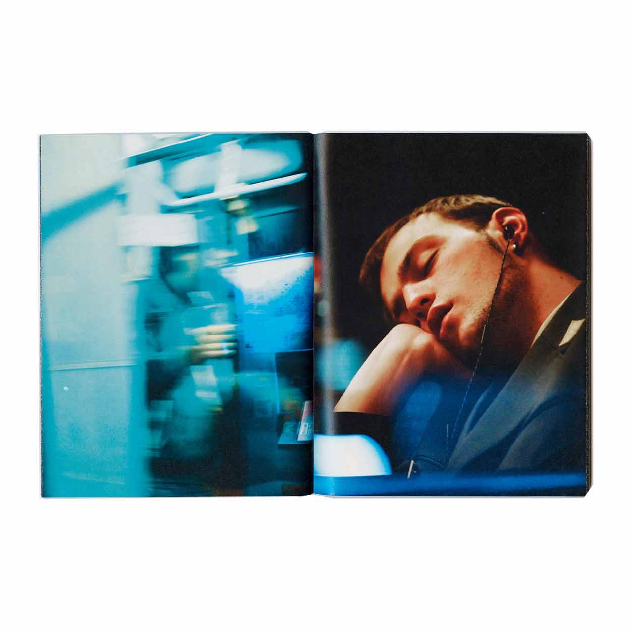
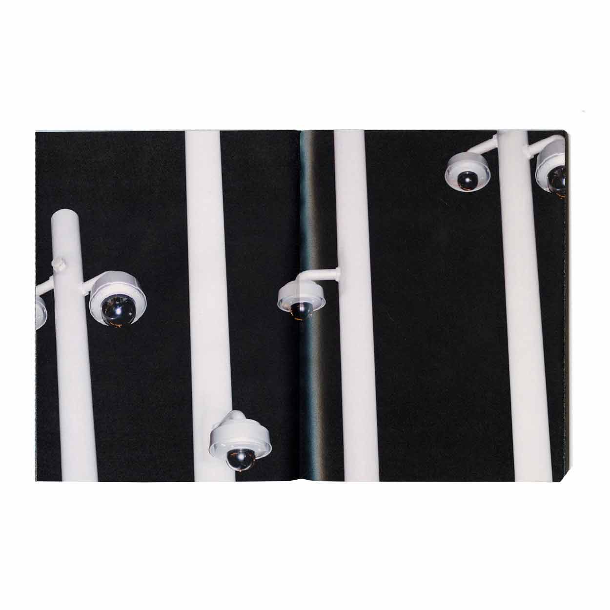
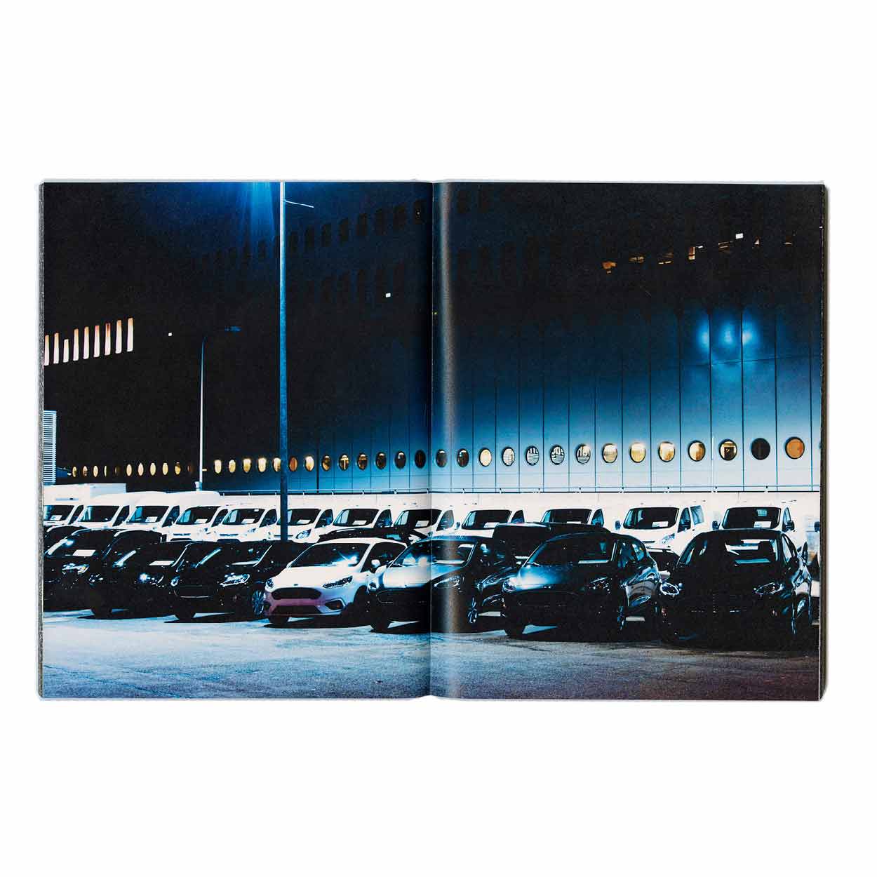
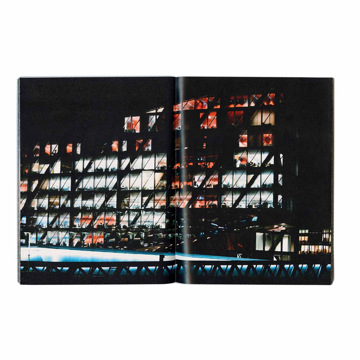
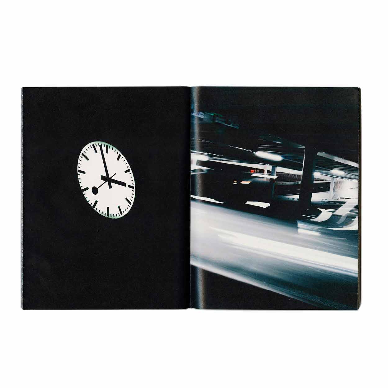
The book Karōshi was made in collaboration with the photographer Théa Giglio. The book deals with the working mentality of our culture. The artificial light which allows us to overcome the rhyme of nature becomes the main actor. (kaˈrəʊʃɪ) (noun) Japanese, from: ka (過) ‘excess’ ro (労) ‘labour’ shi (死) ‘death’ Ka-rō-shi is a Japanese term, which can be translated literally as “overwork death”. The major medical causes of karōshi deathsare heart attack and stroke due to stress and a starvation diet. This phenomenon is also widespread in South Korea, where it is referred as gwa-ro-sa (過勞死). In China, overwork-induced death is called guo-lao-si (过劳死).
2018, Book, 130 × 210mm, realized at ECAL, 200 p.
Brunokarrer.ch
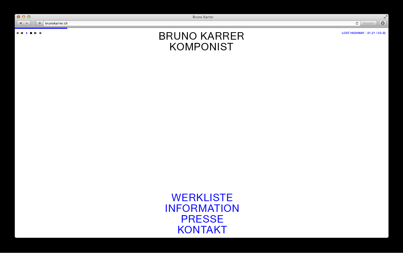
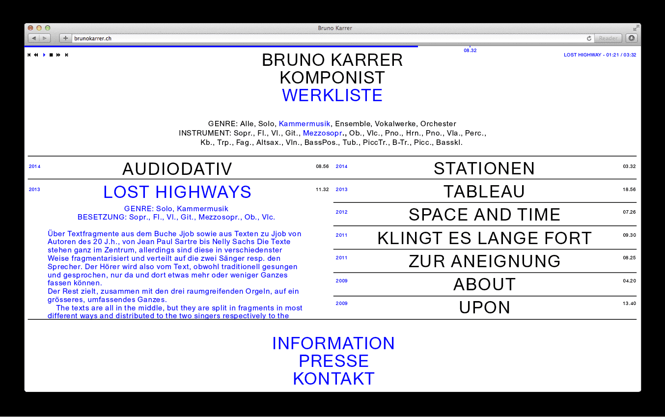
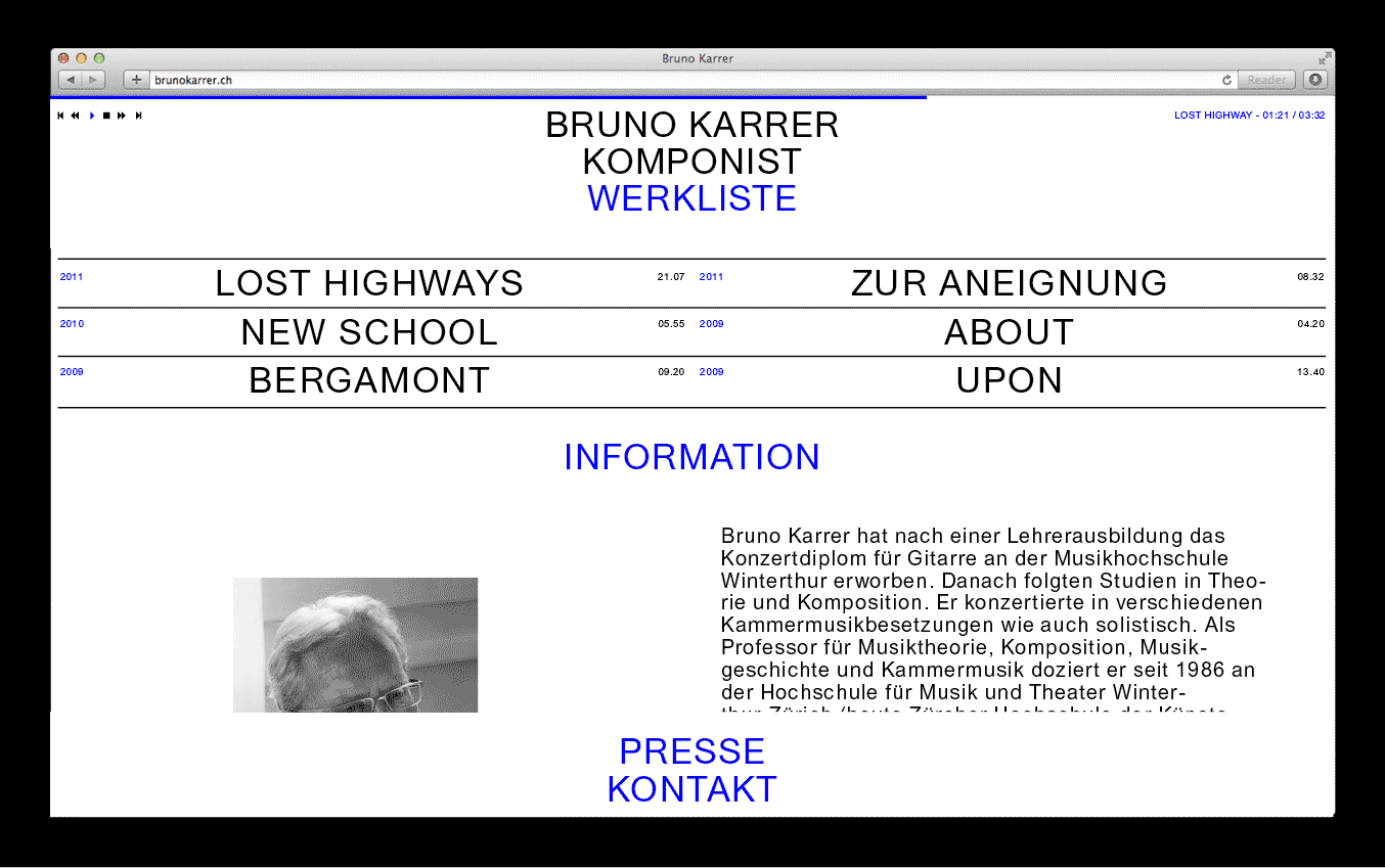
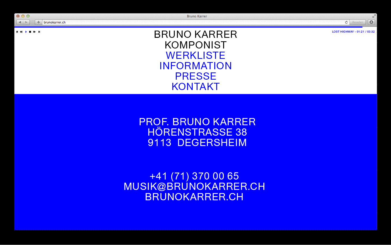
In collaboration with Sandi Gazic & Juri Römmel I created a Website and Archive for the music composer and professor Bruno Karrer. Code by Jonas Huber.
2018, Website, Archive
Re:Europe
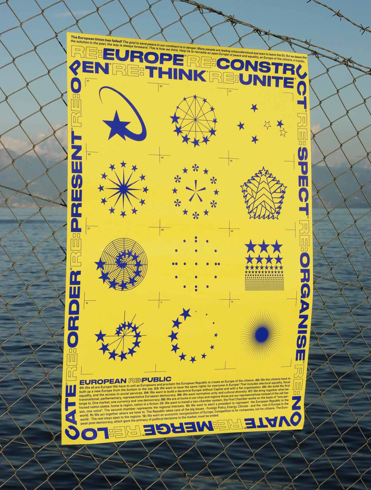
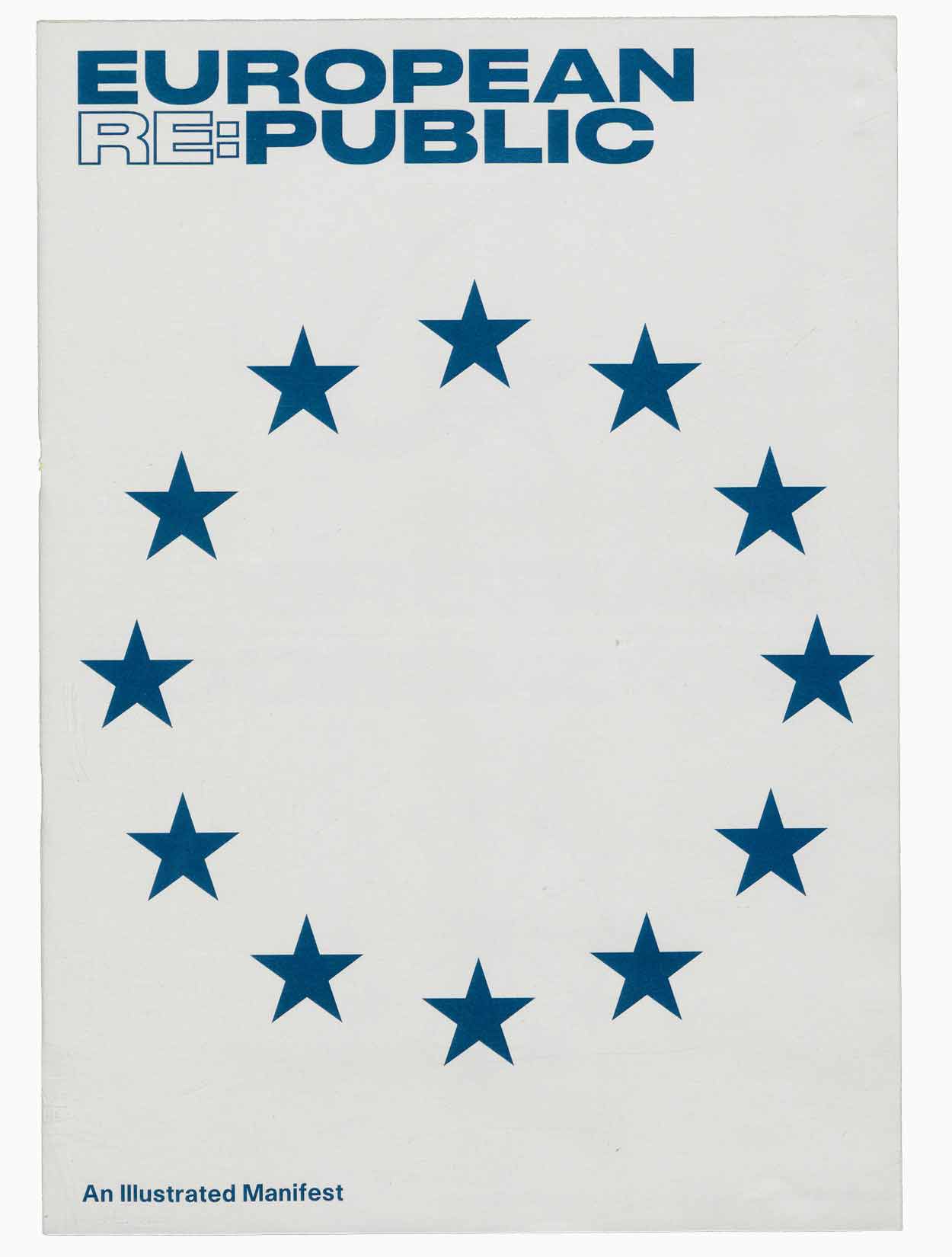
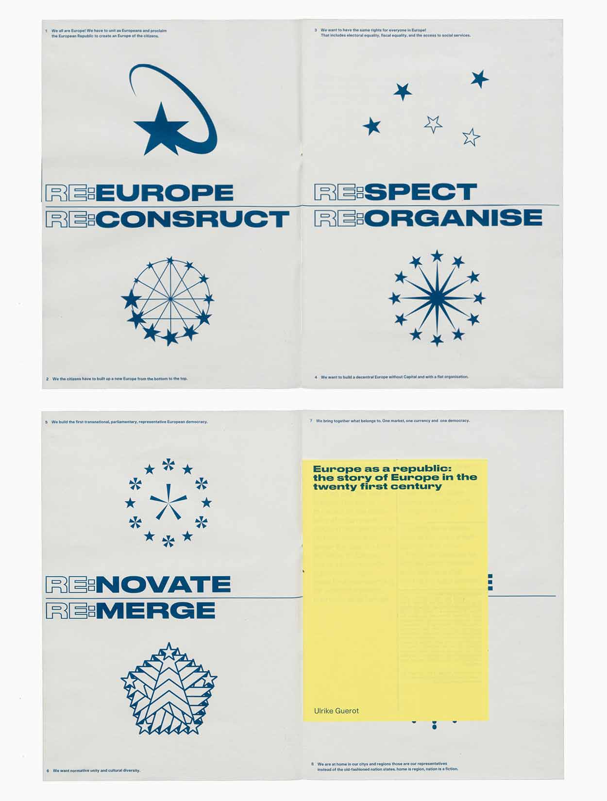
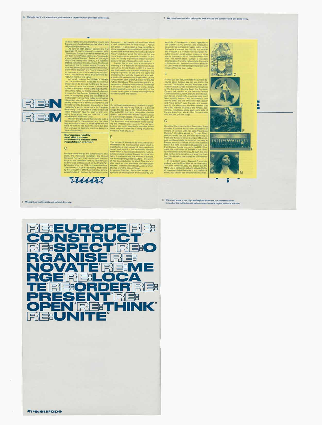
Re:Europe is a project I created during my studies in Lausanne. It was inspired by a political utopia that proposed a new European Republic. I was interested to think about how this idea could be visually represented and summarized in a manifesto.
About
Roman Aurelio Karrer (he/him) is an in(ter)dependent graphic designer, researcher, cultural worker, and occasional editor, publisher, based in Geneva, Switzerland. His work focuses on culture, architecture and the arts. Roman is an associate of Floating e.V. and has an affinity for (design/art) pedagogies, collectivity, (critical) theory and an interest and passion for publishing strategies, visual identities and the creation of systems and toolkits that make design accessible, empowering and democratic. He also designs typefaces, websites, posters and editorial work. Roman enjoys working across disciplines and is available for collaborations, commissions, workshops and talks.
Curriculum
Since 2014 Independent Graphic Designer and Researcher
2026 Intervenant at Master Visual Knowledge HEAD, Geneva (CH)
2020 — 2023 Master of Arts, ‘CCC – Critical Curatorial Cybermedia’ Research-Based Programme HEAD, Genève (CH)
2020 — 2023 Intervenant at ALICE y1 EPFL, Lausanne (CH)
2016 — 2019 Bachelor in Graphic Design at ECAL, Lausanne (CH)
2018 Exchange semester in Communication Design at HFG Karlsruhe (DE)
2014 — 2015 Professional maturity in art and design, St.Gallen (CH)
2010 — 2014 Apprenticeship as Swiss Federal Graphic Designer (EFZ), St.Gallen (CH)
2009 — 2010 Foundation year in art, St.Gallen (CH)
Awards/Residencies
Research residency at ABA (Air Berlin Alexanderplatz), 2024 (DE)
The Most Beautiful Swiss Books 2021
Contributions
Floating University Berlin (since 2018)
Forum on European Culture (2018)
Votetogether.eu (2019)
MAS 006 – Every Object Has Needss (2019)
Issue Journal #8 – All Monuments Must Fall (2021)
Contact
Roman A. Karrer
info@romankarrer.ch
+41 (0)79 769 87 80
Collaborations
Federal Office of Culture Switzerland
Between Bridges
Raumlaborberlin
ALICE / EPFL
art-werk
Soft Agency
EPFL Architecture
Mode Suisse
ECAL.CH
Officeforcities
Sandi Gazic
Featured in
Trans magazine
Euphoric magazine
Arch+ magazine
Vakuum Magazin
Plataforma Arquitectura
Arquine
EPFL News
Exhibitions / Events
I Never Read, Art Book Fair, with «Friends and friends of friends» hosted together with Asta (Kaserne Basel, CH, 2024)
The Sun Machine Is Coming Down , Berlinerfestspiele #70
with floatinguniversity (ICC Berlin, DE, 2021)
Venice Architecture Biennale #17 with floatinguniversity
and raumlaborberlin (Venice, IT, 2021)
Talk about Beirut, Studio106 (Los Angeles, US, 2020)
Diversity is Future, Rote Fabrik (Zurich, CH, 2020)
Tour d’horizon, Archizoom (Lausanne, CH, 2020)
Diplômes 2019, ECAL, (Lausanne, CH, 2019)
DGTF Konferenz, HFG Karlsruhe (Karlsruhe, DE, 2018)
ECAL Graphic Design, Torino Graphic Days (Torino, IT, 2018)
Rundgang, HfG Karlsruhe (Karlsruhe, DE, 2018)
ECAL Graphic Design, Grafik 17 (Zurich, CH, 2017)
make.aZINE, Celeste (Vienna, A, 2016)
Inspiriert.sg (St.Gallen, CH, 2015)
Cosmic-boyz, viereinhalb (St.Gallen, CH, 2015)
Unraum17 (St.Gallen, CH, 2014)
Teaching / Workshops / Interventions / Talks
End of Semester Jury, Joint Master of Architecture (JMA) (Fribourg, CH, 2026)
Lecture, ENSAD (Nancy, FR, 2024)
Lecture, KIT Institut Entwerfen, Kunst und Theorie (Karlsruhe, DE, 2021)
Lecture «On Navigation», Alice y1 – EPFL (Lausanne, CH, 2021)
Lecture «On me(n)ta(l) constructions», Alice y1 – EPFL (Lausanne, CH, 2020)
Workshop «Questions and Statements», Floating University Berlin (Berlin, DE, 2019)
Image Credits: Floating University Berlin: Daniel Seiffert: 2,4,10,11 (r), 12 (l). Victoria Tomaschko: 11 (r). Lena Giovanazzi: 14. Pablo Bellon (Found in Guilin CHN): 16(l). Unknown: 17. / Floating Mono Stencil: David Roberts: 3,4,5 / ModeSuisse: Tino Konino: 5 Contaminations: Daniel Seiffert: 2 Learn(e)scapes: Rosa Merk: 4,5 Raul Walch: 14,16 The (Real) Book: Théa Giglio: 1,3,4,5,8-26 Close/d: Morgan Carlier: 2,12. / Built with mousebuilt.
© 2026 All Rights served Roman A. Karrer
Last Project Update: 01.06.2025